 Piktochart Team
·

Updated on
November 21, 2024
Published on
November 15, 2024

Orange, pastel, and blue color palettes offer a unique blend of warmth, softness, and tranquility, making them a popular choice for various design projects. These palettes can evoke a range of emotions, from the calmness of a pastel blue sky to the vibrant energy of a sunset.
Incorporating these colors into your designs can create visually appealing and harmonious compositions. Whether you're designing for digital media or print, understanding how to balance these hues can elevate your work to new heights.
Designing with orange, pastel, and blue color palettes can be both exciting and challenging. Here are some practical tips to help you create stunning designs:

The 'Sunset Dreams' palette, with its vibrant #FF6F20 and soothing #A7C6ED, creates a mood that is both invigorating and calming, reminiscent of a serene evening sky.
These colors interact harmoniously to produce a cohesive look, making them ideal for interior decor where the warm tones of #FFB74D and #F2E1D5 can create a welcoming atmosphere, while the soft #F9AFAF adds a touch of elegance.

The 'Coral Breeze' palette, with its vibrant #FF8C42 and soothing #B2E0F0, evokes a sense of warmth and calmness, making it perfect for creating inviting and serene environments.
This palette would excel in product packaging, where the energetic #F2A900 and soft #FFB3A0 can draw attention while maintaining a harmonious and appealing look.

The 'Ocean Sunset' palette, featuring dominant colors like #FF7F50 and #A4D8E1, creates a striking balance between the warmth of coral and the coolness of aqua, resulting in a visually soothing yet invigorating effect.
This harmonious blend is ideal for wellness branding, where the calming #E0F7FA and the inviting #FFCC99 can foster a sense of tranquility and well-being, making it perfect for eco-friendly interior spaces.
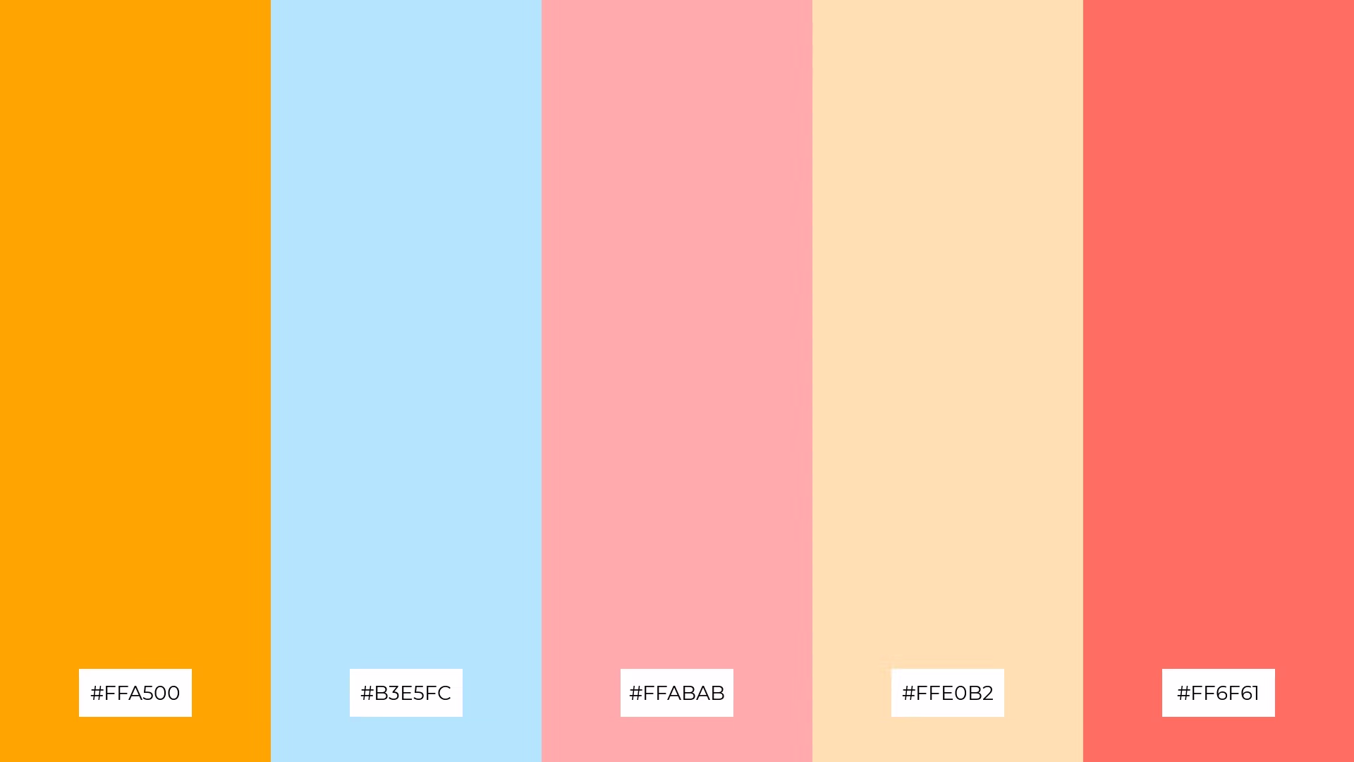
The 'Citrus Sky' palette, with its blend of bold #FFA500 and soft #B3E5FC, offers a unique balance that creates a distinct and inviting mood.
This palette is ideal for modern web designs, where the vibrant #FF6F61 and soothing #FFE0B2 can draw attention while maintaining a harmonious and appealing look.

The 'Tropical Vibes' palette, with its vibrant #FF6F20 and soothing #A2DFF7, creates an ambiance of lively serenity, perfect for evoking a sense of tropical escape.
This harmonious blend of colors is ideal for luxury fashion campaigns, where the warm #FFB74D and soft #F9C9B6 can create a sophisticated yet inviting look, while the elegant #F2E1D5 adds a touch of refinement.

The 'Peachy Waves' palette, with its blend of vibrant #FF9A3D and soothing #A7C6ED, creates a harmonious balance that can evoke a mood of playful sophistication, making it ideal for minimalistic branding that seeks to stand out while maintaining elegance.
This palette's combination of warm #FFB3A0 and soft #F6D6A8, complemented by the energetic #F2A900, is perfect for bold event designs where a lively yet refined atmosphere is desired, ensuring that the visual elements captivate and engage the audience.

The 'Warm Serenity' palette, with its vibrant #FF8C42 and soothing #B2E0F0, juxtaposes energetic and calming hues to create a visually engaging contrast that captures attention and maintains interest.
This dynamic combination is perfect for creative projects like magazine layouts or artistic websites, where the blend of warm #FFCC99 and soft #E0F7FA can enhance the visual appeal and provide a balanced, inviting atmosphere.

The 'Soft Citrus' palette, with its vibrant #FF6F20 and soothing #A4D8E1, can create a sense of calm when used together, while the energetic #FFABAB and bold #FF6F61 can infuse excitement into any design.
This versatile combination is perfect for spa branding, where the tranquil #FFE0B2 can enhance a serene atmosphere, or for vibrant marketing campaigns that seek to captivate and energize the audience.

The 'Blush and Sky' palette, with its softer tones like #A7C6ED and #F9C9B6, combined with the brighter #FF7F50 and #FFB74D, creates a mood that is both refreshing and inviting.
This blend is ideal for seasonal promotions, where the vibrant hues can capture attention while the softer shades provide a calming balance, making it perfect for spring or summer campaigns.
The 'Golden Hour' palette, with its vibrant #FFA500 and soothing #B3E5FC, creates a visual flow that evokes feelings of joy and tranquility, making it perfect for designs that aim to uplift and calm simultaneously.
This harmonious blend of colors is ideal for lifestyle branding, where the energetic #FFABAB and serene #FFE0B2 can create an inviting and sophisticated look, or for tech product packaging that seeks to stand out with a balanced, emotionally engaging aesthetic.

The 'Serene Sunset' palette, with its blend of vibrant #FF9A3D and soothing #A2DFF7, creates a welcoming effect by balancing warm and cool tones, making it ideal for boutique interiors where a cozy yet sophisticated atmosphere is desired.
This palette's combination of soft #FFB3A0 and #F6D6A8, complemented by the dramatic #F2A900, can add a touch of elegance and excitement, making it perfect for luxury e-commerce sites that aim to captivate and engage high-end shoppers.
The 'Coral Skies' palette, with its vibrant #FF8C42 and soothing #B2E0F0, creates a balanced contrast that evokes both energy and calmness, making it ideal for designs that seek to capture attention while maintaining a serene atmosphere.
This harmonious blend is perfect for casual apparel lines, where the warm #FFCC99 and soft #F2B2A1 can create an inviting and stylish look, while the tranquil #E0F7FA adds a touch of sophistication.

The 'Pastel Paradise' palette, with its vibrant #FF6F20 and soothing #A4D8E1, blends warm and cool tones to evoke a mood of playful elegance, making it perfect for artisan product branding that seeks to captivate and charm.
This harmonious combination of warm #FFB74D and soft #F9C9B6, complemented by the refined #F2E1D5, is ideal for editorial layouts where a balanced, inviting atmosphere is desired, ensuring that the visual elements engage and delight the reader.

The 'Citrus Dream' palette, with its vibrant #FF7F50 and soothing #A7C6ED, creates a dynamic interplay of bold and subtle hues that can capture attention while maintaining a harmonious balance.
This versatile combination is perfect for festival marketing, where the energetic #FFABAB and #FF6F61 can draw crowds, while the soft #FFE0B2 provides a calming contrast, ensuring an engaging and inviting visual experience.

The 'Warm Embrace' palette, with its vibrant #FFA500 and soothing #B3E5FC, creates a harmonious blend that can evoke a sense of balance and tranquility, making it perfect for cozy interior makeovers where a welcoming atmosphere is desired.
Alternatively, the contrasting hues of #FFCC99 and #F2B2A1 against the tranquil #E0F7FA can add a dynamic visual interest, ideal for tech startups aiming to create an engaging and innovative workspace that stimulates creativity and productivity.
When using orange, pastel, and blue color palettes in home decor, consider incorporating these hues through accent pieces like throw pillows, rugs, or wall art. The vibrant energy of orange can be balanced with the calming tones of pastel blue, creating a space that feels both lively and serene.
For marketing materials, these palettes can be used to draw attention and convey a sense of harmony. Use orange for call-to-action buttons or headlines, pastel blue for backgrounds, and neutral tones to tie everything together. This combination ensures your materials are eye-catching yet professional.
In clothing design, blending these colors can result in stylish and versatile pieces. An orange statement piece paired with pastel blue accessories can create a balanced and fashionable look. Experiment with different shades to find the perfect mix that resonates with your brand's aesthetic.
Ready to bring your designs to life? Try creating these stunning color palettes using Piktochart and elevate your projects to new heights.
The latest industry news, interviews, technologies, and resources.

Published on
November 25, 2024


