Green and orange color palettes offer a vibrant and dynamic combination that can bring energy and warmth to any design. These colors, when used together, create a striking balance between the freshness of green and the zest of orange.
Whether you’re designing for a brand, a website, or an infographic, incorporating green and orange can make your visuals stand out. This article explores the versatility and appeal of green and orange color palettes in various design contexts.
Tips For Creating Green Orange Color Palettes
Designing with green and orange can be both exciting and challenging. Here are some practical tips to help you create stunning color palettes:
- Balance the Colors: Ensure that neither green nor orange dominates the design. Use them in proportions that complement each other to maintain visual harmony.
- Match Complementary Shades: Pair green and orange with neutral colors like white, gray, or beige to soften the overall look and make the vibrant hues pop.
- Use Gradients: Gradients can blend green and orange seamlessly, creating a smooth transition that adds depth and interest to your design.
- Consider the Context: Think about where and how the design will be used. For instance, a bright green and orange palette might be perfect for a summer event but too bold for a corporate setting.
- Test Different Combinations: Experiment with various shades and tints of green and orange to find the perfect match. Tools like color wheels can help you visualize different combinations.
- Incorporate Textures: Adding textures or patterns can break up the solid blocks of color, making the design more engaging and versatile.
15 Green Orange Color Palettes
1) Citrus Grove
The ‘Citrus Grove’ palette, with its vibrant oranges and lush greens, evokes a lively and refreshing mood, reminiscent of a sunlit orchard.
These colors interact harmoniously to create a cohesive look, making them ideal for a summer-themed interior decor that brings the outdoors inside with a burst of natural energy.
2) Forest Sunset
The ‘Forest Sunset’ palette, with its rich blend of deep greens and warm oranges, evokes a sense of tranquility and natural beauty, reminiscent of a serene evening in the woods.
This palette would excel in product packaging for eco-friendly brands, where the colors can convey both sustainability and a connection to nature.
3) Tropical Oasis
The ‘Tropical Oasis’ palette, featuring dominant colors like the vibrant #FFB300 and the lush #1B5E20, creates a lively yet balanced visual experience.
This harmonious blend is perfect for wellness branding, where the energetic hues can evoke a sense of vitality and rejuvenation, while the calming greens provide a grounding effect.
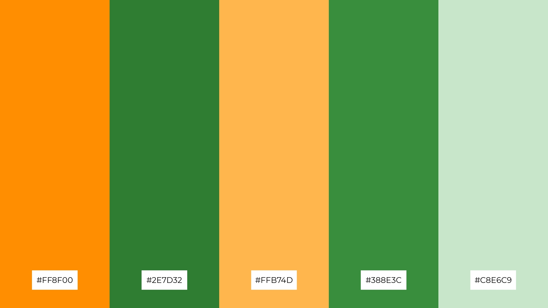
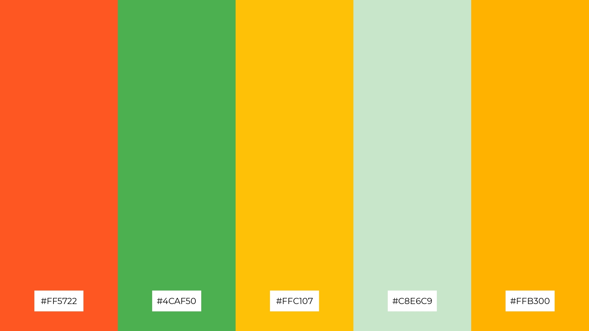
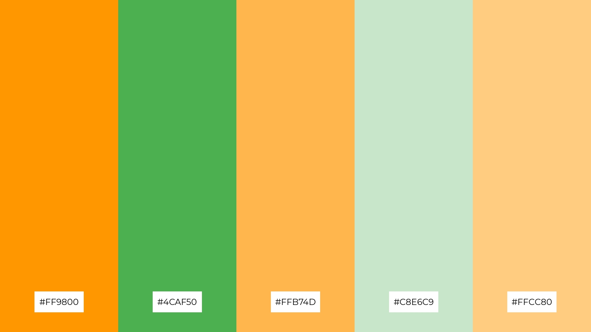
4) Autumn Harvest
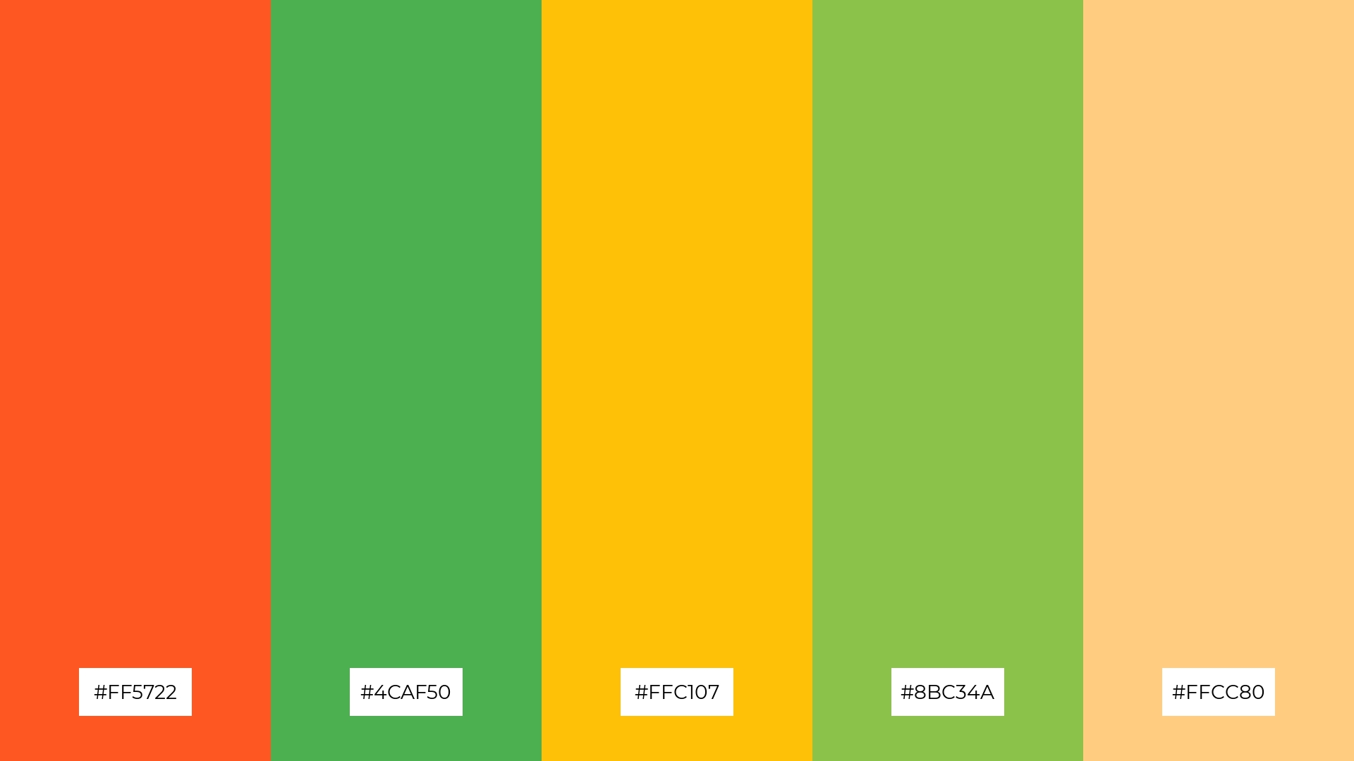
The ‘Autumn Harvest’ palette, with its mix of soft and bold tones like #FF5722 and #4CAF50, creates a distinct mood that balances warmth and vibrancy.
This palette is ideal for creating inviting retail spaces or modern web designs, where the colors can enhance the ambiance and attract attention.
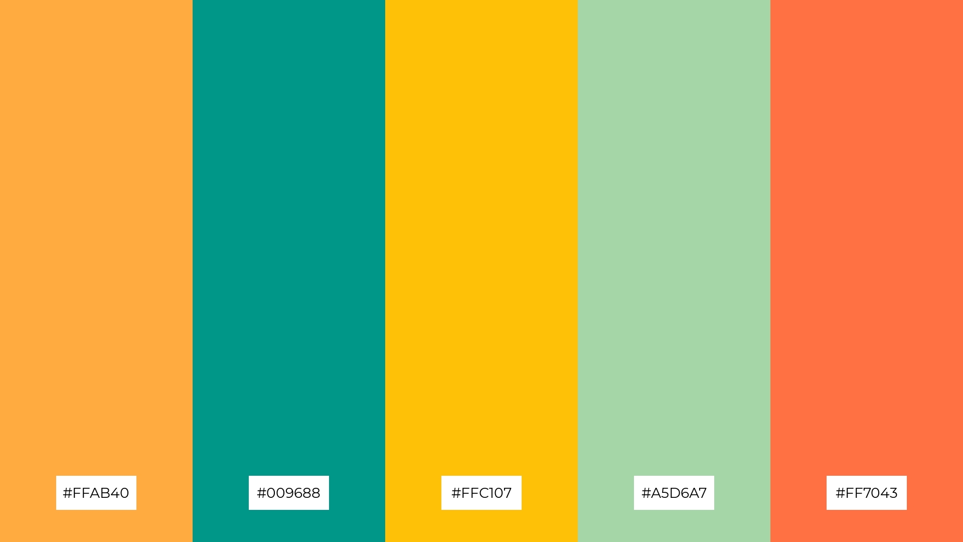
5) Minted Citrus
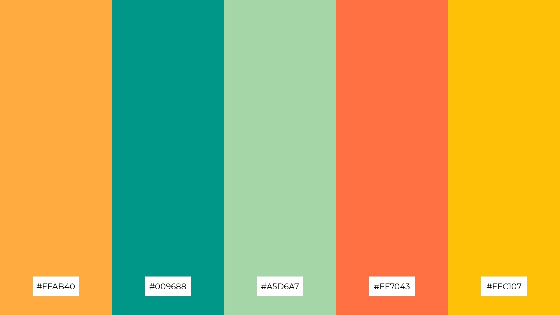
The ‘Minted Citrus’ palette, with its blend of #FFAB40, #009688, #A5D6A7, #FF7043, and #FFC107, creates a vibrant yet soothing ambiance, perfect for evoking a sense of fresh elegance and modernity.
This color combination is ideal for luxury fashion campaigns, where the dynamic hues can highlight the sophistication and contemporary flair of the designs, making them stand out in a competitive market.
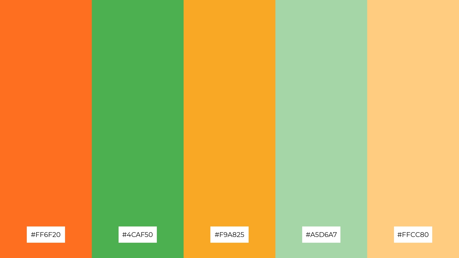
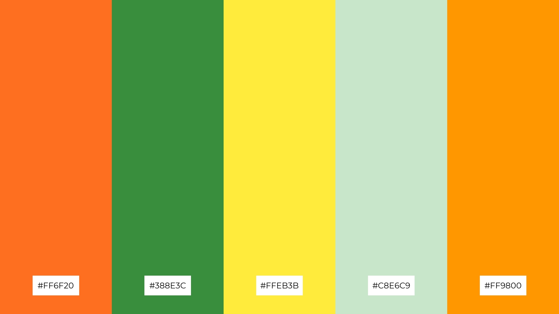
6) Lush Citrus
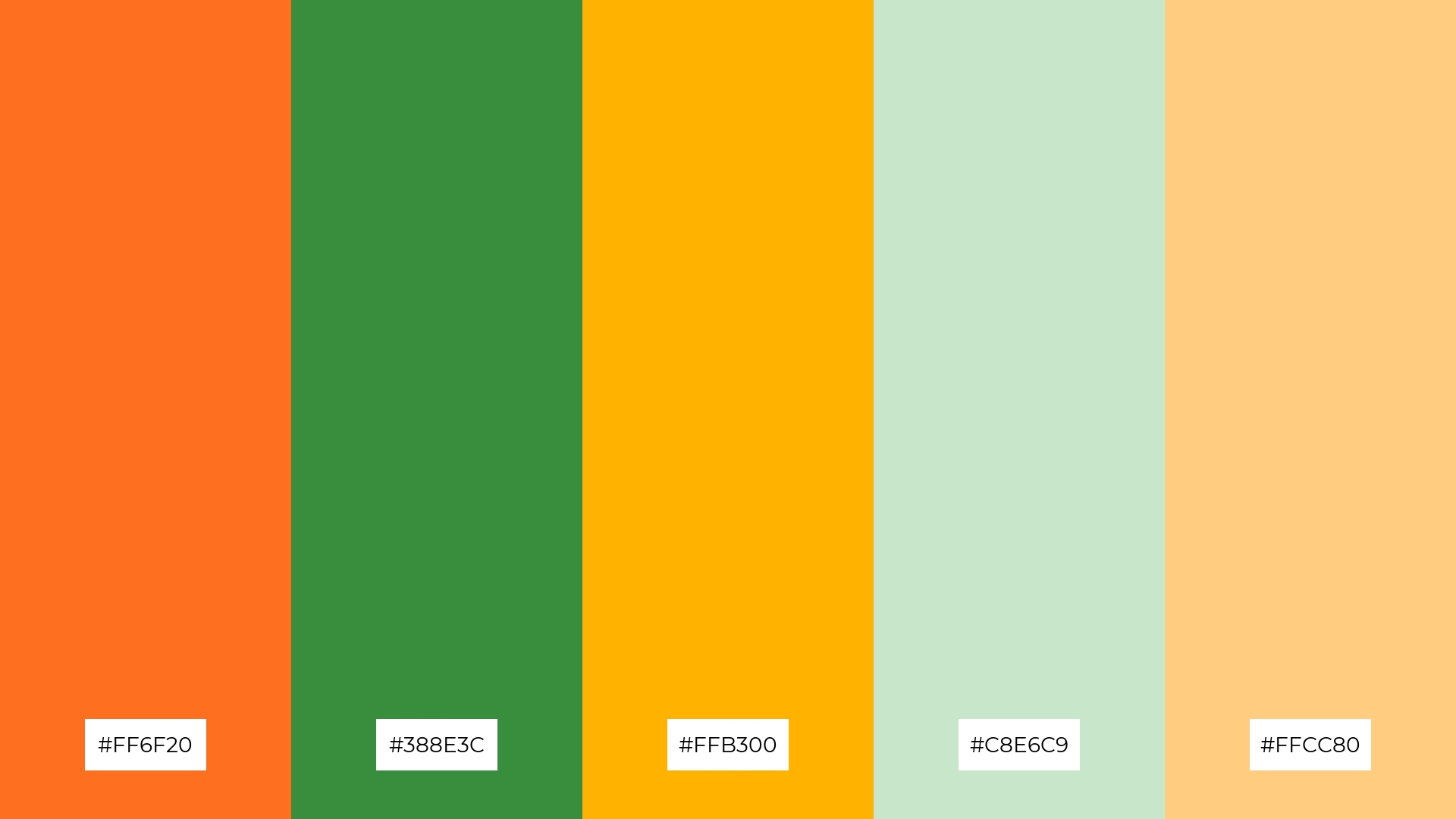
The ‘Lush Citrus’ palette, with its vibrant #FF6F20 and #FFB300 paired with the calming #388E3C and #C8E6C9, creates a balanced harmony that can evoke a sense of playful sophistication, making it ideal for minimalistic branding that seeks to stand out with a touch of elegance.
This color combination is also perfect for bold event designs, where the energetic hues of #FFCC80 and #FF6F20 can capture attention and create an inviting atmosphere, while the softer greens provide a refreshing contrast that keeps the overall look cohesive and engaging.
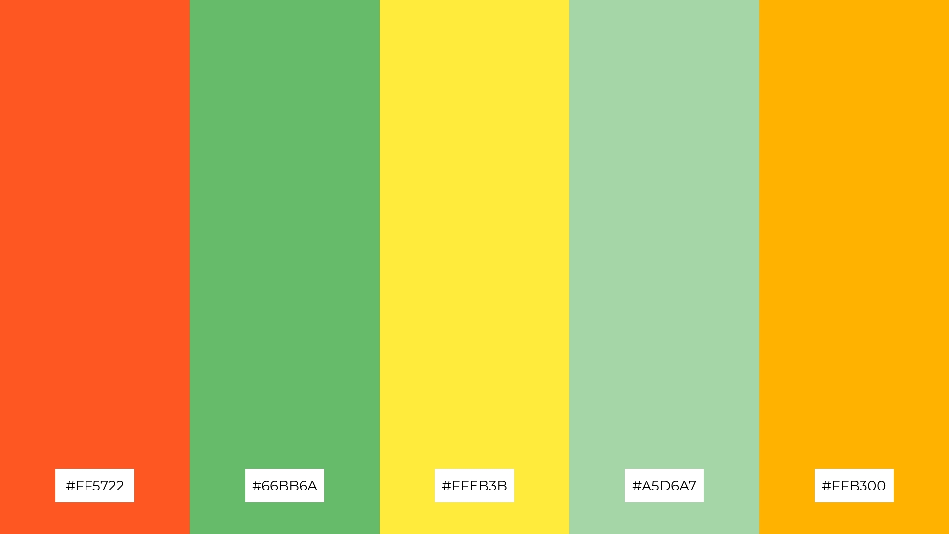
7) Verdant Flame
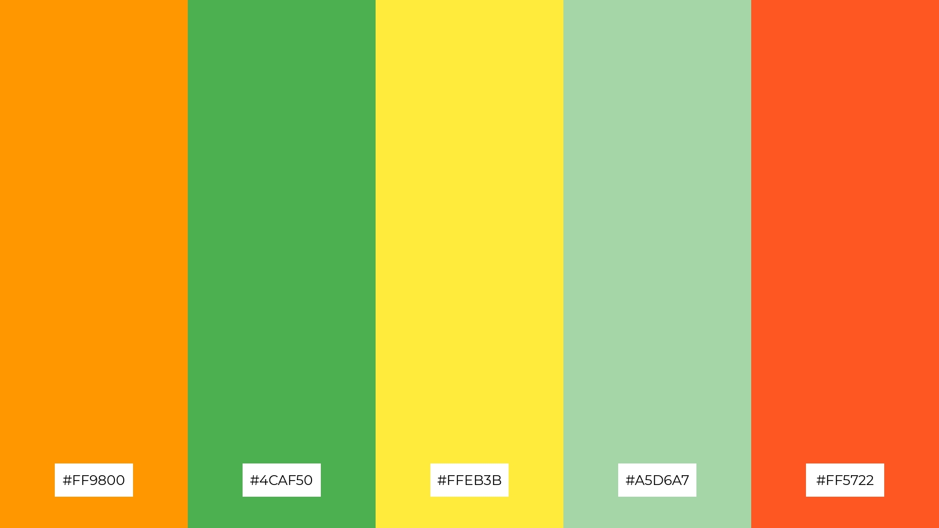
The ‘Verdant Flame’ palette, with its bold #FF9800 and #FF5722 contrasting against the calming #4CAF50 and #A5D6A7, creates a dynamic visual interest that captures attention and evokes a sense of vibrant energy.
This striking combination is perfect for creative projects like magazine layouts or artistic websites, where the interplay of intense and soothing hues can enhance the overall aesthetic and engage the audience effectively.
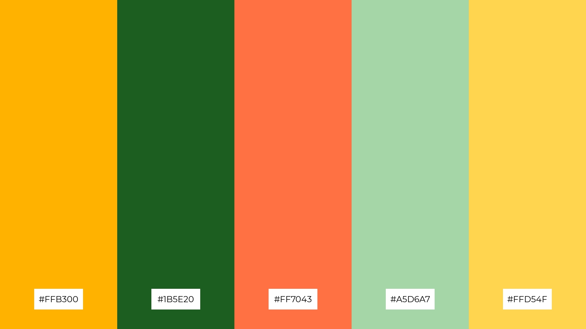
8) Jungle Sunrise
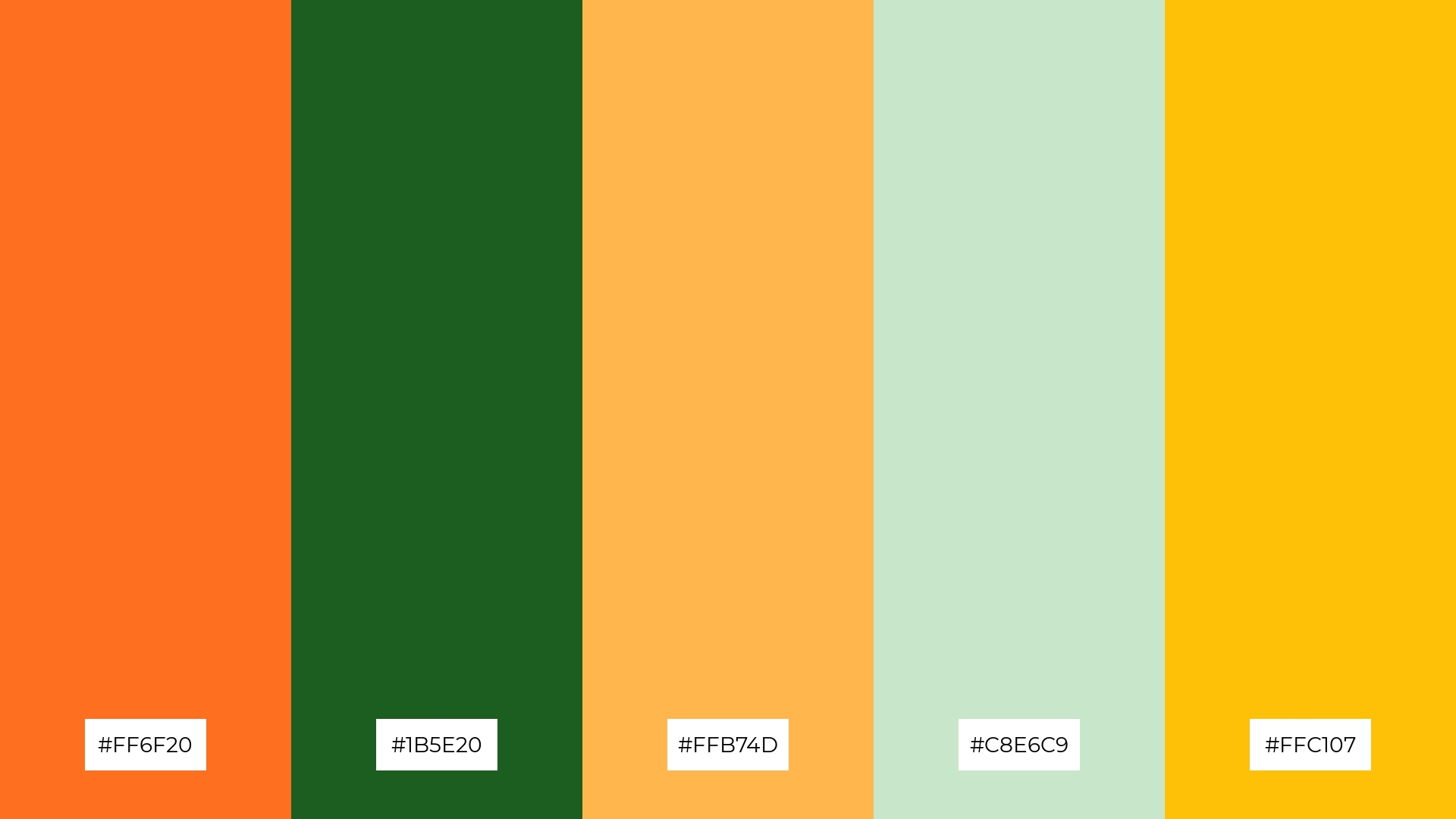
The ‘Jungle Sunrise’ palette, with its vibrant #FF6F20 and #FFC107 paired with the calming #1B5E20 and #C8E6C9, can evoke a sense of excitement and energy, making it perfect for vibrant marketing campaigns that aim to capture attention and convey a lively atmosphere.
Conversely, the soothing combination of #1B5E20 and #C8E6C9, accented with the warm #FFB74D, can create a tranquil and refreshing ambiance, ideal for spa branding that seeks to promote relaxation and rejuvenation.
9) Citrus Meadow
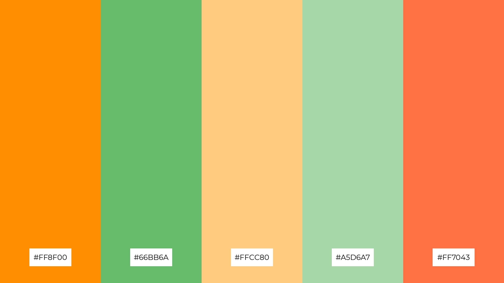
The ‘Citrus Meadow’ palette, with its bright #FF8F00 and #FF7043, contrasted by the softer #66BB6A and #A5D6A7, creates a lively yet soothing visual experience.
This blend of vibrant and gentle tones makes it perfect for seasonal promotions, where the energetic hues can capture attention while the calming greens provide a balanced and inviting atmosphere.
10) Green Ember
The ‘Green Ember’ palette, with its vibrant #FF5722 and #FFB300, contrasted by the calming #4CAF50 and #C8E6C9, creates a dynamic visual flow that evokes both joy and tranquility, making it a versatile choice for various design contexts.
This harmonious blend is ideal for lifestyle branding, where the energetic hues can convey excitement and innovation, while the soothing greens provide a sense of balance and reliability, making it equally effective for tech product packaging that aims to attract and reassure consumers.
11) Orchard Bliss
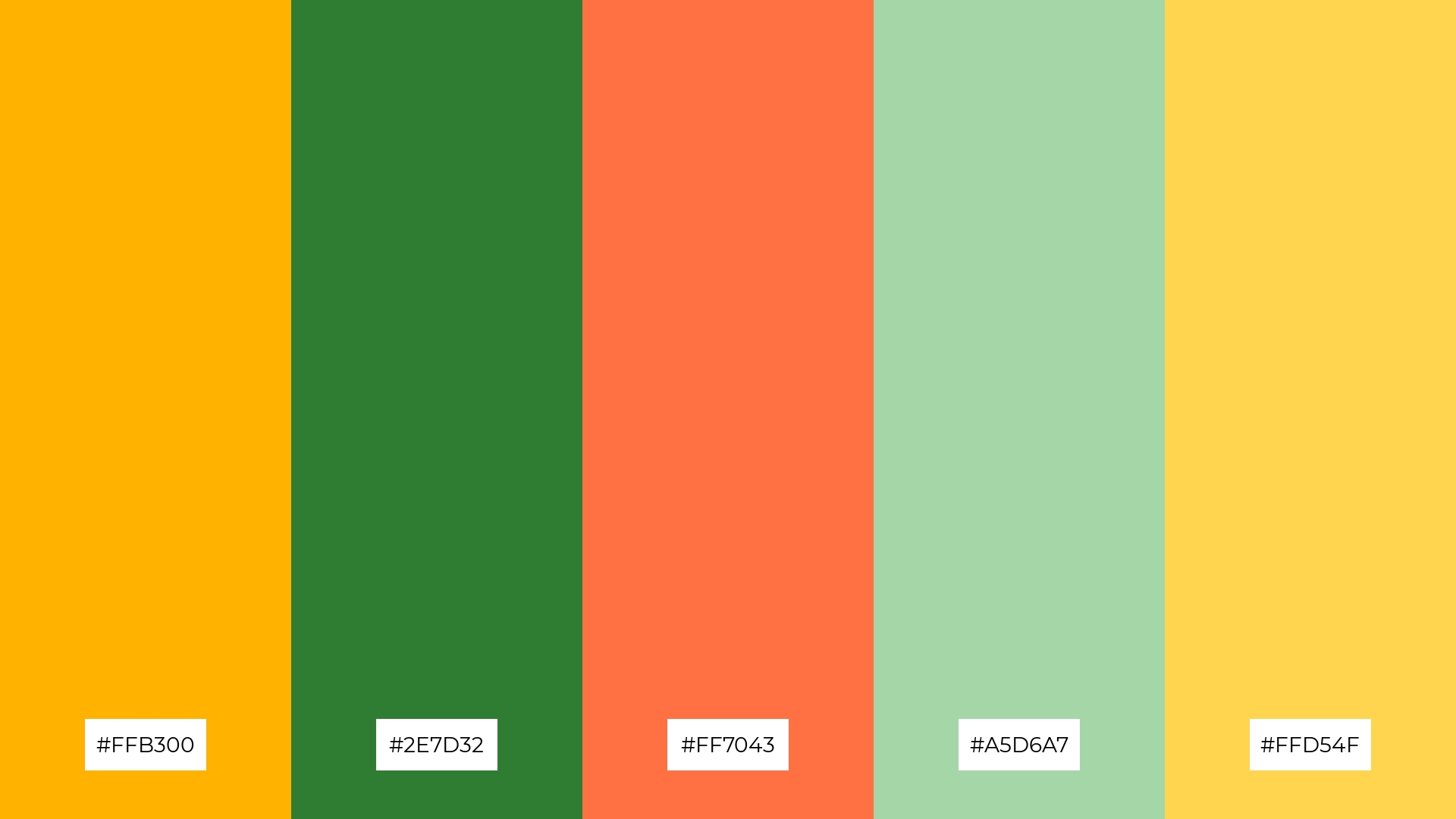
The ‘Orchard Bliss’ palette, with its vibrant #FFB300 and #FF7043 contrasted by the calming #2E7D32 and #A5D6A7, creates a welcoming effect that can make any design feel both inviting and lively.
This harmonious blend is perfect for boutique interiors, where the energetic hues can attract attention and create a warm atmosphere, while the soothing greens provide a balanced and sophisticated backdrop.
12) Sunset Grove
The ‘Sunset Grove’ palette, with its vibrant #FF6F20 and #FF9800 contrasted by the calming #388E3C and #C8E6C9, along with the bright #FFEB3B, creates a dynamic interplay of warmth and tranquility that evokes a sense of balanced energy.
This harmonious blend is ideal for casual apparel lines, where the energetic hues can capture attention and convey a lively, youthful vibe, while the soothing greens and soft yellow provide a refreshing contrast that keeps the overall look cohesive and inviting.
13) Citrus Dream
The ‘Citrus Dream’ palette, with its blend of warm tones like #FFAB40 and #FF7043 and cool hues like #009688 and #A5D6A7, creates a balanced visual harmony that evokes a sense of vibrant sophistication.
This unique combination is perfect for artisan product branding, where the dynamic interplay of colors can highlight the craftsmanship and creativity of handmade goods, making them stand out in a competitive market.
14) Harvest Glow
The ‘Harvest Glow’ palette, with its vibrant #FF9800 and #FFB74D contrasted by the calming #4CAF50 and #C8E6C9, creates a dynamic interplay of bold and subtle hues that can evoke a sense of warmth and freshness.
This harmonious blend is perfect for festival marketing, where the energetic colors can capture attention and convey a lively atmosphere, while the softer tones provide a balanced and inviting backdrop.
15) Emerald Flame
The ‘Emerald Flame’ palette, with its vibrant #FF5722 and #FFB300 contrasted by the calming #66BB6A and #A5D6A7, creates a dynamic visual harmony that can evoke both energy and tranquility, making it versatile for various design contexts.
This unique combination is ideal for tech startups looking to convey innovation and reliability, or for cozy interior makeovers where the vibrant hues can add warmth and excitement while the soothing greens provide a balanced and inviting atmosphere.
How to Use Green Orange Patterns in Design
Green and orange color palettes can transform home decor by creating a lively and inviting atmosphere. Use green as a base color for walls or large furniture pieces, and accent with orange through cushions, artwork, or smaller decor items to add a pop of energy. This combination can make spaces feel both refreshing and warm, perfect for living rooms or kitchens.
In marketing materials, green and orange can be used to capture attention and convey a message of vitality and enthusiasm. Pair a bold orange headline with green subheadings and accents to create a visually striking and cohesive design. This palette is particularly effective for brands promoting health, wellness, or eco-friendly products.
For clothing, green and orange can create a vibrant and trendy look. Consider using green as the primary color for garments and adding orange accessories or patterns to make the outfit stand out. This combination is perfect for summer collections or activewear, where the colors can evoke a sense of energy and freshness.
Ready to experiment with green and orange color palettes in your designs? Try creating your own stunning combinations using Piktochart and bring your creative vision to life!


