Mauve color palettes offer a unique blend of sophistication and subtlety, making them a favorite among designers. This versatile hue can add a touch of elegance to any project, from infographics to web design.
Exploring the various shades of mauve can inspire creativity and bring a fresh perspective to your visual content. Whether you’re aiming for a modern or vintage look, mauve provides endless possibilities.
Tips For Creating Mauve Color Palettes
Designing with mauve can elevate your projects, but it’s essential to use it effectively.
- Balance with Neutrals: Pair mauve with neutral colors like white, gray, or beige to create a harmonious and sophisticated look.
- Complementary Shades: Use complementary colors such as soft greens or muted yellows to make the mauve elements stand out.
- Layering Tones: Experiment with different tones of mauve, from light lavender to deep plum, to add depth and dimension to your design.
- Accent Colors: Incorporate accent colors like gold or silver to add a touch of luxury and contrast to your palette.
- Versatility: Ensure your design remains versatile by using mauve in various elements, such as backgrounds, text, and graphics, to maintain a cohesive look.
15 Mauve Color Palettes
1) Twilight Garden
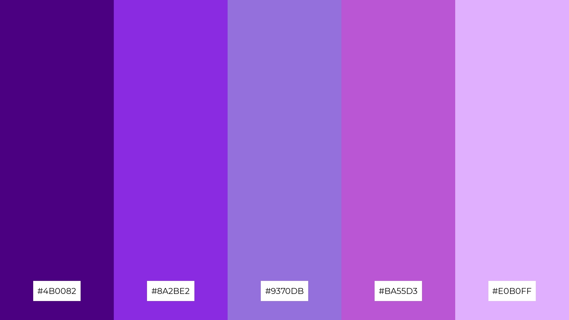
The ‘Twilight Garden’ palette, with its rich indigo, vibrant blue-violet, and soft lavender hues, creates a mood of enchanting mystery and serene elegance.
These colors interact harmoniously to produce a cohesive look, making them ideal for a fashion collection that aims to evoke a sense of whimsical sophistication.
2) Vintage Romance
The ‘Vintage Romance’ palette, with its delicate shades of mauve and violet, evokes a sense of nostalgic warmth and timeless elegance.
This palette would excel in digital branding for a boutique or artisanal product packaging, where a touch of vintage charm can enhance the overall aesthetic appeal.
3) Lavender Fields
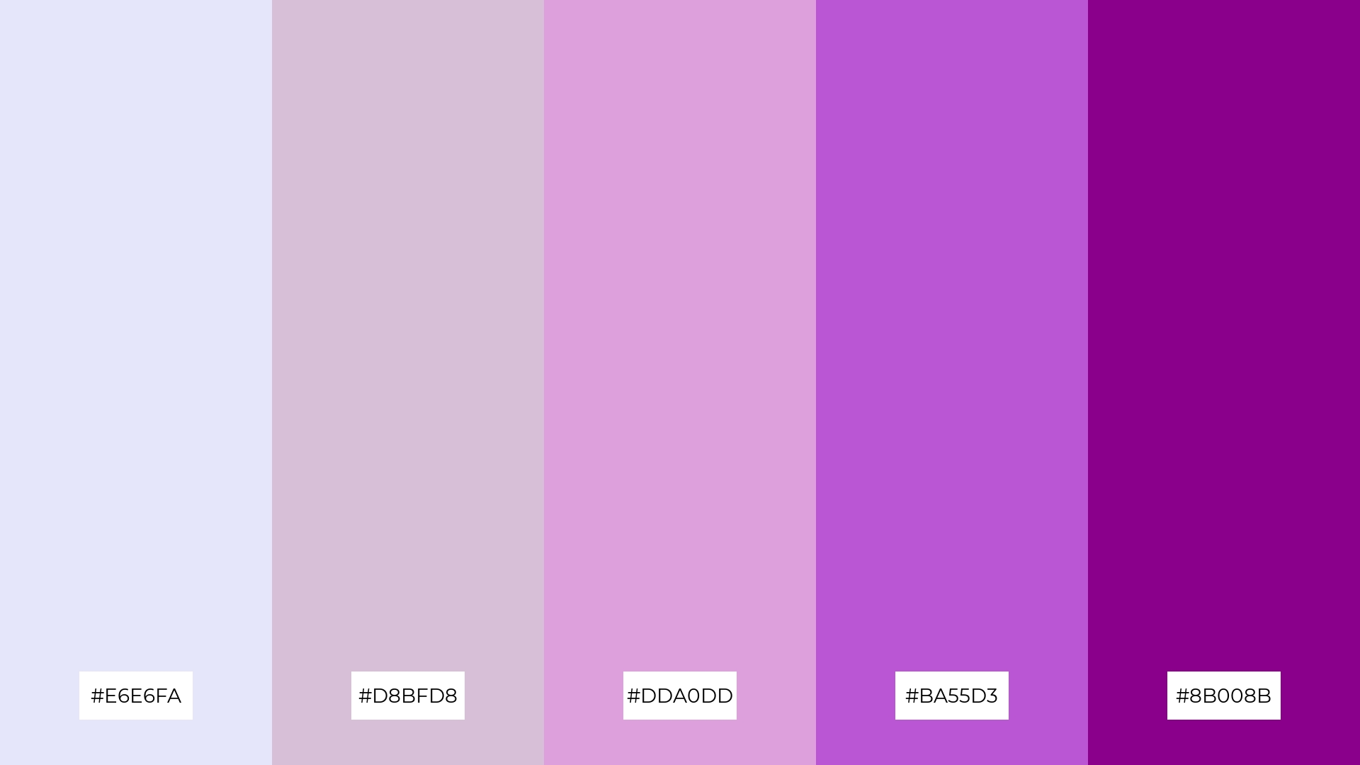
The ‘Lavender Fields’ palette, featuring dominant colors like #E6E6FA, #D8BFD8, #DDA0DD, #BA55D3, and #8B008B, creates a soothing and cohesive visual experience.
This harmonious blend of soft and deep purples is perfect for wellness branding, where the calming and serene qualities of lavender can enhance the sense of tranquility and relaxation.
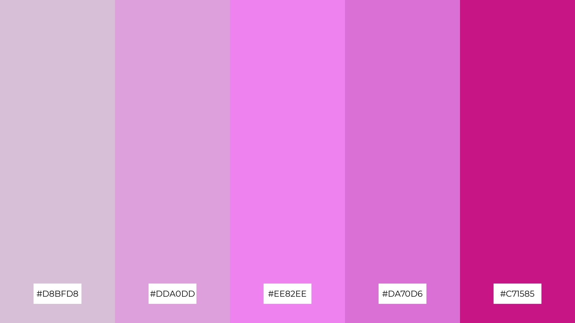
4) Soft Petals
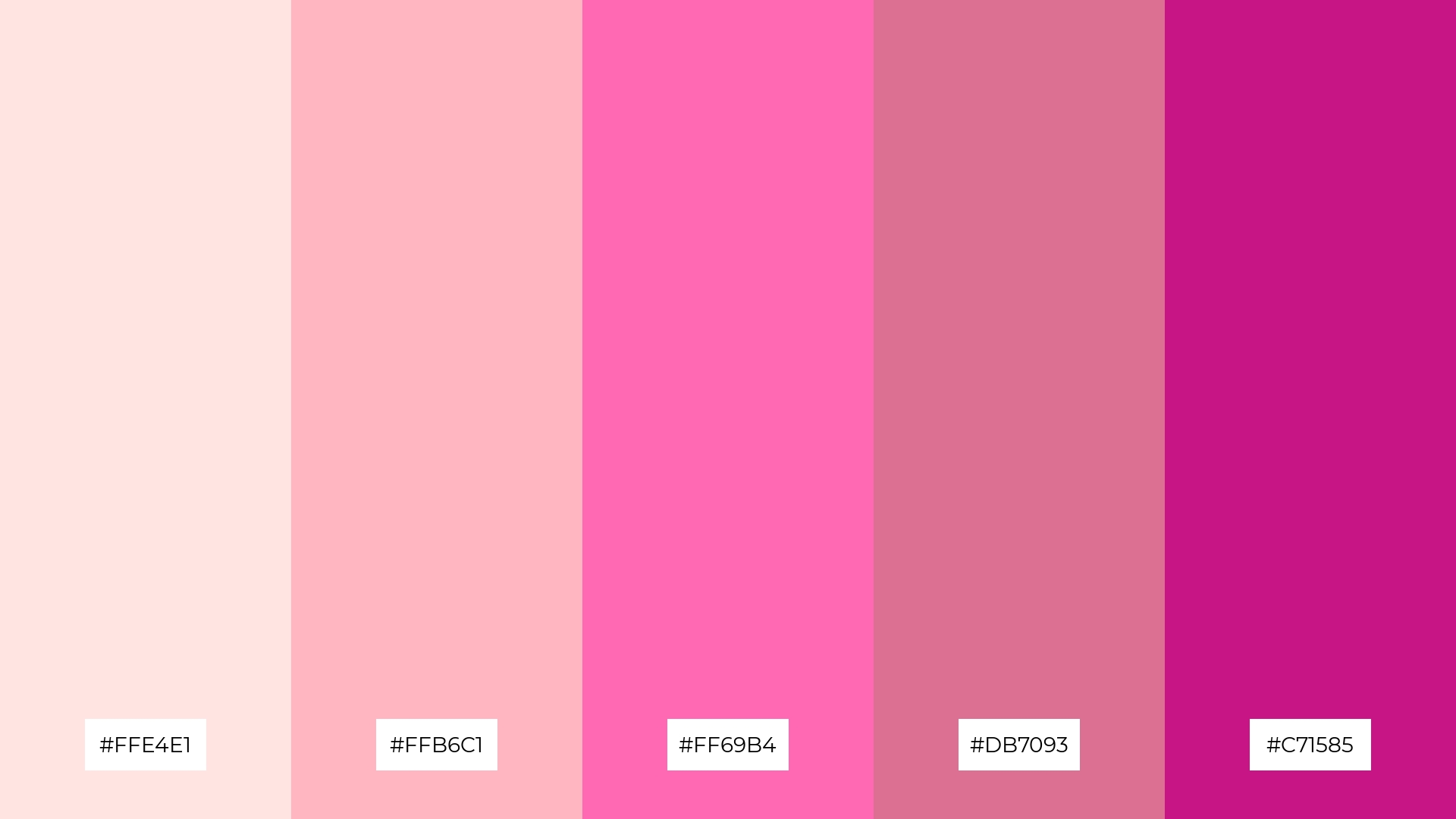
The ‘Soft Petals’ palette, with its blend of soft pinks and bold magentas, offers a balanced and distinct mood that can add both warmth and vibrancy to any design.
This palette is ideal for creating inviting retail spaces or modern web designs, where the combination of gentle and striking tones can enhance the overall aesthetic appeal and attract attention.
5) Mystic Sunset
The ‘Mystic Sunset’ palette, with its vibrant oranges and soft lavender, creates a dynamic yet serene ambiance that can transform any design into a captivating visual experience.
This palette is perfect for luxury fashion campaigns, where the bold and warm hues can evoke a sense of opulence and sophistication, making the collection stand out.
6) Enchanted Forest
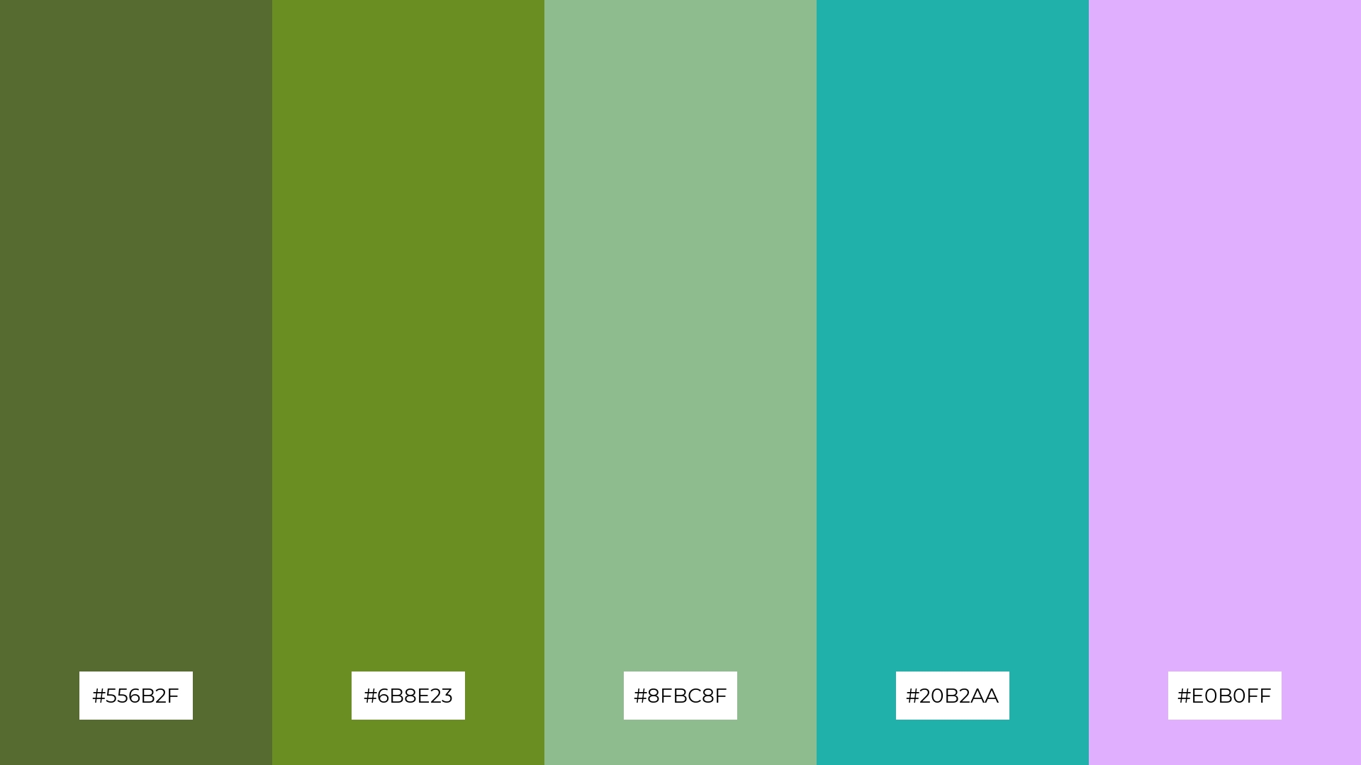
The ‘Enchanted Forest’ palette, with its blend of deep greens, soft teals, and a touch of lavender, creates a harmonious and sophisticated mood that can evoke a sense of natural elegance and tranquility.
This palette is ideal for minimalistic branding, where the subtle interplay of these colors can enhance the brand’s refined and serene image, making it perfect for eco-friendly products or wellness services.
7) Ocean Breeze
The ‘Ocean Breeze’ palette, with its mix of deep blues and soft purples, creates a striking contrast that adds visual interest and depth to any design.
This palette is perfect for creative projects like magazine layouts or artistic websites, where the dynamic interplay of colors can captivate and engage the audience.
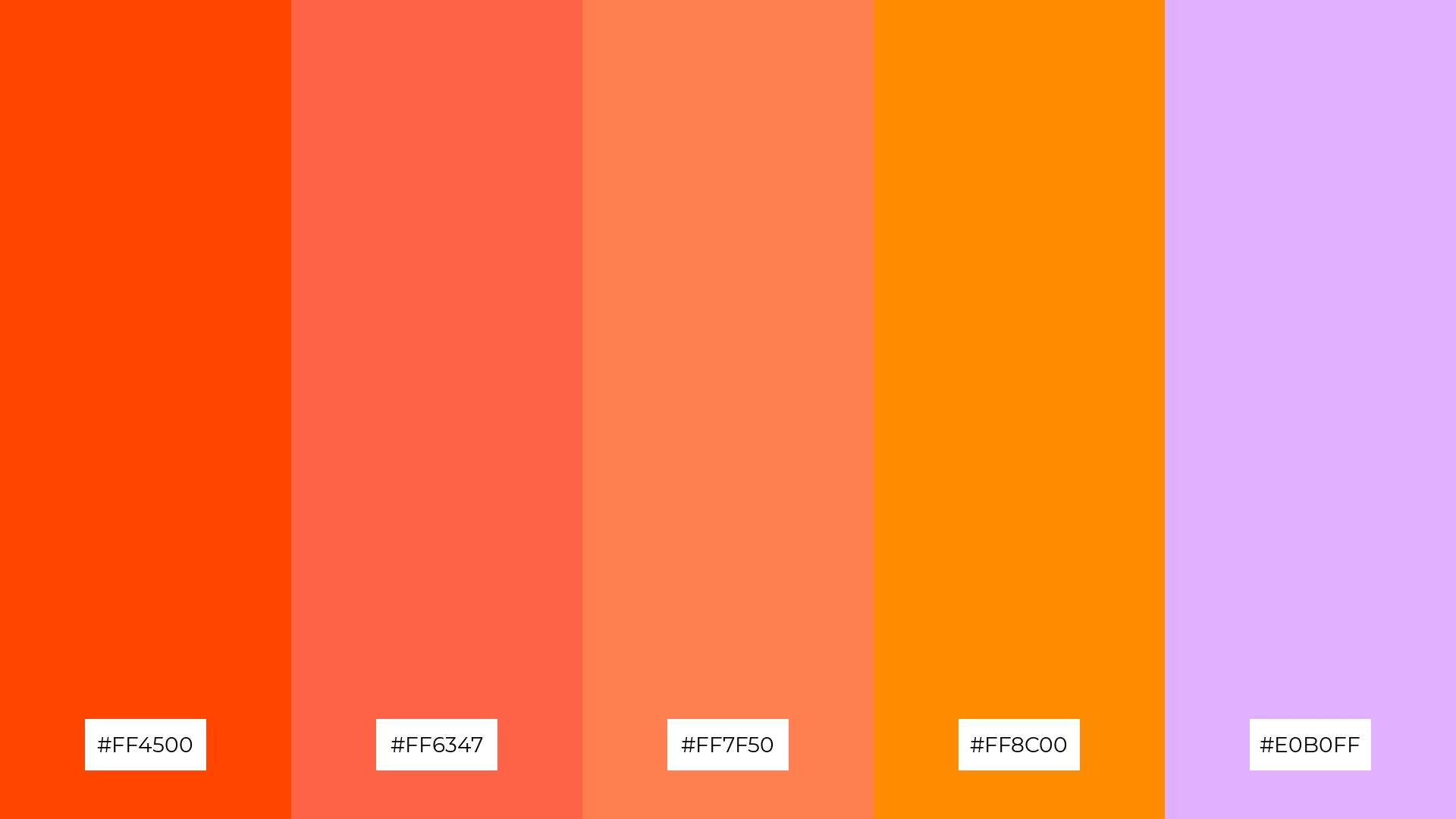
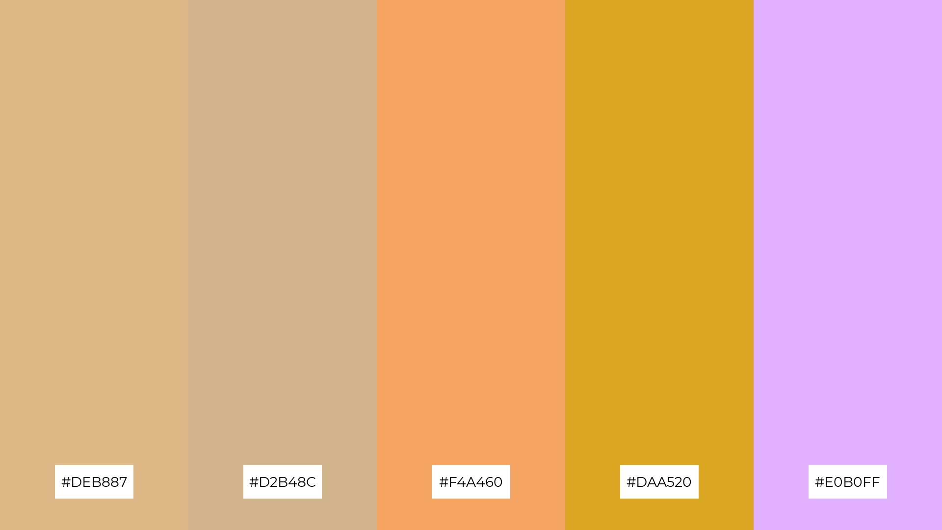
8) Autumn Leaves
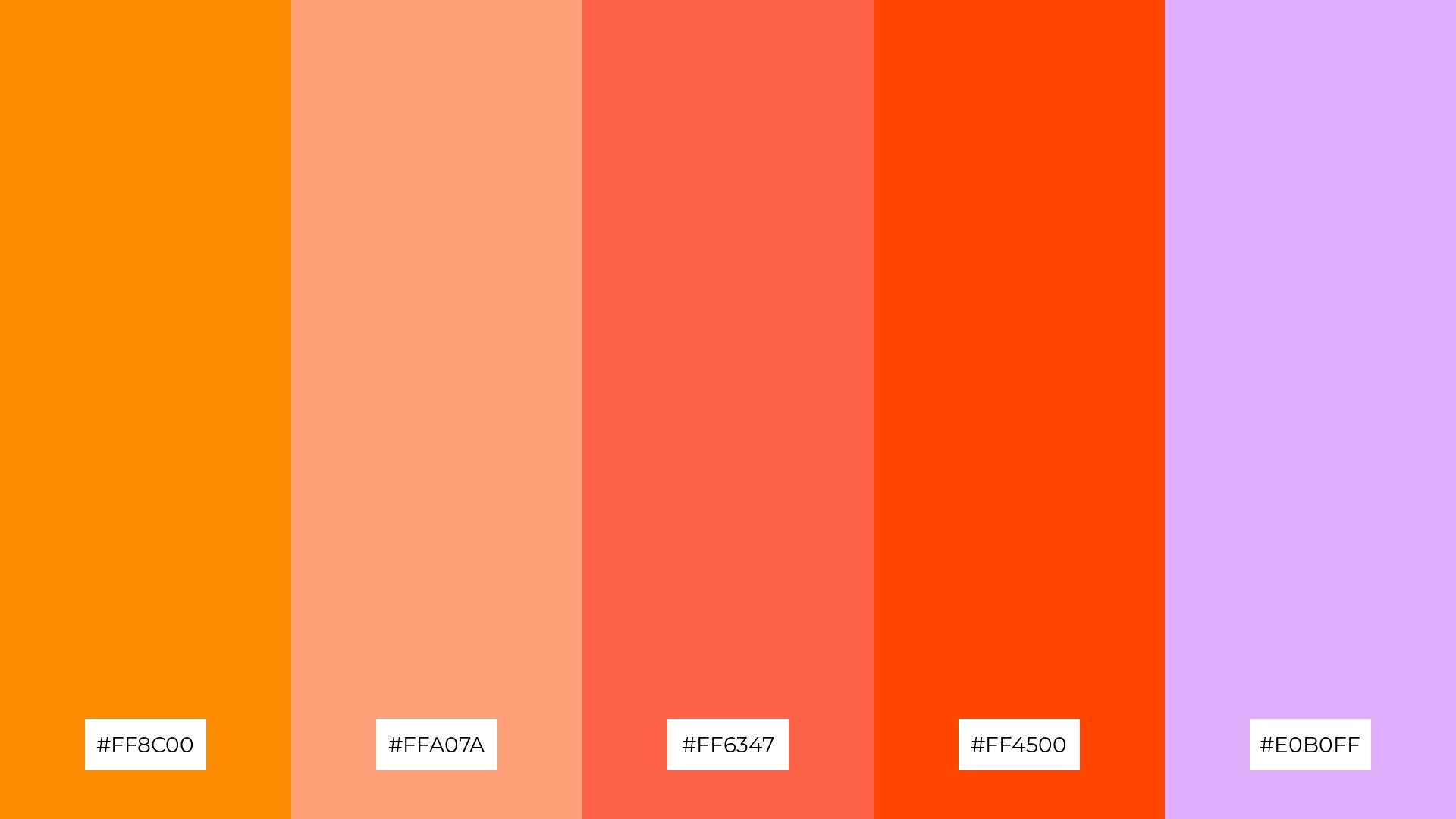
The ‘Autumn Leaves’ palette, with its warm oranges and soft purples, can evoke a sense of calm when used in spa branding, creating a serene and inviting atmosphere.
Alternatively, the vibrant hues of this palette can inject excitement into marketing campaigns, making them visually striking and memorable.
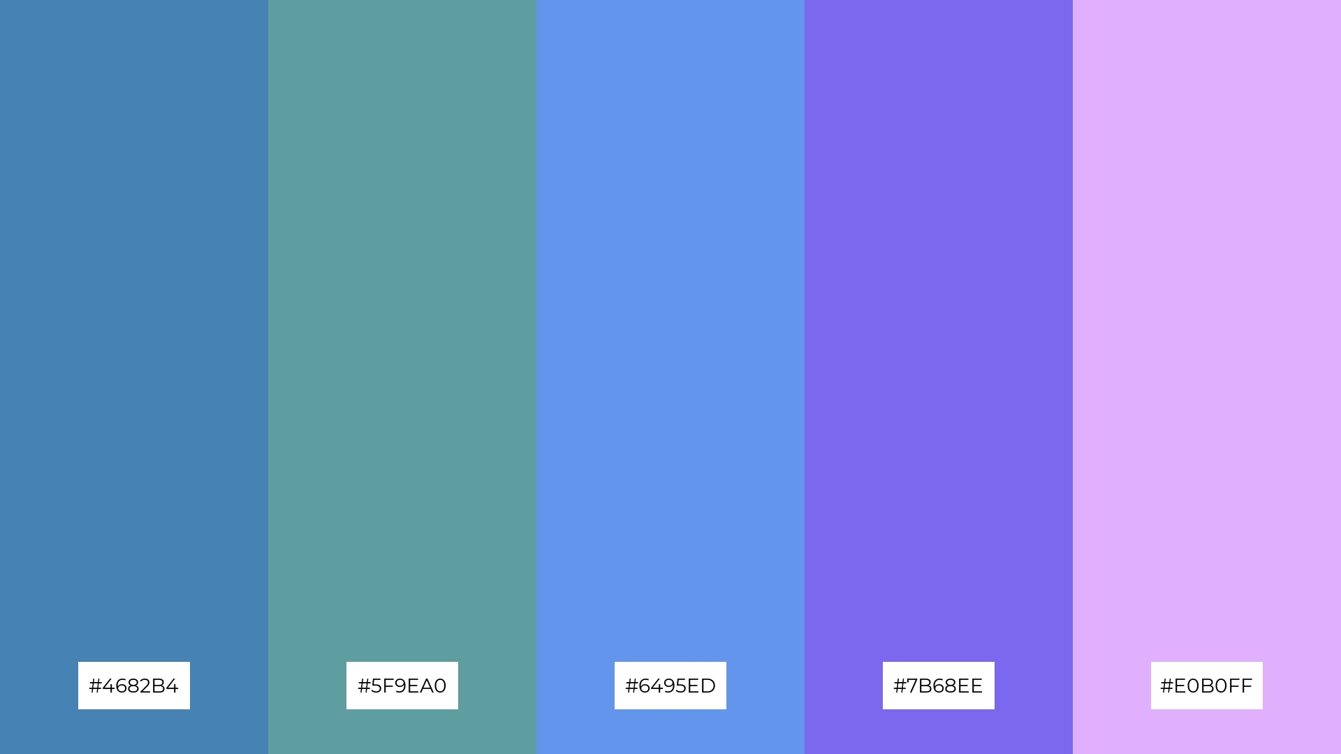
9) Royal Elegance
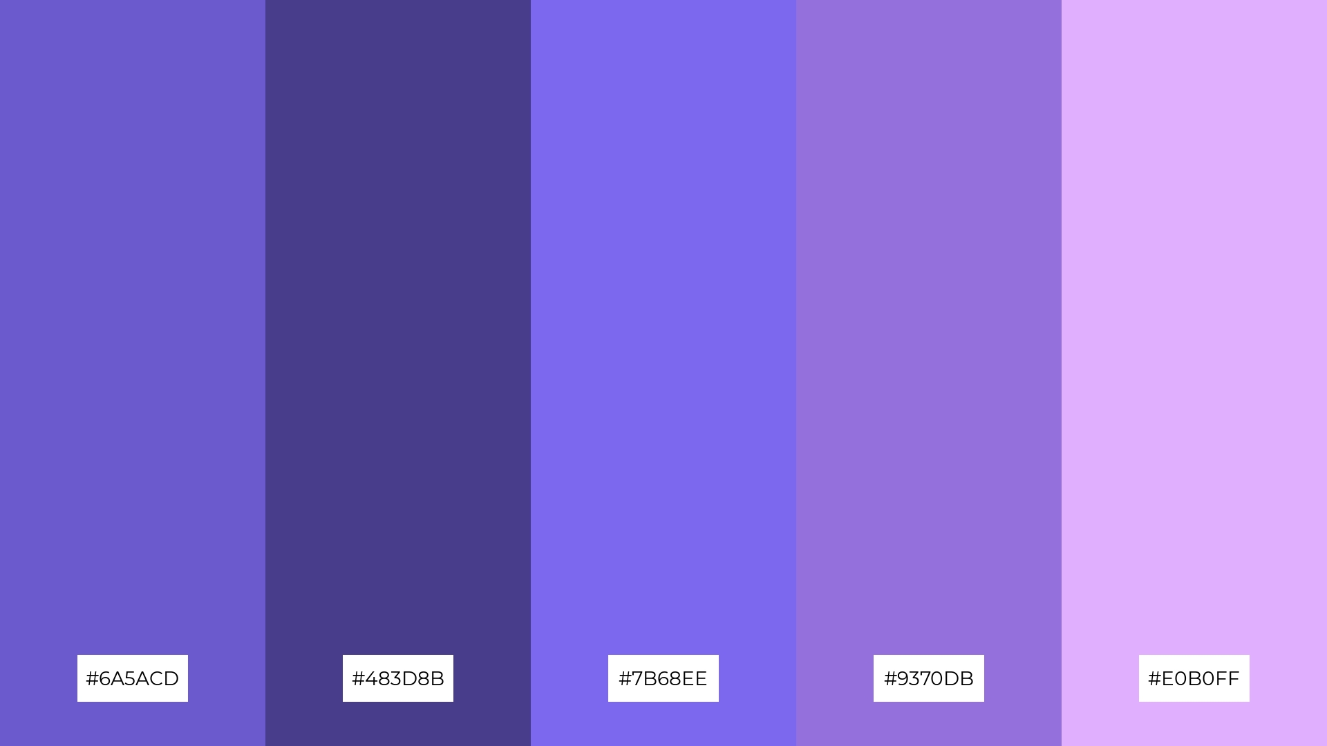
The ‘Royal Elegance’ palette, with its softer tones like #E0B0FF and brighter shades such as #7B68EE, creates a luxurious and uplifting mood.
This blend is ideal for home decor, where the combination of soft and bright hues can add a touch of sophistication and warmth to any space.
10) Spring Blossom
The ‘Spring Blossom’ palette, with its vibrant pinks and soft purples, creates a visual flow that evokes feelings of joy and rejuvenation, making it perfect for designs that aim to uplift and energize.
This palette is ideal for lifestyle branding or tech product packaging, where the lively and refreshing colors can enhance the product’s appeal and convey a sense of innovation and vitality.
11) Winter Chill
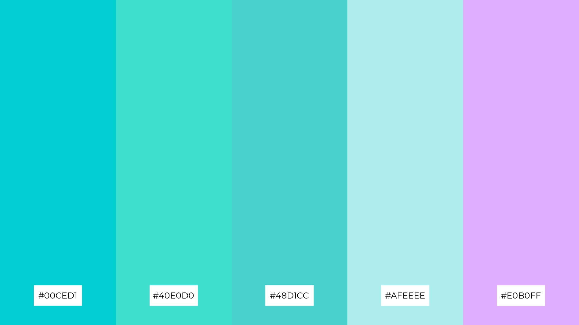
The ‘Winter Chill’ palette, with its cool tones of turquoise and soft lavender, creates a welcoming and refreshing effect that can evoke a sense of calm and serenity in any design.
This palette shines in luxury e-commerce sites, where the blend of soothing and sophisticated hues can enhance the user experience and convey a sense of elegance and exclusivity.
12) Desert Rose
The ‘Desert Rose’ palette, with its blend of warm browns and soft purples, creates a balanced yet dynamic visual experience that can evoke a sense of both comfort and sophistication.
This palette is ideal for casual apparel lines, where the harmonious interaction of these hues can enhance the overall aesthetic appeal and convey a relaxed yet stylish vibe.
13) Urban Chic
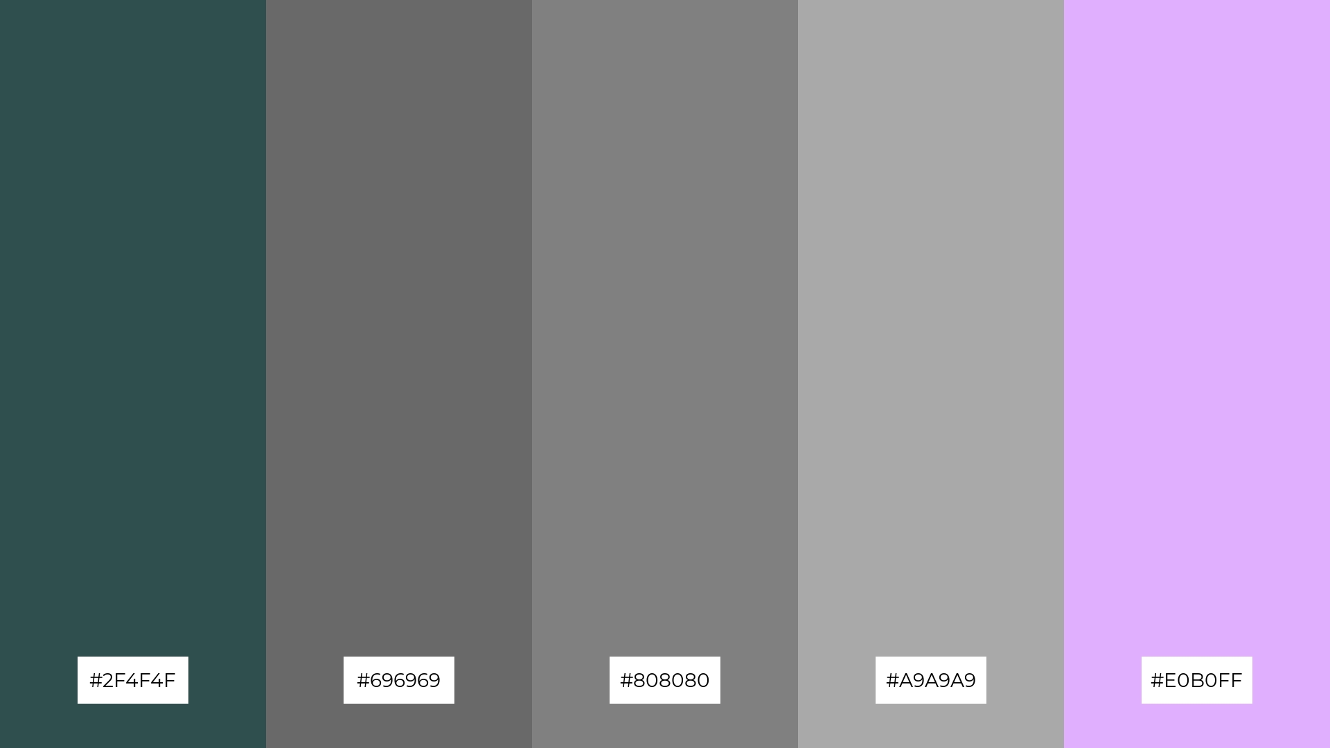
The ‘Urban Chic’ palette, with its blend of warm grays and cool lavender, creates a sophisticated and modern mood that is both inviting and stylish.
This palette is perfect for artisan product branding, where the combination of these hues can enhance the handcrafted quality and contemporary appeal of the products.
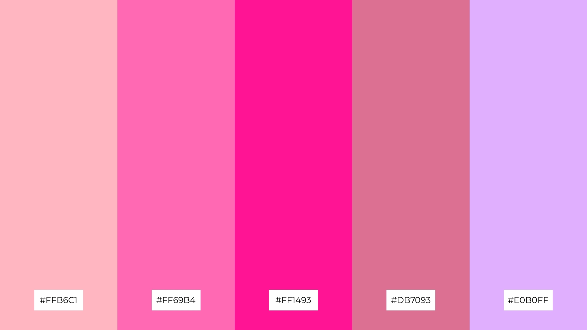
14) Candy Crush
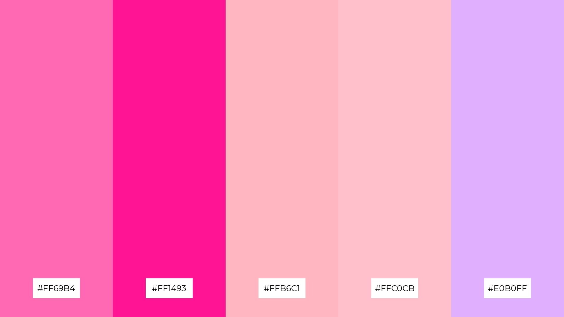
The ‘Candy Crush’ palette, with its vibrant pinks and soft lavenders, creates a dynamic and playful visual experience that can add a touch of whimsy and excitement to any design.
This bold and lively color scheme is perfect for festival marketing, where the energetic hues can capture attention and convey a sense of fun and celebration.
15) Midnight Dream
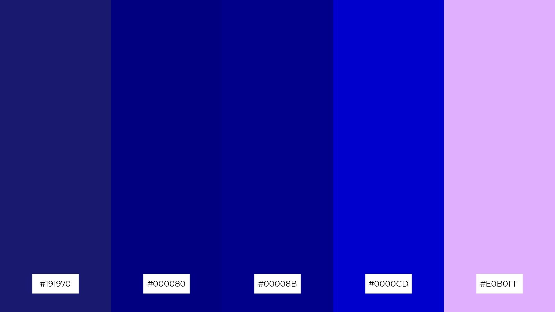
The ‘Midnight Dream’ palette, with its deep blues and soft lavender, conveys a sense of harmony when used in tech startups, creating a calming yet innovative atmosphere that fosters creativity and focus.
Alternatively, this palette can create a striking contrast in cozy interior makeovers, where the bold blues can add depth and the soft lavender can introduce a touch of warmth and elegance.
How to Use Mauve Patterns in Design
In home decor, mauve color palettes can create a serene and sophisticated atmosphere. Pairing mauve with neutral tones like beige or gray can add a touch of elegance to living spaces, while incorporating metallic accents can enhance the overall aesthetic.
For marketing materials, using mauve can evoke a sense of calm and trust. Combining mauve with complementary colors like soft greens or muted yellows can make your designs stand out, creating visually appealing and memorable content.
In clothing design, mauve offers versatility and timeless appeal. Layering different shades of mauve, from light lavender to deep plum, can add depth and dimension to your fashion pieces, making them both stylish and unique.
Ready to experiment with mauve color palettes in your next design project? Try creating these stunning palettes using Piktochart and elevate your designs to the next level.


