Light pink color palettes are a versatile choice for a variety of design projects, offering a soft and calming aesthetic. Whether you’re creating infographics, social media graphics, or presentations, light pink can add a touch of elegance and warmth.
From pastel shades to more vibrant hues, light pink can be adapted to suit different moods and themes. This article explores the best ways to incorporate light pink into your designs effectively.
Tips For Creating Light Pink Color Palettes
Designing with light pink can be both exciting and challenging, but with the right approach, you can create stunning visuals.
- Balance with Neutrals: Pair light pink with neutral colors like white, gray, or beige to create a balanced and sophisticated look.
- Complementary Shades: Use complementary colors such as mint green or soft blue to make the light pink pop and add visual interest.
- Gradients and Ombres: Experiment with gradients and ombre effects by blending light pink with darker shades of pink or other pastel colors for a smooth transition.
- Accent Colors: Incorporate light pink as an accent color in your design to highlight key elements without overwhelming the viewer.
- Versatile Combinations: Mix light pink with metallics like gold or silver for a versatile and modern design that works well in various contexts.
- Test and Iterate: Always test your color palette on different devices and backgrounds to ensure it looks good in all scenarios.
Create a free Piktochart account to get started on creating your visual.
15 Light Pink Color Palettes
1) Blush Garden

The ‘Blush Garden’ palette, with its range of soft pinks from #FFB6C1 to #FFF0F5, creates a serene and romantic mood, perfect for evoking feelings of warmth and tenderness.
These shades interact harmoniously to produce a cohesive look, making them ideal for use in fashion, where they can add a delicate and elegant touch to any ensemble.
2) Rose Petal

The ‘Rose Petal’ palette, with its vibrant and varied shades of pink, evokes a sense of energy and passion, making it perfect for designs that aim to capture attention and convey enthusiasm.
This palette would excel in digital branding for beauty products, where the dynamic and lively colors can highlight the vibrancy and allure of the brand.
3) Cotton Candy

The ‘Cotton Candy’ palette, featuring dominant colors like #FFB6C1 and #FF69B4, creates a playful and whimsical atmosphere that is both inviting and cheerful.
These shades work together to produce a harmonious and cohesive look, making them ideal for wellness branding, where the soft and uplifting colors can promote a sense of calm and positivity.
4) Pink Sunset
The ‘Pink Sunset’ palette, with its blend of soft and bold tones ranging from #FFB6C1 to #FF8C00, offers a unique balance that creates a distinct and captivating mood.
This palette is ideal for creating inviting retail spaces or modern web designs, where the dynamic interplay of colors can draw attention and evoke a sense of warmth and energy.
5) Pastel Dreams

The ‘Pastel Dreams’ palette, with its blend of #FFB6C1, #FFDAB9, #E6E6FA, #D8BFD8, and #FFFACD, creates a serene and dreamy ambiance that is perfect for evoking a sense of calm and tranquility.
This palette is ideal for wedding themes, where the soft and harmonious colors can enhance the romantic and elegant atmosphere, making every moment feel magical and timeless.
6) Spring Blossom
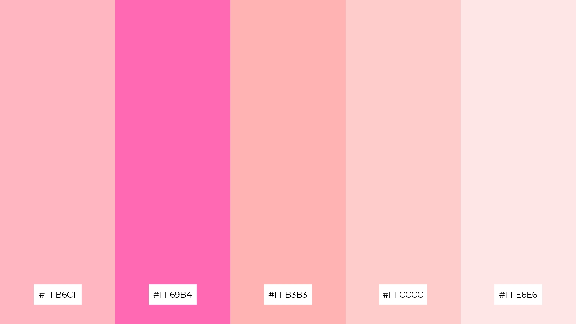
The ‘Spring Blossom’ palette, with its harmonious blend of #FFB6C1, #FF69B4, #FFB3B3, #FFCCCC, and #FFE6E6, creates a sophisticated yet playful mood, making it versatile for various design contexts.
This palette is particularly effective for minimalistic branding, where the soft and cohesive colors can convey elegance and simplicity, or for bold event designs, where the vibrant hues can energize and captivate the audience.
7) Sweet Pea
The ‘Sweet Pea’ palette, with its mix of soft and bold pinks, creates a striking contrast that adds depth and visual interest to any design.
This palette is perfect for creative projects like magazine layouts or artistic websites, where the dynamic interplay of colors can captivate and engage the audience.
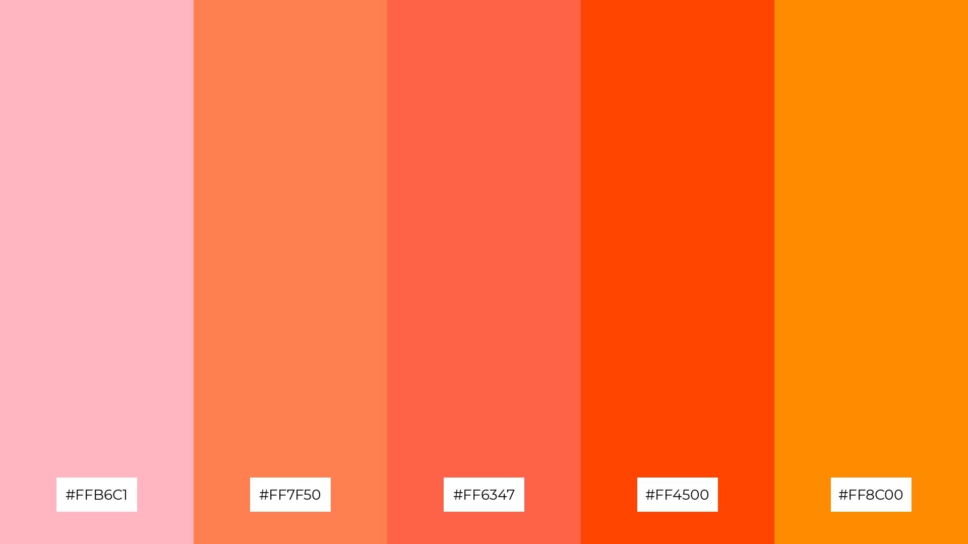
8) Pink Lemonade
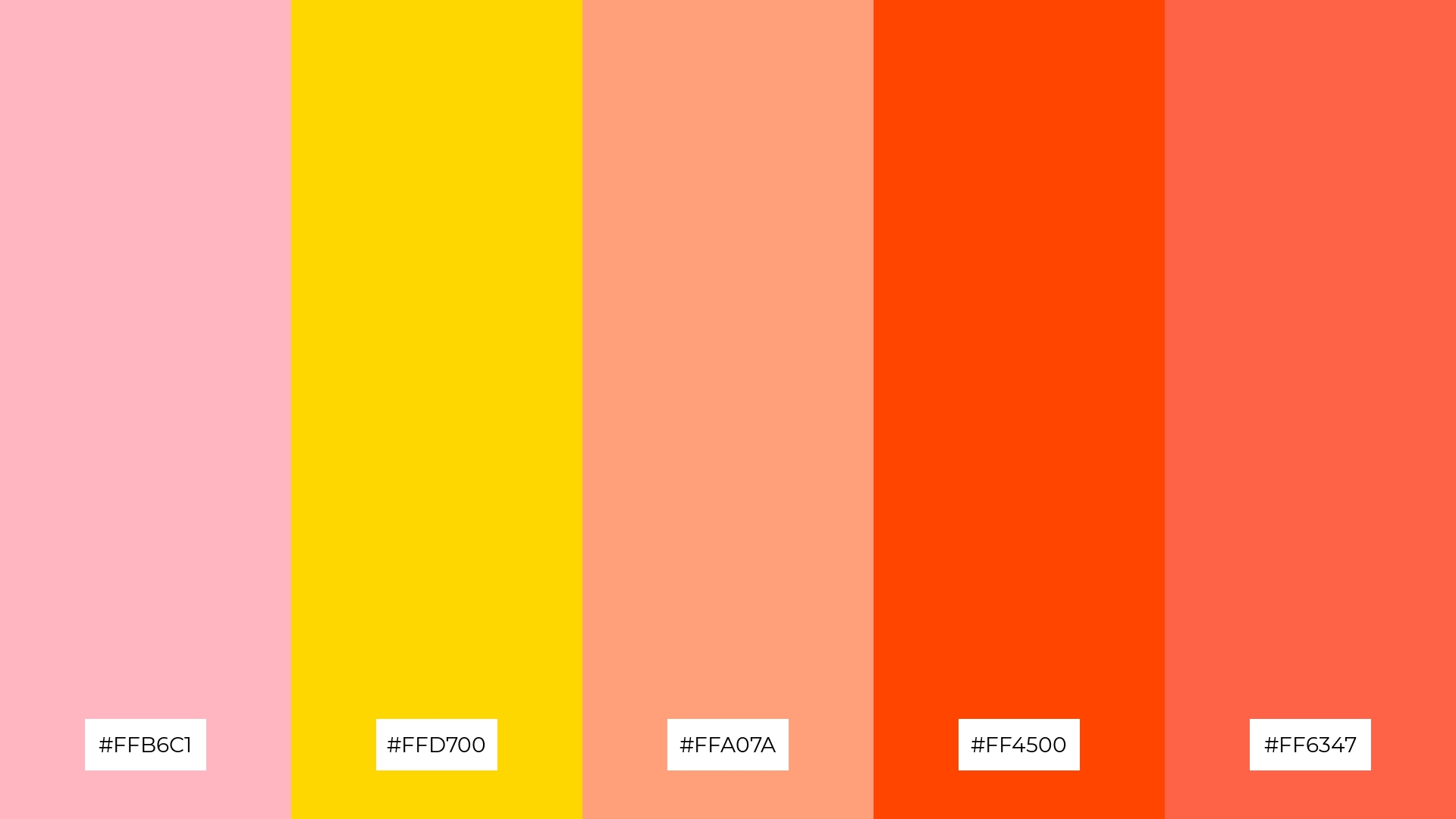
The ‘Pink Lemonade’ palette, with its blend of #FFB6C1, #FFD700, #FFA07A, #FF4500, and #FF6347, can evoke a sense of calm when the softer shades are used together, creating a soothing and inviting atmosphere.
Conversely, combining the bolder hues can generate excitement and energy, making this palette ideal for vibrant marketing campaigns that aim to capture attention and convey enthusiasm.
9) Cherry Blossom
The ‘Cherry Blossom’ palette, with its softer tones like #FFB6C1 and #FFE6E6, creates a gentle and soothing ambiance that is perfect for home decor, adding a touch of elegance and tranquility to any space.
On the other hand, the brighter shades such as #FF69B4 and #FFB3B3 inject a sense of vibrancy and playfulness, making this palette ideal for seasonal promotions that aim to capture attention and evoke a sense of joy and excitement.
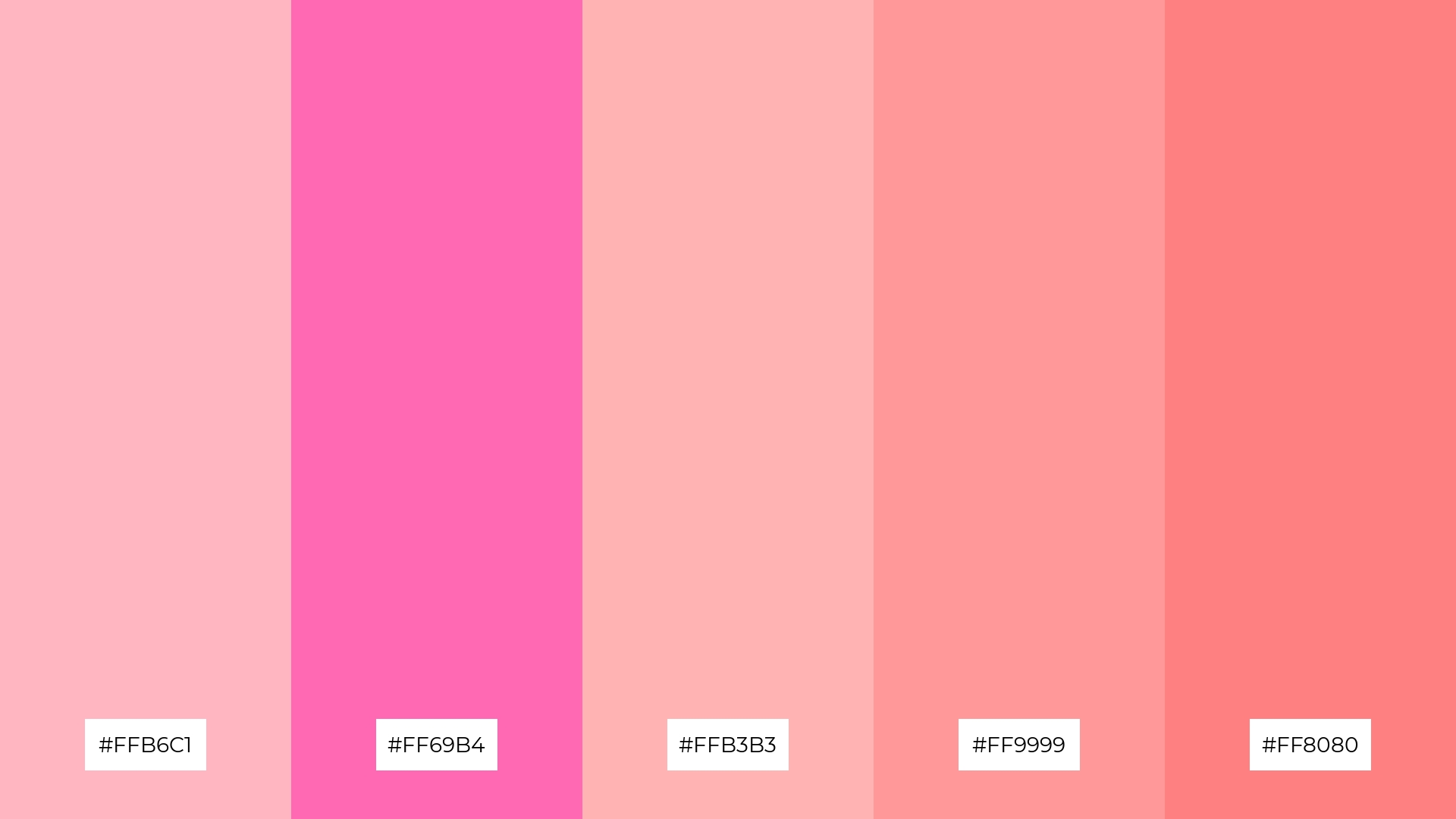
10) Pink Sorbet
The ‘Pink Sorbet’ palette, with its blend of #FFB6C1, #FF69B4, #FFB3B3, #FF9999, and #FF8080, creates a visual flow that evokes feelings of joy and warmth, making it perfect for designs that aim to uplift and energize.
This palette is ideal for lifestyle branding, where the vibrant and harmonious colors can convey a sense of fun and positivity, or for tech product packaging, where the dynamic hues can capture attention and create a memorable unboxing experience.
11) Pink Champagne
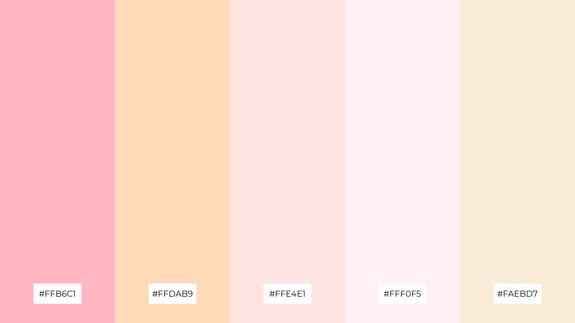
The ‘Pink Champagne’ palette, with its blend of #FFB6C1, #FFDAB9, #FFE4E1, #FFF0F5, and #FAEBD7, creates a welcoming effect by combining soft and elegant tones that evoke a sense of warmth and sophistication.
This palette shines in luxury e-commerce sites, where the delicate and refined colors can enhance the user experience by creating an inviting and upscale atmosphere.
12) Pink Orchid
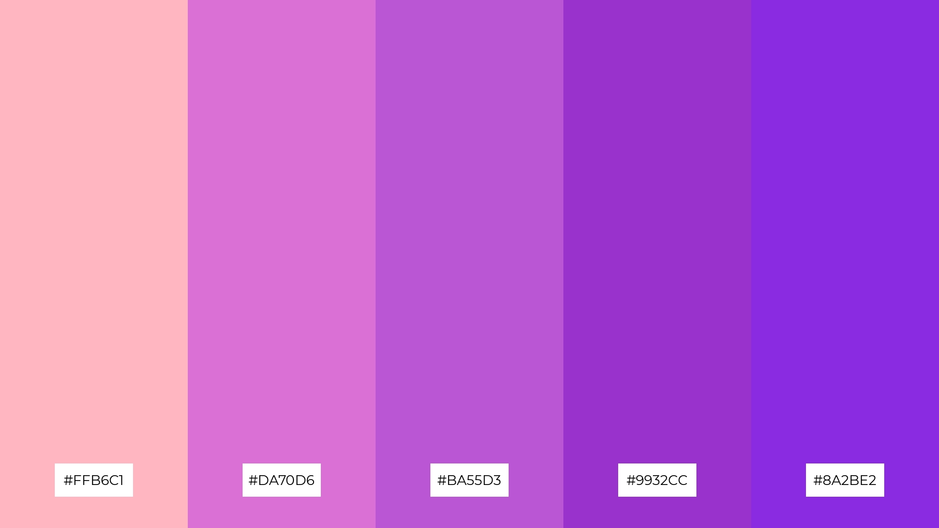
The ‘Pink Orchid’ palette, with its harmonious blend of #FFB6C1, #DA70D6, #BA55D3, #9932CC, and #8A2BE2, creates a striking balance between soft and bold hues, offering a versatile range that can evoke both calm and vibrancy.
This palette is particularly fitting for sleek corporate branding, where the dynamic interplay of colors can convey professionalism and creativity, making a memorable impression on clients and stakeholders.
13) Pink Flamingo
The ‘Pink Flamingo’ palette, with its blend of warm and cool tones ranging from #FFB6C1 to #C71585, evokes a vibrant and dynamic mood that can captivate and energize viewers.
This palette is particularly effective for artisan product branding, where the striking contrast and harmonious interplay of colors can highlight the uniqueness and creativity of handcrafted items.
14) Pink Frosting
The ‘Pink Frosting’ palette, with its dynamic interplay of #FFB6C1, #FF69B4, #FFB3B3, #FF9999, and #FF8080, offers a versatile range that can evoke both bold and subtle characteristics, making it perfect for creating visually engaging designs.
This palette is particularly effective for festival marketing, where the vibrant and harmonious colors can capture attention and convey a sense of excitement and celebration.
15) Pink Velvet
The ‘Pink Velvet’ palette, with its blend of #FFB6C1, #FF69B4, #FFB3B3, #FF9999, and #FF8080, conveys a sense of harmony when the softer shades are used together, creating a cohesive and soothing visual experience.
Conversely, the bolder hues can be used to create striking contrasts, making this palette ideal for tech startups aiming to capture attention with dynamic branding or for cozy interior makeovers that seek to balance warmth and vibrancy.
How to Use Light Pink Patterns in Design
Light pink color palettes can be a game-changer in home decor, adding a touch of elegance and tranquility to any space. Use soft pinks for walls or accent pieces to create a calming atmosphere, perfect for bedrooms or living areas. Pairing light pink with neutral tones like white or beige can enhance the overall sophistication of the room.
In marketing materials, light pink can be used to evoke feelings of warmth and approachability. Incorporate light pink as a background color or in key elements to draw attention without overwhelming the viewer. This subtle yet effective use of color can make your promotional content more engaging and memorable.
For clothing design, light pink offers a versatile option that can be both playful and elegant. Use pastel pinks for casual wear to create a soft, inviting look, or opt for bolder shades to make a statement in formal attire. The adaptability of light pink makes it a valuable addition to any fashion collection.
Ready to experiment with light pink color palettes in your next design project? Try creating stunning visuals using Piktochart. Get started now and bring your creative ideas to life!


