 Piktochart Team
Light gray color palettes offer a versatile and sophisticated option for various design projects. They provide a neutral backdrop that can enhance other colors and elements in your design.
Whether you're working on a website, infographic, or presentation, light gray tones can add a touch of elegance and modernity. These palettes are perfect for creating a clean and professional look.
Designing with light gray can elevate your project, but it requires a thoughtful approach to achieve the best results.
Create a free Piktochart account to get started on creating your visual.

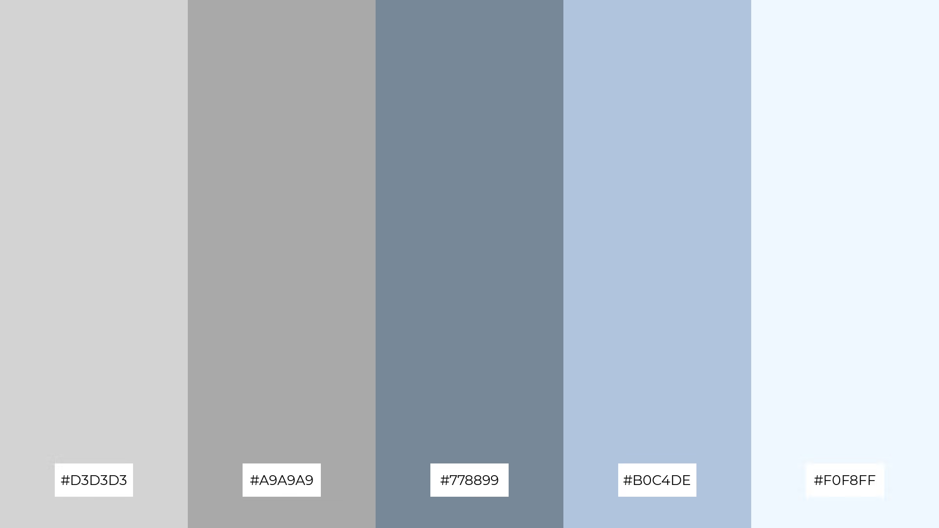
The 'Misty Morning' palette, with its blend of soft grays and delicate blues, evokes a serene and tranquil mood, reminiscent of a calm, foggy dawn.
These colors interact harmoniously to create a cohesive look, making them ideal for interior decor where a peaceful and inviting atmosphere is desired.

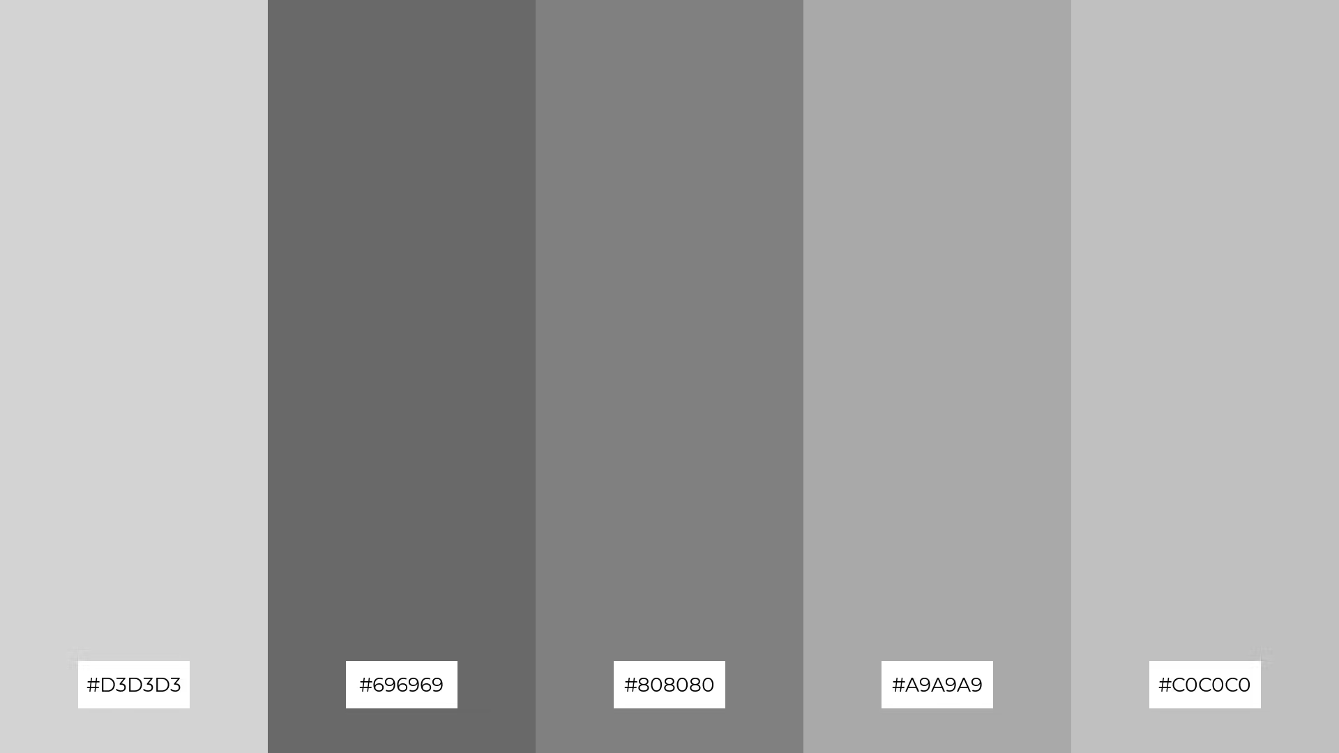
The 'Urban Chic' palette, with its sophisticated blend of grays ranging from light to dark, evokes a sense of modernity and understated elegance, making it perfect for creating a calm yet stylish atmosphere.
This palette would excel in digital branding for tech startups or minimalist product packaging, where a sleek and contemporary look is essential to convey innovation and professionalism.

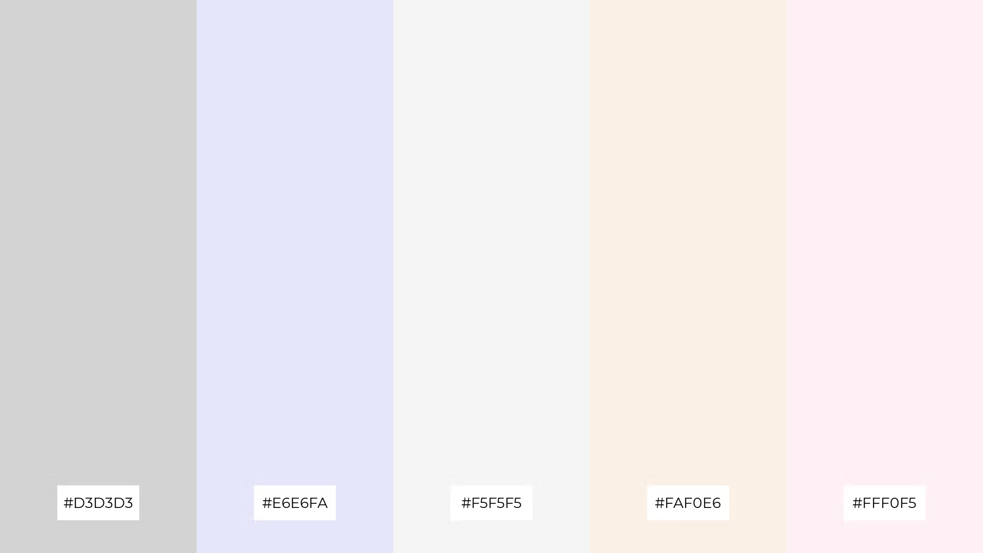
The 'Soft Elegance' palette, featuring dominant colors like #D3D3D3 (light gray), #E6E6FA (lavender), #F5F5F5 (white smoke), #FAF0E6 (linen), and #FFF0F5 (lavender blush), creates a harmonious and soothing visual experience.
This palette is particularly well-suited for wellness branding, where the gentle and calming hues can evoke a sense of tranquility and well-being, making it ideal for creating serene and inviting spaces.

The 'Industrial Loft' palette, with its mix of soft grays and bold charcoal tones, offers a balanced and distinct mood that combines warmth with a touch of urban sophistication.
This palette is ideal for creating inviting retail spaces or modern web designs, where the interplay of soft and bold hues can enhance the overall aesthetic and draw in customers or users.

The 'Coastal Breeze' palette, with its blend of light gray, sky blue, steel blue, powder blue, and light blue, evokes a serene and refreshing ambiance reminiscent of a tranquil seaside escape.
This palette is perfect for wedding themes, where the calming and airy colors can create a romantic and peaceful atmosphere, making the event feel both elegant and relaxed.

The 'Winter Wonderland' palette, with its blend of light gray, ghost white, light cyan, azure, and mint cream, creates a harmonious and sophisticated mood, perfect for minimalistic branding that seeks to convey elegance and purity.
This palette can also be used in bold event designs, where the cool and refreshing tones evoke a sense of playfulness and whimsy, making it ideal for winter-themed parties or festive celebrations.

The 'Modern Minimalist' palette, with its contrasting elements of light gray, white, and off-white shades, creates visual interest through subtle variations that add depth and sophistication to any design.
This palette is highly recommended for creative projects like magazine layouts or artistic websites, where its clean and elegant tones can enhance readability and provide a sleek, contemporary aesthetic.

The 'Vintage Charm' palette, with its blend of light gray, wheat, moccasin, peach puff, and papaya whip, can evoke a sense of calm when used in soft, harmonious combinations, making it ideal for spa branding where tranquility is paramount.
Conversely, this palette can bring excitement and energy to vibrant marketing campaigns by pairing the warm, inviting tones of wheat and moccasin with the playful hues of peach puff and papaya whip.

The 'Serene Spa' palette, featuring softer tones like #D3D3D3 (light gray) and brighter hues such as #AFEEEE (pale turquoise) and #E0FFFF (light cyan), creates a calming and refreshing ambiance.
This blend of colors is perfect for home decor, where the tranquil and airy mood can transform any space into a peaceful retreat, or for seasonal promotions that aim to evoke a sense of renewal and relaxation.

The 'Urban Jungle' palette, with its blend of light gray, dark olive green, olive drab, dark sea green, and pale green, creates a visual flow that evokes a sense of tranquility and connection to nature, making it perfect for designs that aim to soothe and rejuvenate.
This palette is ideal for lifestyle branding, where the calming greens can promote wellness and sustainability, or for tech product packaging, where the natural hues can convey innovation and eco-friendliness.

The 'Sunset Glow' palette, with its blend of light gray, gold, orange, dark orange, and red-orange, creates a welcoming and dramatic effect by combining warm, vibrant tones that evoke the beauty of a sunset.
This palette shines in boutique interiors, where the rich and inviting colors can create a luxurious and captivating atmosphere, or in luxury e-commerce sites, where the dramatic hues can enhance the visual appeal and draw in customers.

The 'Pastel Dream' palette, with its blend of light gray, light pink, hot pink, deep pink, and pink, creates a harmonious balance by combining soft and vibrant hues that evoke a sense of playful elegance.
This palette is perfect for casual apparel lines, where the mix of gentle and bold colors can create a fresh and trendy look that appeals to a youthful and fashion-forward audience.

The 'Earthy Tones' palette, with its blend of light gray, saddle brown, sienna, chocolate, and peru, masterfully combines warm and cool hues to evoke a grounded and organic mood.
This palette is uniquely suited for artisan product branding, where the rich and natural colors can convey authenticity and craftsmanship, making it perfect for packaging handmade goods or editorial layouts that aim to highlight sustainable and eco-friendly themes.

The 'Ocean Depths' palette, with its blend of light gray, navy, dark blue, midnight blue, and royal blue, creates a dynamic interplay of bold and subtle hues that evoke the mystery and allure of the deep sea.
This palette is perfect for festival marketing, where the rich and captivating colors can create an immersive and vibrant atmosphere, drawing in attendees and enhancing the overall visual appeal of the event.

The 'Autumn Leaves' palette, with its blend of light gray, dark red, firebrick, crimson, and tomato, can convey a sense of harmony when used in a balanced manner, creating a warm and inviting atmosphere that feels cohesive and well-integrated.
This palette is ideal for cozy interior makeovers, where the rich and vibrant hues can add a touch of warmth and comfort, making spaces feel more intimate and welcoming.
Light gray color palettes can be a game-changer in home decor, offering a neutral base that complements various styles. Pair light gray walls with vibrant accent pieces like cushions or artwork to create a balanced and inviting space. This approach allows for easy updates and seasonal changes without a complete overhaul.
In marketing materials, light gray can serve as a sophisticated backdrop that highlights key messages and visuals. Use it to frame bold typography or colorful graphics, ensuring that your content stands out while maintaining a clean and professional look. This technique is particularly effective in digital ads and brochures where clarity and impact are crucial.
For clothing design, light gray offers a versatile canvas that can be dressed up or down. Combine it with bright accessories or layers to create a chic and modern outfit suitable for various occasions. This neutral tone is perfect for both casual wear and formal attire, making it a staple in any wardrobe.
Ready to elevate your design projects with light gray palettes? Try creating your own using Piktochart and see the difference it makes!