Kelly green is a vibrant, eye-catching shade that brings a fresh and lively feel to any design. This bold color is perfect for creating striking visuals that stand out.
Whether you’re designing infographics, presentations, or social media graphics, incorporating kelly green can add a touch of energy and modernity. Let’s explore some inspiring kelly green color palettes to elevate your next project.
Tips For Creating Kelly Green Color Palettes
Designing with kelly green can be both exciting and challenging. Here are some practical tips to help you create stunning color palettes:
- Balance with Neutrals: Pair kelly green with neutral colors like white, gray, or beige to create a balanced and harmonious look.
- Complementary Colors: Use complementary shades such as pink or coral to make kelly green pop and add visual interest.
- Accent with Metallics: Incorporate metallics like gold or silver to add a touch of elegance and sophistication to your design.
- Gradients and Shades: Experiment with different gradients and shades of green to create depth and dimension in your design.
- Versatile Combinations: Mix kelly green with versatile colors like navy blue or black for a timeless and adaptable palette.
- Test and Iterate: Always test your color combinations on different devices and mediums to ensure consistency and appeal.
15 Kelly Green Color Palettes
1) Emerald Garden
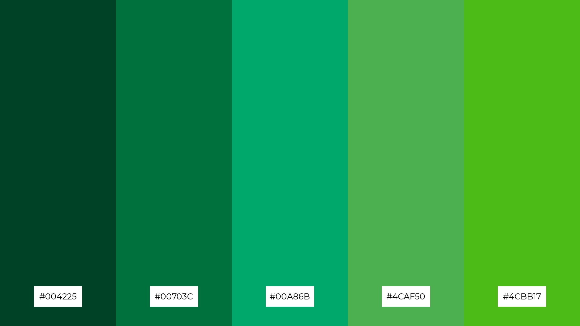
The ‘Emerald Garden’ palette evokes a sense of tranquility and natural beauty, with its rich greens blending seamlessly to create a serene and cohesive look.
This palette is perfect for interior decor, where the varying shades of green can transform a space into a lush, calming oasis, highlighting its ability to bring the outdoors inside.
2) Spring Meadow
The ‘Spring Meadow’ palette, with its blend of soft yellows and vibrant greens, evokes a sense of renewal and vitality, reminiscent of a fresh spring morning.
This palette would excel in digital branding for eco-friendly products, where the lively and refreshing colors can effectively communicate sustainability and natural beauty.
3) Ocean Breeze
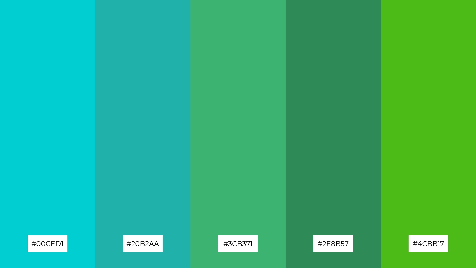
The ‘Ocean Breeze’ palette features dominant colors like turquoise (#00CED1) and sea green (#20B2AA), which create a refreshing and calming effect, perfect for wellness branding.
These hues, combined with shades of medium sea green (#3CB371), sea green (#2E8B57), and lime green (#4CBB17), harmonize beautifully to evoke a sense of tranquility and natural balance, making them ideal for eco-friendly interior spaces.
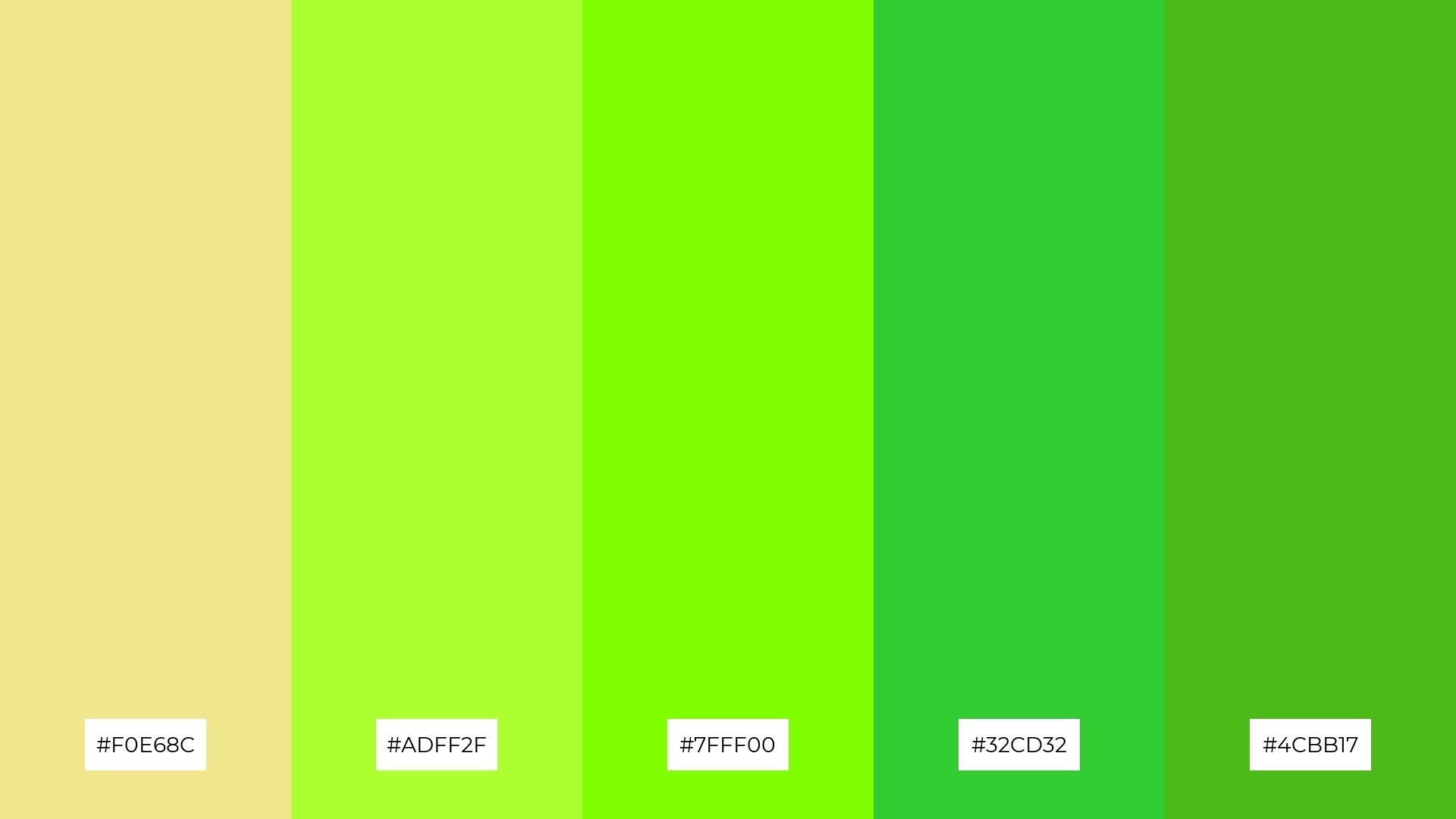
4) Sunset Fields
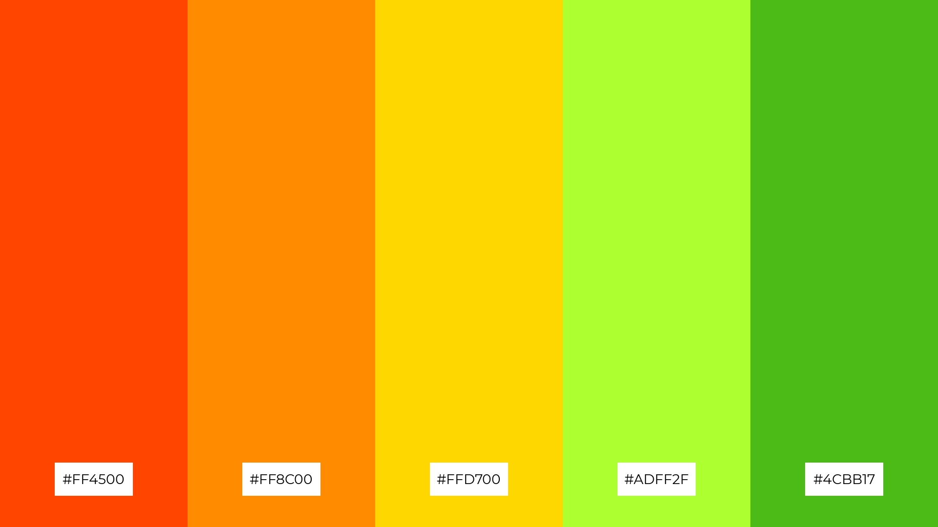
The ‘Sunset Fields’ palette, with its blend of soft and bold tones like #FF4500, #FF8C00, #FFD700, #ADFF2F, and #4CBB17, creates a distinct mood that is both warm and invigorating.
This palette is ideal for creating inviting retail spaces, where the vibrant colors can attract customers and enhance the shopping experience.
5) Tropical Forest
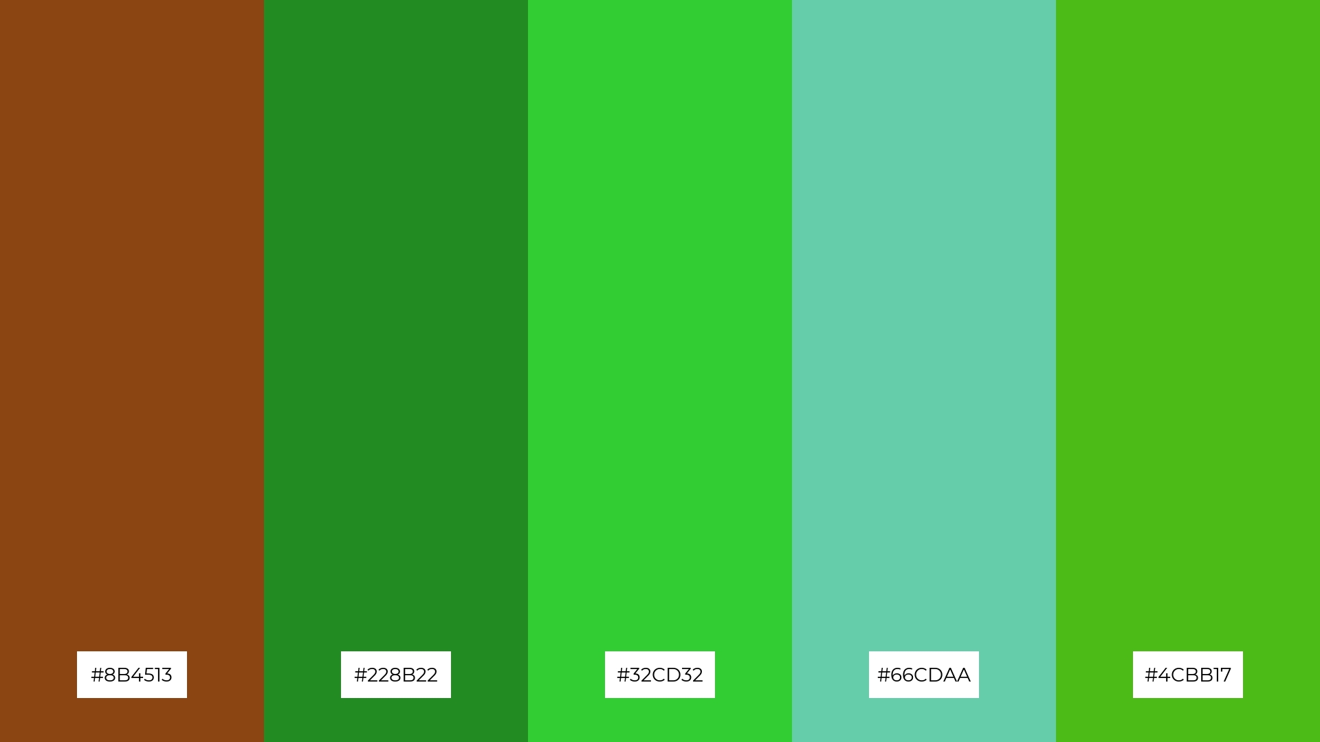
The ‘Tropical Forest’ palette, with its rich browns and vibrant greens, creates a lush and invigorating ambiance that evokes the essence of a thriving jungle.
This palette is perfect for luxury fashion campaigns, where the earthy tones and lively greens can highlight the natural beauty and elegance of high-end designs.
6) Citrus Burst
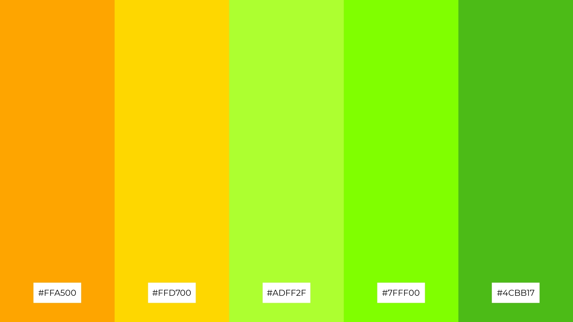
The ‘Citrus Burst’ palette, with its vibrant oranges and greens, creates a lively and energetic atmosphere that can infuse any design with a sense of playfulness and vitality.
This color harmony is ideal for bold event designs, where the bright and cheerful hues can captivate attendees and set a festive, upbeat mood.
7) Mountain Peaks
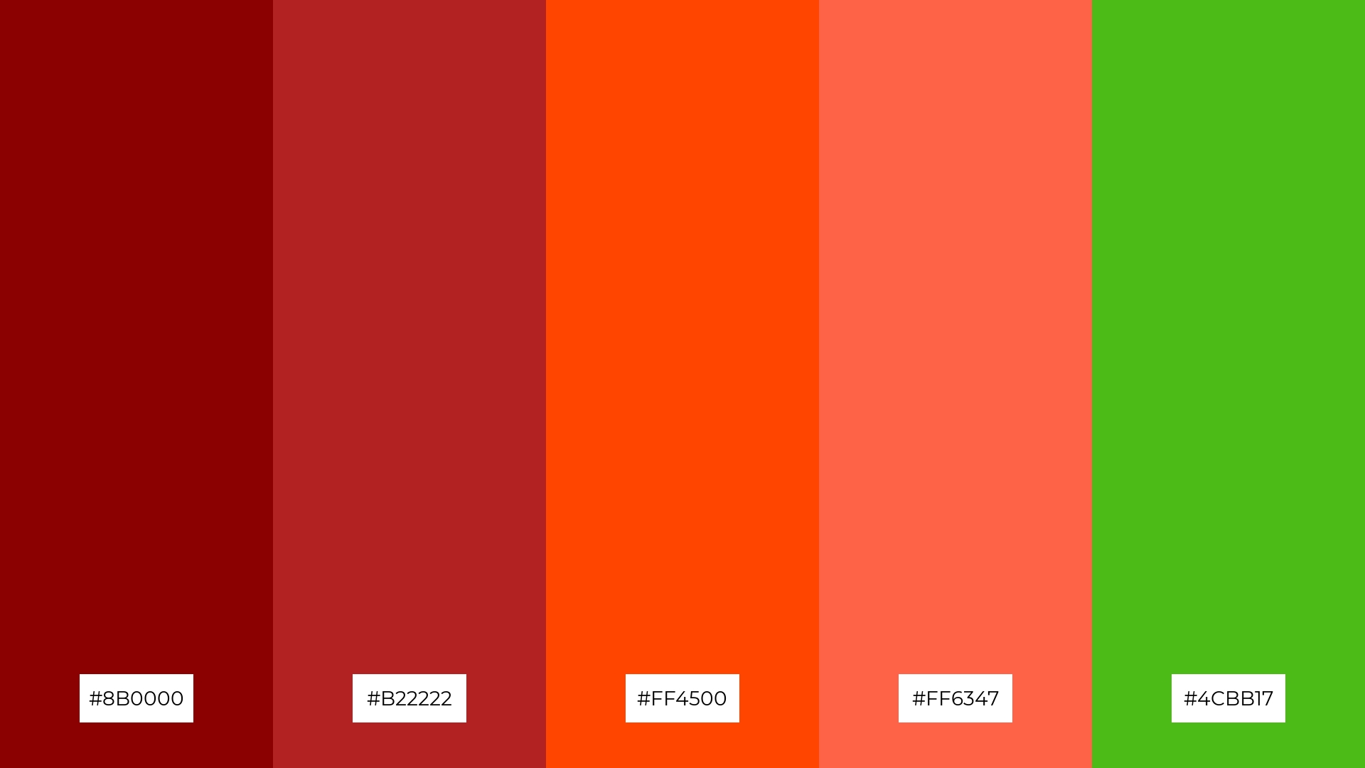
The ‘Mountain Peaks’ palette, with its deep reds (#8B0000, #B22222) and vibrant oranges (#FF4500, #FF6347) contrasted against the lively green (#4CBB17), creates a dynamic and visually striking combination that captures attention and evokes a sense of adventure.
This palette is ideal for creative projects like magazine layouts or artistic websites, where the bold and contrasting colors can enhance visual storytelling and create a memorable, engaging experience for the audience.
8) Fresh Mint
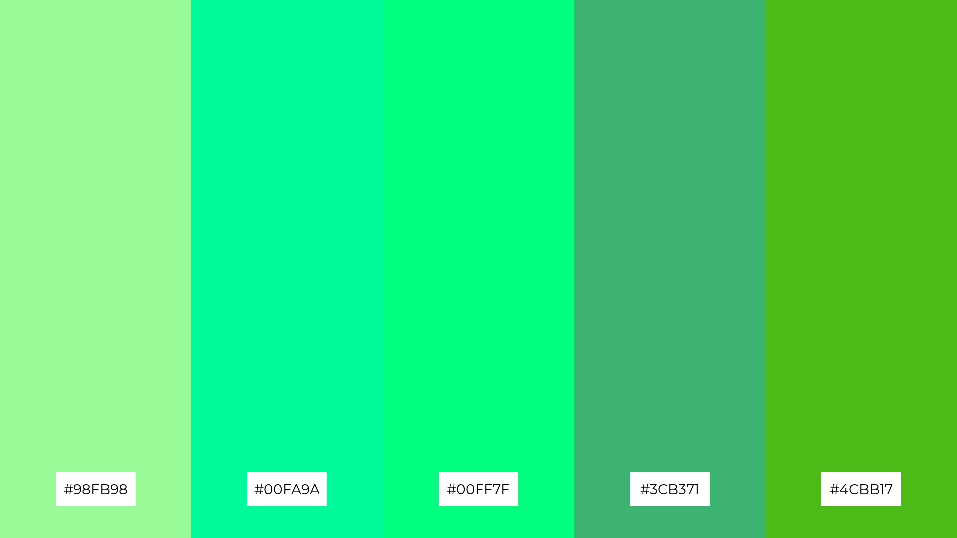
The ‘Fresh Mint’ palette, with its soothing shades of mint green (#98FB98, #00FA9A, #00FF7F, #3CB371, #4CBB17), brings a sense of calm and relaxation, making it perfect for spa branding where tranquility and rejuvenation are key.
Alternatively, when combined with more vibrant hues, this palette can create an exciting and energetic atmosphere, ideal for dynamic marketing campaigns that aim to capture attention and convey a fresh, lively message.
9) Floral Bloom
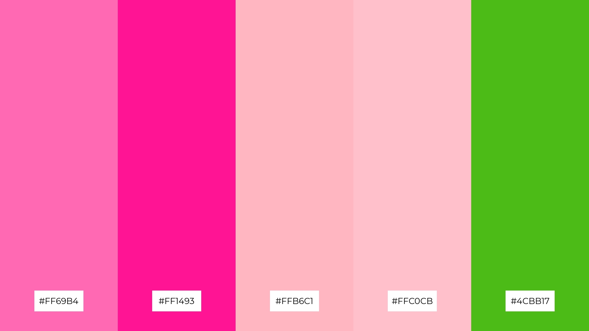
The ‘Floral Bloom’ palette, with its softer tones like light pink (#FFB6C1) and bright hues such as hot pink (#FF69B4), creates a cheerful and inviting atmosphere.
This blend of colors is perfect for seasonal promotions, where the vibrant and soft shades can evoke feelings of joy and celebration, making it an ideal choice for spring or summer home decor.
10) Berry Delight
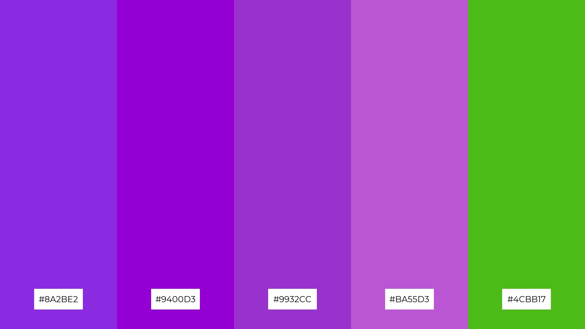
The ‘Berry Delight’ palette, with its rich purples and vibrant green, creates a visually captivating flow that evokes feelings of creativity and sophistication, making it perfect for lifestyle branding that aims to inspire and uplift.
This harmonious blend of colors can also be effectively utilized in tech product packaging, where the dynamic and engaging hues can attract attention and convey a sense of innovation and modernity.
11) Desert Oasis
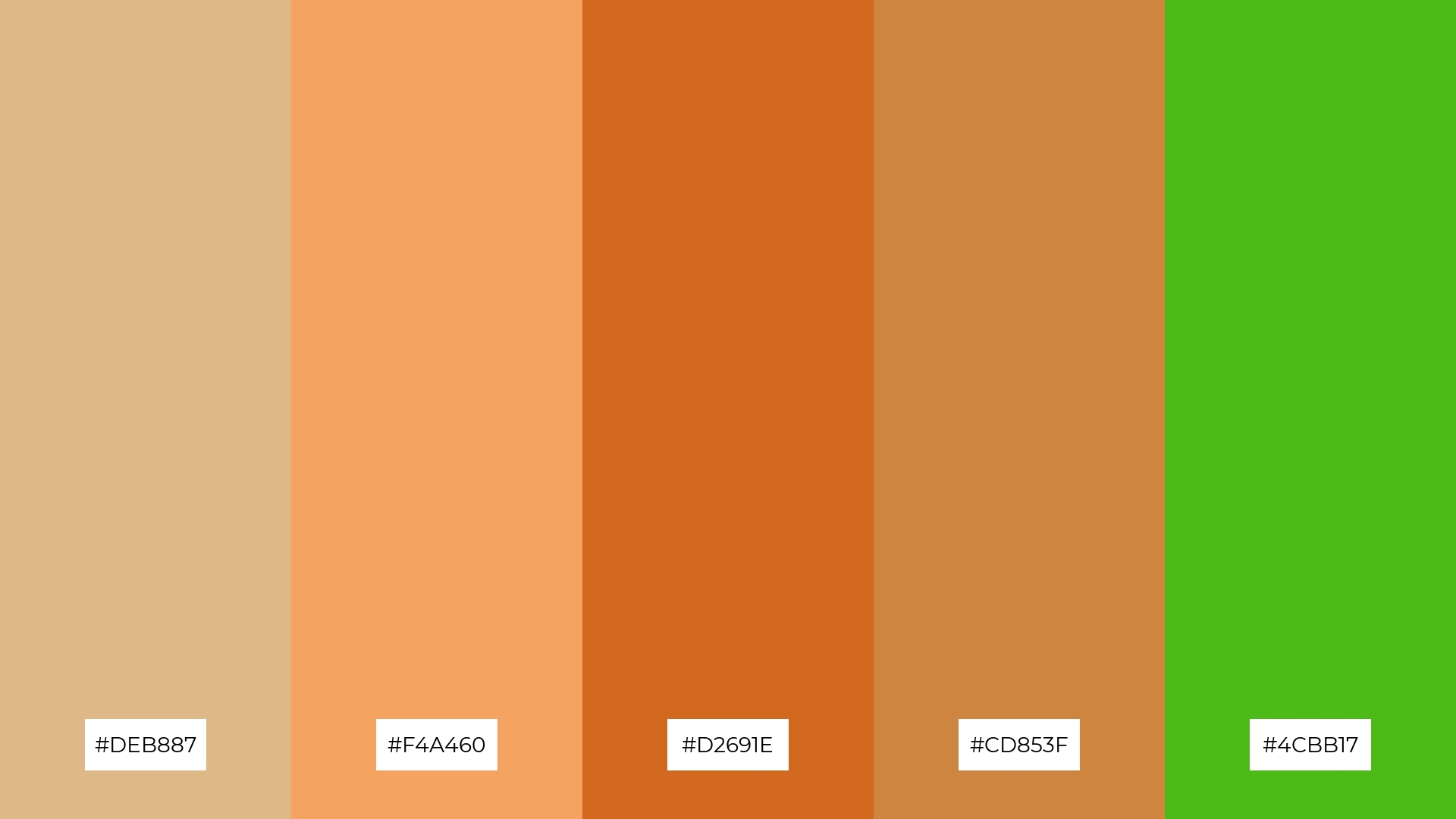
The ‘Desert Oasis’ palette, with its warm browns and vibrant green, creates a welcoming and earthy ambiance that can make any space feel inviting and grounded.
This palette shines in boutique interiors, where the rich and dramatic tones can enhance the shopping experience by creating a cozy yet sophisticated atmosphere.
12) Winter Chill
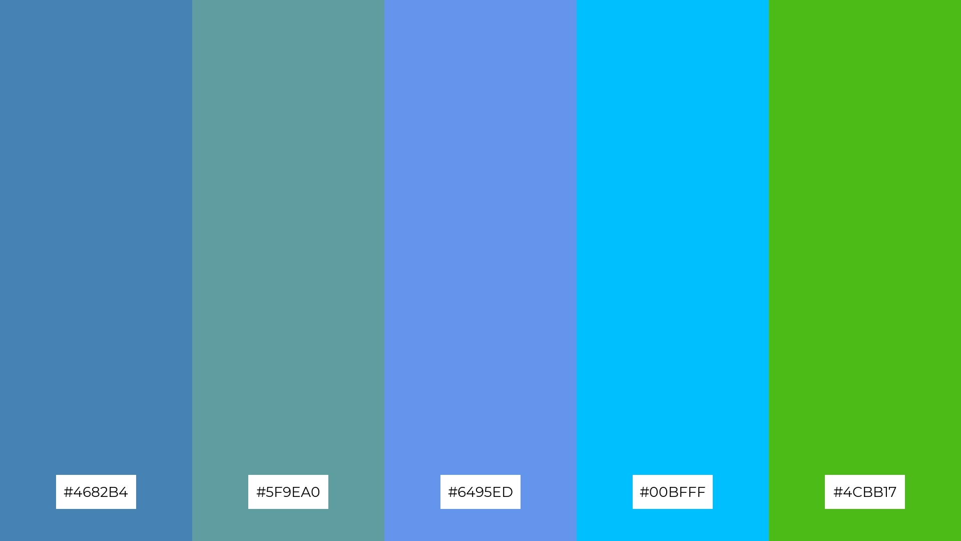
The ‘Winter Chill’ palette, with its cool blues (#4682B4, #5F9EA0, #6495ED, #00BFFF) and a touch of vibrant green (#4CBB17), creates a harmonious balance that evokes a sense of calm and freshness.
This palette is ideal for sleek corporate branding, where the serene blues can convey professionalism and trust, while the lively green adds a modern and dynamic touch.
13) Autumn Leaves
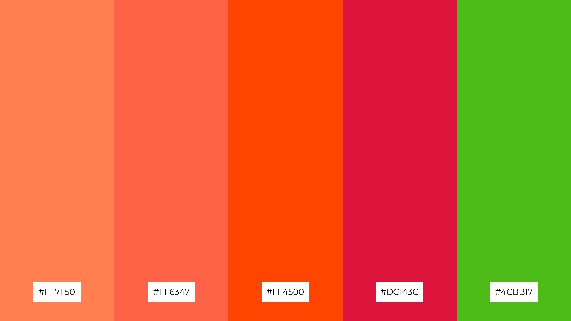
The ‘Autumn Leaves’ palette, with its blend of warm corals (#FF7F50, #FF6347, #FF4500) and cool crimson (#DC143C) alongside vibrant green (#4CBB17), creates a harmonious balance that evokes a sense of cozy sophistication and natural beauty.
This palette is perfect for artisan product branding, where the rich and inviting colors can highlight the craftsmanship and authenticity of handmade goods, making them stand out in a crowded market.
14) Vintage Charm
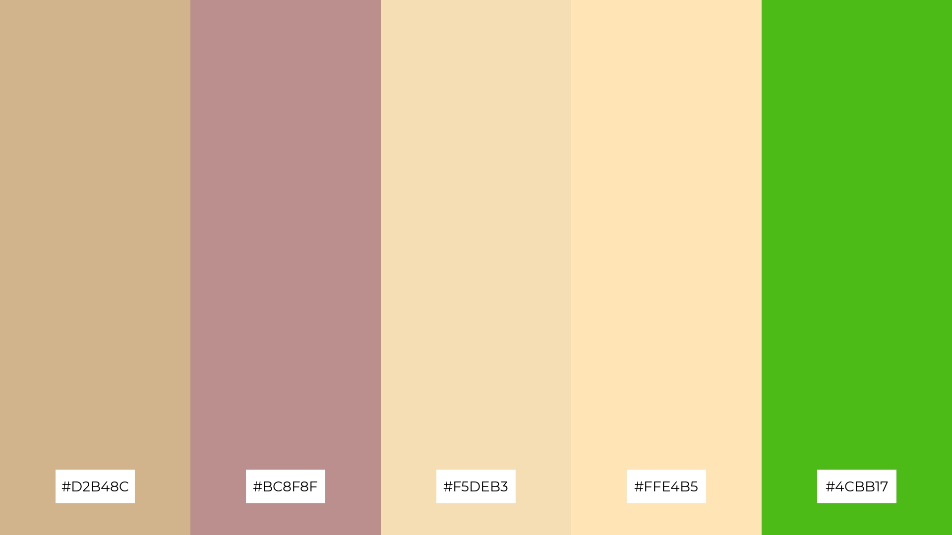
The ‘Vintage Charm’ palette, with its blend of soft beiges (#D2B48C, #F5DEB3, #FFE4B5) and muted rose (#BC8F8F) contrasted against the bold green (#4CBB17), creates a dynamic interaction that balances subtlety with striking accents.
This palette is ideal for restaurant menus, where the warm and inviting tones can enhance the dining experience by evoking a sense of nostalgia and comfort, while the vibrant green adds a fresh and modern twist.
15) Urban Jungle

The ‘Urban Jungle’ palette, with its deep greens and muted tones, conveys a sense of harmony when used in tech startups, creating a balanced and calming environment that fosters creativity and focus.
Alternatively, this palette can create a striking contrast in cozy interior makeovers, where the bold greens can stand out against neutral backgrounds, adding a touch of modernity and vibrancy to the space.
How to Use Kelly Green Patterns in Design
Kelly green color palettes can transform home decor by adding a vibrant and refreshing touch to any space. Use kelly green as an accent color in cushions, rugs, or wall art to create a lively and modern atmosphere. Pair it with neutral tones to balance the boldness and maintain a cohesive look.
In marketing materials, kelly green can be used to draw attention and convey a sense of energy and innovation. Incorporate it in call-to-action buttons, headers, or infographics to make your content stand out. Combining kelly green with complementary colors like coral or gold can enhance visual appeal and engagement.
For clothing design, kelly green can add a pop of color that is both trendy and timeless. Use it in accessories or statement pieces to create a bold fashion statement. Pairing kelly green with classic colors like navy or black can create a sophisticated and versatile look.
Ready to experiment with kelly green in your designs? Try creating stunning color palettes using Piktochart and bring your creative vision to life!


