 Piktochart Team
·

Updated on
November 26, 2024
Published on
November 25, 2024

Impressionist color palettes are renowned for their vibrant and dynamic use of color, capturing the essence of light and movement. These palettes often feature bold, contrasting hues that evoke emotion and atmosphere.
Artists like Monet and Renoir revolutionized the art world with their innovative approach to color, breaking away from traditional techniques. Their work continues to inspire modern designers and artists, making impressionist color palettes a timeless choice.
Designing color palettes with an Impressionist touch can elevate your projects with a sense of vibrancy and movement.

The 'Morning Dew' palette evokes a serene and refreshing mood, with its soft blues and warm yellows blending seamlessly to create a tranquil yet uplifting atmosphere.
Perfect for interior decor, this palette's harmonious interaction of colors can transform a living space into a cozy and inviting retreat, highlighting its ability to balance calmness with vibrancy.

The 'Lavender Fields' palette, with its soothing shades of lavender and periwinkle, evokes a sense of calmness and tranquility, making it ideal for creating serene and peaceful environments.
This palette would excel in digital branding for wellness and self-care products, where its gentle hues can convey a message of relaxation and rejuvenation.

The 'Sunset Glow' palette features dominant colors such as vibrant coral (#FF6F61) and warm apricot (#FFB74D), which create a lively and inviting atmosphere.
Ideal for eco-friendly interior spaces, this palette's harmonious blend of warm tones can evoke a sense of natural beauty and sustainability, making it perfect for creating welcoming and environmentally conscious environments.
The 'Serene Waters' palette, with its blend of soft pastels and bold blues, offers a balanced and distinct mood that evokes both tranquility and depth.
Ideal for modern web designs, this palette can create inviting and visually appealing digital experiences that captivate users with its harmonious interplay of colors.

The 'Garden Blooms' palette, with its soft pinks, warm yellows, and cool greens, creates a harmonious and serene ambiance that evokes the freshness and tranquility of a blooming garden.
Perfect for wedding themes, this palette's delicate and elegant colors can transform any venue into a romantic and enchanting setting, making it ideal for creating unforgettable and picturesque celebrations.
The 'Autumn Whisper' palette, with its rich oranges and golden yellows, creates a warm and inviting atmosphere that exudes sophistication and elegance.
Ideal for minimalistic branding, this palette's harmonious blend of colors can convey a sense of refined simplicity and timeless appeal, making it perfect for high-end products and services.
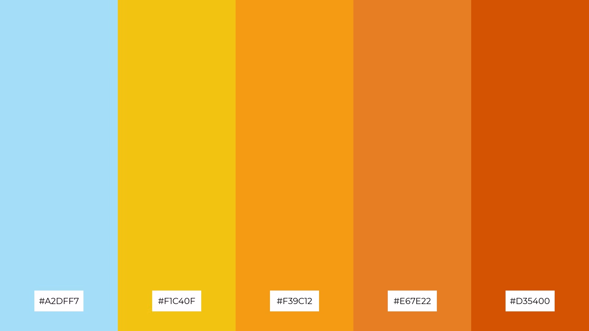
The 'Coastal Breeze' palette, with its cool blue (#A2DFF7) juxtaposed against warm yellows and oranges (#F1C40F, #F39C12, #E67E22, #D35400), creates a striking contrast that captures attention and adds visual interest.
Ideal for creative projects like magazine layouts or artistic websites, this palette's dynamic interplay of colors can enhance the overall aesthetic, making content more engaging and visually appealing.
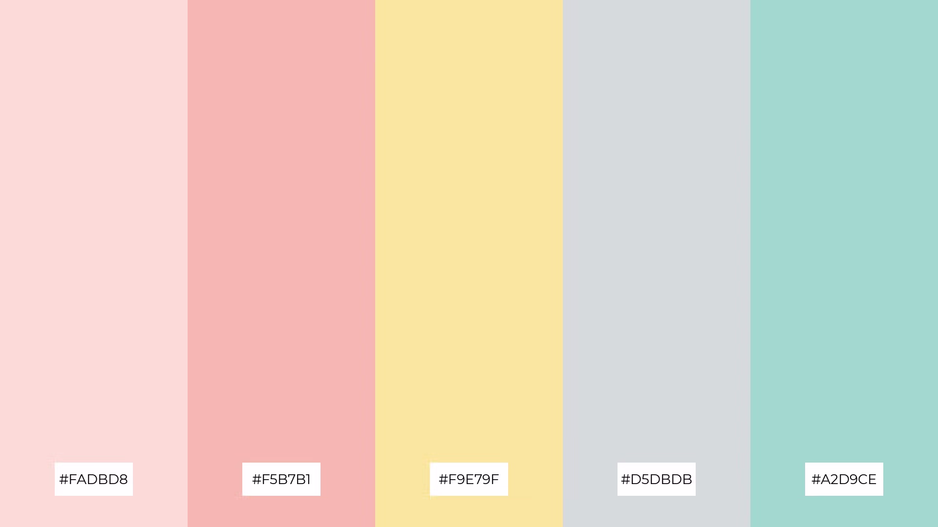
The 'Dreamy Pastels' palette, with its soft pinks (#FADBD8, #F5B7B1) and gentle greens (#A2D9CE), brings a sense of calm and serenity, making it perfect for spa branding where relaxation and tranquility are paramount.
Conversely, the vibrant combination of pastel yellows (#F9E79F) and cool grays (#D5DBDB) can inject excitement and energy into marketing campaigns, creating a fresh and engaging visual appeal that captures attention.

The 'Rustic Charm' palette, with its softer tones of lavender (#C39BD3) and brighter shades of amethyst (#A569BD), creates a warm and inviting atmosphere that exudes a sense of comfort and elegance.
Ideal for home decor, this blend of colors can transform any space into a cozy and sophisticated retreat, making it perfect for seasonal promotions that aim to evoke a sense of timeless beauty and charm.

The 'Spring Awakening' palette, with its blend of soft yellows (#F9E79F), gentle pinks (#F5B7B1), and cool greens (#A2D9CE, #76D7C4), creates a visual flow that evokes feelings of joy and renewal, reminiscent of the freshness and vibrancy of springtime.
Ideal for lifestyle branding or tech product packaging, this palette's harmonious and uplifting colors can convey a sense of innovation and positivity, making it perfect for products that aim to inspire and energize consumers.

The 'Twilight Hues' palette, with its blend of deep blues (#5D6D7E) and soft grays (#D5DBDB, #F2F4F4), creates a welcoming and sophisticated atmosphere that can evoke a sense of calm and elegance in any design.
Ideal for luxury e-commerce sites, this palette's dramatic yet inviting tones can enhance the visual appeal of high-end products, making it perfect for creating an upscale and refined online shopping experience.
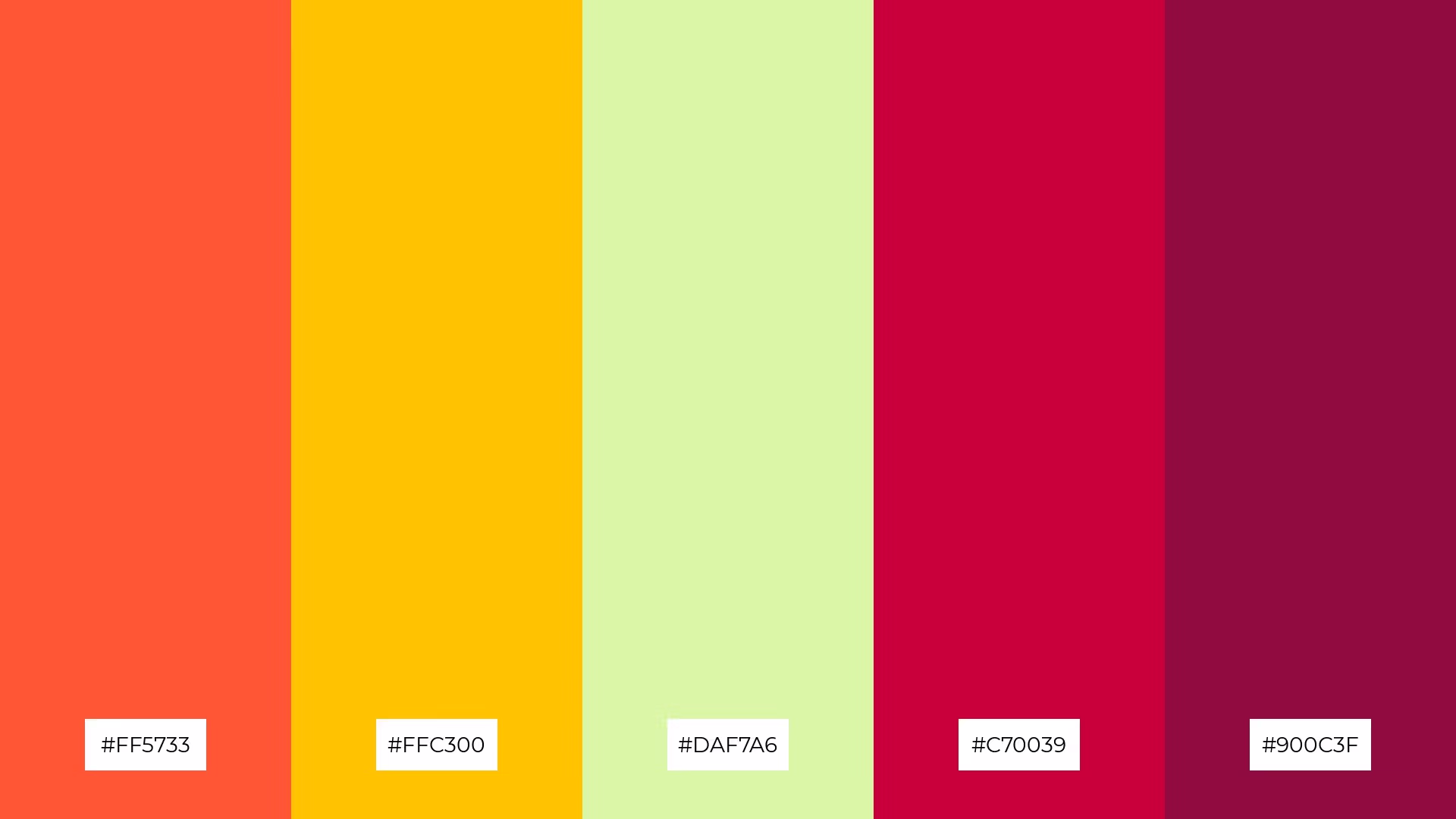
The 'Vibrant Meadows' palette, with its energetic mix of bright oranges (#FF5733), sunny yellows (#FFC300), and fresh greens (#DAF7A6), creates a dynamic contrast that is both eye-catching and harmonious.
Perfect for casual apparel lines, this palette's bold and lively colors can infuse a sense of fun and playfulness into fashion designs, making them stand out in a crowded market.

The 'Enchanted Forest' palette, with its blend of deep blues (#2E4053, #1F618D) and vibrant greens (#2980B9, #5DADE2, #85C1AE), creates a harmonious balance of warm and cool tones that evoke a sense of mystery and tranquility.
Ideal for artisan product branding, this palette's unique interplay of colors can enhance the visual appeal of handcrafted goods, making them stand out with an enchanting and sophisticated allure.

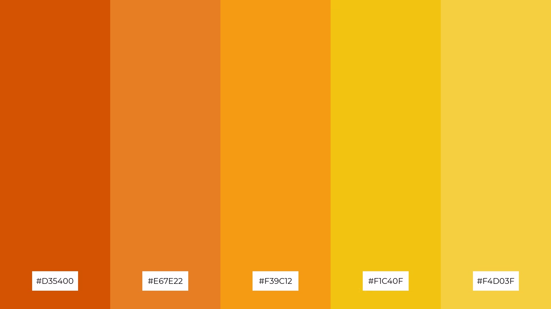
The 'Golden Hour' palette, with its radiant blend of golden yellows (#F4D03F) and deep reds (#C0392B), creates a dynamic and captivating visual experience that can evoke warmth and excitement.
Ideal for festival marketing, this palette's bold and vibrant colors can draw attention and convey a sense of celebration and energy, making it perfect for creating eye-catching promotional materials.

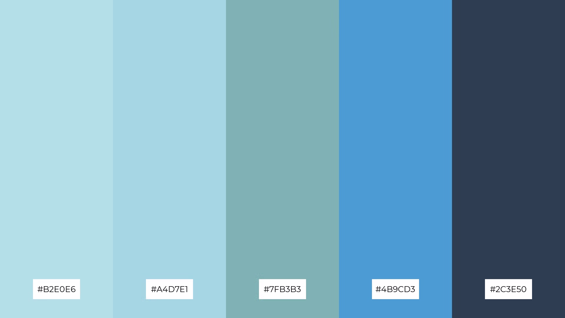
The 'Winter Wonderland' palette, with its cool blues and icy tones, conveys a sense of harmony when used to create serene and cohesive designs that evoke the tranquility of a snowy landscape.
Ideal for tech startups, this palette's crisp and clean colors can enhance user interfaces with a modern and refreshing look, while also being perfect for cozy interior makeovers that aim to create a calm and inviting atmosphere.
Incorporating Impressionist color palettes into home decor can transform any space into a vibrant and inviting retreat. Use a mix of bold and subtle hues to create a dynamic yet harmonious atmosphere, drawing inspiration from nature to ground your palette with earthy greens and sky blues.
For marketing materials, leverage the striking contrasts of complementary shades to capture attention and evoke emotion. Experiment with light and shadow to add depth and dimension, ensuring your designs stand out across various mediums, from digital screens to print.
In fashion design, Impressionist palettes can infuse clothing lines with a sense of playfulness and sophistication. Balance vibrant colors with softer tones to create versatile pieces that appeal to a wide audience, making your designs both eye-catching and timeless.
Ready to bring the magic of Impressionist color palettes to your projects? Try creating your own stunning designs with Piktochart. Get started today!
The latest industry news, interviews, technologies, and resources.

Published on
November 25, 2024


