Green and navy blue color palettes are a timeless combination that exudes sophistication and tranquility. This duo is perfect for creating designs that are both modern and classic.
Whether you’re working on a branding project or a personal design, the blend of green and navy blue offers versatility and elegance. These colors can be used to evoke a sense of calmness and reliability in your visuals.
Tips For Creating Green Navy Blue Color Palettes
Designing with green and navy blue can be both exciting and challenging. Here are some practical tips to help you create stunning color palettes:
- Balance the Colors: Ensure that neither green nor navy blue dominates the design. Use a 60-30-10 rule, where one color takes up 60% of the space, the second 30%, and an accent color 10%.
- Match Complementary Shades: Pair green and navy blue with complementary colors like white, beige, or gold to add depth and contrast to your design.
- Use Gradients: Incorporate gradients to blend green and navy blue seamlessly. This technique can add a modern touch and make transitions smoother.
- Consider the Context: Think about where your design will be used. For digital designs, ensure the colors look good on screens. For print, check how they appear on different materials.
- Test Different Combinations: Experiment with various shades of green and navy blue to find the perfect match. Tools like color pickers can help you visualize different combinations.
- Keep It Versatile: Create a palette that can be easily adapted for different purposes, whether it’s for a website, a logo, or marketing materials. Versatility ensures your design remains cohesive across various platforms.
15 Green Navy Blue Color Palettes
1) Ocean Breeze
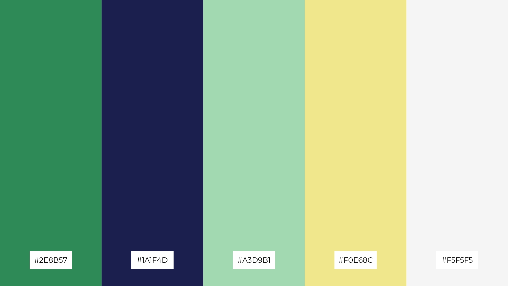
The ‘Ocean Breeze’ palette, with its blend of serene greens and deep blues, creates a refreshing and calming mood, reminiscent of a tranquil seaside escape.
Perfect for interior decor, this palette’s harmonious interaction of colors can transform a living space into a peaceful retreat, with the soft hues of #A3D9B1 and #F0E68C adding warmth and light, while #2E8B57 and #1A1F4D provide depth and stability.
2) Forest Night
The ‘Forest Night’ palette, with its rich greens and deep blues, evokes a sense of calmness and connection to nature, making it ideal for designs that aim to promote relaxation and tranquility.
This palette would excel in product packaging for eco-friendly brands, where the natural hues can emphasize sustainability and environmental consciousness, while the bright accents of #F2C94C and #EAEAEA add a touch of energy and modernity.
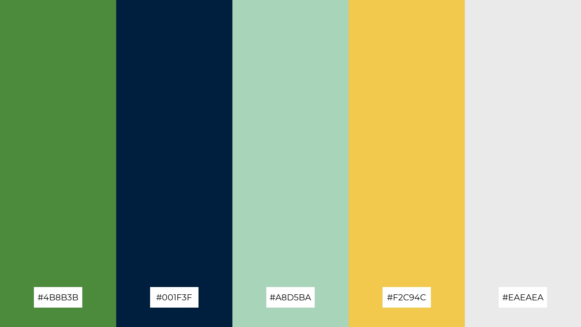
3) Deep Sea Escape
The ‘Deep Sea Escape’ palette features dominant colors like the deep green of #3B7A57 and the dark blue of #001F5B, which create a strong foundation of tranquility and depth.
Accented by the vibrant #5BC0BE and the warm #F9C74F, this palette achieves a harmonious balance that is perfect for wellness branding, where the calming and invigorating hues can promote a sense of well-being and rejuvenation.
4) Emerald Twilight
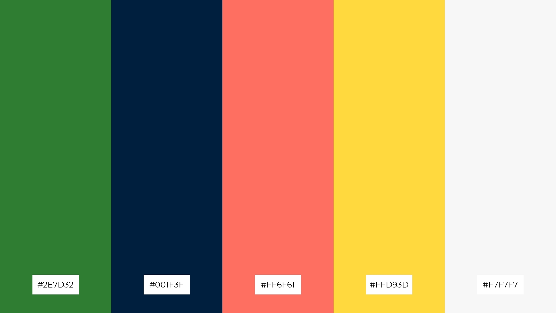
The ‘Emerald Twilight’ palette, with its mix of soft (#FFD93D, #F7F7F7) and bold tones (#2E7D32, #001F3F, #FF6F61), offers a balanced and distinct mood that is both inviting and dynamic.
This versatile palette is ideal for creating inviting retail spaces or modern web designs, where the harmonious blend of colors can attract attention while maintaining a welcoming atmosphere.
5) Mystic Lagoon
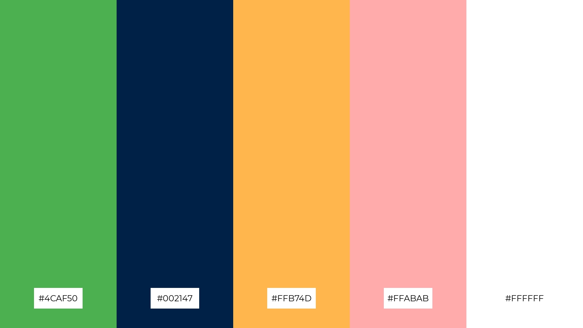
The ‘Mystic Lagoon’ palette, with its blend of #4CAF50, #002147, #FFB74D, #FFABAB, and #FFFFFF, creates a serene yet vibrant ambiance, perfect for evoking a sense of calm and elegance.
This harmonious combination is ideal for luxury fashion campaigns, where the rich greens and deep blues can convey sophistication, while the warm accents and crisp white add a touch of modernity and freshness.
6) Urban Jungle
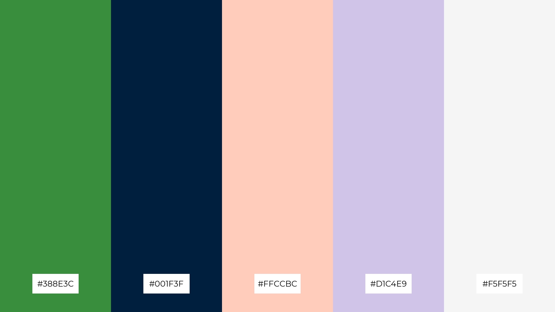
The ‘Urban Jungle’ palette, with its mix of deep green (#388E3C) and dark blue (#001F3F) contrasted by the soft peach (#FFCCBC), lavender (#D1C4E9), and light gray (#F5F5F5), creates a sophisticated yet playful mood that can be tailored to various design needs.
This versatile combination is perfect for minimalistic branding, where the bold greens and blues provide a strong foundation, while the softer hues add a touch of elegance and modernity, making it ideal for contemporary lifestyle brands or chic event designs.
7) Serene Waters
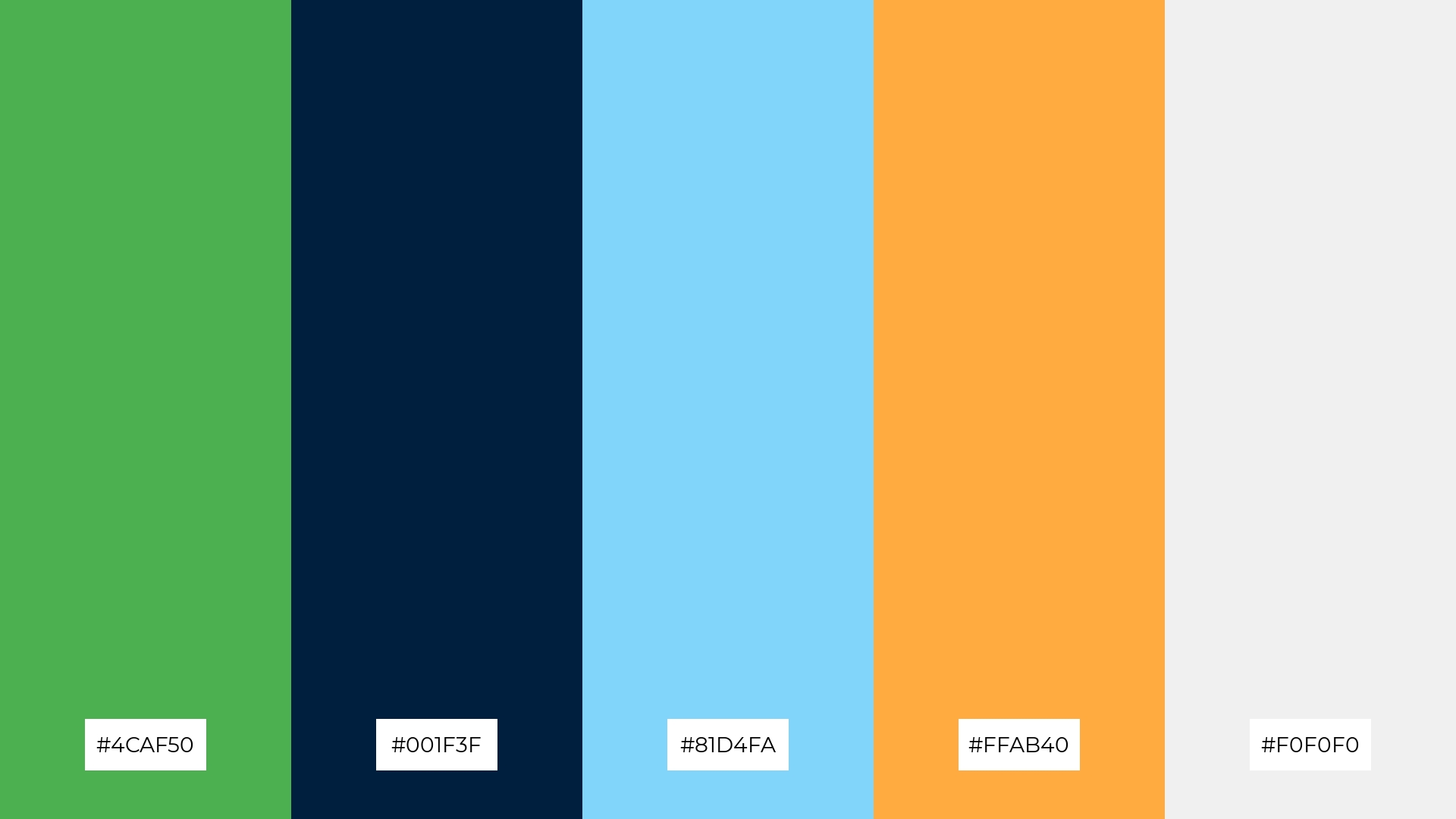
The ‘Serene Waters’ palette, with its contrasting elements of deep green (#4CAF50) and dark blue (#001F3F) against the light and airy #81D4FA, #FFAB40, and #F0F0F0, creates a dynamic visual interest that captivates the viewer’s attention.
This versatile palette is perfect for creative projects like magazine layouts or artistic websites, where the bold and soft hues can be used to highlight key elements and create a visually engaging experience.
8) Enchanted Forest
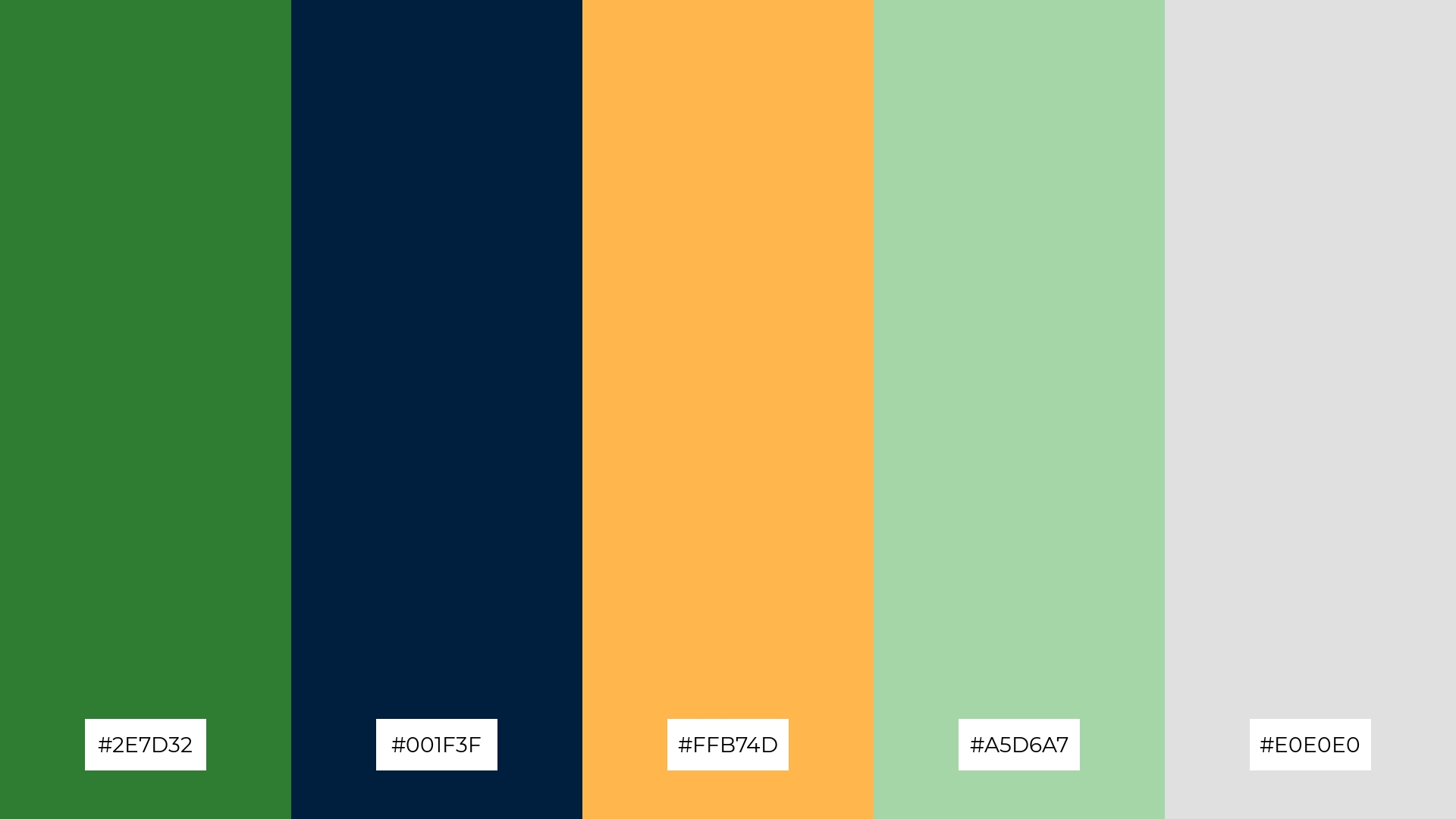
The ‘Enchanted Forest’ palette, with its deep green (#2E7D32) and dark blue (#001F3F), brings a sense of calm and tranquility, making it perfect for spa branding where relaxation and serenity are paramount.
Conversely, the vibrant #FFB74D and the soft hues of #A5D6A7 and #E0E0E0 can create an exciting and dynamic visual, ideal for vibrant marketing campaigns that aim to capture attention and evoke a sense of energy and freshness.
9) Coastal Calm
The ‘Coastal Calm’ palette, with its soft tones of #FFE0B2 and #F5F5F5, alongside the brighter #FFABAB, creates a light and airy mood that evokes a sense of relaxation and comfort.
This harmonious blend is ideal for home decor, where the soothing colors can transform any space into a serene retreat, or for seasonal promotions that aim to capture the essence of a tranquil coastal getaway.
10) Verdant Dream

The ‘Verdant Dream’ palette, with its deep green (#388E3C) and dark blue (#001F3F), creates a visual flow that evokes a sense of tranquility and stability, while the warm #FFCC80 and cool #B2DFDB add a touch of joy and freshness, making the overall experience both calming and uplifting.
This harmonious blend is perfect for lifestyle branding, where the serene and joyful colors can convey a sense of well-being and positivity, or for tech product packaging, where the balanced hues can highlight innovation and reliability while maintaining an inviting and modern aesthetic.
11) Midnight Oasis
The ‘Midnight Oasis’ palette, with its deep green (#2E8B57) and dark blue (#001F3F) tones, creates a dramatic and sophisticated effect, while the soft accents of #FFABAB, #FFE0B2, and #F0F0F0 add a welcoming and elegant touch.
This versatile combination is perfect for luxury e-commerce sites, where the rich and inviting colors can enhance the user experience and convey a sense of exclusivity and refinement.
12) Tropical Escape
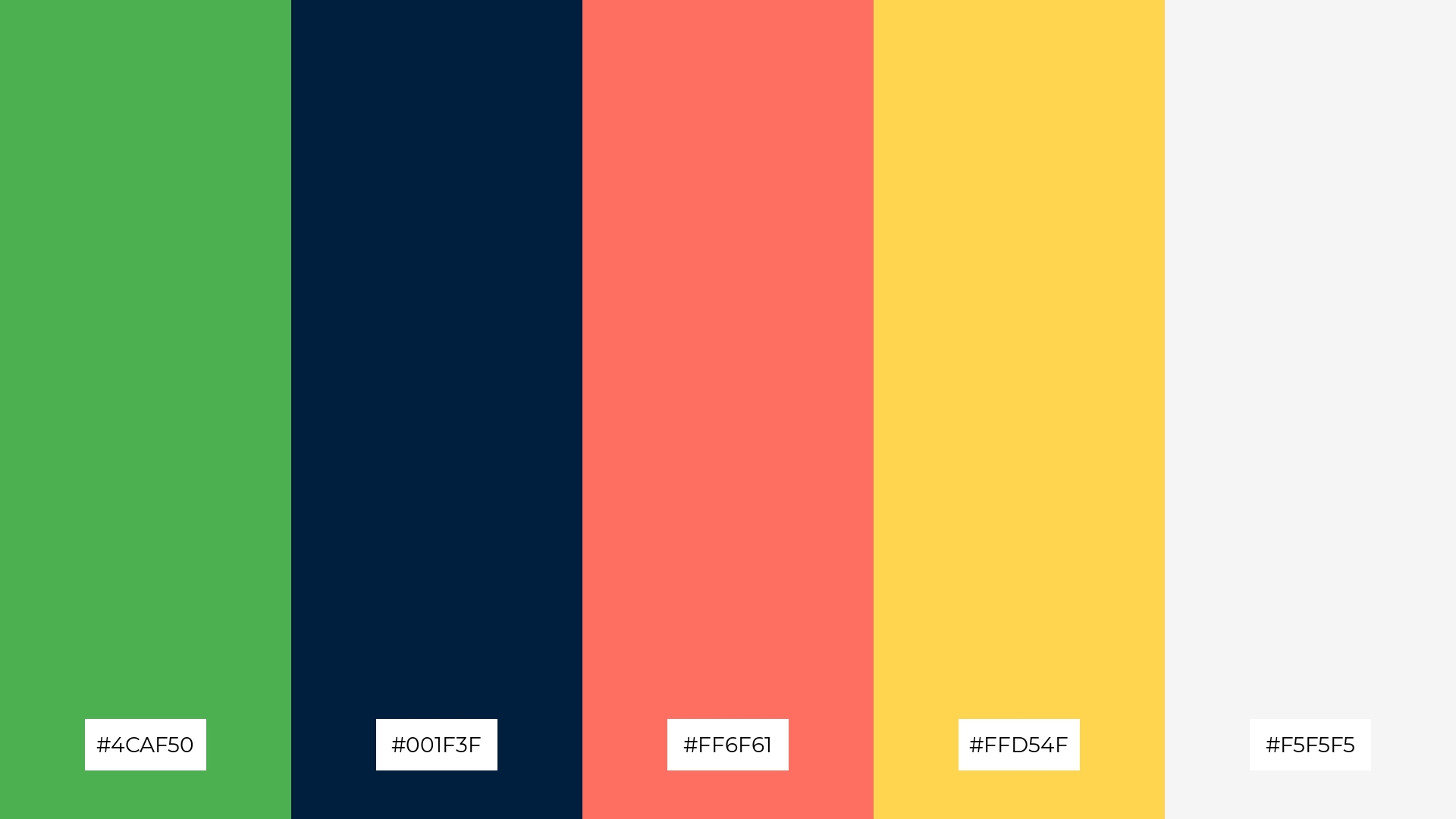
The ‘Tropical Escape’ palette, with its vibrant #4CAF50 and #FF6F61, balanced by the deep #001F3F and softened by #FFD54F and #F5F5F5, creates a dynamic yet harmonious visual experience.
This lively combination is perfect for casual apparel lines, where the bold and playful hues can evoke a sense of fun and energy, while the softer tones add a touch of sophistication and balance.
13) Lush Haven
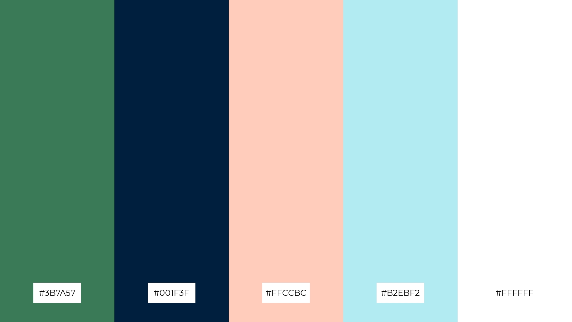
The ‘Lush Haven’ palette, with its blend of warm (#FFCCBC) and cool tones (#3B7A57, #001F3F, #B2EBF2, #FFFFFF), creates a balanced and inviting mood that evokes both comfort and sophistication.
This harmonious combination is perfect for artisan product branding, where the rich greens and deep blues can convey quality and craftsmanship, while the soft peach and crisp white add a touch of elegance and modernity.
14) Celestial Grove
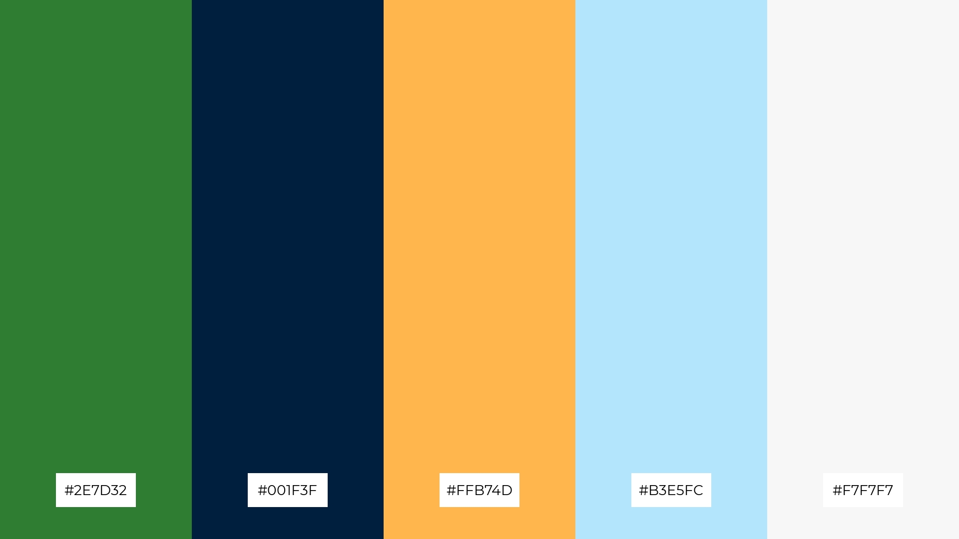
The ‘Celestial Grove’ palette, with its deep green (#2E7D32) and dark blue (#001F3F) tones, creates a bold and sophisticated foundation, while the vibrant #FFB74D and the soft hues of #B3E5FC and #F7F7F7 add a touch of warmth and subtle elegance.
This dynamic combination is perfect for festival marketing, where the rich and inviting colors can capture attention and convey a sense of excitement and celebration, while the softer tones provide balance and visual harmony.
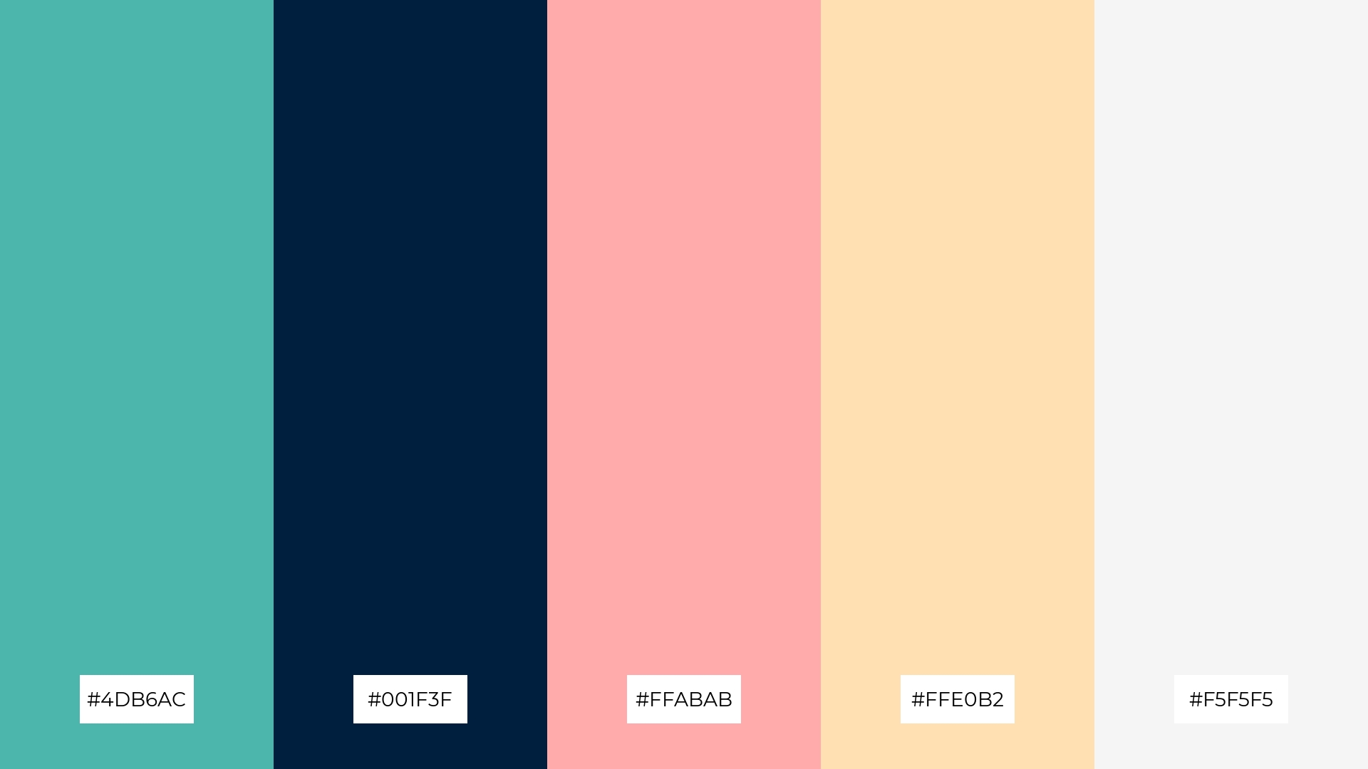
15) Vibrant Oasis
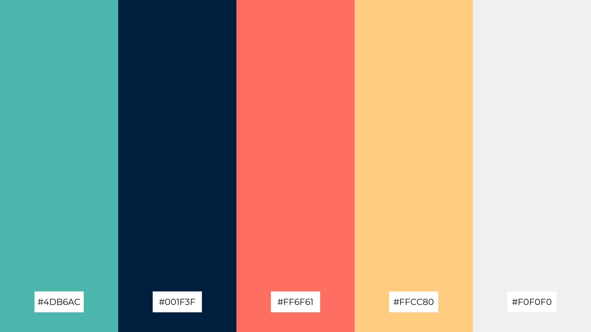
The ‘Vibrant Oasis’ palette, with its blend of #4DB6AC, #001F3F, #FF6F61, #FFCC80, and #F0F0F0, conveys a sense of harmony through its balanced mix of cool and warm tones, creating a visually pleasing and cohesive design.
This dynamic combination is ideal for tech startups, where the vibrant and contrasting hues can evoke innovation and energy, or for cozy interior makeovers, where the harmonious blend of colors can transform a space into a welcoming and stylish retreat.
How to Use Green Navy Blue Patterns in Design
Green and navy blue color palettes can be a game-changer in home decor, offering a sophisticated and calming ambiance. Use deep navy blue for larger furniture pieces or accent walls, while incorporating green through plants, cushions, or smaller decor items to create a balanced and inviting space.
For marketing materials, this color combination can convey reliability and tranquility. Utilize navy blue for backgrounds and text to ensure readability, while green can be used for call-to-action buttons and highlights to draw attention and create a sense of trust and calmness.
In clothing design, green and navy blue can create timeless and versatile pieces. Consider navy blue as the base color for garments, with green accents or patterns to add a fresh and modern twist. This combination works well for both casual and formal wear, making it a versatile choice for any wardrobe.
Ready to create your own stunning green and navy blue palettes? Try using Piktochart’s intuitive design tools to bring your vision to life. Get started with Piktochart today!


