Gray and silver color palettes offer a sophisticated and versatile range of hues that can elevate any design project. These neutral tones are perfect for creating a modern, sleek aesthetic.
Whether you’re designing a website, an infographic, or a presentation, incorporating gray and silver can add a touch of elegance and professionalism. Their subtlety allows other colors to stand out while maintaining a cohesive look.
Tips For Creating Gray Silver Color Palettes
Designing with gray and silver can be both rewarding and challenging. Here are some practical tips to help you create stunning color palettes:
- Balance with Bold Colors: Use gray and silver as a backdrop to make bold colors pop. This creates a striking contrast that draws attention to key elements.
- Complementary Shades: Pair gray and silver with complementary shades like navy blue, emerald green, or burgundy to add depth and richness to your design.
- Layering Textures: Incorporate different textures and finishes, such as matte and metallic, to add visual interest and dimension to your palette.
- Neutral Accents: Use gray and silver as neutral accents to balance out more vibrant colors, ensuring your design remains cohesive and visually appealing.
- Versatile Combinations: Experiment with various shades of gray and silver to create versatile designs that can adapt to different themes and moods.
- Subtle Gradients: Implement subtle gradients between gray and silver to create a smooth transition and a more dynamic visual experience.
15 Gray Silver Color Palettes
1) Misty Dawn
The ‘Misty Dawn’ color palette, with its soft blues and varying shades of gray, evokes a serene and calming mood, reminiscent of a tranquil morning mist.
These colors interact harmoniously to create a cohesive and sophisticated look, making them ideal for minimalist interior decor where a peaceful and elegant atmosphere is desired.
2) Silver Lining
The ‘Silver Lining’ color palette, with its range of soft grays and a hint of lavender, evokes a sense of calmness and tranquility, making it perfect for creating a serene and inviting atmosphere.
This palette would excel in digital branding for wellness apps or product packaging for skincare lines, where a soothing and elegant aesthetic is essential to convey a sense of relaxation and luxury.
3) Urban Chic
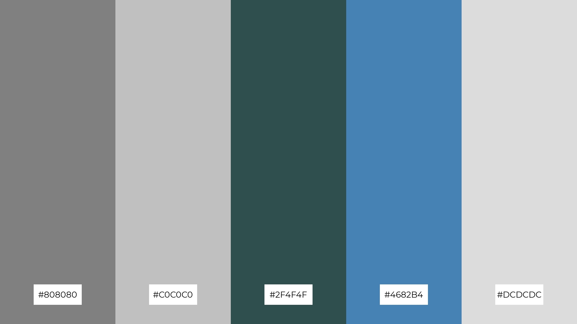
The ‘Urban Chic’ color palette features dominant hues of gray (#808080, #C0C0C0, #DCDCDC), dark slate gray (#2F4F4F), and steel blue (#4682B4), creating a modern and sophisticated look.
This combination of colors brings a balanced and cohesive harmony, making it ideal for eco-friendly interior spaces where a contemporary yet calming atmosphere is desired.
4) Frosted Elegance
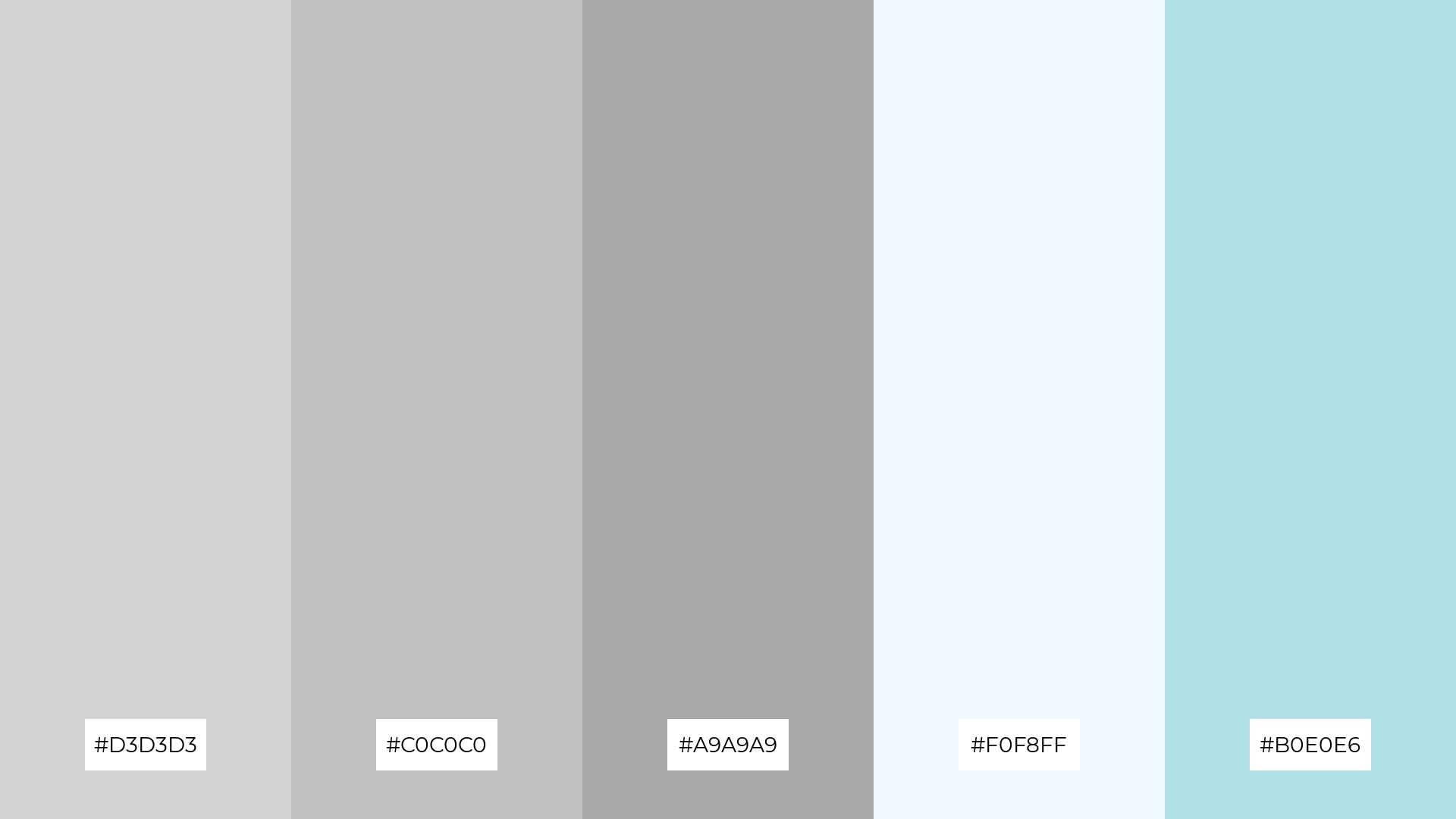
The ‘Frosted Elegance’ color palette, with its blend of light gray (#D3D3D3), silver (#C0C0C0), dark gray (#A9A9A9), Alice blue (#F0F8FF), and powder blue (#B0E0E6), offers a perfect balance of soft and bold tones, creating a distinct and sophisticated mood.
This palette is ideal for creating inviting retail spaces or modern web designs, where a harmonious and elegant atmosphere is essential to attract and engage customers.
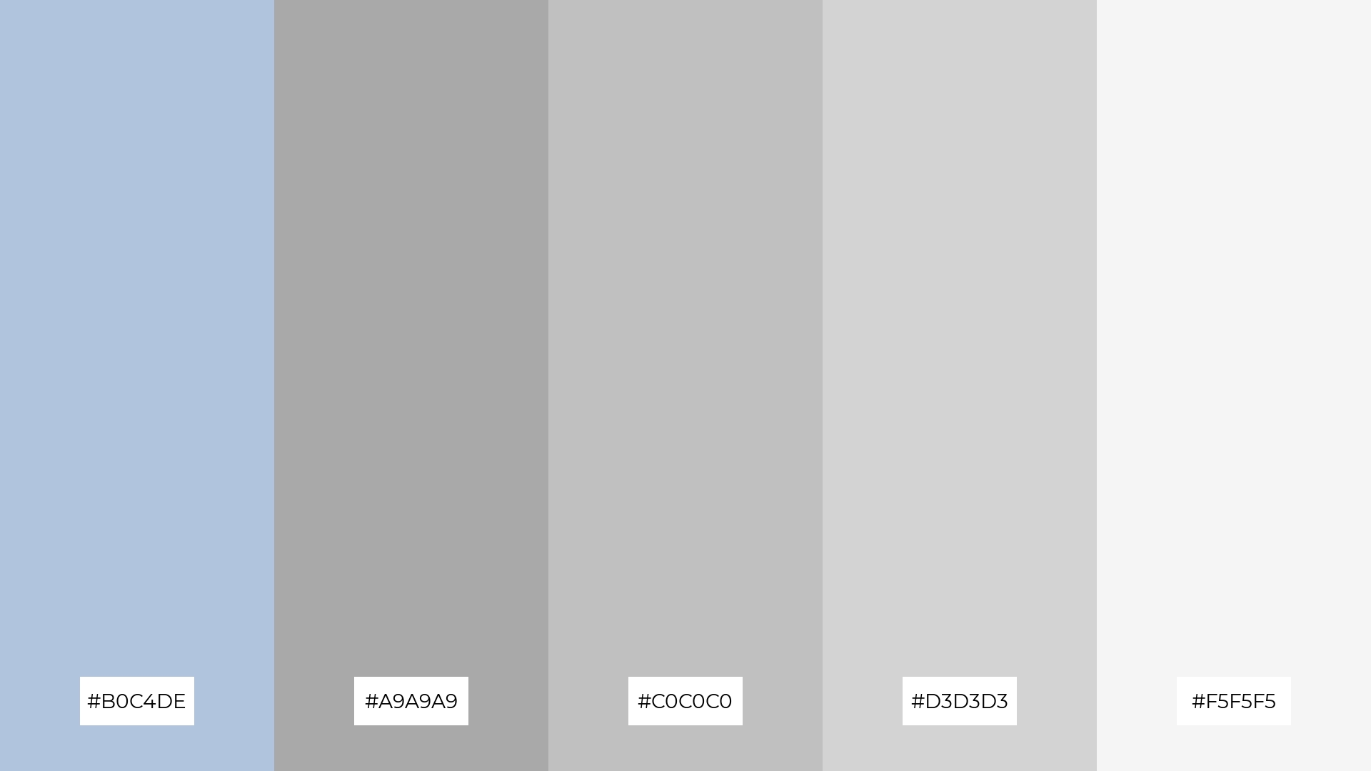
5) Steel Serenity
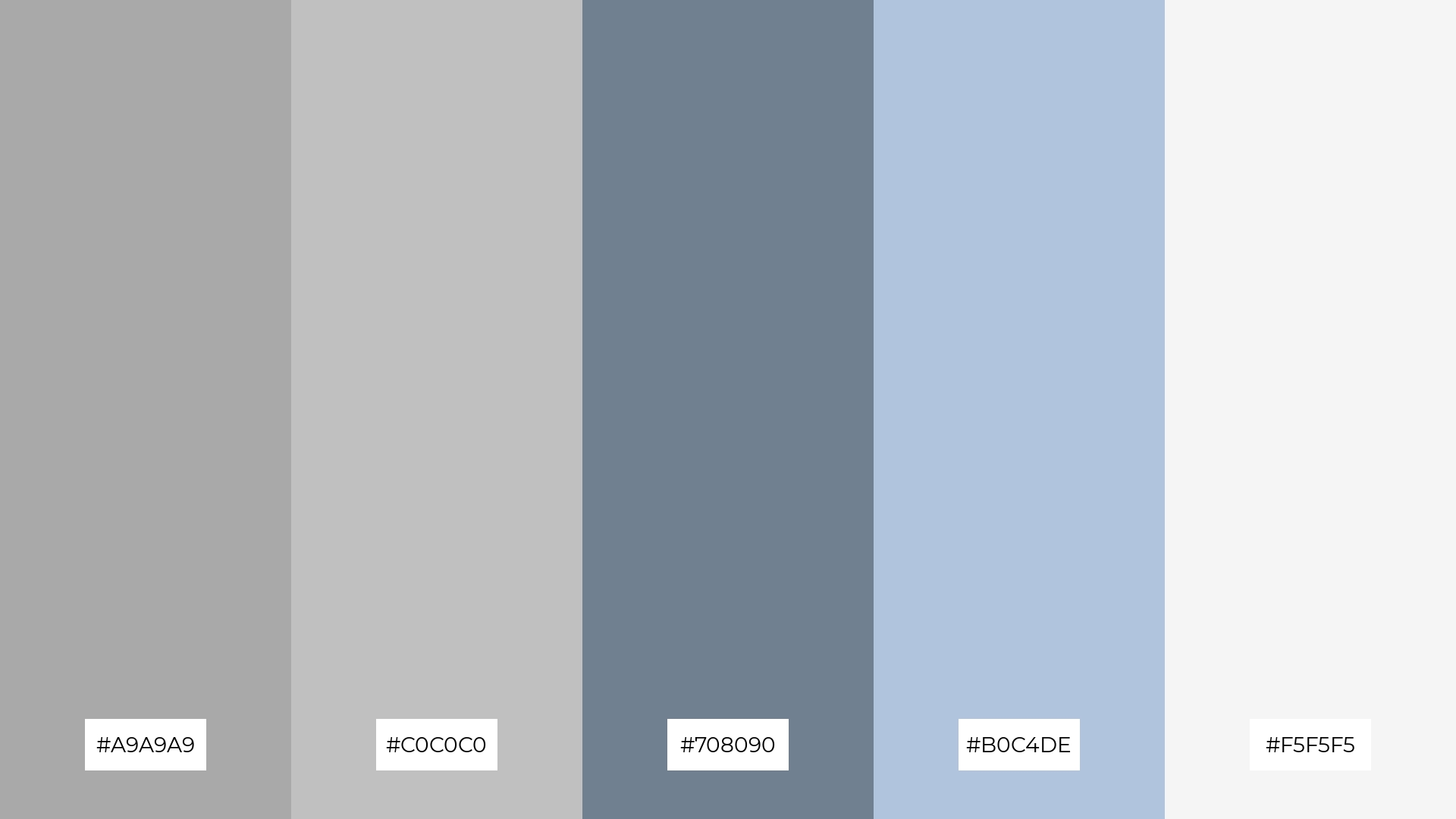
The ‘Steel Serenity’ color palette, with its blend of light gray (#A9A9A9), silver (#C0C0C0), slate gray (#708090), light steel blue (#B0C4DE), and white smoke (#F5F5F5), creates a tranquil and calming ambiance, perfect for evoking a sense of peace and relaxation.
This palette is ideal for luxury fashion campaigns, where the serene and sophisticated tones can highlight the elegance and refinement of high-end clothing and accessories.
6) Twilight Silver
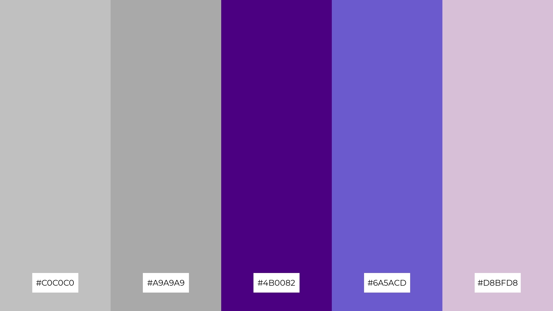
The ‘Twilight Silver’ color palette, with its blend of silver (#C0C0C0), dark gray (#A9A9A9), indigo (#4B0082), slate blue (#6A5ACD), and thistle (#D8BFD8), creates a sophisticated and serene mood, perfect for minimalistic branding that aims to convey elegance and refinement.
This palette’s harmonious interaction of cool and muted tones makes it ideal for bold event designs, where the combination of deep indigo and soft thistle can add a touch of playfulness while maintaining a polished and cohesive look.
7) Shimmering Shadows
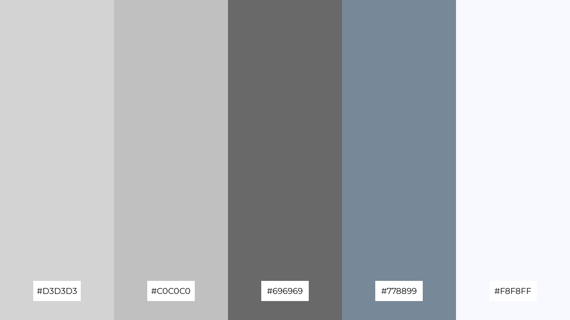
The ‘Shimmering Shadows’ color palette, with its blend of light gray (#D3D3D3), silver (#C0C0C0), dim gray (#696969), light slate gray (#778899), and ghost white (#F8F8FF), creates visual interest through the contrast between soft and dark tones, adding depth and dimension to any design.
This palette is perfect for creative projects like magazine layouts or artistic websites, where the interplay of light and dark shades can highlight key elements and create a sophisticated, visually engaging experience for the audience.
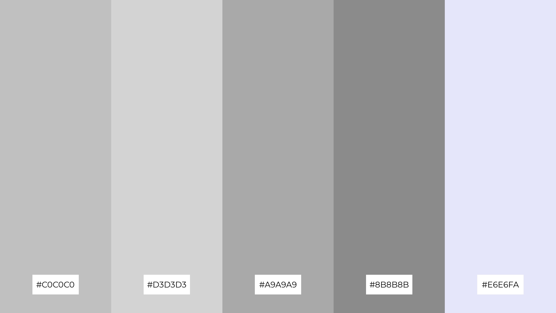
8) Ethereal Glow
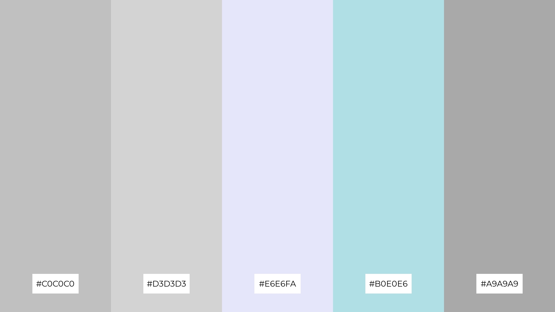
The ‘Ethereal Glow’ color palette, with its blend of silver (#C0C0C0), light gray (#D3D3D3), lavender (#E6E6FA), powder blue (#B0E0E6), and dark gray (#A9A9A9), can evoke a sense of calm when used in soft gradients and subtle transitions, making it perfect for spa branding that aims to create a serene and relaxing atmosphere.
Alternatively, the same palette can bring excitement and vibrancy when the colors are used in bold, contrasting combinations, making it ideal for dynamic marketing campaigns that seek to capture attention and convey a sense of energy and innovation.
9) Silver Sands
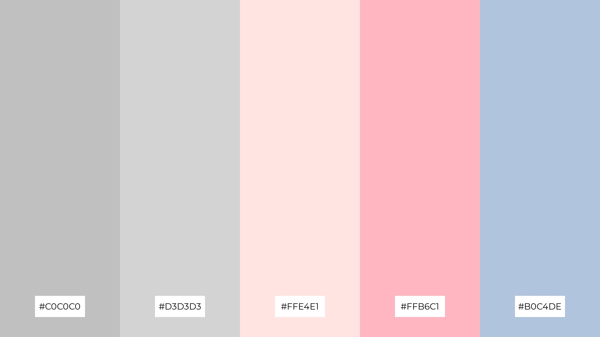
The ‘Silver Sands’ color palette, with its blend of silver (#C0C0C0), light gray (#D3D3D3), misty rose (#FFE4E1), light pink (#FFB6C1), and light steel blue (#B0C4DE), features softer and brighter tones that create a gentle and uplifting mood.
This harmonious combination is ideal for home decor, where the soothing and cheerful colors can enhance the ambiance of living spaces, or for seasonal promotions that aim to evoke a sense of freshness and renewal.
10) Cloudy Reflections
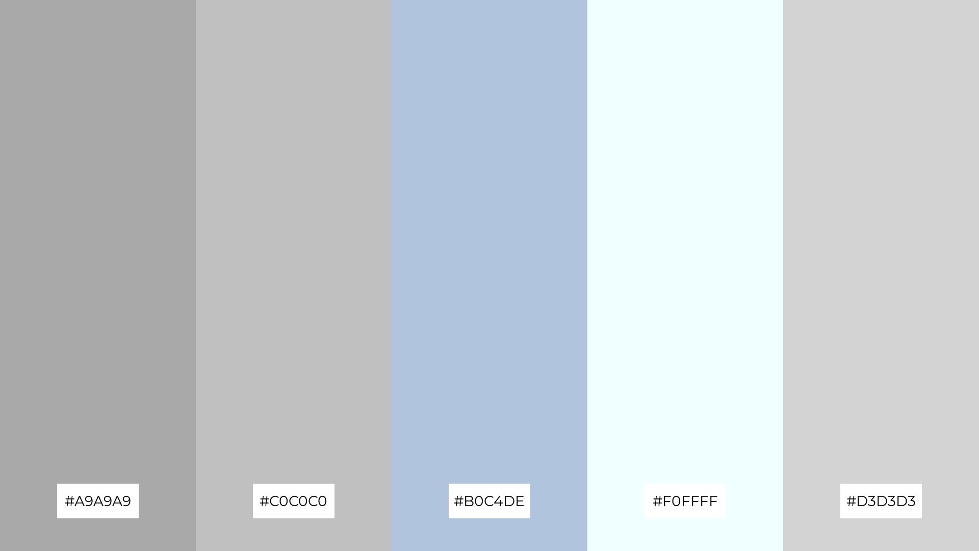
The ‘Cloudy Reflections’ color palette, with its blend of dark gray (#A9A9A9), silver (#C0C0C0), light steel blue (#B0C4DE), azure (#F0FFFF), and light gray (#D3D3D3), creates a serene and tranquil visual flow that evokes a sense of calm and relaxation.
This soothing combination is ideal for lifestyle branding, such as wellness products or tech product packaging, where the gentle and harmonious colors can convey a sense of peace and sophistication, appealing to consumers seeking a balanced and refined aesthetic.
11) Modern Minimalism
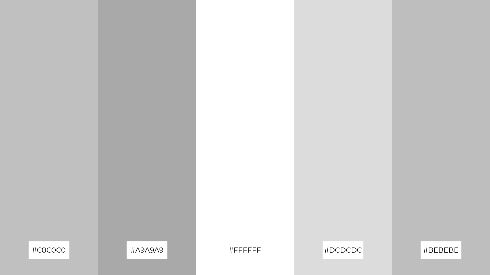
The ‘Modern Minimalism’ color palette, with its blend of silver (#C0C0C0), dark gray (#A9A9A9), white (#FFFFFF), gainsboro (#DCDCDC), and gray (#BEBEBE), creates a welcoming effect through its clean and understated tones, making spaces feel open and inviting.
This palette shines in luxury e-commerce sites, where the sophisticated and neutral colors can highlight high-end products, creating a dramatic and elegant shopping experience for discerning customers.
12) Silver Moonlight
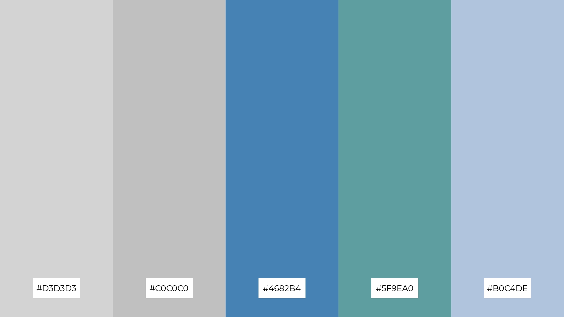
The ‘Silver Moonlight’ color palette, with its blend of light gray (#D3D3D3), silver (#C0C0C0), steel blue (#4682B4), cadet blue (#5F9EA0), and light steel blue (#B0C4DE), creates a harmonious balance through the interplay of cool and neutral tones, evoking a sense of calm and sophistication.
This palette is ideal for sleek corporate branding, where the refined and professional hues can convey a sense of reliability and modernity, making it perfect for companies aiming to project a polished and trustworthy image.
13) Industrial Vibes
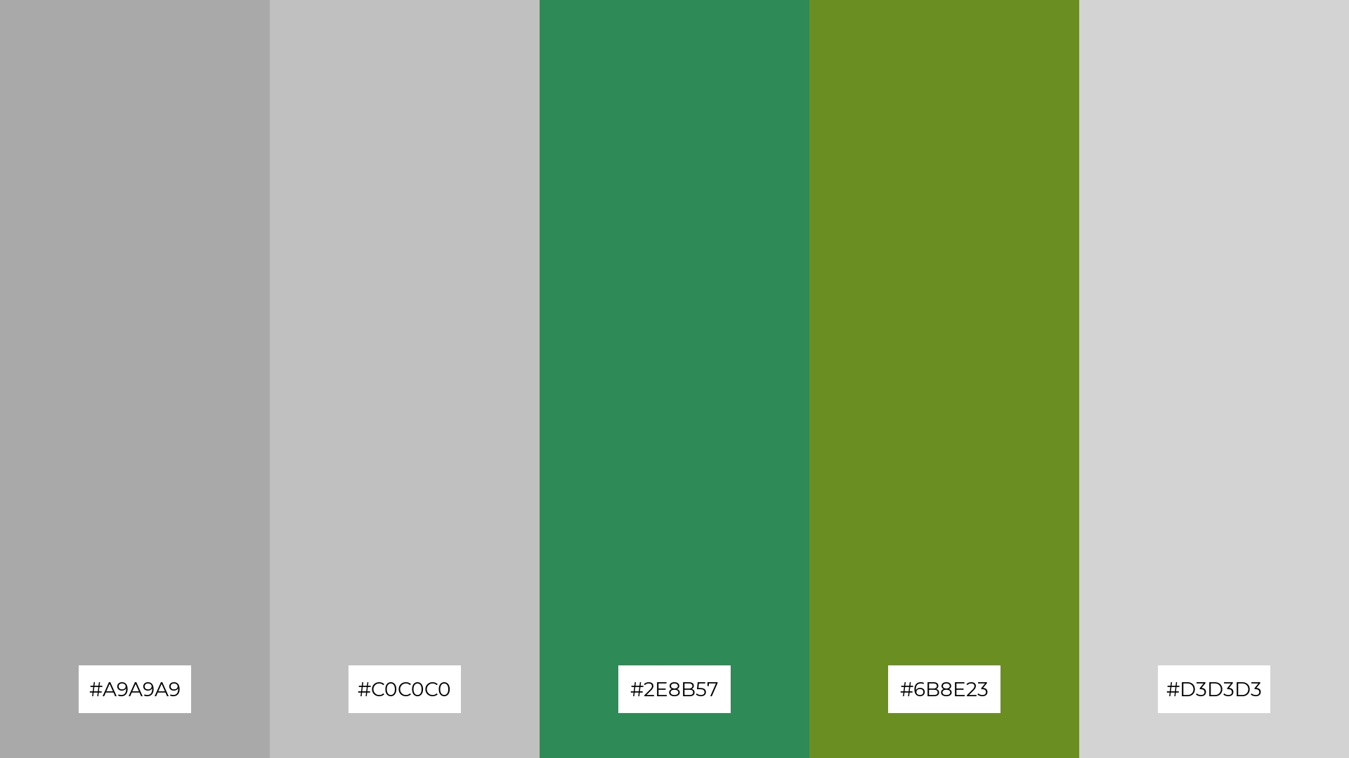
The ‘Industrial Vibes’ color palette, with its blend of warm greens (#2E8B57, #6B8E23) and cool grays (#A9A9A9, #C0C0C0, #D3D3D3), creates a balanced and grounded mood that evokes a sense of rugged sophistication.
This palette is perfect for artisan product branding, where the earthy greens can highlight the handcrafted quality of the products, while the cool grays add a touch of modernity and refinement, making the overall design both authentic and contemporary.
14) Soft Silver

The ‘Soft Silver’ color palette, with its blend of silver (#C0C0C0), light gray (#D3D3D3), papaya whip (#FFEFD5), peach puff (#FFDAB9), and light steel blue (#B0C4DE), creates a dynamic interplay of soft and warm tones that can evoke both subtle elegance and bold vibrancy.
This versatile palette is perfect for restaurant menus, where the gentle hues can enhance the dining experience by creating a welcoming and sophisticated atmosphere, making the presentation of dishes visually appealing and appetizing.
15) Elegant Grayscale
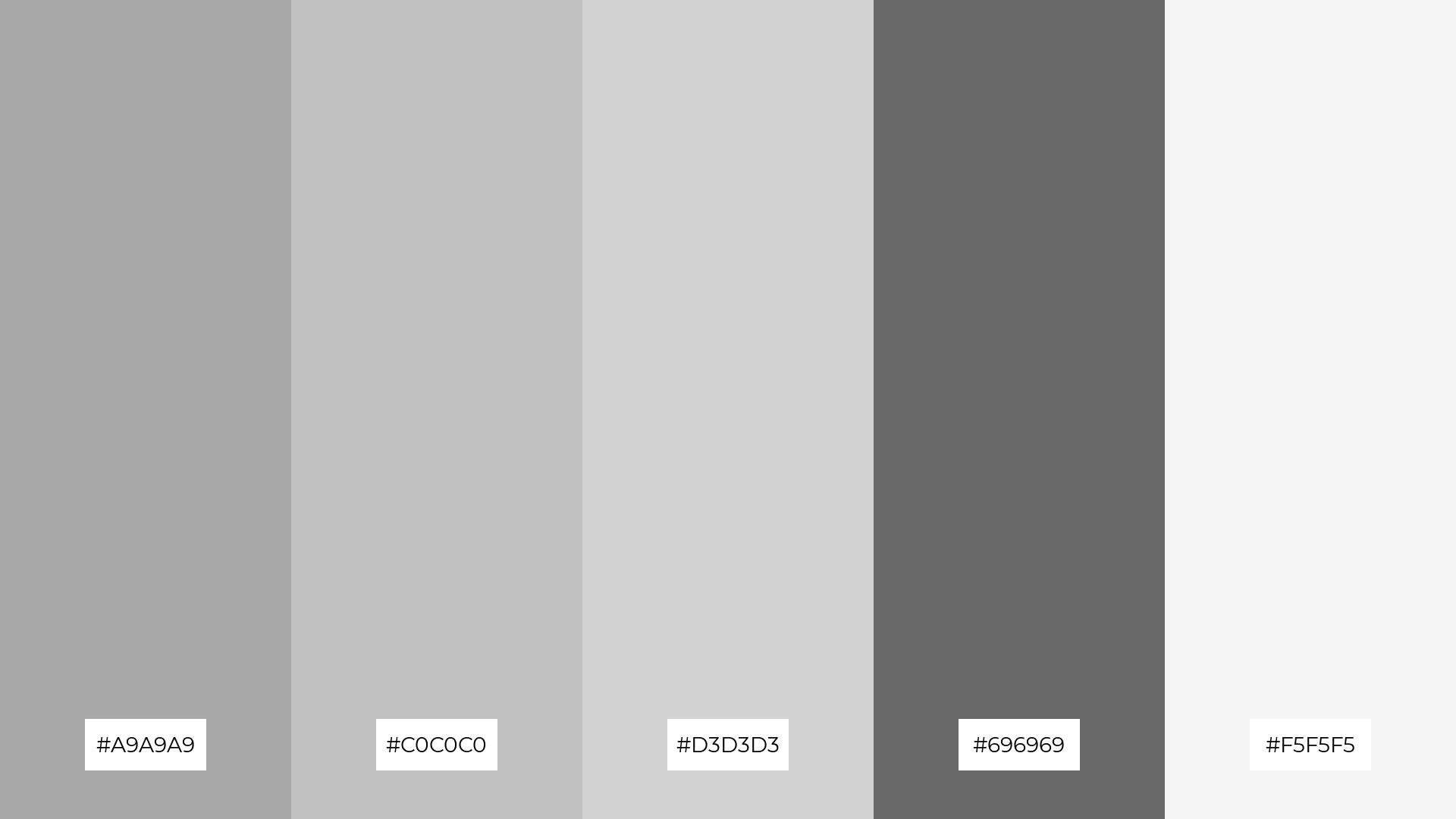
The ‘Elegant Grayscale’ color palette, with its blend of dark gray (#A9A9A9), silver (#C0C0C0), light gray (#D3D3D3), dim gray (#696969), and white smoke (#F5F5F5), conveys a sense of harmony through its cohesive and balanced tones, creating a unified and sophisticated look.
This palette is ideal for tech startups aiming to project a modern and professional image, or for cozy interior makeovers where the subtle contrasts can add depth and warmth to living spaces, making them feel both inviting and stylish.
How to Use Gray Silver Patterns in Design
Gray and silver color palettes can transform home decor by creating a serene and sophisticated atmosphere. Use these neutral tones as a base and add pops of color through accessories like cushions, rugs, or artwork to create a balanced and inviting space.
In marketing materials, gray and silver can convey professionalism and modernity. Pair these hues with bold accent colors to highlight key messages and draw attention to important elements, ensuring your design stands out while maintaining a sleek and polished look.
For clothing design, gray and silver offer a versatile foundation that can be dressed up or down. Combine these shades with vibrant patterns or textures to create stylish and contemporary outfits that appeal to a wide range of tastes.
Ready to experiment with gray and silver color palettes in your next design project? Try creating stunning palettes using Piktochart and elevate your designs today!


