Graffiti, an art form that thrives on the streets, is as much about color as it is about expression. The vibrant hues and bold contrasts in graffiti color palettes play a crucial role in conveying the artist’s message and style.
From neon splashes to muted tones, the choice of colors can transform a simple wall into a captivating canvas. Understanding these palettes can offer deeper insights into the world of street art and its cultural significance.
Tips For Creating Graffiti Color Palettes
Designing a graffiti color palette requires a keen eye for detail and a sense of balance.
- Balance Bold and Subtle Colors: Use a mix of vibrant and muted tones to create depth and interest in your artwork.
- Match Complementary Shades: Pair colors that are opposite on the color wheel to make your designs pop.
- Use a Limited Color Scheme: Stick to a few key colors to maintain a cohesive look and avoid overwhelming the viewer.
- Incorporate Neutral Tones: Add blacks, whites, and grays to balance out brighter colors and provide contrast.
- Experiment with Gradients: Blend colors smoothly to create dynamic transitions and add a sense of movement.
- Consider the Background: Ensure your color choices stand out against the wall or surface you are working on.
15 Graffiti Color Palettes
1) Urban Jungle
The ‘Urban Jungle’ palette, with its earthy greens, vibrant yellows, and warm oranges, evokes a sense of natural vitality and urban energy.
In interior decor, this palette can transform a living space into a lively yet grounded environment, with the bold hues interacting harmoniously to create a cohesive and inviting atmosphere.
2) Neon Dreams
The ‘Neon Dreams’ palette, with its electric pinks and vibrant blues, exudes a sense of high energy and modernity, making it perfect for designs that aim to captivate and excite.
This palette would excel in digital branding for tech startups or product packaging for trendy consumer electronics, where the bold colors can draw attention and convey innovation.
3) Street Vibes
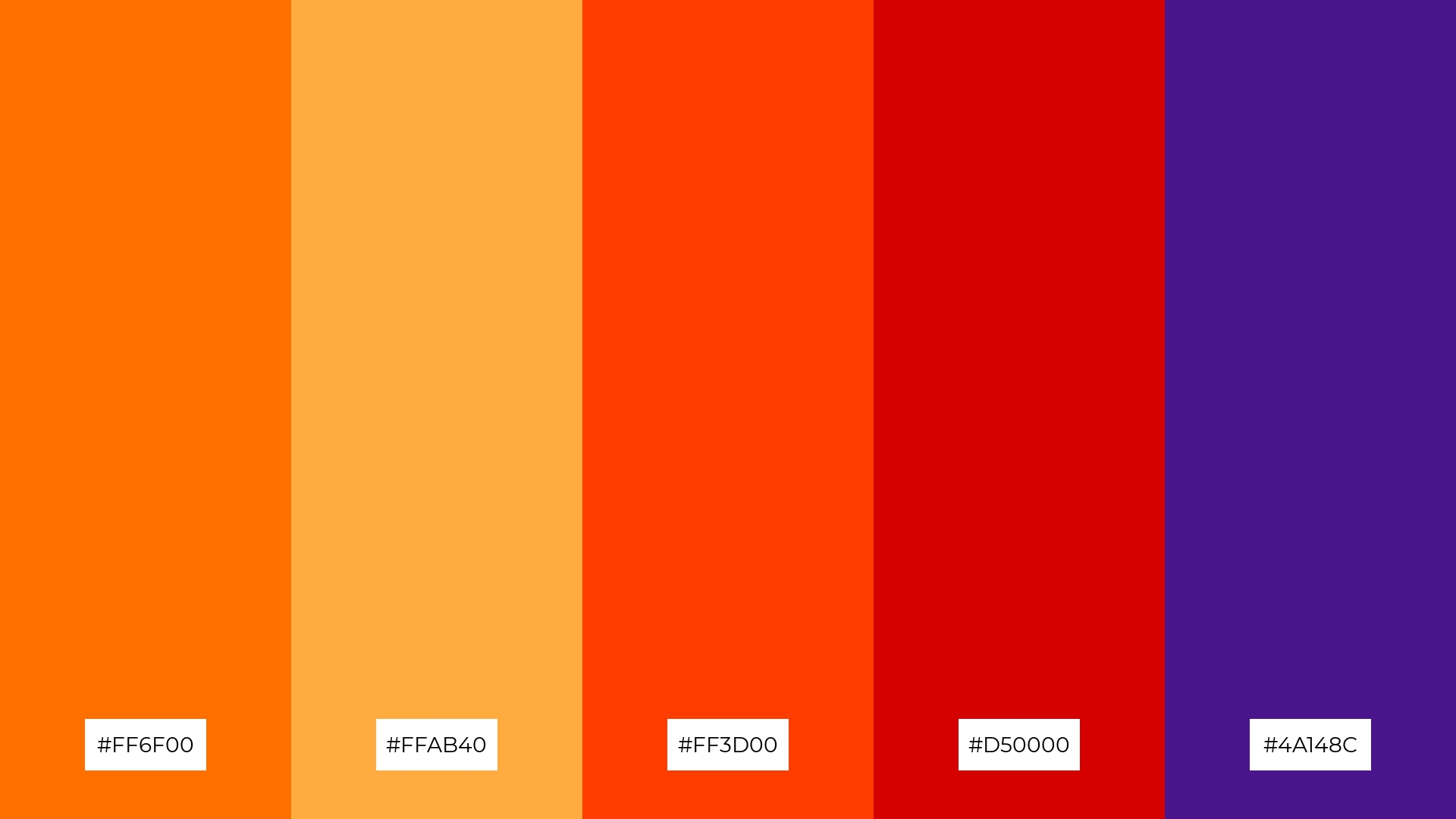
The ‘Street Vibes’ palette, featuring dominant colors like fiery orange (#FF6F00), warm amber (#FFAB40), and intense red (#D50000), creates a vibrant and energetic visual experience.
This palette’s harmony, achieved through the bold interplay of these hues, makes it ideal for wellness branding, where the dynamic colors can evoke feelings of vitality and enthusiasm.
4) Rebel Spirit
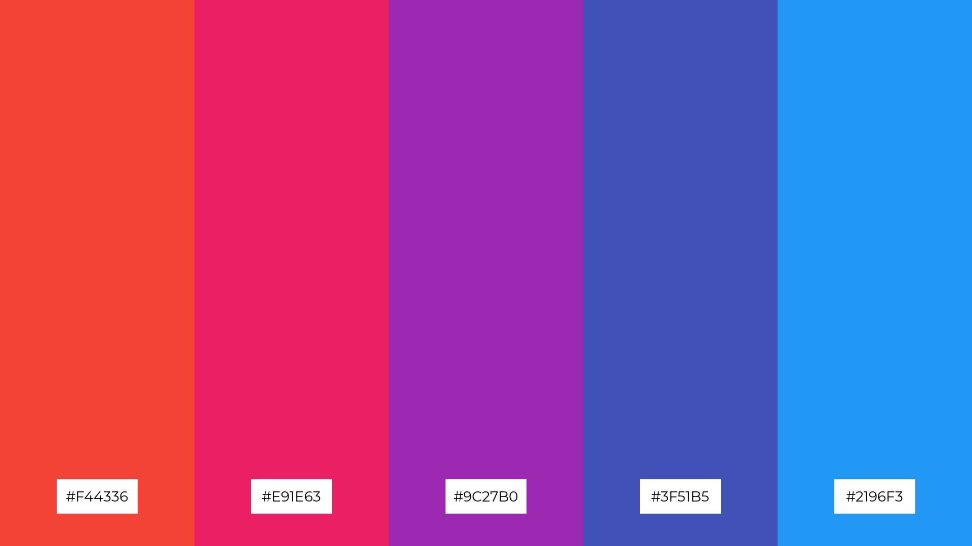
The ‘Rebel Spirit’ palette, with its mix of soft pinks and bold purples, offers a balanced yet striking visual experience that can set a distinct and memorable mood.
This palette is ideal for creating inviting retail spaces or modern web designs, where the interplay of these colors can draw attention and create a dynamic atmosphere.
5) Graffiti Sunset
The ‘Graffiti Sunset’ palette, with its blend of warm oranges, vibrant reds, and sunny yellows, combined with refreshing greens and calming blues, creates a harmonious yet dynamic ambiance that evokes both energy and tranquility.
This versatile palette is perfect for luxury fashion campaigns, where the bold and contrasting colors can highlight the elegance and sophistication of high-end designs, making a striking visual impact.
6) Electric Pulse
The ‘Electric Pulse’ palette, with its cool blues and purples contrasted by vibrant pinks, creates a sophisticated yet playful mood that can captivate and engage viewers.
This palette is ideal for bold event designs, where the dynamic interplay of these colors can energize the atmosphere and leave a lasting impression on attendees.
7) Urban Decay
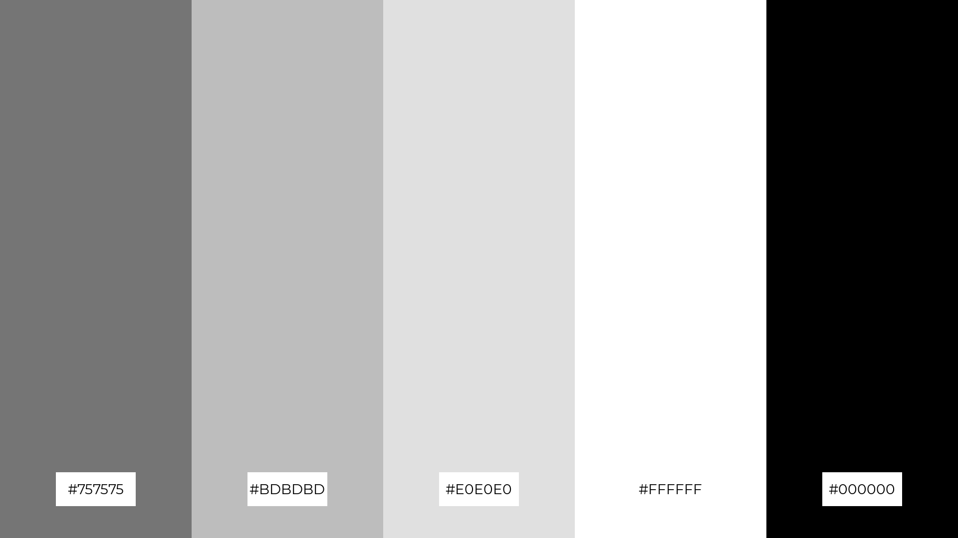
The ‘Urban Decay’ palette, with its contrasting elements of deep blacks, crisp whites, and varying shades of gray, creates a striking visual interest through its stark and minimalist aesthetic.
This palette is perfect for creative projects like magazine layouts or artistic websites, where the interplay of these neutral tones can enhance readability and provide a modern, sophisticated look.
8) Color Explosion
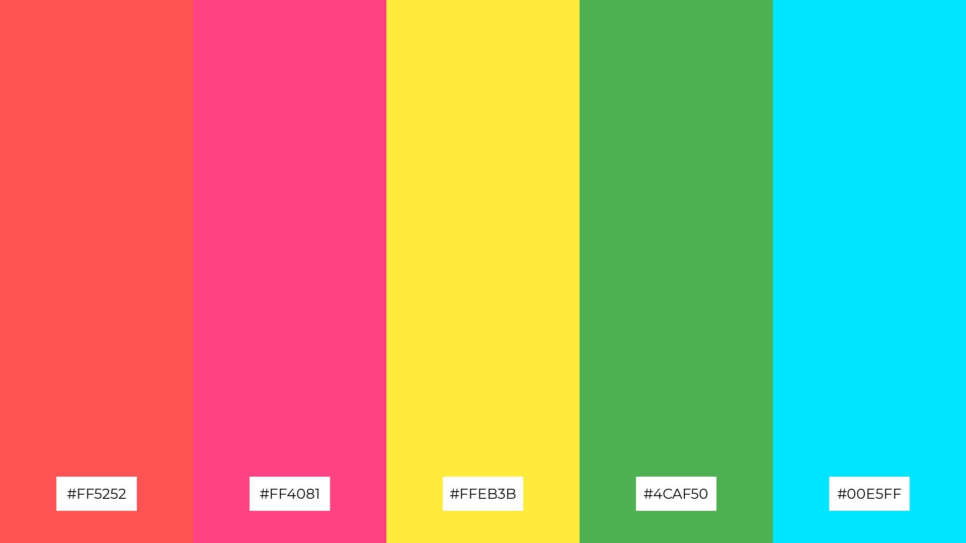
The ‘Color Explosion’ palette, with its mix of fiery reds (#FF5252), vibrant pinks (#FF4081), and sunny yellows (#FFEB3B), can create an exhilarating and energetic atmosphere, perfect for vibrant marketing campaigns that aim to capture attention and evoke excitement.
Conversely, the inclusion of calming greens (#4CAF50) and refreshing blues (#00E5FF) can transform the same palette into a soothing and tranquil combination, making it ideal for spa branding where a sense of relaxation and rejuvenation is paramount.
9) Graffiti Night
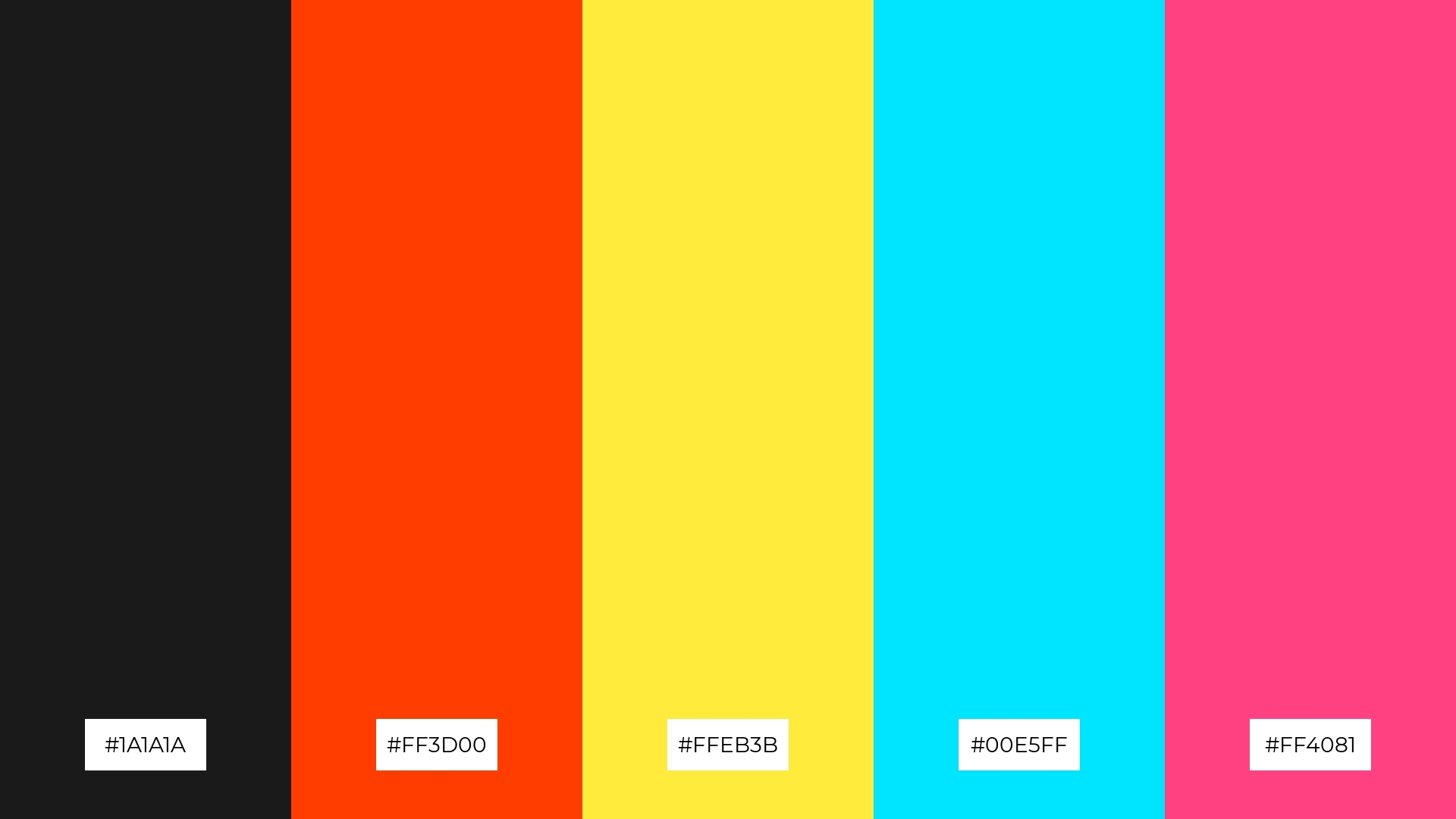
The ‘Graffiti Night’ palette, with its mix of bright tones like vibrant orange (#FF3D00), sunny yellow (#FFEB3B), and refreshing blue (#00E5FF), creates a lively and energetic mood that can invigorate any space.
This blend of colors is ideal for seasonal promotions, where the dynamic interplay of these hues can capture attention and evoke a sense of excitement and celebration.
10) Wild Style
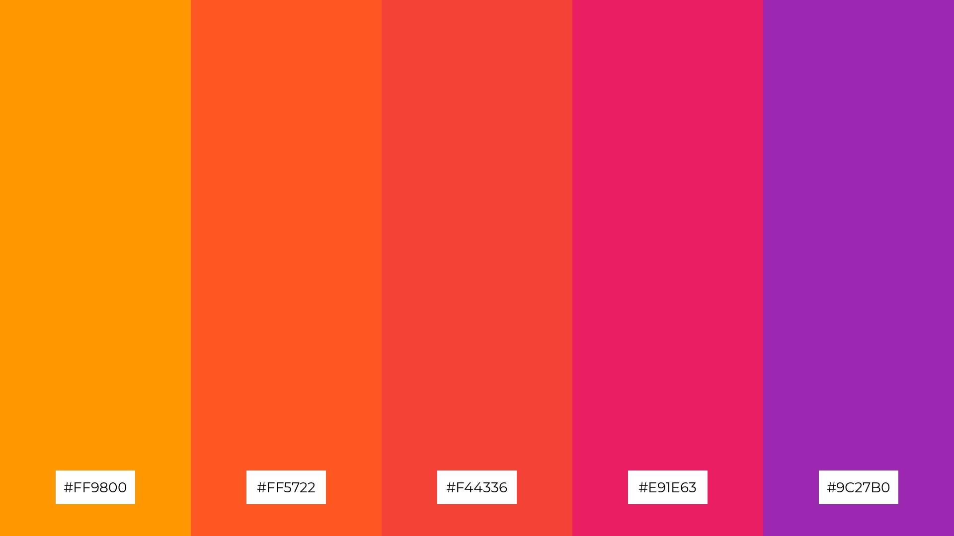
The ‘Wild Style’ palette, with its progression from vibrant orange (#FF9800) to deep purple (#9C27B0), creates a dynamic visual flow that evokes feelings of excitement and creativity.
This energetic combination is perfect for lifestyle branding or tech product packaging, where the bold and lively colors can capture attention and convey a sense of innovation and joy.
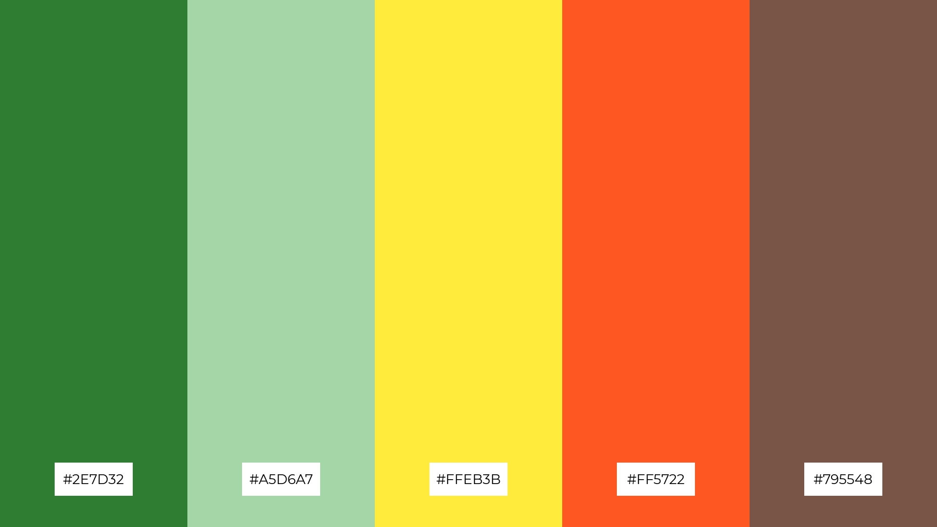
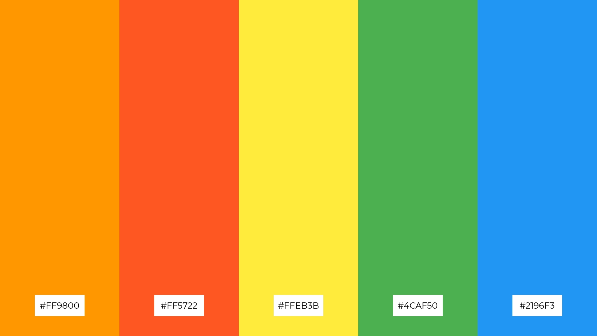
11) Urban Oasis
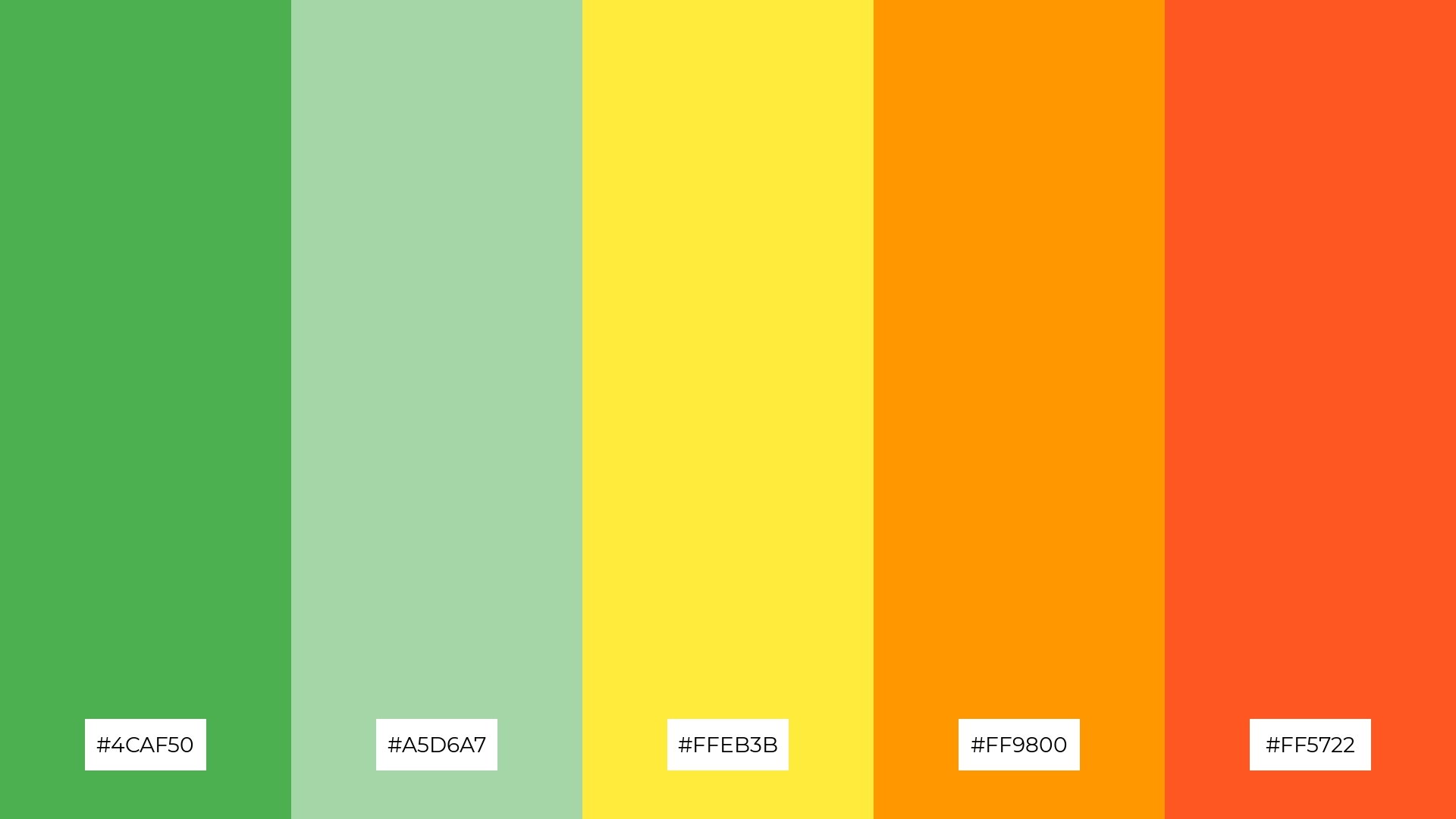
The ‘Urban Oasis’ palette, with its mix of refreshing greens (#4CAF50, #A5D6A7), sunny yellow (#FFEB3B), and warm oranges (#FF9800, #FF5722), creates a welcoming and vibrant atmosphere that can make any design feel inviting and lively.
This palette shines in boutique interiors, where the harmonious blend of these tones can create a cozy yet dynamic environment, perfect for attracting and retaining customers.
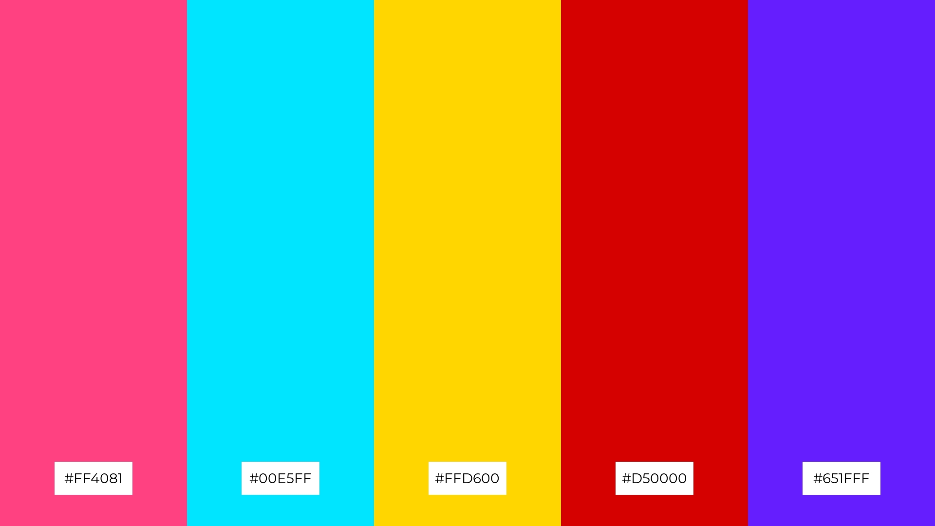
12) Vivid Contrast
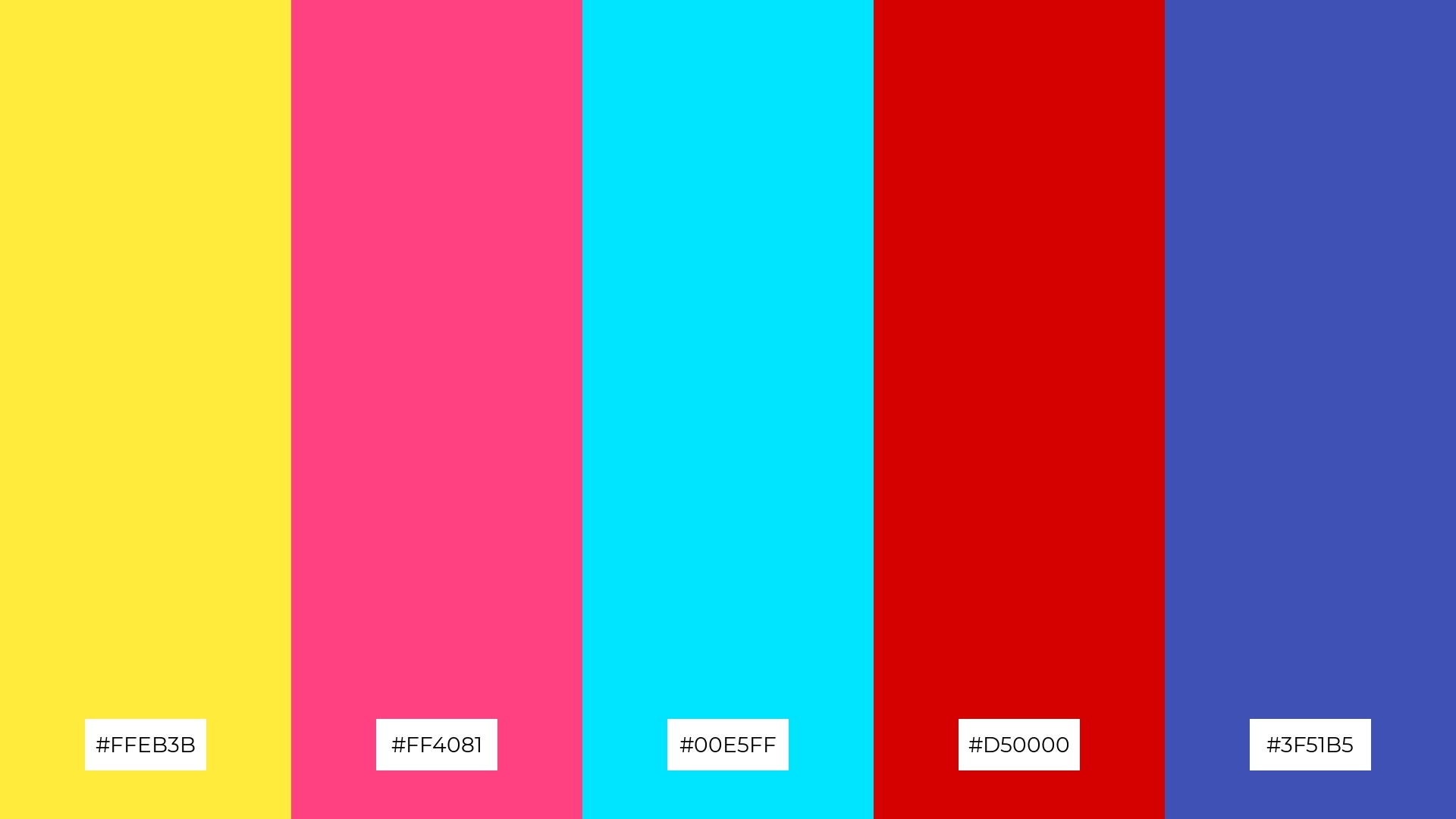
The ‘Vivid Contrast’ palette, with its bright yellow (#FFEB3B), vibrant pink (#FF4081), refreshing blue (#00E5FF), intense red (#D50000), and deep blue (#3F51B5), creates a striking visual balance through the interplay of warm and cool tones.
This dynamic combination is perfect for casual apparel lines, where the bold and contrasting colors can make a statement and appeal to a youthful, energetic audience.
13) Graffiti Glow
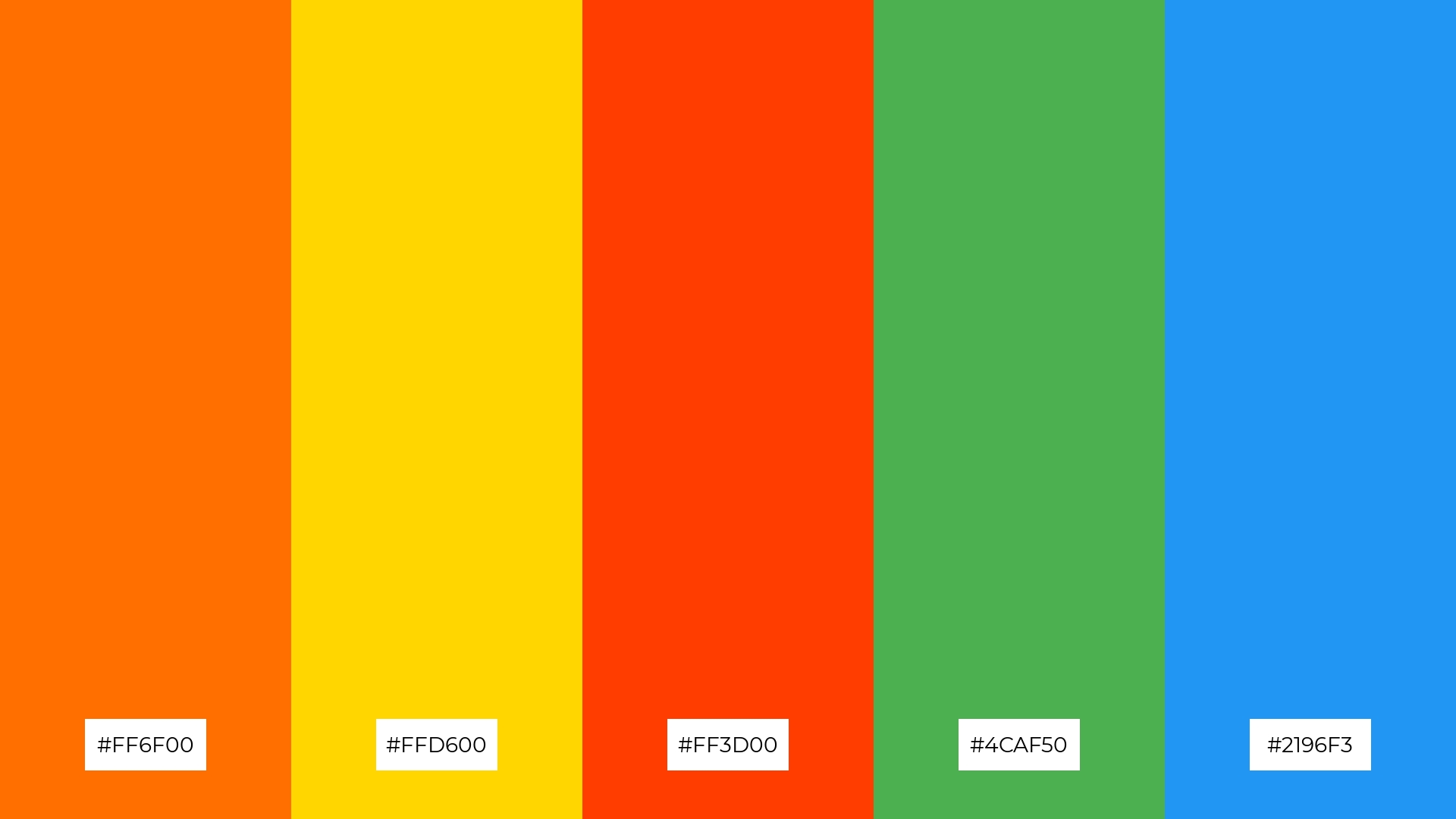
The ‘Graffiti Glow’ palette, with its blend of warm tones like fiery orange (#FF6F00) and sunny yellow (#FFD600) alongside cool hues like refreshing green (#4CAF50) and vibrant blue (#2196F3), creates a balanced and invigorating mood that captivates and energizes.
This dynamic combination is perfect for artisan product branding, where the interplay of these colors can highlight the craftsmanship and creativity of handmade goods, making them stand out in a crowded market.
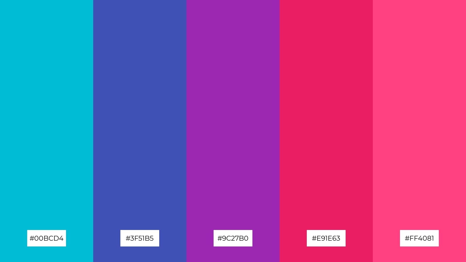
14) Chromatic Chaos
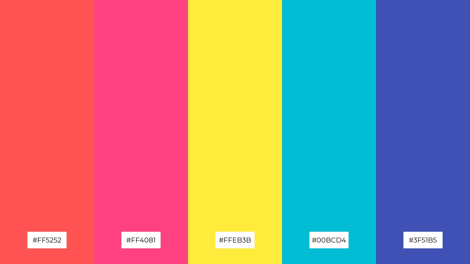
The ‘Chromatic Chaos’ palette, with its fiery reds (#FF5252), vibrant pinks (#FF4081), sunny yellows (#FFEB3B), refreshing blues (#00BCD4), and deep blues (#3F51B5), creates a dynamic interplay of bold and subtle hues that can captivate and energize any visual design.
This striking combination is perfect for festival marketing, where the vibrant and contrasting colors can draw attention and evoke a sense of excitement and celebration.
15) Urban Palette
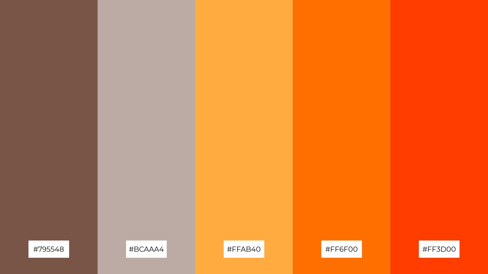
The ‘Urban Palette’ (#795548, #BCAAA4, #FFAB40, #FF6F00, #FF3D00) conveys a sense of harmony through its balanced mix of earthy browns and vibrant oranges, creating a cohesive and inviting visual experience.
This palette is ideal for cozy interior makeovers, where the warm tones can create a welcoming atmosphere, or for tech startups, where the bold colors can convey innovation and energy.
How to Use Graffiti Patterns in Design
Graffiti color palettes can transform home decor by adding vibrant energy and unique character to any space. For a bold statement, use the ‘Urban Jungle’ palette to create an accent wall that brings a touch of nature indoors. Alternatively, the ‘Graffiti Sunset’ palette can infuse warmth and tranquility into living areas, making them feel both dynamic and inviting.
In marketing materials, graffiti color palettes can capture attention and convey a brand’s personality. The ‘Neon Dreams’ palette is perfect for tech startups looking to stand out with high-energy visuals, while the ‘Color Explosion’ palette can make promotional campaigns pop with excitement and vibrancy. For a more sophisticated look, the ‘Urban Decay’ palette offers a minimalist yet striking aesthetic.
Clothing designs can also benefit from the dynamic nature of graffiti color palettes. The ‘Wild Style’ palette can add a sense of creativity and innovation to casual apparel lines, making them appealing to a youthful audience. Meanwhile, the ‘Vivid Contrast’ palette can create eye-catching pieces that stand out in any wardrobe.
Ready to bring these vibrant palettes to life in your designs? Try creating your own graffiti color palettes using Piktochart and see how they can transform your projects.


