Gold color palettes are a timeless choice in design, exuding elegance and sophistication. Whether used in branding, web design, or infographics, gold hues can elevate the visual appeal of any project.
From shimmering metallics to muted gold tones, these palettes offer versatility and a touch of luxury. Discover how to incorporate gold into your designs to create stunning and impactful visuals.
Tips For Creating Gold Color Palettes
Designing with gold can be both exciting and challenging, but with the right approach, you can create visually stunning and versatile color palettes.
- Balance with Neutrals: Pair gold with neutral colors like white, black, or gray to create a balanced and sophisticated look.
- Complementary Shades: Use complementary colors such as deep blues or rich purples to make the gold elements pop and add depth to your design.
- Subtle Accents: Incorporate gold as an accent color rather than the main hue to avoid overwhelming the design. This can be achieved through borders, icons, or text highlights.
- Texture and Finish: Experiment with different textures and finishes, such as matte or metallic gold, to add dimension and interest to your palette.
- Versatility: Ensure your gold palette is versatile by testing it across various mediums, including digital screens and print materials, to maintain consistency and impact.
- Contrast and Readability: Pay attention to contrast and readability, especially when using gold for text. Ensure there is enough contrast between the gold and background colors to keep the text legible.
15 Gold Color Palettes
1) Golden Sunrise

The ‘Golden Sunrise’ palette evokes a warm and invigorating mood, with its gradient of gold to deep crimson creating a sense of energy and passion.
Perfect for interior decor, this palette can transform a living space into a vibrant and cozy retreat, with each color seamlessly blending to enhance the overall ambiance.
2) Royal Gold

The ‘Royal Gold’ palette, with its rich hues of gold, bronze, and deep indigo, evokes a sense of opulence and regality, making it perfect for high-end product packaging that aims to convey luxury and exclusivity.
In digital branding, this palette can create a striking and memorable visual identity, combining the warmth of gold with the calmness of navy blue to establish a brand that feels both prestigious and approachable.
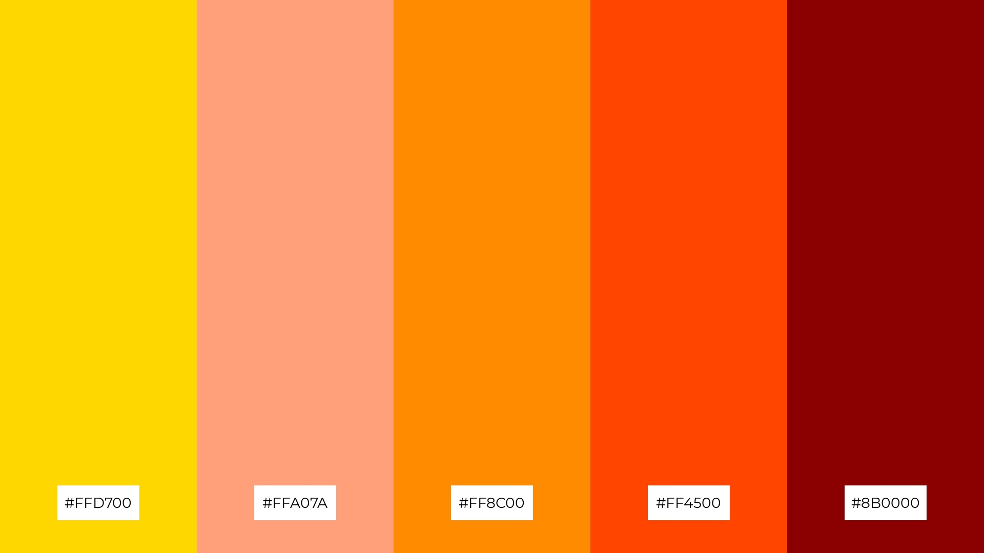
3) Autumn Gold
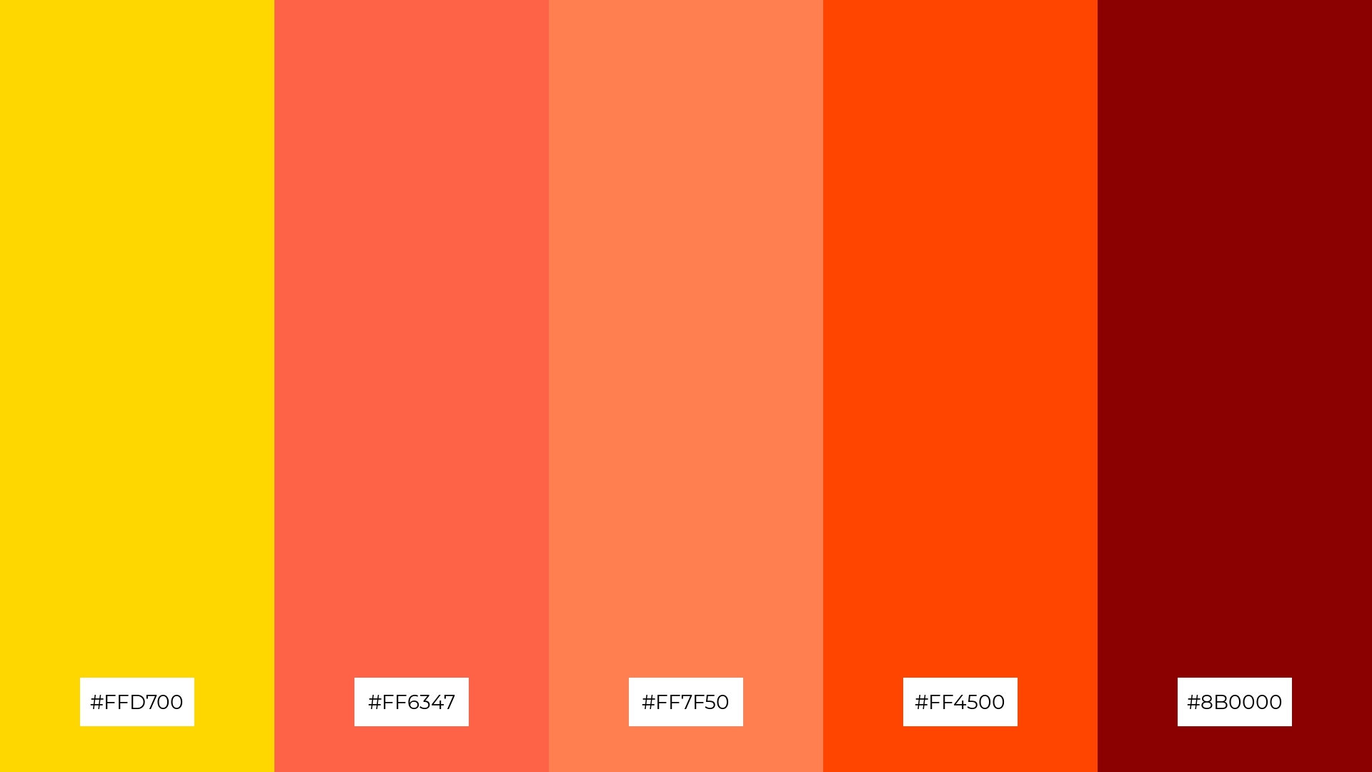
The ‘Autumn Gold’ palette features dominant colors such as vibrant gold (#FFD700), warm tomato (#FF6347), and rich coral (#FF7F50), creating a harmonious blend that evokes the essence of fall.
Ideal for wellness branding, this palette’s warm and inviting tones can foster a sense of comfort and tranquility, making it perfect for creating serene and eco-friendly interior spaces.
4) Golden Sands
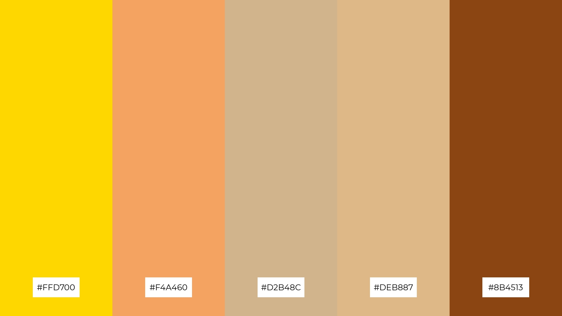
The ‘Golden Sands’ palette, with its blend of soft tans and bold golds, offers a balanced and distinct mood that can evoke both warmth and sophistication.
Ideal for creating inviting retail spaces, this palette can also be used in modern web designs to provide a welcoming and stylish atmosphere.
5) Golden Forest
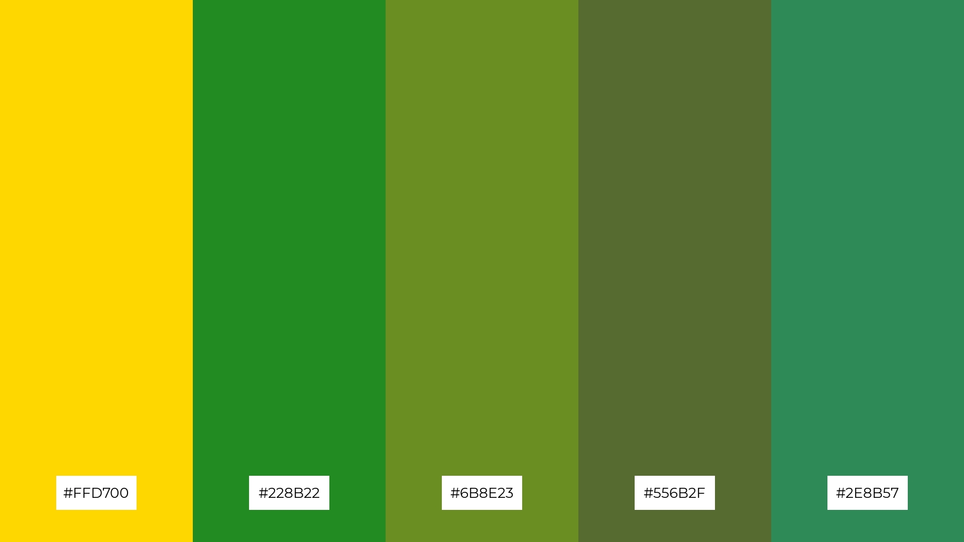
The ‘Golden Forest’ palette, with its blend of vibrant gold (#FFD700) and lush greens (#228B22, #6B8E23, #556B2F, #2E8B57), creates a serene and natural ambiance, reminiscent of a tranquil forest bathed in sunlight.
Perfect for wedding themes, this palette can transform any venue into an enchanting woodland setting, combining the elegance of gold with the calming effect of green to create a magical and memorable atmosphere.
6) Golden Twilight
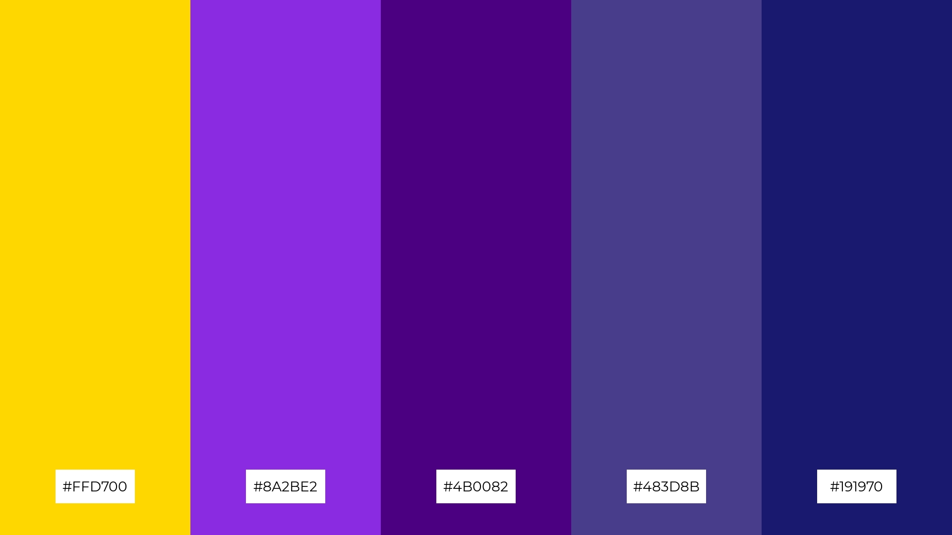
The ‘Golden Twilight’ palette, with its blend of vibrant gold (#FFD700) and deep purples (#8A2BE2, #4B0082, #483D8B, #191970), creates a striking contrast that exudes sophistication and mystery, making it ideal for high-end minimalistic branding that aims to leave a lasting impression.
This palette’s rich and bold hues can also be leveraged in event designs, where the interplay of gold and purple tones can set a dramatic and luxurious mood, perfect for evening galas or upscale parties.
7) Golden Rose
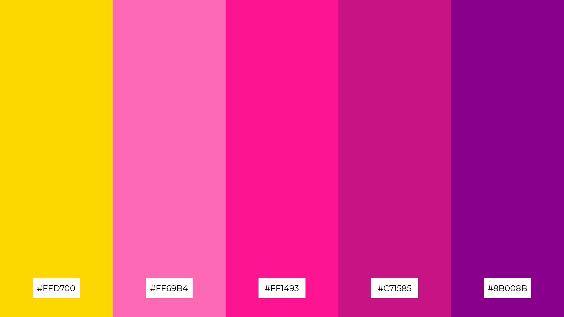
The ‘Golden Rose’ palette, with its blend of vibrant gold (#FFD700) and varying shades of pink and magenta (#FF69B4, #FF1493, #C71585, #8B008B), creates a striking contrast that adds depth and visual interest to any design.
Ideal for creative projects like magazine layouts or artistic websites, this palette’s dynamic interplay of warm gold and bold pinks can captivate audiences and enhance the overall aesthetic appeal.
8) Golden Ocean
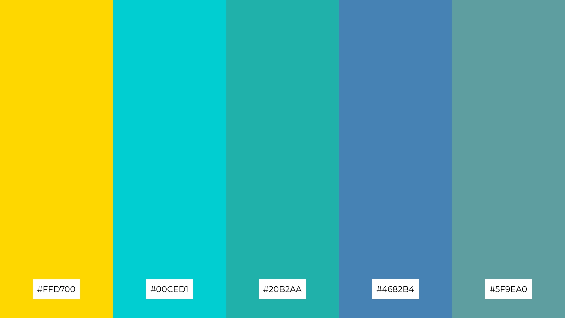
The ‘Golden Ocean’ palette, with its blend of vibrant gold (#FFD700) and soothing aqua tones (#00CED1, #20B2AA, #4682B4, #5F9EA0), can evoke a sense of calm when the cooler shades dominate, creating a tranquil and refreshing atmosphere.
Conversely, when the gold takes center stage, this palette can infuse a design with energy and excitement, making it perfect for vibrant marketing campaigns that aim to capture attention and convey a dynamic message.
9) Golden Desert
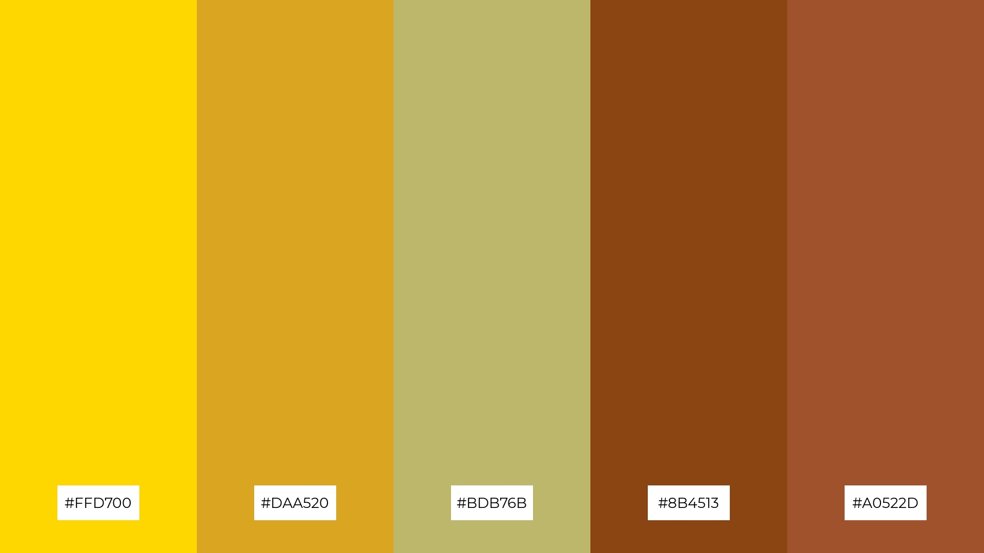
The ‘Golden Desert’ palette, with its softer tones of gold (#FFD700) and khaki (#BDB76B), creates a warm and inviting atmosphere that can evoke the serene beauty of a sunlit desert landscape.
Ideal for seasonal promotions, this blend of brighter and muted hues can infuse designs with a sense of warmth and nostalgia, making it perfect for autumn-themed marketing campaigns or cozy home decor projects.
10) Golden Harvest
The ‘Golden Harvest’ palette, with its gradient from vibrant gold (#FFD700) to deep crimson (#8B0000), creates a visual flow that evokes feelings of warmth, joy, and energy, making it perfect for designs that aim to uplift and inspire.
Ideal for lifestyle branding, this palette can infuse tech product packaging with a sense of innovation and excitement, capturing the attention of consumers and conveying a message of dynamic progress and creativity.
11) Golden Night
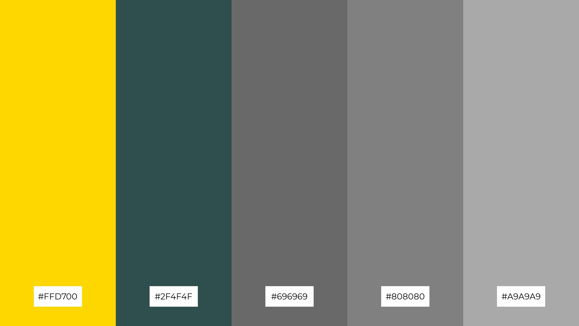
The ‘Golden Night’ palette, with its blend of vibrant gold (#FFD700) and various shades of gray (#2F4F4F, #696969, #808080, #A9A9A9), creates a dramatic yet welcoming effect by combining the warmth of gold with the sophistication of gray tones.
This palette shines in luxury e-commerce sites, where the contrast between gold and gray can highlight premium products and create an elegant, high-end shopping experience.
12) Golden Meadow
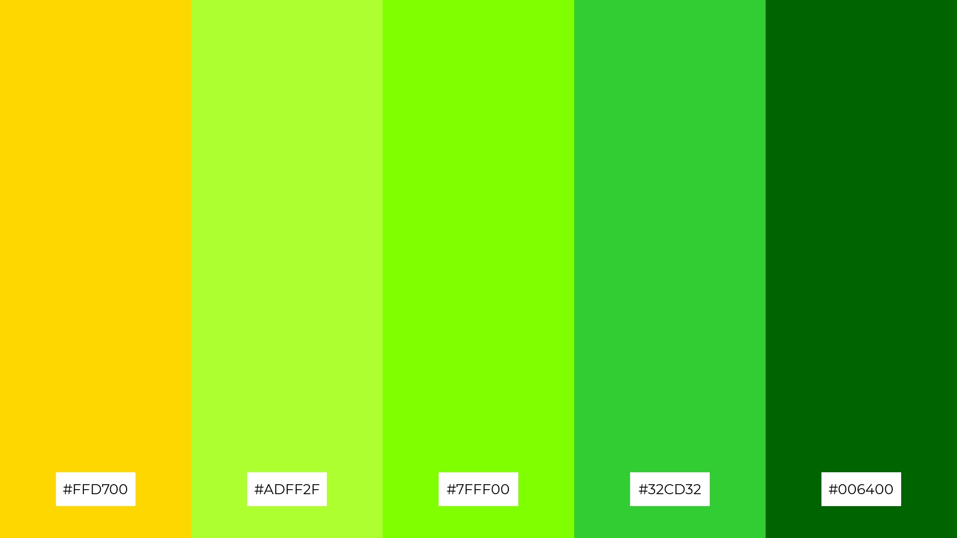
The ‘Golden Meadow’ palette, with its vibrant gold (#FFD700) and varying shades of green (#ADFF2F, #7FFF00, #32CD32, #006400), creates a harmonious balance where the gold adds warmth and the greens provide a refreshing contrast, evoking a sense of natural elegance.
Ideal for casual apparel lines, this palette can infuse clothing designs with a lively yet sophisticated vibe, making them perfect for both everyday wear and stylish outdoor activities.
13) Golden Sunset
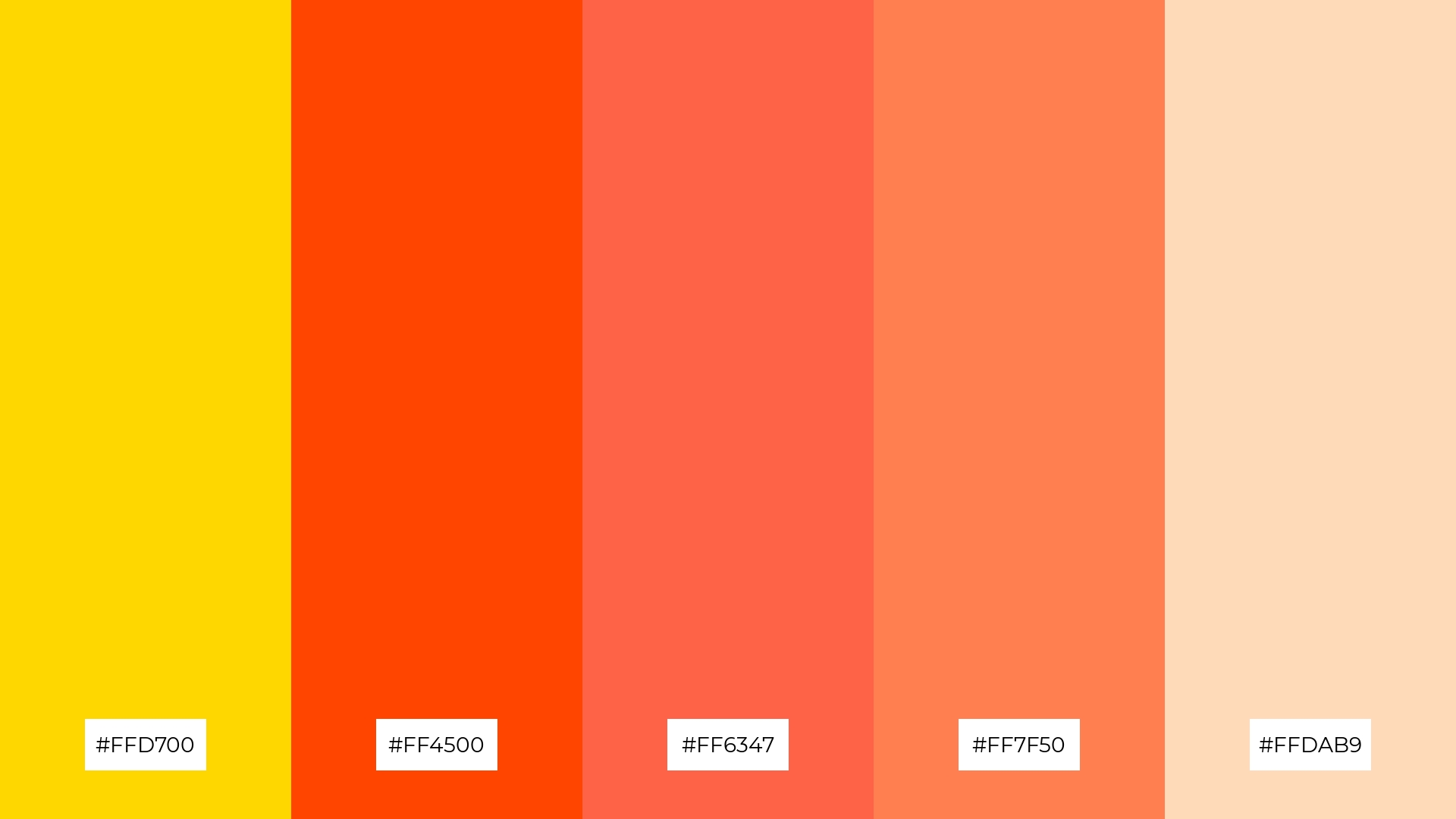
The ‘Golden Sunset’ palette, with its blend of warm gold (#FFD700) and cool peach (#FFDAB9) tones, creates a harmonious and inviting mood that evokes the serene beauty of a sunset.
Ideal for artisan product branding, this palette can infuse packaging with a sense of handcrafted quality and warmth, making it perfect for products that aim to convey authenticity and charm.
14) Golden Sky
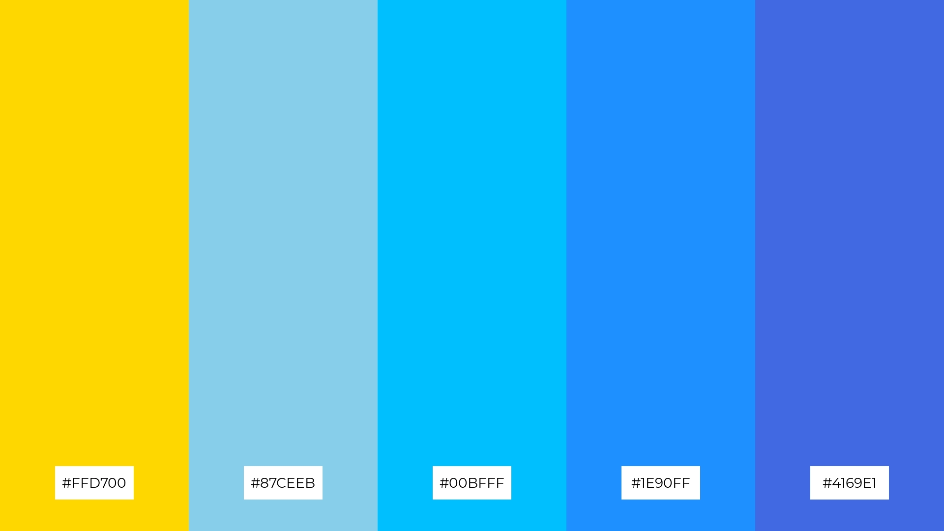
The ‘Golden Sky’ palette, with its vibrant gold (#FFD700) and varying shades of blue (#87CEEB, #00BFFF, #1E90FF, #4169E1), creates a dynamic interplay of warmth and coolness, making it both bold and versatile.
Ideal for festival marketing, this palette can capture attention and convey a sense of excitement and celebration, with the gold elements adding a touch of luxury and the blues providing a refreshing contrast.
15) Golden Elegance
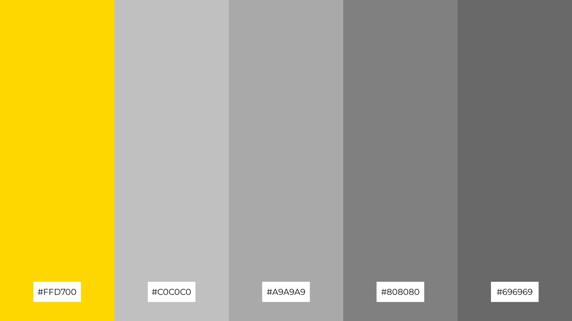
The ‘Golden Elegance’ palette, with its blend of vibrant gold (#FFD700) and varying shades of gray (#C0C0C0, #A9A9A9, #808080, #696969), can convey a sense of harmony when the gold is used as an accent against the more subdued gray tones, creating a balanced and sophisticated look.
Ideal for tech startups, this palette can infuse office spaces with a modern and sleek aesthetic, while also being perfect for cozy interior makeovers where the gold elements add warmth and the grays provide a calming backdrop.
How to Use Gold Patterns in Design
Gold color palettes can transform home decor by adding a touch of luxury and warmth. Use gold accents in furniture, lighting, and accessories to create a cohesive and elegant look. Pairing gold with neutral tones like beige or white can enhance the overall sophistication of your space.
In marketing materials, gold can be used to highlight key information and draw attention to important elements. Incorporate gold in your logos, headers, and call-to-action buttons to create a sense of exclusivity and prestige. Combining gold with deep blues or purples can make your design stand out and leave a lasting impression.
For clothing design, gold can add a glamorous and stylish touch. Use gold threads or embellishments to accentuate details and create eye-catching pieces. Pairing gold with darker fabrics like black or navy can create a striking contrast that exudes elegance and sophistication.
Ready to elevate your designs with stunning gold palettes? Try creating your own using Piktochart and see how gold can transform your projects.


