Blue and gold color palettes are a timeless combination that exudes elegance and sophistication. This pairing can transform any design into a visually stunning masterpiece.
Whether used in digital graphics, print media, or interior design, the blend of blue and gold offers a versatile and striking aesthetic. These colors work harmoniously to create a balance of calm and luxury.
Tips For Creating Blue Gold Color Palettes
Designing with blue and gold can elevate your visuals, but it requires a thoughtful approach to achieve the perfect balance.
- Balance the Colors: Use blue as the dominant color and gold as an accent to avoid overwhelming the design. This creates a focal point and adds a touch of elegance.
- Complementary Shades: Pair blue and gold with neutral tones like white, gray, or beige to soften the overall look and make the primary colors stand out.
- Versatile Designs: Experiment with different shades of blue, from navy to sky blue, and various gold tones, from metallic to matte, to find the perfect combination for your project.
- Texture and Patterns: Incorporate textures and patterns, such as gold foil or blue gradients, to add depth and interest to your design.
- Consistent Theme: Ensure that the blue and gold palette aligns with the overall theme and message of your design to maintain coherence and impact.
15 Blue Gold Color Palettes
1) Ocean Sunset
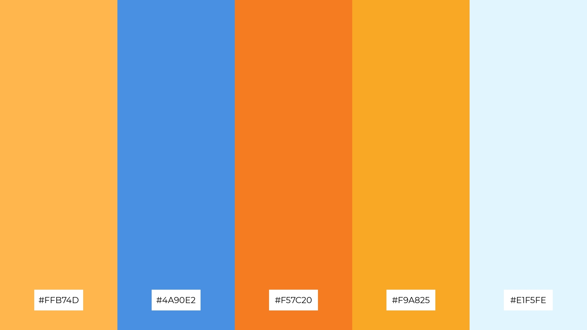
The ‘Ocean Sunset’ color palette evokes a serene yet vibrant mood, blending the calming blues with the warm, energizing hues of sunset to create a harmonious and uplifting atmosphere.
Perfect for interior decor, this palette can transform a living space into a tranquil retreat, with the blues providing a soothing backdrop and the sunset tones adding pops of warmth and energy.
2) Royal Elegance
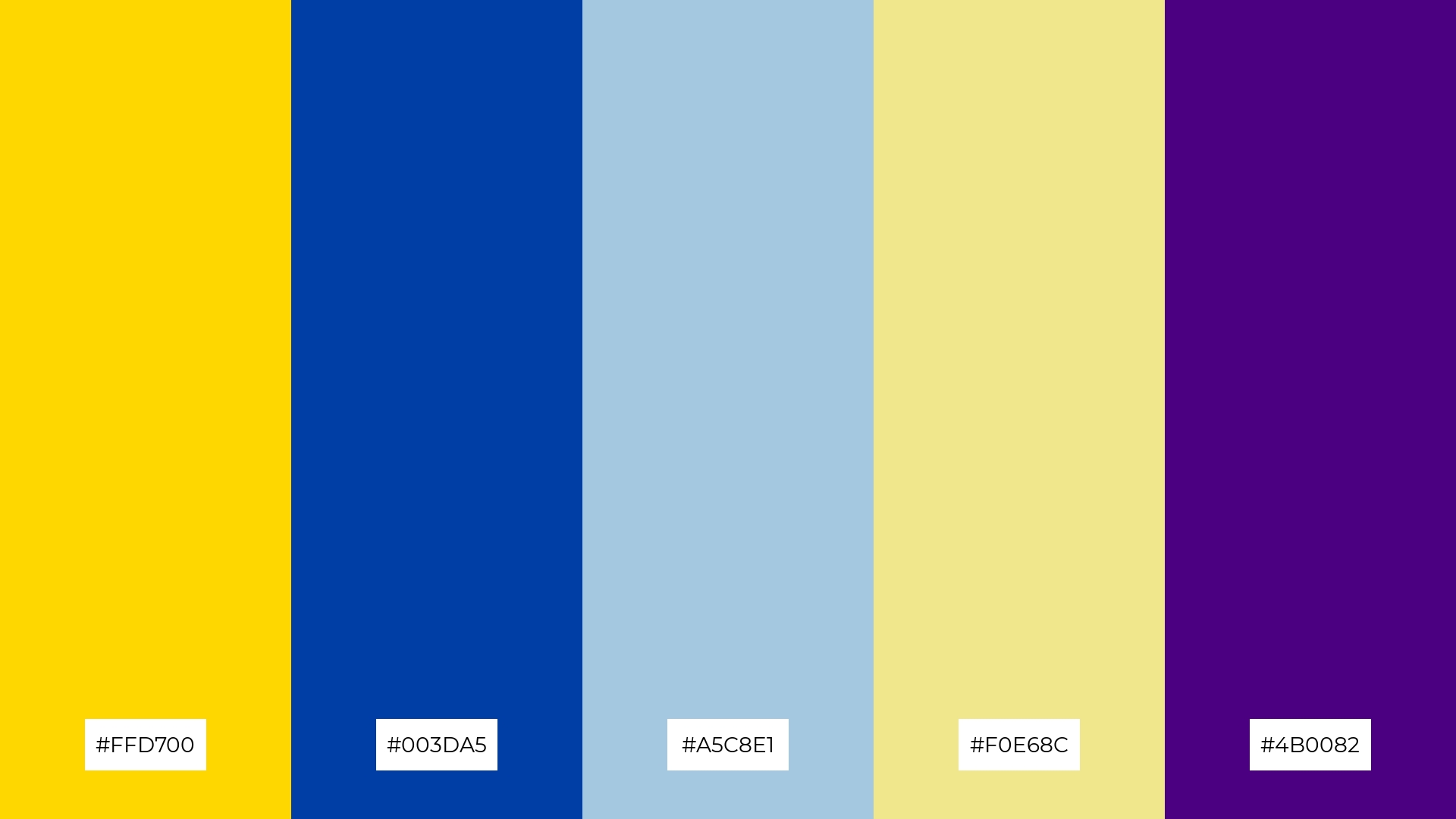
The ‘Royal Elegance’ color palette, with its rich gold (#FFD700) and deep blue (#003DA5), evokes a sense of luxury and sophistication, making it perfect for high-end product packaging.
In digital branding, the combination of soft blue (#A5C8E1), khaki (#F0E68C), and indigo (#4B0082) creates a balanced and calming effect, ideal for brands aiming to convey trust and reliability.
3) Serene Waves
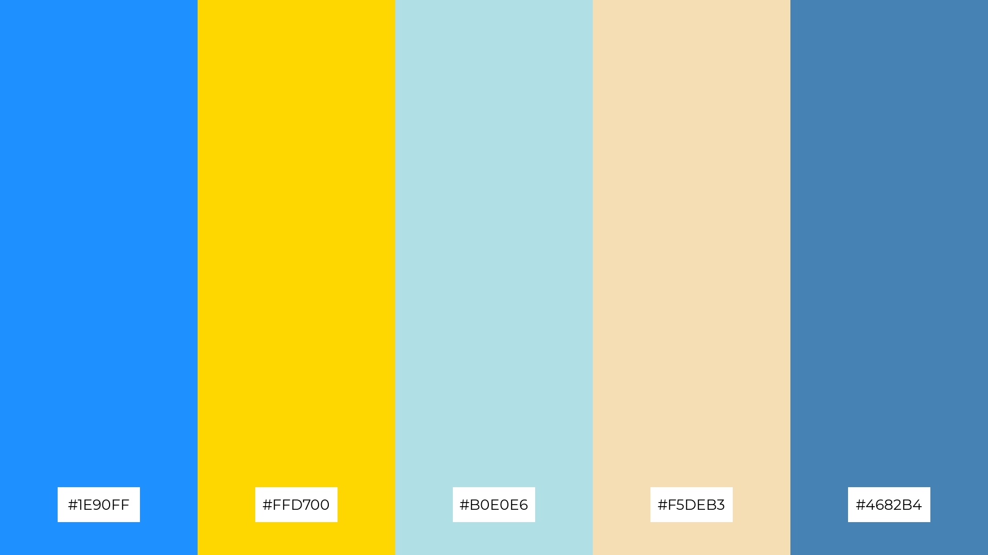
The ‘Serene Waves’ color palette, featuring dominant hues like deep sky blue (#1E90FF) and gold (#FFD700), creates a refreshing and balanced visual experience.
Ideal for wellness branding, this palette’s harmonious blend of colors promotes a sense of tranquility and rejuvenation, making it perfect for eco-friendly interior spaces.
4) Golden Hour
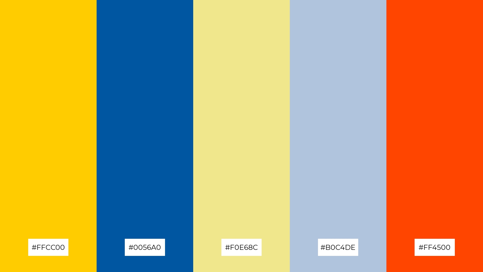
The ‘Golden Hour’ color palette, with its blend of soft hues like khaki (#F0E68C) and light steel blue (#B0C4DE) alongside bold tones like orange-red (#FF4500) and deep blue (#0056A0), offers a balanced and distinct mood.
This palette is ideal for creating inviting retail spaces, where the combination of warm and cool colors can enhance the shopping experience and attract customers.
5) Twilight Bliss
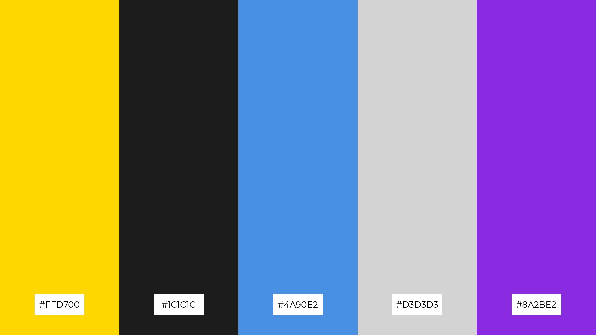
The ‘Twilight Bliss’ color palette, with its blend of gold (#FFD700), charcoal (#1C1C1C), sky blue (#4A90E2), light gray (#D3D3D3), and electric violet (#8A2BE2), creates a serene yet sophisticated ambiance perfect for modern wedding themes.
This palette’s harmonious mix of warm and cool tones can elevate luxury fashion campaigns, offering a striking balance between elegance and contemporary flair.
6) Coastal Breeze
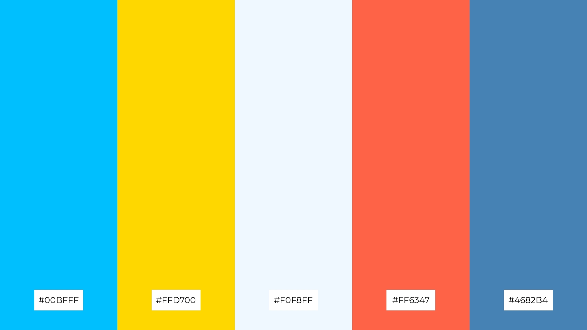
The ‘Coastal Breeze’ color palette, with its blend of deep sky blue (#00BFFF), gold (#FFD700), alice blue (#F0F8FF), tomato (#FF6347), and steel blue (#4682B4), creates a harmonious balance that evokes a sense of playful sophistication.
This palette is ideal for bold event designs, where the vibrant and contrasting colors can energize the atmosphere and captivate the audience’s attention.
7) Majestic Dawn
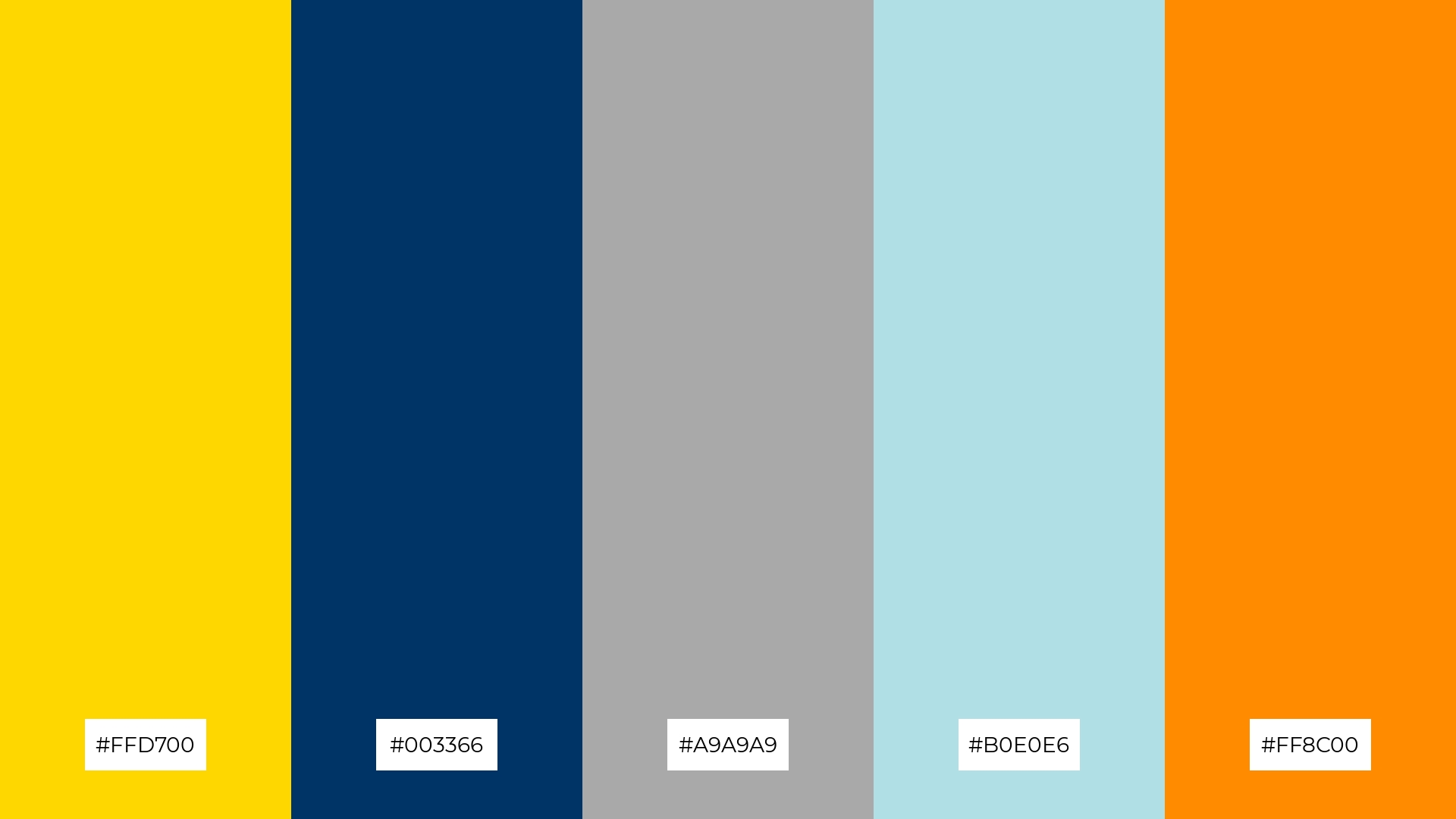
The ‘Majestic Dawn’ color palette, with its contrasting elements of vibrant gold (#FFD700), deep navy (#003366), dark gray (#A9A9A9), pale blue (#B0E0E6), and bold orange (#FF8C00), creates a dynamic visual interest that captivates the viewer’s attention.
This palette is ideal for creative projects like magazine layouts or artistic websites, where the interplay of warm and cool tones can enhance the overall aesthetic and engage the audience effectively.
8) Sapphire Dreams
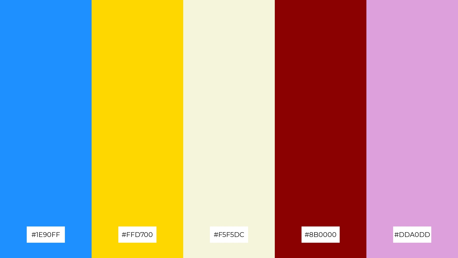
The ‘Sapphire Dreams’ color palette, with its blend of deep sky blue (#1E90FF), gold (#FFD700), beige (#F5F5DC), dark red (#8B0000), and plum (#DDA0DD), can evoke a sense of calm when the soothing blue and beige tones are paired together, making it perfect for spa branding.
Conversely, combining the vibrant gold and dark red with the rich plum can create an exciting and dynamic visual, ideal for vibrant marketing campaigns that aim to capture attention and energize the audience.
9) Golden Oasis
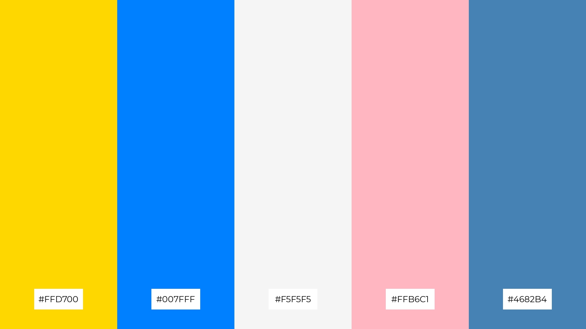
The ‘Golden Oasis’ color palette, featuring softer tones like light pink (#FFB6C1) and bright hues such as gold (#FFD700) and sky blue (#007FFF), creates a cheerful and inviting atmosphere.
This blend of colors is perfect for seasonal promotions, where the vibrant and soft tones can evoke a sense of warmth and excitement, making it ideal for capturing the festive spirit.
10) Celestial Harmony
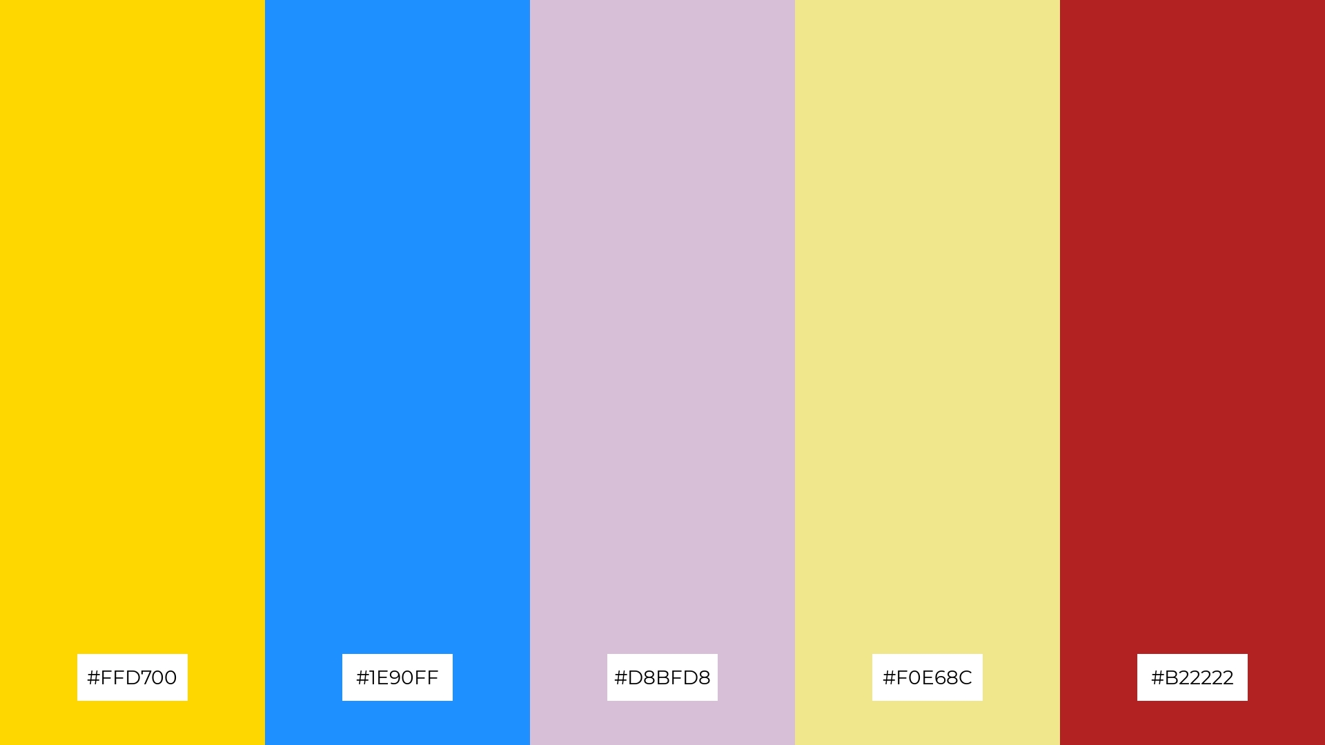
The ‘Celestial Harmony’ color palette, with its blend of gold (#FFD700), deep sky blue (#1E90FF), thistle (#D8BFD8), khaki (#F0E68C), and firebrick (#B22222), creates a visual flow that evokes a sense of joy and tranquility, balancing vibrant energy with soothing calmness.
This harmonious mix of colors is ideal for lifestyle branding, where the palette’s emotional impact can enhance the appeal of wellness products, or for tech product packaging, where the dynamic yet calming hues can attract and reassure consumers.
11) Vibrant Serenity
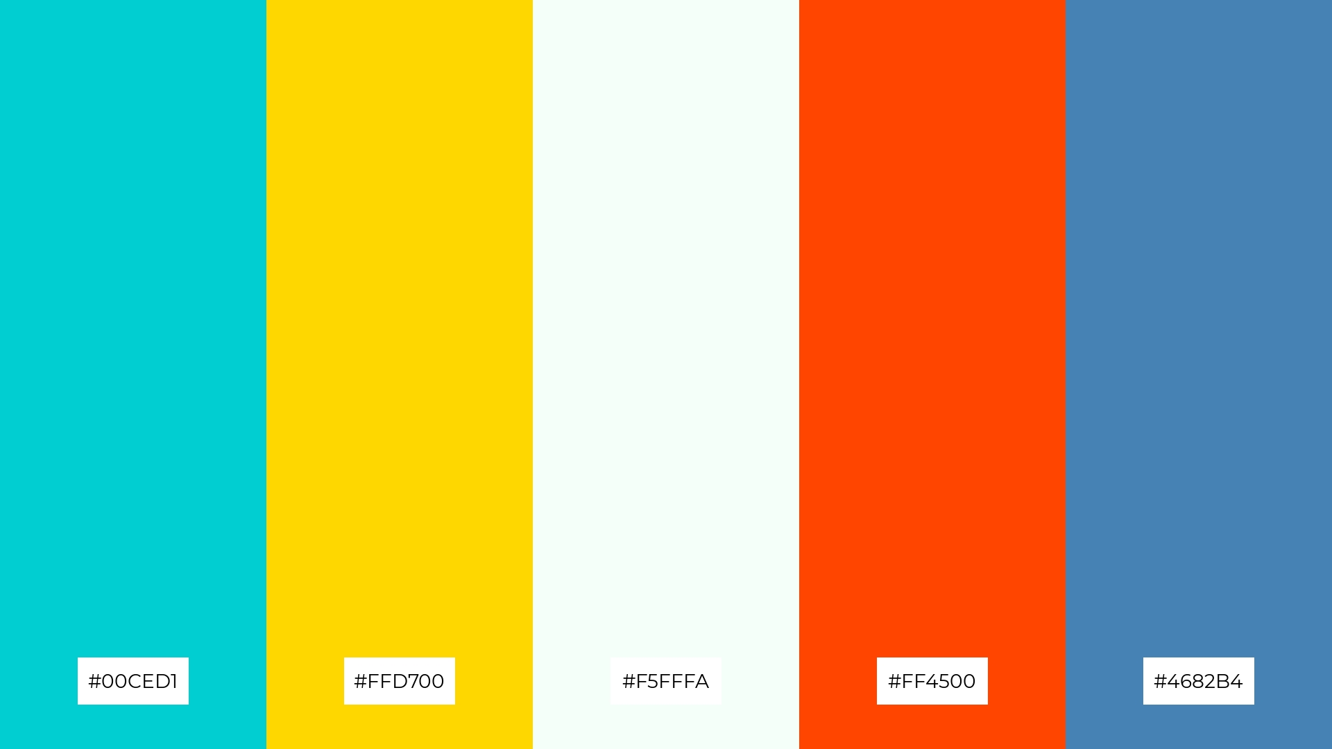
The ‘Vibrant Serenity’ color palette, with its blend of turquoise (#00CED1), gold (#FFD700), mint cream (#F5FFFA), orange-red (#FF4500), and steel blue (#4682B4), creates a welcoming effect by combining soothing and invigorating tones that balance warmth and coolness.
This palette shines in boutique interiors, where the harmonious mix of colors can create an inviting and dynamic atmosphere that captivates customers and enhances their shopping experience.
12) Luxe Lagoon
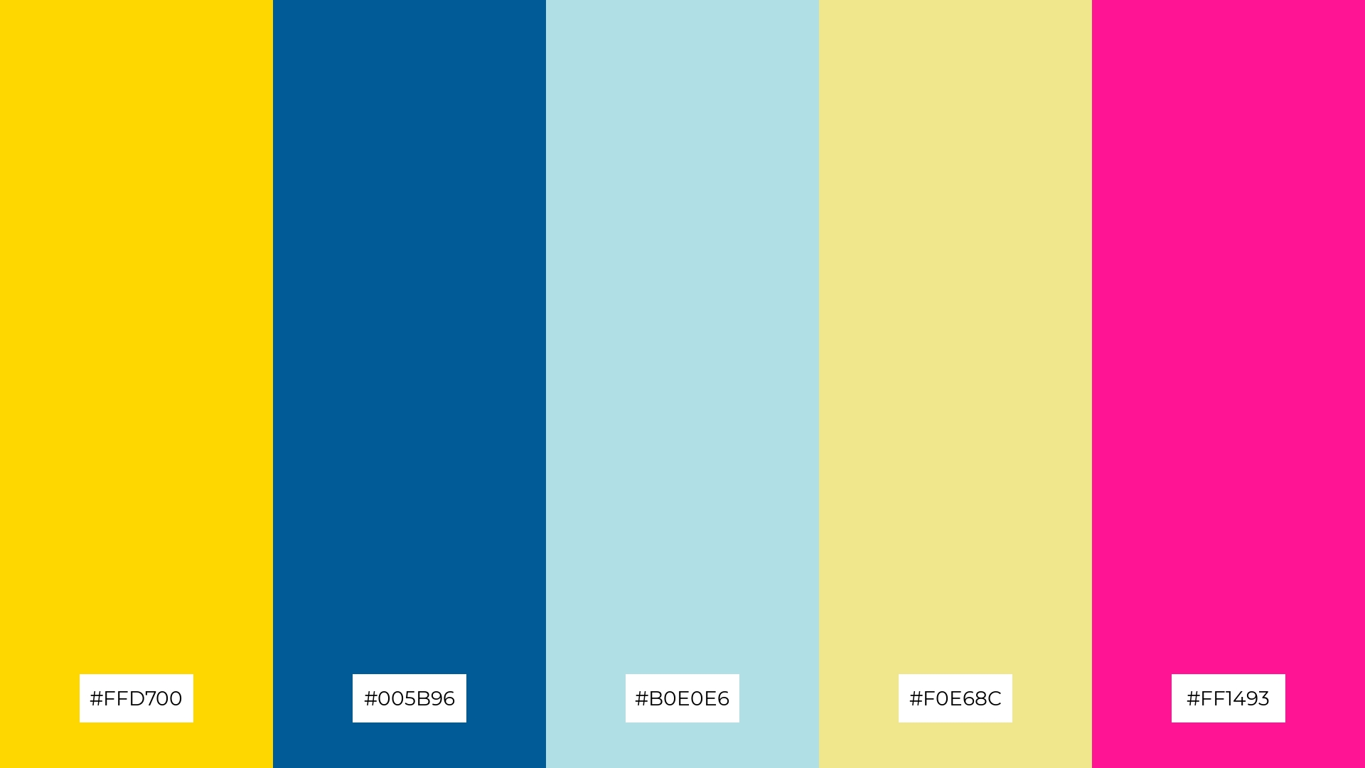
The ‘Luxe Lagoon’ color palette, with its blend of vibrant gold (#FFD700), deep blue (#005B96), pale blue (#B0E0E6), khaki (#F0E68C), and hot pink (#FF1493), creates a striking balance between bold and soft hues, offering a visually engaging contrast that captivates the viewer.
This palette is perfect for sleek corporate branding, where the dynamic interplay of colors can convey both professionalism and creativity, making a memorable impact on clients and stakeholders.
13) Dusk Reflections
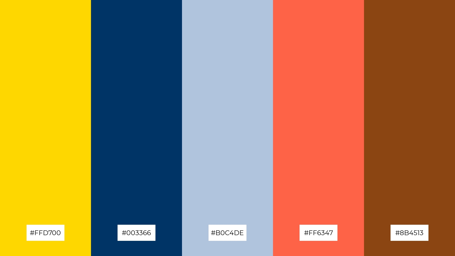
The ‘Dusk Reflections’ color palette, with its blend of vibrant gold (#FFD700), deep navy (#003366), light steel blue (#B0C4DE), tomato (#FF6347), and saddle brown (#8B4513), masterfully combines warm and cool tones to evoke a mood of serene sophistication and dynamic energy.
This palette is uniquely suited for artisan product branding, where the harmonious interplay of colors can highlight the craftsmanship and authenticity of handmade goods, creating a visually compelling and emotionally resonant brand identity.
14) Enchanted Forest
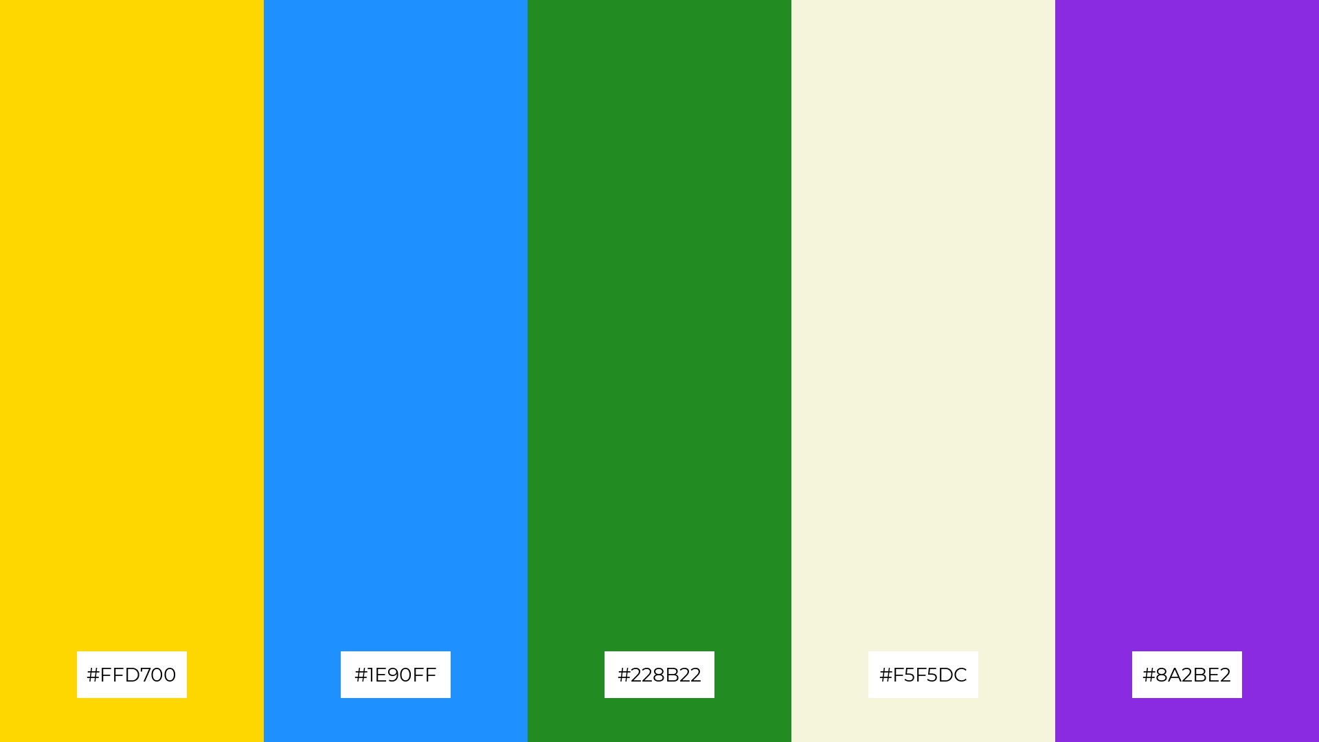
The ‘Enchanted Forest’ color palette, with its blend of gold (#FFD700), deep sky blue (#1E90FF), forest green (#228B22), beige (#F5F5DC), and electric violet (#8A2BE2), creates a dynamic interplay of bold and subtle hues that evoke a sense of mystery and allure.
This palette is perfect for festival marketing, where the vibrant and contrasting colors can captivate the audience’s attention and enhance the festive atmosphere.
15) Urban Chic
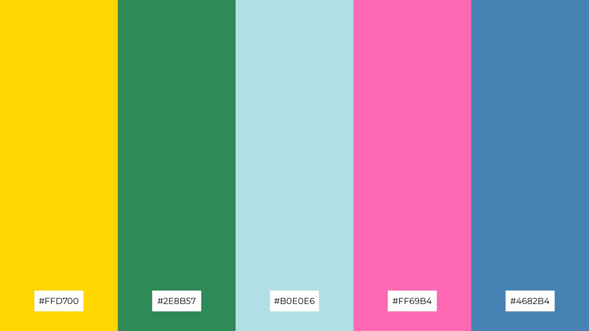
The ‘Urban Chic’ color palette, with its blend of gold (#FFD700), sea green (#2E8B57), powder blue (#B0E0E6), hot pink (#FF69B4), and steel blue (#4682B4), conveys a sense of harmony when the softer hues are paired together, creating a balanced and calming visual experience.
Conversely, the palette can create a striking contrast when the vibrant gold and hot pink are juxtaposed with the cooler tones, making it ideal for tech startups aiming to capture attention or cozy interior makeovers that seek to blend modernity with comfort.
How to Use Blue Gold Patterns in Design
In home decor, blue and gold color palettes can create a luxurious and calming atmosphere. Use blue as the primary color for walls or large furniture pieces, and incorporate gold accents through decorative items like cushions, frames, or light fixtures to add a touch of elegance.
For marketing materials, the combination of blue and gold can convey professionalism and sophistication. Utilize blue backgrounds with gold typography or icons to highlight key information and create a visually appealing contrast that captures attention.
In clothing design, blue and gold can be used to create striking and fashionable outfits. Pair a deep blue dress with gold accessories or incorporate gold embroidery on blue fabrics to achieve a chic and stylish look.
Ready to bring your blue and gold design ideas to life? Try creating these stunning palettes using Piktochart. Get started now and transform your designs with ease!


