 Piktochart Team
·

Updated on
November 26, 2024
Published on
November 25, 2024

Color palettes inspired by enchanted gardens can transform any design into a magical experience. These palettes draw from the vibrant hues and serene tones found in nature's most whimsical settings.
From lush greens to delicate pastels, enchanted garden color palettes offer a wide range of options for creating visually captivating graphics. Whether you're designing an infographic or a social media post, these colors can add a touch of enchantment to your work.
Designing color palettes with an enchanted garden theme can elevate your visuals to new heights. Here are some practical tips to get you started:

The 'Whimsical Blooms' palette evokes a mood of gentle elegance and playful charm, with its soft pinks and blues harmonizing beautifully with the vibrant green and gold accents.
Perfect for a spring-themed fashion collection, these colors interact to create a cohesive look that is both refreshing and sophisticated, making each piece stand out while maintaining a unified aesthetic.

The 'Twilight Petals' palette, with its deep indigo and soft lavender, evokes a sense of calm and tranquility, while the pale turquoise and light pink add a touch of gentle warmth and serenity.
This palette would excel in digital branding for wellness apps or meditation platforms, where the soothing colors can create a peaceful and inviting user experience.

The 'Mystic Ferns' palette, dominated by shades of green like #2E8B57 and #3CB371, creates a refreshing and invigorating atmosphere, while the lighter tones of #98FB98, #F0E68C, and #FFE4B5 add a touch of warmth and balance.
This harmonious blend of colors is ideal for eco-friendly interior spaces, where the natural greens can promote a sense of tranquility and connection to nature, making the environment both inviting and serene.

The 'Fairy Dust' palette, with its blend of soft pinks and bold golds, offers a balanced mix of gentle and striking tones that create a distinct and enchanting mood.
This versatile palette is ideal for creating inviting retail spaces or modern web designs, where the harmonious colors can captivate and engage the audience.

The 'Secret Garden' palette, with its rich browns and warm beiges, evokes a sense of rustic elegance and timeless charm, creating a serene and inviting ambiance.
This palette is perfect for designing wedding themes, where the harmonious blend of earthy tones can add a touch of natural sophistication and warmth to the celebration.

The 'Enchanted Twilight' palette, with its deep purples and soft blues, creates a sophisticated and serene mood, perfect for minimalistic branding that aims to convey elegance and calm.
For bold event designs, the addition of pale yellow adds a playful touch, making the palette versatile enough to create a dynamic and engaging atmosphere.

The 'Celestial Blooms' palette, with its vibrant mix of #FF6347 and #FF4500, contrasted by the bright #FFD700 and the refreshing greens of #ADFF2F and #7FFF00, creates a dynamic and visually stimulating effect.
This striking combination is perfect for creative projects like magazine layouts or artistic websites, where the bold colors can capture attention and add a lively, energetic feel to the design.
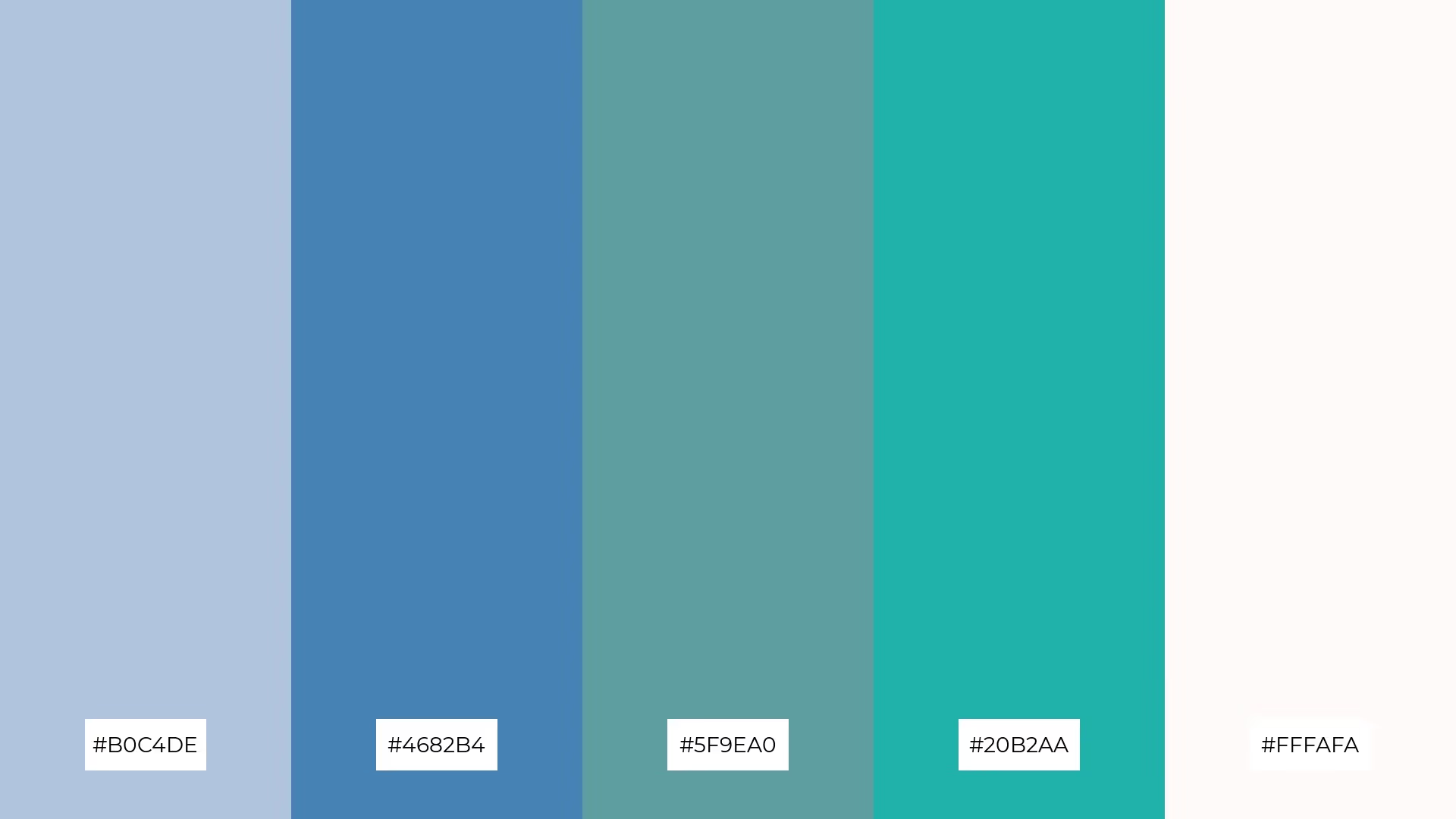
The 'Moonlit Blossoms' palette, with its soothing blend of #B0C4DE and #FFFAFA, brings a sense of calm and tranquility, making it ideal for spa branding where a serene and relaxing atmosphere is essential.
Conversely, the vibrant combination of #4682B4, #5F9EA0, and #20B2AA can inject excitement and energy into marketing campaigns, creating a dynamic and engaging visual experience that captures attention.

The 'Garden of Dreams' palette, with its softer tones of #FFB6C1 and #FF69B4, creates a dreamy and romantic atmosphere, while the brighter hues of #FF1493, #C71585, and #8B008B add a vibrant and energetic touch.
This blend of colors is perfect for seasonal promotions, where the mix of gentle and bold shades can evoke a sense of excitement and allure, making the designs both captivating and memorable.

The 'Enchanted Oasis' palette, with its refreshing greens of #00FA9A, #3CB371, and #2E8B57, combined with the vibrant #FFD700 and the soft #FFF5EE, creates a visual flow that evokes feelings of tranquility and joy, making it perfect for designs that aim to soothe and uplift.
This harmonious blend of colors is ideal for lifestyle branding, such as wellness products or eco-friendly tech packaging, where the calming greens and cheerful gold can enhance the user experience by promoting a sense of well-being and positivity.

The 'Petal Whisper' palette, with its blend of #F0E68C, #E6E6FA, #DDA0DD, #FFB347, and #FF6347, creates a welcoming effect by combining soft pastels with vibrant accents, making any design feel both inviting and lively.
This palette shines in boutique interiors, where the harmonious mix of gentle and bold tones can create a sophisticated yet approachable atmosphere, perfect for attracting and engaging customers.

The 'Serene Sanctuary' palette, with its soothing blend of #B0E0E6, #AFEEEE, #E0FFFF, #F5FFFA, and #F0FFF0, creates a harmonious and balanced visual experience by combining soft blues and greens that evoke a sense of calm and tranquility.
This palette is ideal for sleek corporate branding, where the gentle hues can convey professionalism and serenity, making the brand appear both approachable and sophisticated.

The 'Radiant Flora' palette, with its blend of warm tones like #FF4500 and #FF6347 and cool accents of #FFD700 and #FFF8DC, creates a vibrant yet balanced mood that evokes both energy and harmony.
This palette is perfect for artisan product branding, where the dynamic mix of colors can highlight the craftsmanship and uniqueness of handmade goods, making each product stand out with a lively and inviting appeal.

The 'Lush Haven' palette, with its rich greens of #228B22 and #32CD32, contrasted by the soft #F5FFFA and #FFE4E1, creates a dynamic interplay of bold and subtle tones that can bring any design to life.
This versatile palette is perfect for festival marketing, where the vibrant greens can capture attention and the gentle pastels can add a touch of elegance, making the promotional materials both eye-catching and sophisticated.
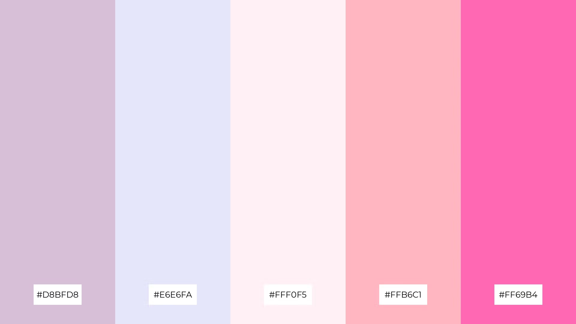
The 'Ethereal Garden' palette, with its blend of #D8BFD8, #E6E6FA, #FFF0F5, #FFB6C1, and #FF69B4, conveys a sense of harmony through its soft, pastel tones that seamlessly blend together to create a soothing and cohesive visual experience.
This palette is ideal for cozy interior makeovers, where the gentle hues can create a warm and inviting atmosphere, or for tech startups aiming to establish a friendly and approachable brand identity that stands out in a competitive market.
Enchanted Garden color palettes can bring a touch of nature's magic to your home decor. Use soft greens and pastel pinks to create a serene bedroom atmosphere, or incorporate vibrant floral hues in your living room to add a lively and inviting feel. These palettes can transform any space into a tranquil retreat or a vibrant gathering spot.
For marketing materials, Enchanted Garden palettes can make your designs stand out. Use bold greens and golds to create eye-catching flyers or social media posts that capture attention. Pairing these colors with neutral backgrounds can help highlight key information and make your message more impactful.
In clothing design, these palettes offer endless possibilities. Soft blues and lavenders can create elegant and sophisticated pieces, while brighter tones like coral and mint green can add a playful and fresh touch to your collection. Experiment with different combinations to find the perfect balance for your brand.
Ready to bring the magic of Enchanted Garden color palettes to your designs? Try creating your own using Piktochart and see how these colors can transform your projects.
The latest industry news, interviews, technologies, and resources.

Published on
November 25, 2024


