Exploring cyan color palettes can open up a world of vibrant and refreshing design possibilities. This versatile hue, often associated with tranquility and clarity, is a favorite among designers.
Whether you’re creating infographics, presentations, or social media graphics, incorporating cyan can add a touch of modernity and sophistication. Let’s dive into the various ways you can use cyan to elevate your visual projects.
Tips For Creating Cyan Color Palettes
Designing with cyan can be both exciting and challenging. Here are some practical tips to help you create stunning color palettes:
- Balance with Neutrals: Pair cyan with neutral colors like white, gray, or black to create a balanced and harmonious look.
- Complementary Colors: Use complementary shades such as orange or red to make your design pop and add visual interest.
- Gradients and Shades: Experiment with different gradients and shades of cyan to add depth and dimension to your design.
- Accent Colors: Incorporate accent colors like yellow or pink to highlight key elements and draw attention.
- Versatility: Ensure your palette is versatile by testing it across various mediums, from digital screens to printed materials.
- Consistency: Maintain consistency in your color usage to create a cohesive and professional look throughout your project.
15 Cyan Color Palettes
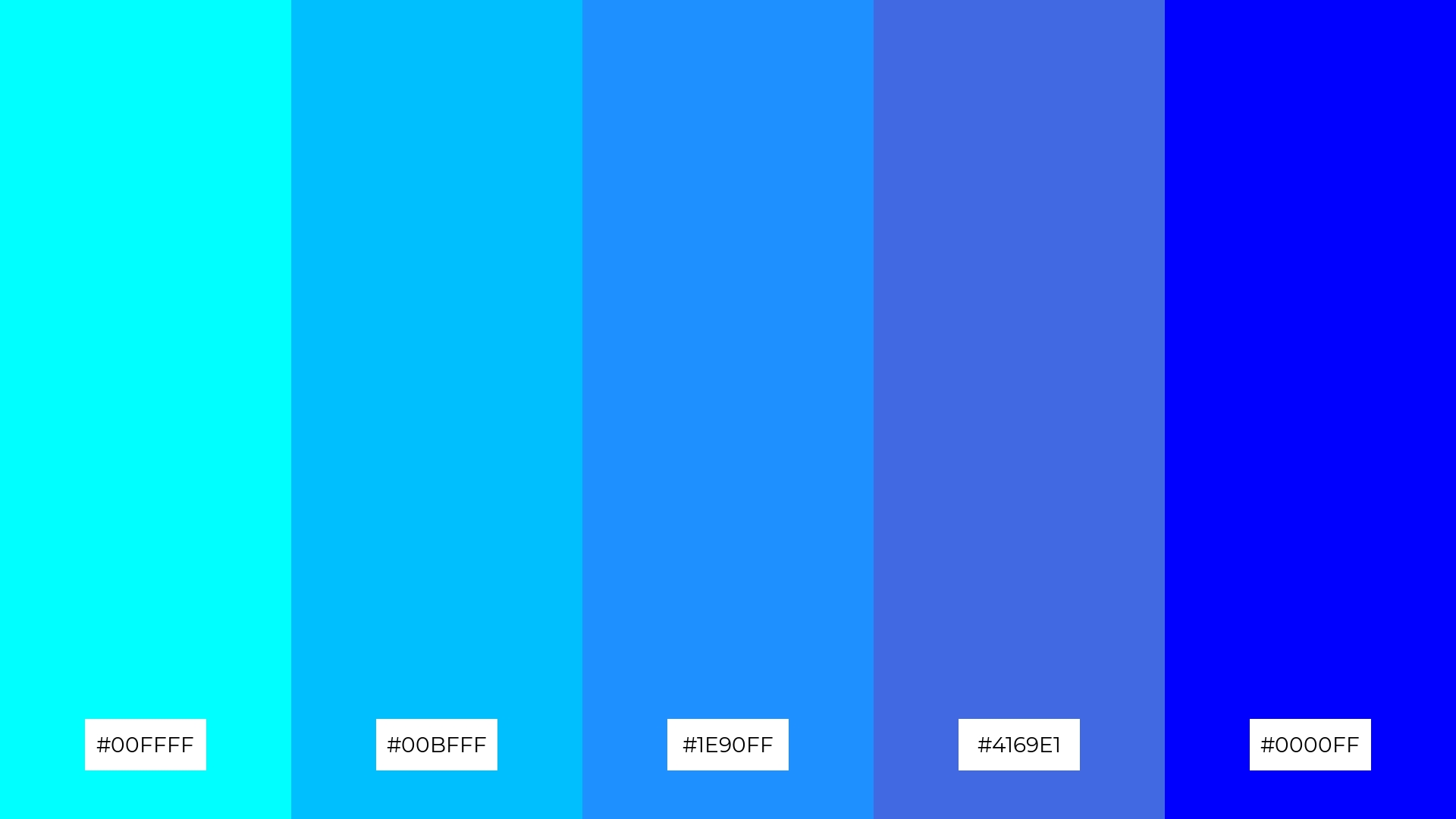
1) Ocean Breeze
The ‘Ocean Breeze’ palette, with its gradient from bright cyan to deep navy, evokes a sense of calm and serenity, reminiscent of a tranquil seaside escape.
These colors interact seamlessly to create a cohesive look, perfect for a coastal-themed interior decor that emphasizes relaxation and sophistication.
2) Tropical Lagoon
The ‘Tropical Lagoon’ palette, with its vibrant hues of cyan and teal, evokes a sense of refreshing energy and tropical warmth, making it ideal for designs that aim to invigorate and inspire.
This palette would excel in digital branding for wellness apps or eco-friendly product packaging, where the colors can convey a message of vitality and natural harmony.
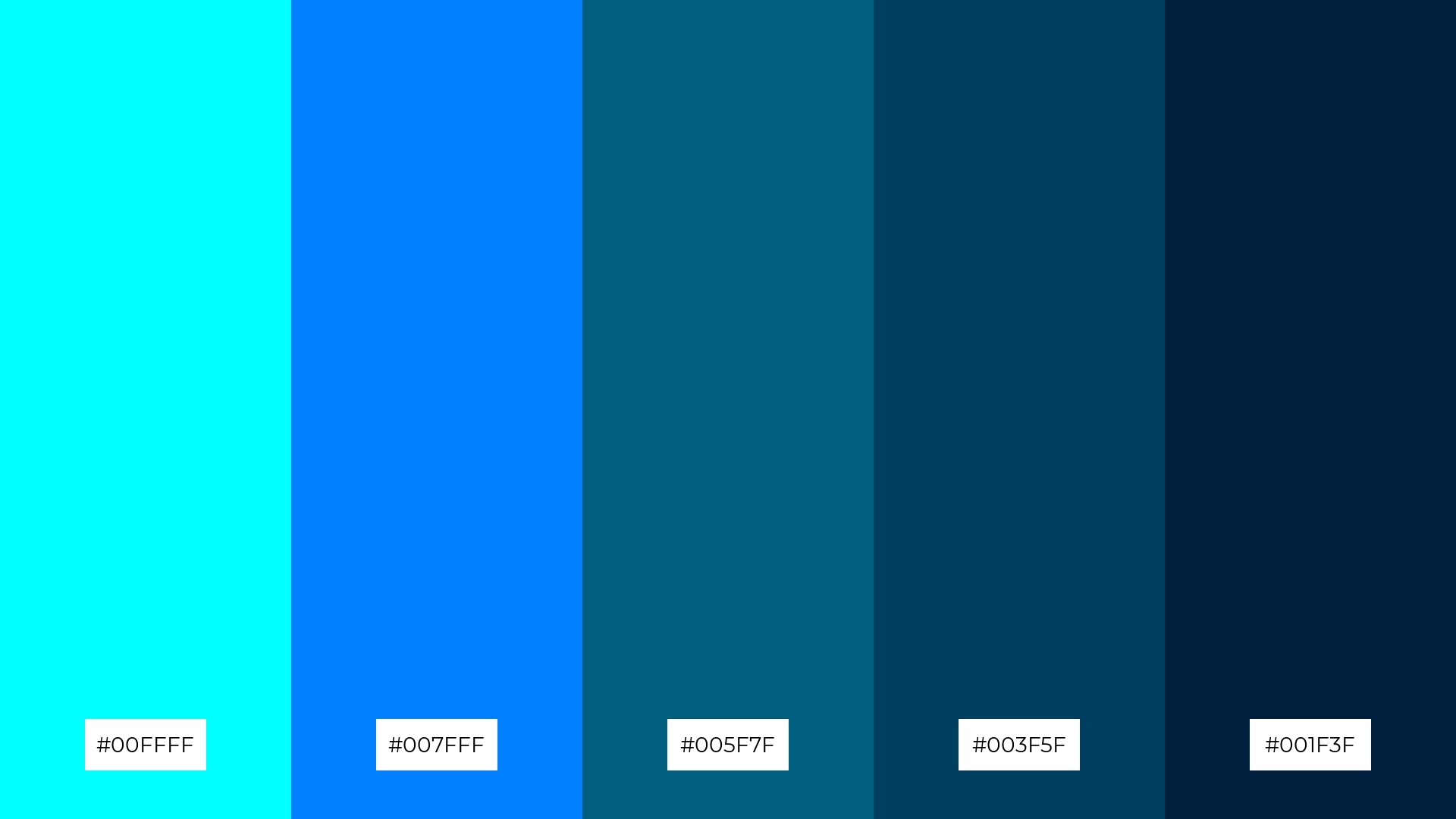
3) Electric Blue
The ‘Electric Blue’ palette, featuring dominant colors like cyan (#00FFFF), deep sky blue (#00BFFF), and royal blue (#4169E1), creates a striking and energetic visual impact.
This vibrant combination is perfect for tech startups or gaming brands, where the bold hues can convey innovation and excitement while maintaining a harmonious and cohesive look.
4) Minty Fresh
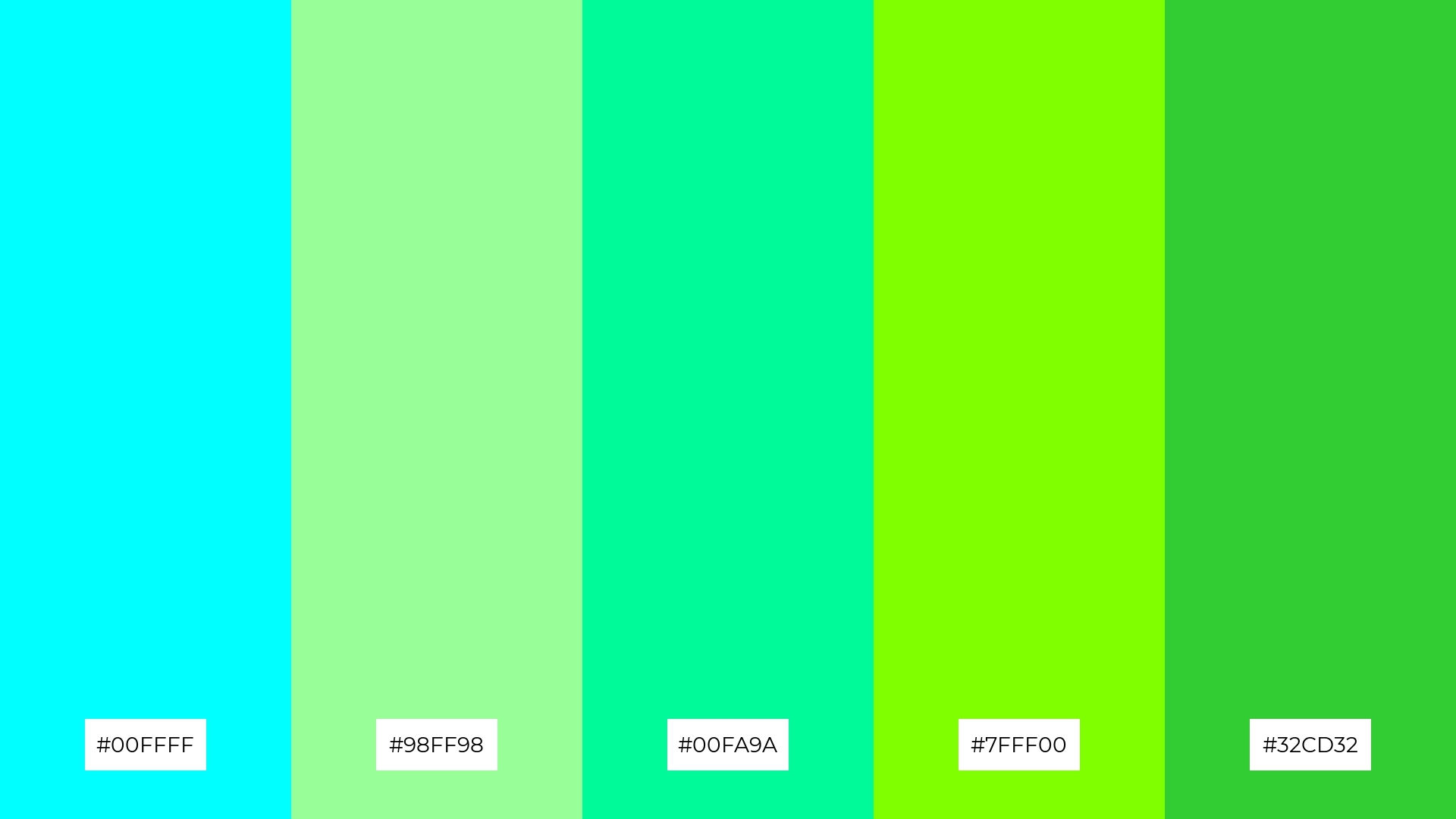
The ‘Minty Fresh’ palette, with its blend of soft and bold tones like cyan (#00FFFF) and lime green (#32CD32), creates a distinct mood that is both refreshing and invigorating.
This palette is ideal for creating inviting retail spaces or modern web designs, where the vibrant yet soothing colors can enhance the user experience and draw attention.
5) Arctic Chill
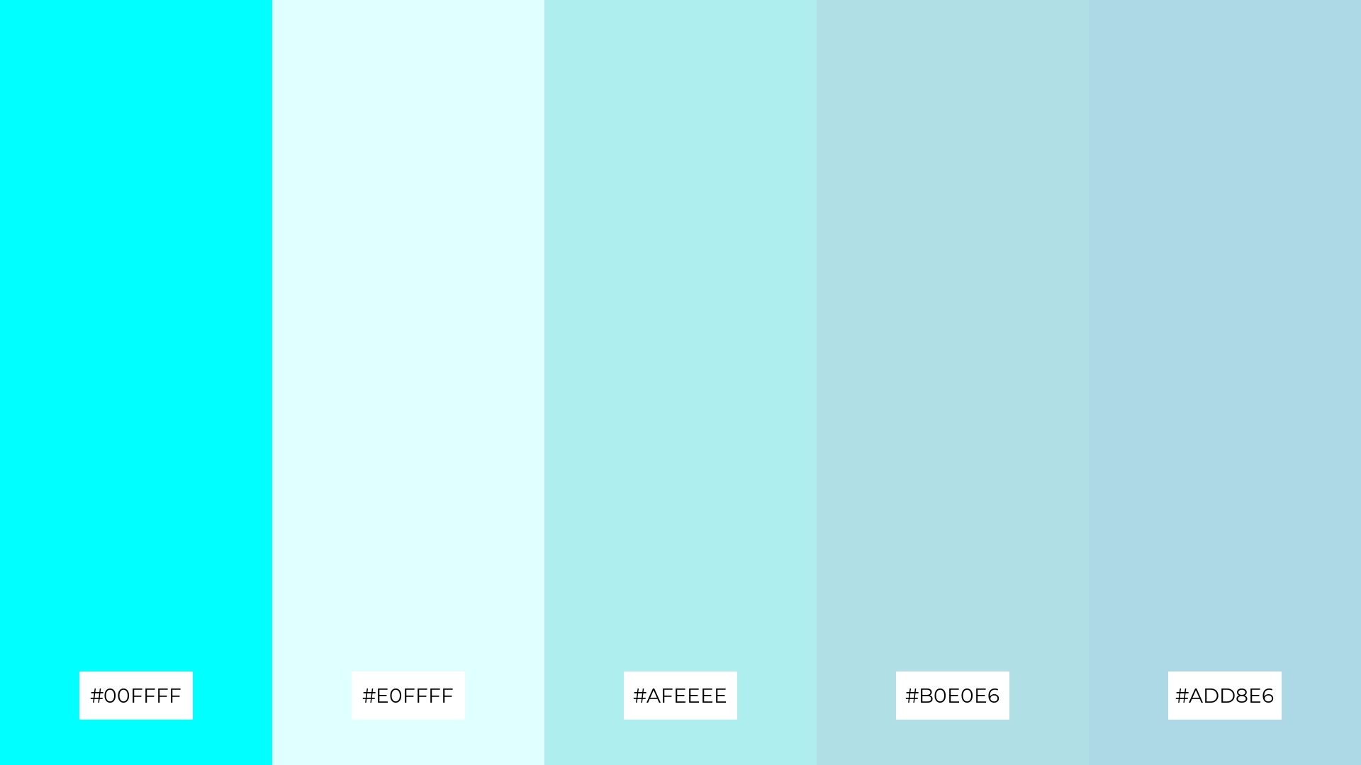
The ‘Arctic Chill’ palette, with its harmonious blend of cyan (#00FFFF), light cyan (#E0FFFF), pale turquoise (#AFEEEE), powder blue (#B0E0E6), and light blue (#ADD8E6), evokes a serene and tranquil ambiance reminiscent of a peaceful winter landscape.
This soothing combination is perfect for luxury fashion campaigns, where the cool, calming tones can convey elegance and sophistication, creating a visually stunning and memorable impression.
6) Neon Splash
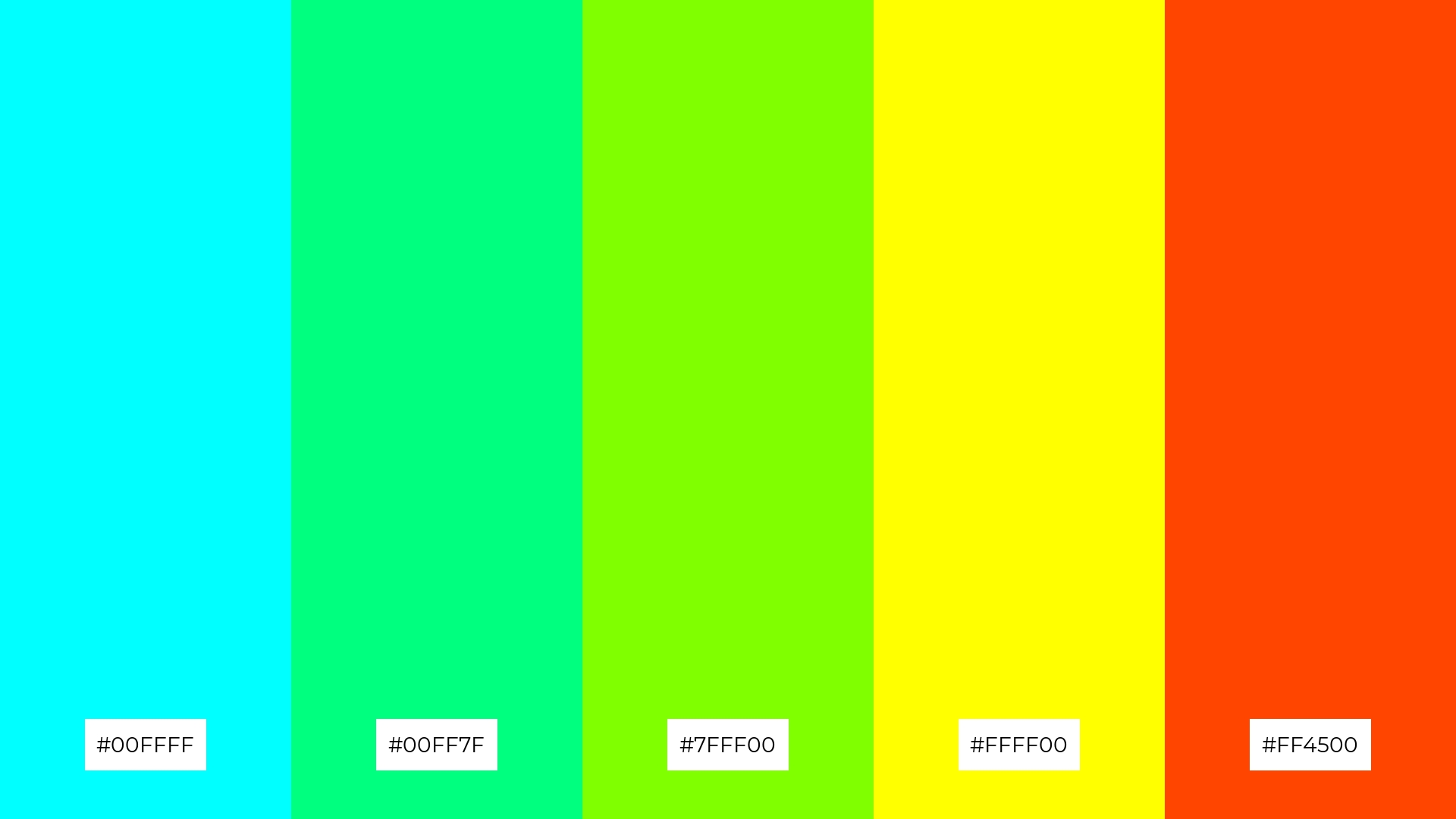
The ‘Neon Splash’ palette, with its vibrant mix of cyan (#00FFFF), spring green (#00FF7F), chartreuse (#7FFF00), yellow (#FFFF00), and orange-red (#FF4500), creates a dynamic and playful mood that can energize any design.
This bold combination is ideal for event designs, where the striking colors can captivate attention and convey a sense of excitement and fun, making it perfect for music festivals or modern art exhibitions.
7) Deep Sea
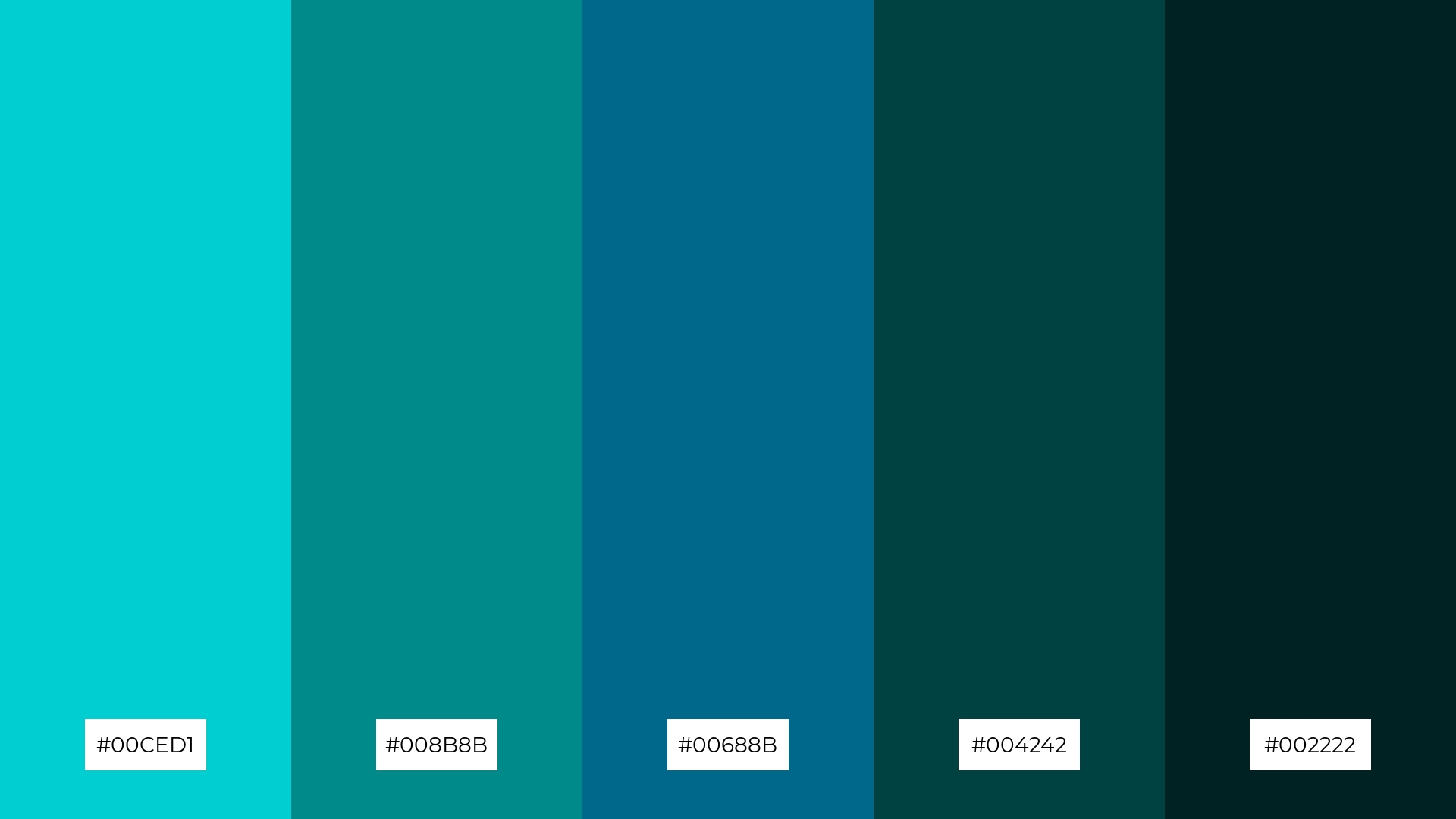
The ‘Deep Sea’ palette, with its contrasting elements of bright cyan (#00CED1) and deep teal (#002222), creates a striking visual interest that captures the viewer’s attention through its dynamic interplay of light and dark tones.
This palette is highly recommended for creative projects like magazine layouts or artistic websites, where the rich, contrasting colors can add depth and sophistication, making the design both captivating and memorable.
8) Sky High
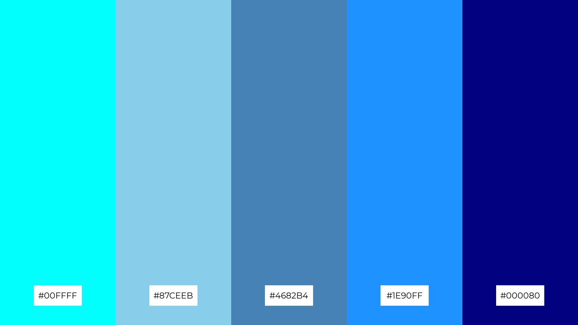
The ‘Sky High’ palette, with its blend of cyan (#00FFFF), sky blue (#87CEEB), steel blue (#4682B4), dodger blue (#1E90FF), and navy (#000080), can evoke a sense of calm when the lighter shades are used together, creating a serene and tranquil atmosphere.
Conversely, combining the bolder hues can infuse a design with excitement and energy, making this palette ideal for vibrant marketing campaigns or dynamic event branding that aims to captivate and inspire.
9) Crystal Waters
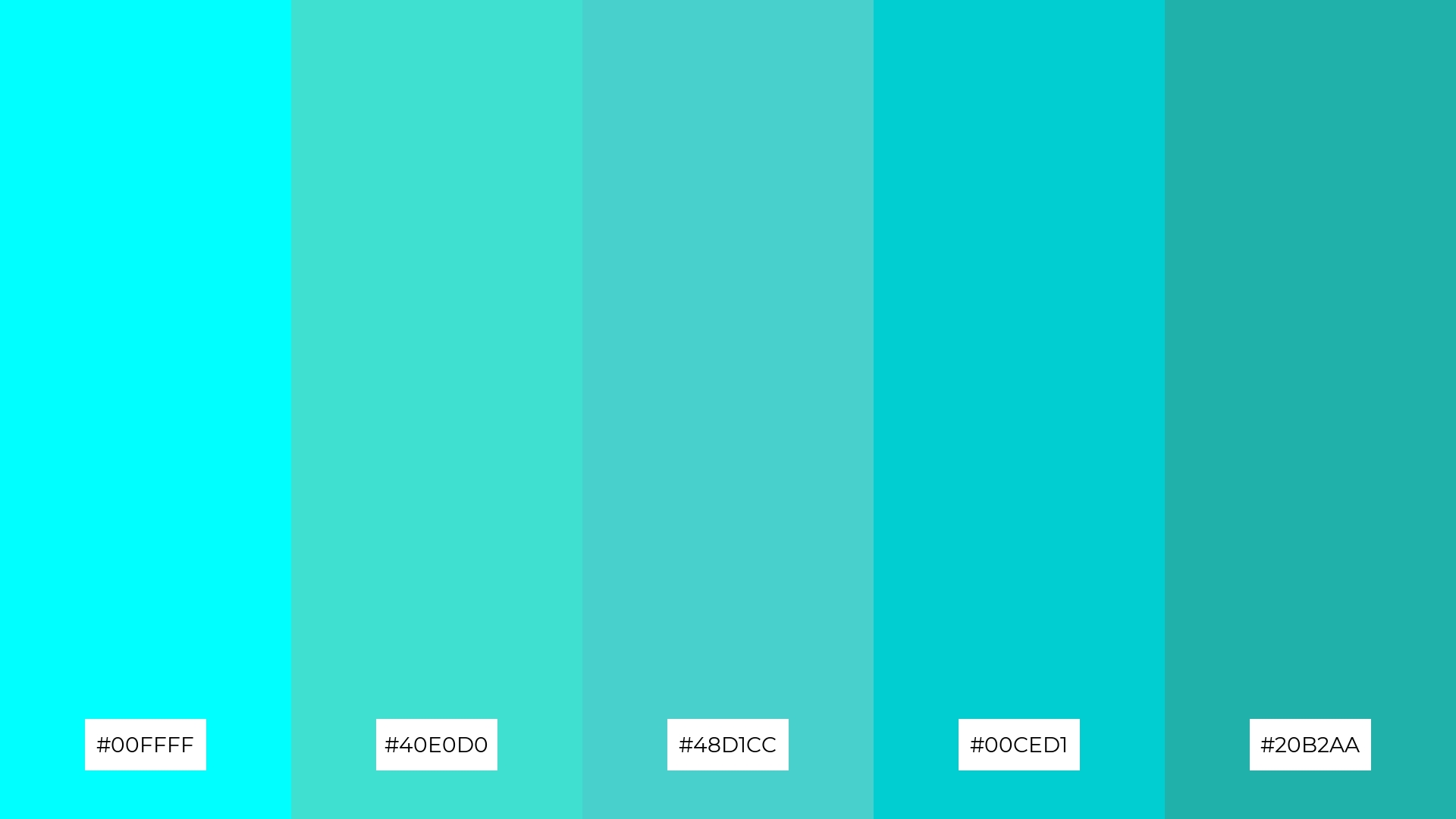
The ‘Crystal Waters’ palette, with its softer tones like light cyan (#E0FFFF) and brighter hues such as turquoise (#40E0D0), creates a refreshing and tranquil mood that evokes the serene beauty of clear, tropical waters.
This harmonious blend is ideal for home decor projects, where the calming colors can transform living spaces into peaceful retreats, or for seasonal promotions that aim to convey a sense of renewal and relaxation.
10) Cool Mint
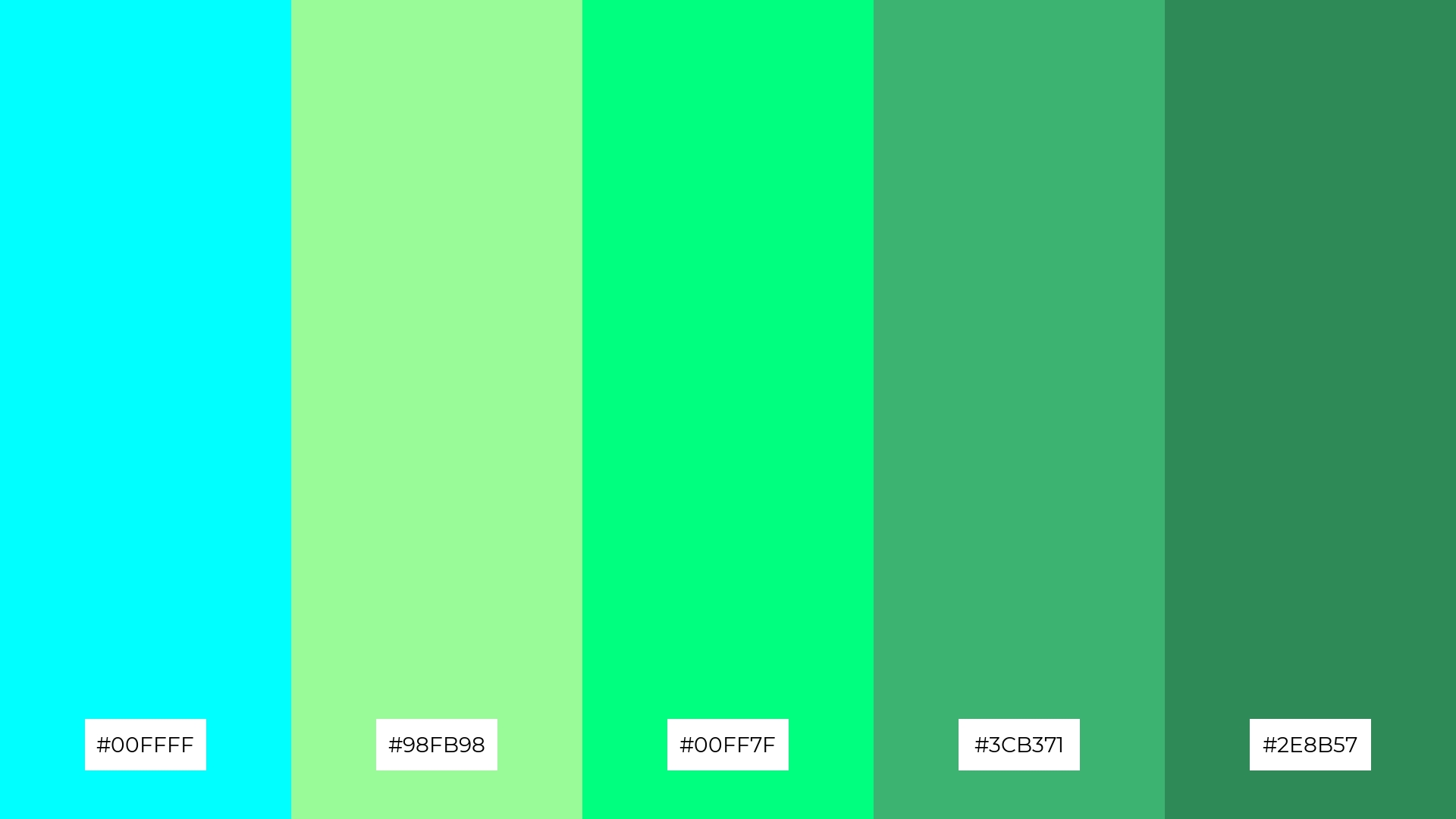
The ‘Cool Mint’ palette, with its refreshing blend of cyan (#00FFFF), pale green (#98FB98), spring green (#00FF7F), medium sea green (#3CB371), and sea green (#2E8B57), creates a visual flow that evokes feelings of tranquility and rejuvenation, making it perfect for designs that aim to soothe and uplift.
This harmonious combination is ideal for lifestyle branding, such as wellness products or eco-friendly tech packaging, where the calming yet invigorating colors can convey a message of health, vitality, and sustainability.
11) Frozen Lake
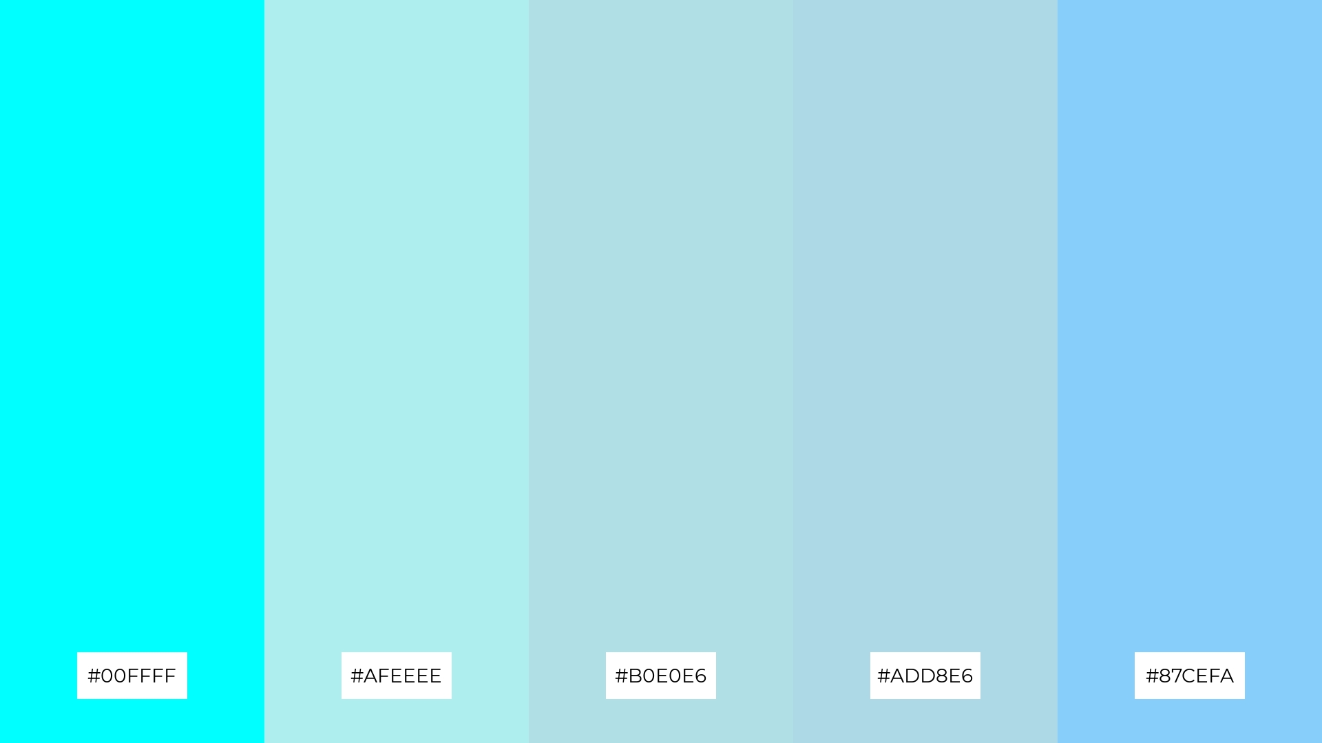
The ‘Frozen Lake’ palette, with its blend of cyan (#00FFFF), pale turquoise (#AFEEEE), powder blue (#B0E0E6), light blue (#ADD8E6), and light sky blue (#87CEFA), creates a welcoming effect by evoking a sense of calm and serenity, making it ideal for boutique interiors that aim to provide a tranquil shopping experience.
This palette also shines in luxury e-commerce sites, where the cool, sophisticated tones can convey elegance and exclusivity, enhancing the overall user experience and making the products appear more desirable.
12) Cyber Glow
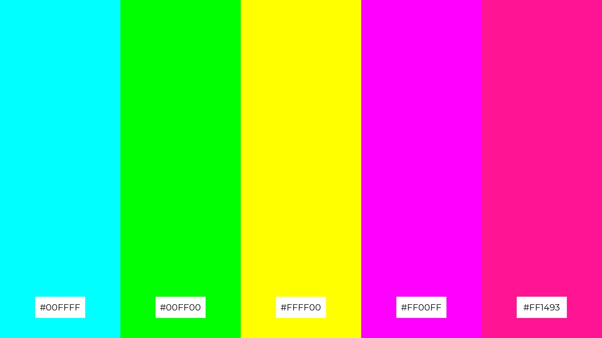
The ‘Cyber Glow’ palette, with its vibrant hues of cyan (#00FFFF), lime green (#00FF00), yellow (#FFFF00), magenta (#FF00FF), and deep pink (#FF1493), creates a striking balance through the interplay of cool and warm tones, resulting in a visually dynamic and energetic effect.
This bold combination is perfect for casual apparel lines, where the vivid colors can convey a sense of fun and individuality, making the designs stand out in a crowded market.
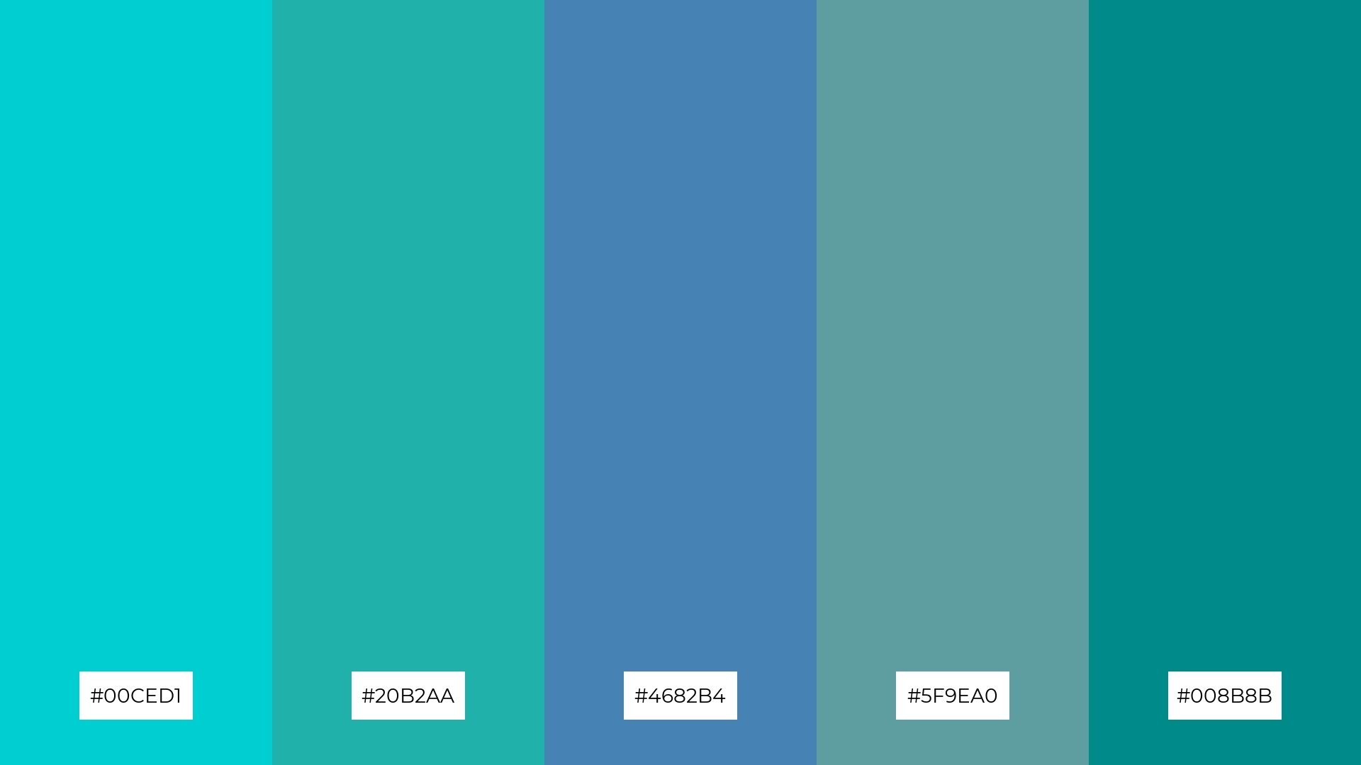
13) Aqua Dream
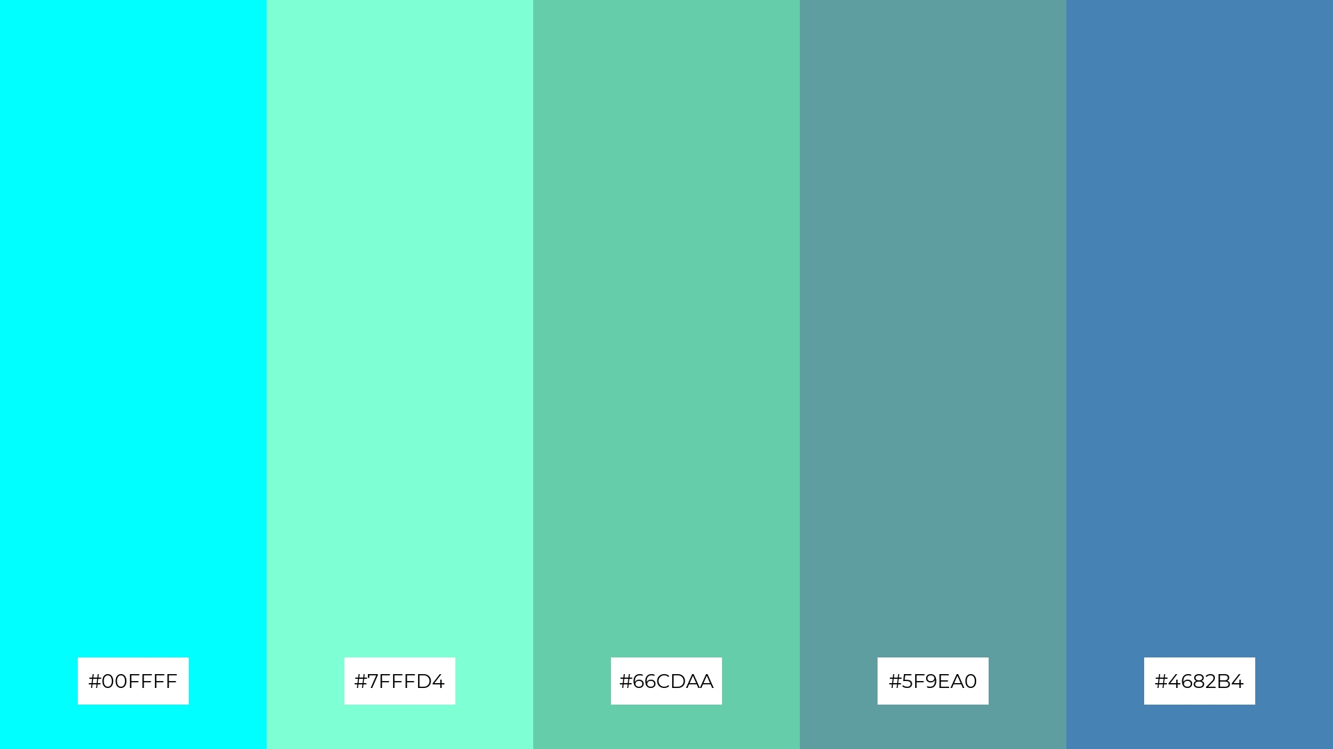
The ‘Aqua Dream’ palette, with its blend of warm and cool tones like cyan (#00FFFF), aquamarine (#7FFFD4), medium aquamarine (#66CDAA), cadet blue (#5F9EA0), and steel blue (#4682B4), evokes a mood of serene sophistication and balanced tranquility.
This harmonious combination is ideal for artisan product branding, where the soothing yet vibrant colors can convey a sense of handcrafted quality and artistic elegance, making the products stand out in a unique and memorable way.
14) Blue Lagoon

The ‘Blue Lagoon’ palette, with its dynamic interplay of cyan (#00FFFF), cadet blue (#5F9EA0), steel blue (#4682B4), royal blue (#4169E1), and medium blue (#0000CD), offers a versatile range of bold and subtle hues that can create a visually captivating experience.
This vibrant combination is perfect for festival marketing, where the striking colors can energize promotional materials and capture the excitement of the event, making it memorable and engaging for attendees.
15) Fresh Splash
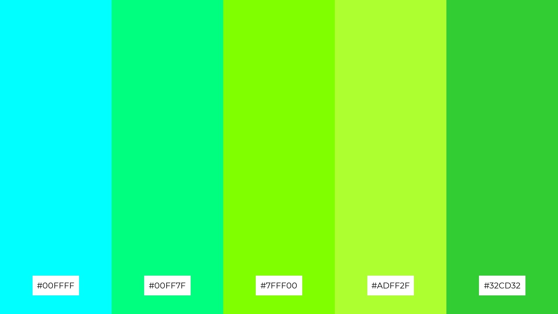
The ‘Fresh Splash’ palette, with its vibrant mix of cyan (#00FFFF), spring green (#00FF7F), chartreuse (#7FFF00), green-yellow (#ADFF2F), and lime green (#32CD32), can convey a sense of harmony when used in balanced proportions, creating a refreshing and cohesive visual experience.
This dynamic combination is ideal for tech startups aiming to project innovation and energy, or for cozy interior makeovers where the lively colors can invigorate and brighten up living spaces, making them feel more welcoming and vibrant.
How to Use Cyan Patterns in Design
Using cyan color palettes in design can transform your projects with a touch of modernity and sophistication. For home decor, consider pairing cyan with neutral tones like white or gray to create a serene and inviting atmosphere. This combination can make living spaces feel more open and airy, perfect for a contemporary look.
In marketing materials, cyan can be used to draw attention and convey a sense of innovation. Pair it with complementary colors like orange or red to make your designs pop and stand out in a crowded market. This approach is particularly effective for tech startups or event promotions, where bold visuals are key to capturing interest.
For clothing design, incorporating cyan can add a refreshing and vibrant touch. Use it as an accent color to highlight specific elements or create patterns that evoke a sense of energy and playfulness. This can make your apparel line more appealing and unique, attracting a diverse audience.
Ready to elevate your designs with stunning cyan palettes? Try creating your own using Piktochart and see the difference it can make in your projects!


