White cream color palettes offer a versatile and timeless option for various design projects. Their subtle elegance can enhance both digital and print media, making them a favorite among designers.
These palettes provide a neutral backdrop that complements a wide range of other colors. Whether you’re aiming for a minimalist look or a sophisticated aesthetic, white cream tones can be the perfect choice.
Tips For Creating White Cream Color Palettes
Designing with white cream color palettes can elevate your project to new heights. Here are some practical tips to help you make the most of this elegant hue:
- Balance with Bold Colors: Use white cream as a base and add bold colors like navy blue or deep green to create a striking contrast.
- Complementary Shades: Pair white cream with soft pastels such as blush pink or mint green for a harmonious and soothing effect.
- Texture and Patterns: Incorporate textures and patterns to add depth and interest to your design without overwhelming the subtlety of white cream.
- Versatility in Design: White cream works well in both modern and traditional designs, making it a versatile choice for various projects.
- Lighting Considerations: Pay attention to lighting conditions, as white cream can appear different under various lighting setups. Test your palette in different environments.
- Accent Colors: Use metallic accents like gold or silver to add a touch of luxury and sophistication to your white cream palette.
15 White Cream Color Palettes
1) Soft Morning

The ‘Soft Morning’ palette evokes a serene and calming mood, with its gentle blend of whites, creams, and muted browns creating a tranquil and inviting atmosphere.
These colors interact harmoniously to produce a cohesive look, making them ideal for interior decor in spaces like bedrooms or living rooms where relaxation is paramount.
2) Creamy Sunset

The ‘Creamy Sunset’ palette, with its warm hues ranging from soft creams to vibrant oranges, evokes a sense of warmth and energy, reminiscent of a serene sunset.
This palette would excel in product packaging for skincare or wellness brands, where the inviting and invigorating colors can enhance the perception of natural and rejuvenating products.
3) Whispering Sands
The ‘Whispering Sands’ palette, featuring dominant colors like pure white (#FFFFFF) and soft beige (#F2E6D5), creates a serene and balanced aesthetic that exudes calmness and sophistication.
Ideal for eco-friendly interior spaces, this palette’s harmonious blend of muted browns and warm neutrals fosters a natural and inviting atmosphere, perfect for promoting sustainability and tranquility.
4) Elegant Ivory
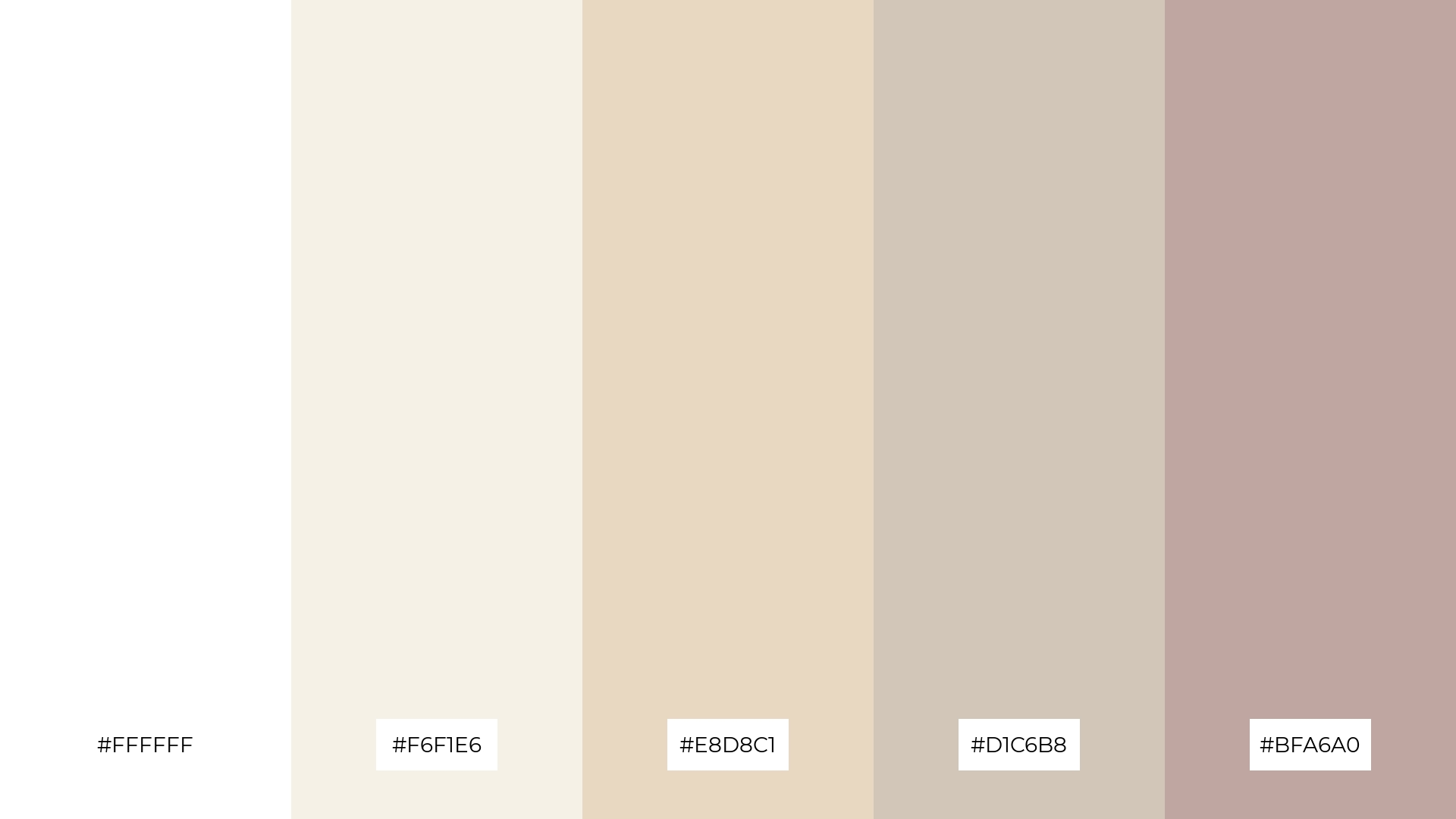
The ‘Elegant Ivory’ palette, with its blend of pure white (#FFFFFF) and warm neutrals like #F6F1E6 and #E8D8C1, offers a balance of soft and bold tones, creating a distinct and sophisticated mood.
This palette is ideal for creating inviting retail spaces or modern web designs, where the harmonious mix of colors can enhance the overall aesthetic and appeal.
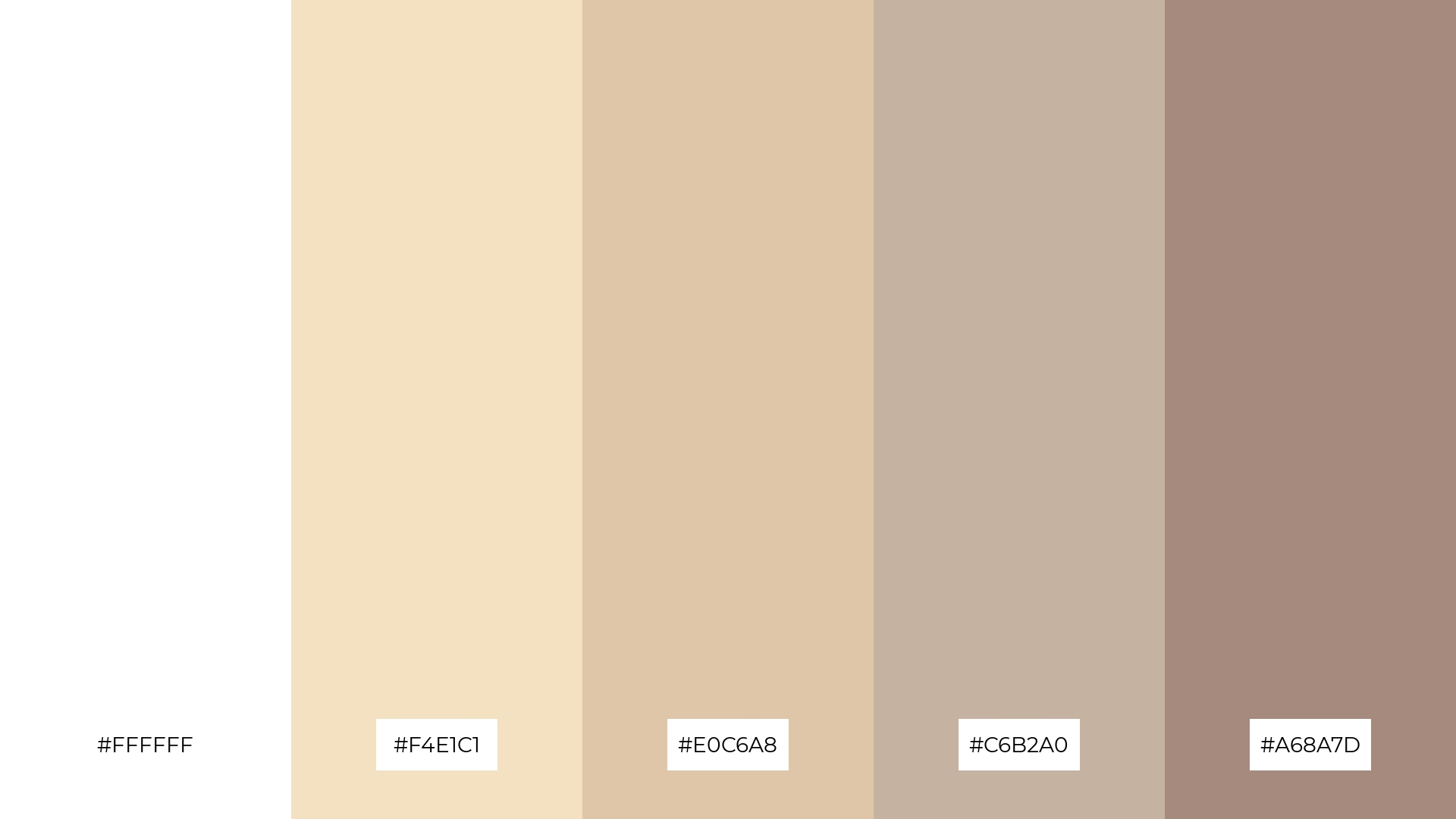
5) Vintage Lace
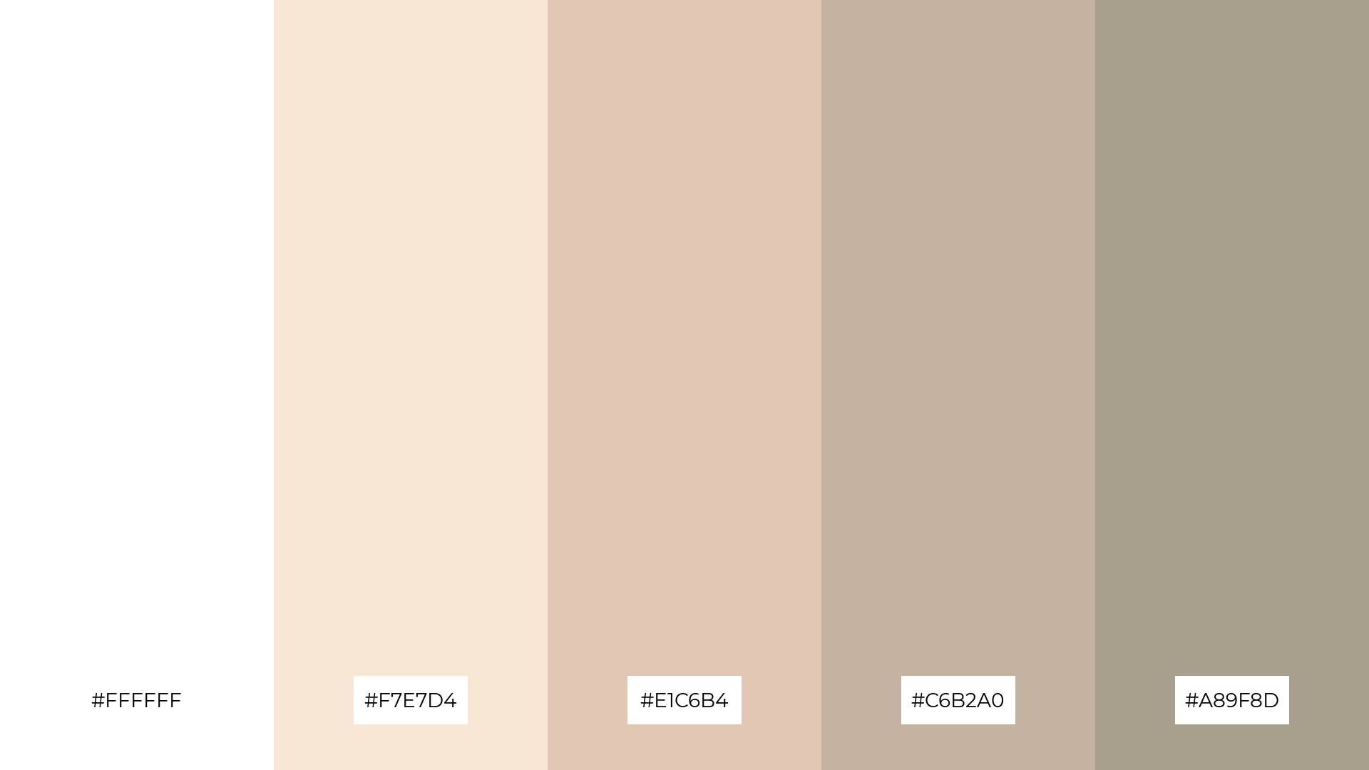
The ‘Vintage Lace’ palette, with its blend of pure white (#FFFFFF), soft beige (#F7E7D4), and muted browns (#E1C6B4, #C6B2A0, #A89F8D), creates an ambiance of timeless elegance and understated sophistication.
This harmonious combination is perfect for wedding themes, where the delicate and refined colors can enhance the romantic and classic atmosphere of the event.
6) Creamy Blossom
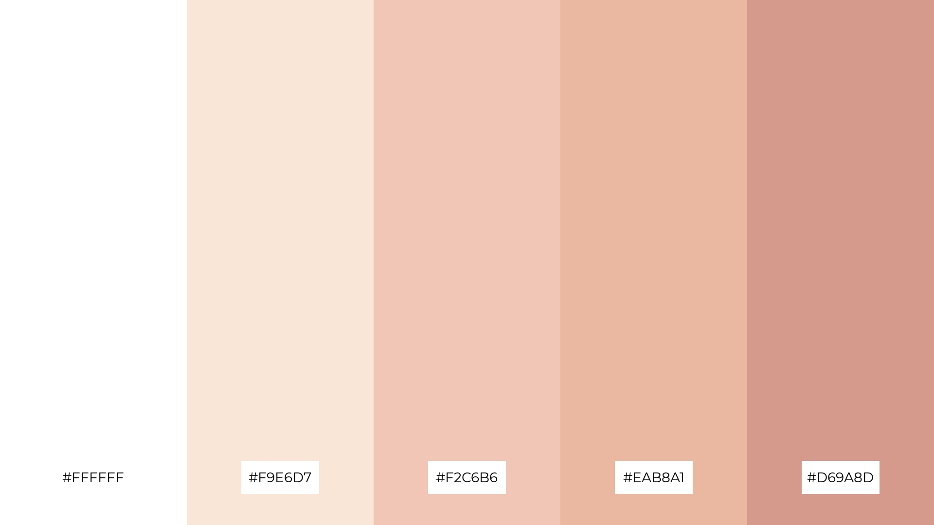
The ‘Creamy Blossom’ palette, with its blend of pure white (#FFFFFF) and warm tones like #F9E6D7 and #F2C6B6, creates a harmonious and sophisticated mood, perfect for minimalistic branding that seeks to convey elegance and refinement.
Alternatively, the vibrant hues of #EAB8A1 and #D69A8D can inject a playful energy into bold event designs, making this palette versatile for various creative applications.
7) Serene Dunes
The ‘Serene Dunes’ palette, with its mix of pure white (#FFFFFF) and warm neutrals like #F4E1C1 and #E0C6A8, creates a striking contrast that adds depth and visual interest to any design.
This palette is ideal for creative projects such as magazine layouts or artistic websites, where the harmonious blend of colors can enhance the overall aesthetic and captivate the audience.
8) Golden Cream
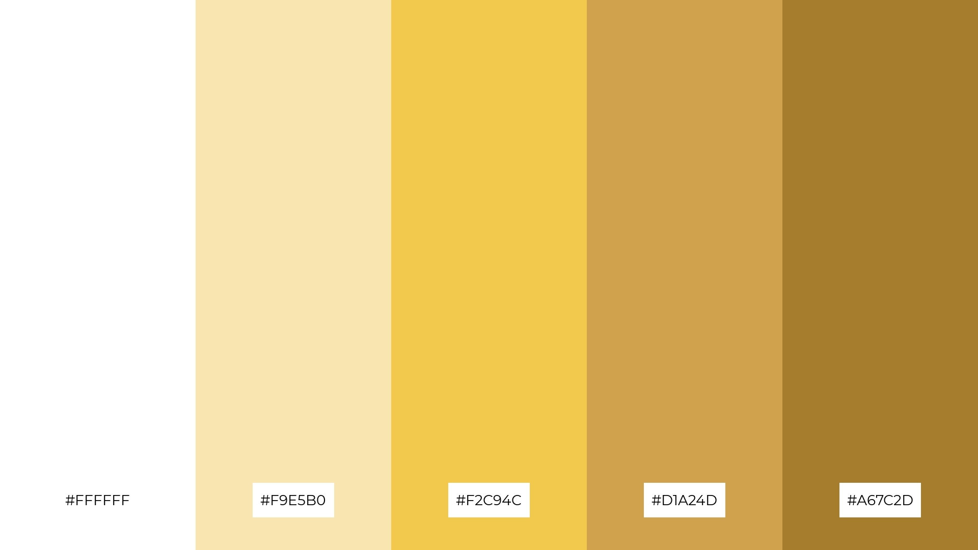
The ‘Golden Cream’ palette, with its blend of pure white (#FFFFFF) and warm tones like #F9E5B0 and #F2C94C, can evoke a sense of calm and serenity, making it ideal for spa branding where relaxation and tranquility are paramount.
Conversely, the vibrant hues of #D1A24D and #A67C2D can inject excitement and energy into vibrant marketing campaigns, capturing attention and creating a dynamic visual impact.
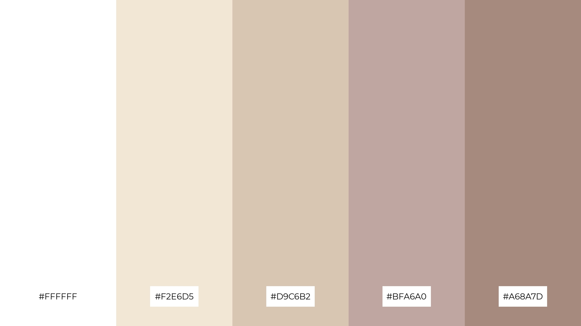
9) Frosted Almond
The ‘Frosted Almond’ palette, with its softer tones like #F2E6D5 and #D9C6B2, creates a gentle and inviting atmosphere that exudes warmth and comfort.
This blend of colors is perfect for home decor, where the harmonious mix of soft and bright hues can enhance the coziness and elegance of living spaces, making it an ideal choice for seasonal promotions as well.
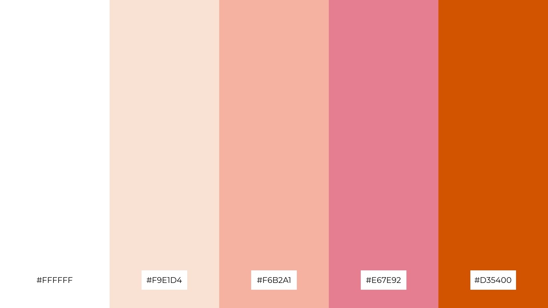
10) Soft Petals
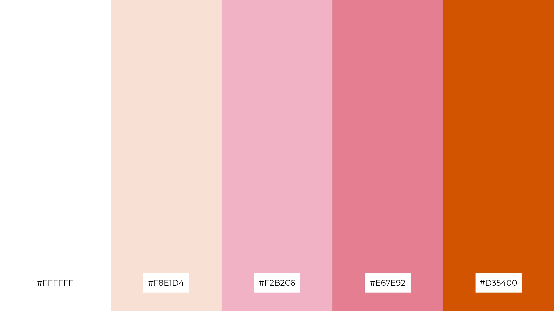
The ‘Soft Petals’ palette, with its gentle transition from pure white (#FFFFFF) to the vibrant #D35400, creates a visual flow that evokes feelings of joy and warmth, making it perfect for designs that aim to uplift and energize.
This harmonious blend of colors is ideal for lifestyle branding or tech product packaging, where the combination of tranquility and vibrancy can enhance the product’s appeal and create a memorable visual experience.
11) Creamy Mint
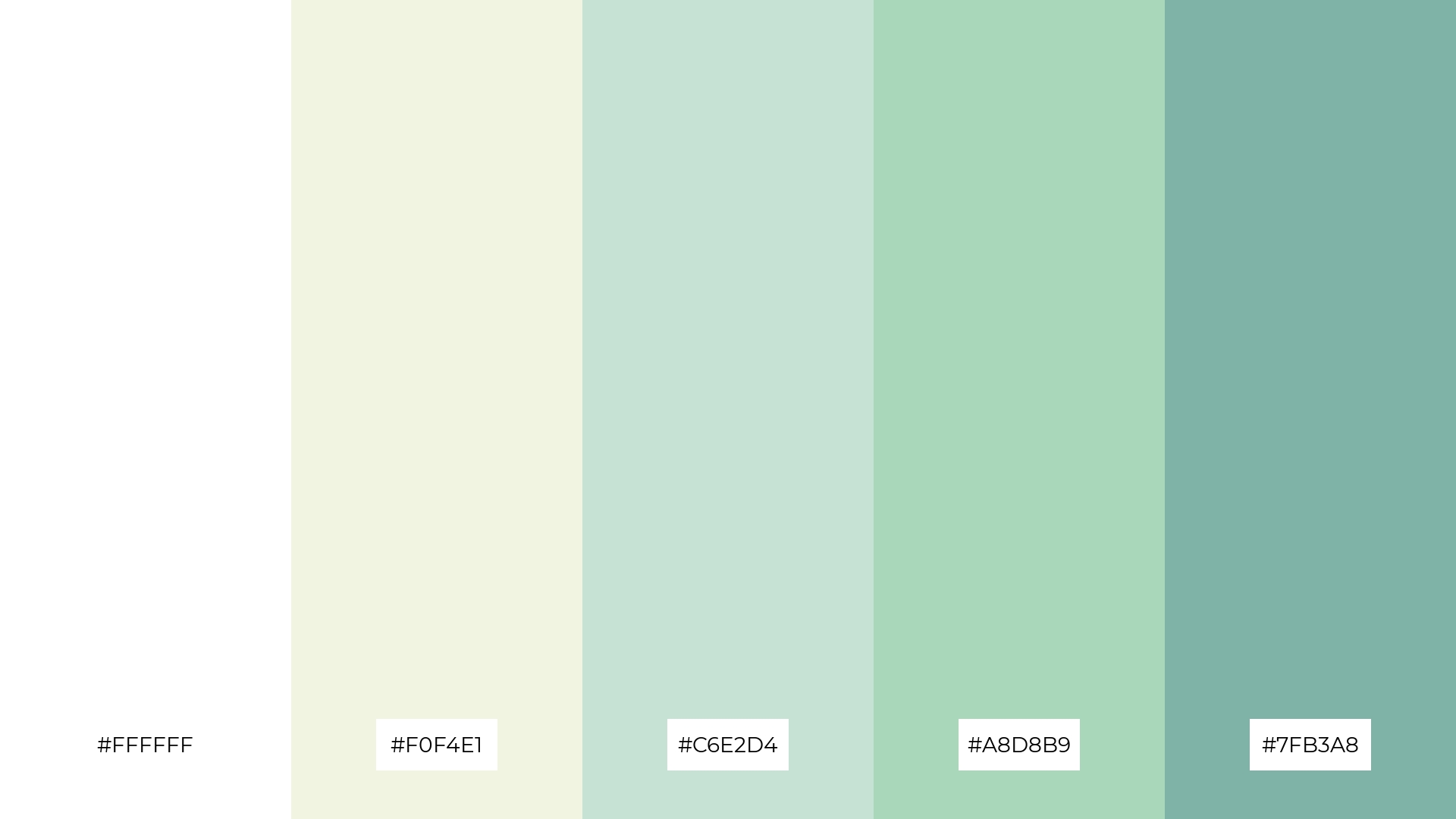
The ‘Creamy Mint’ palette, with its blend of pure white (#FFFFFF) and soft greens like #F0F4E1 and #C6E2D4, creates a welcoming and refreshing atmosphere that can make any space feel inviting and serene.
This palette shines in boutique interiors, where the harmonious mix of colors can enhance the shopping experience by creating a calm and sophisticated environment that encourages customers to linger and explore.
12) Rustic Cream
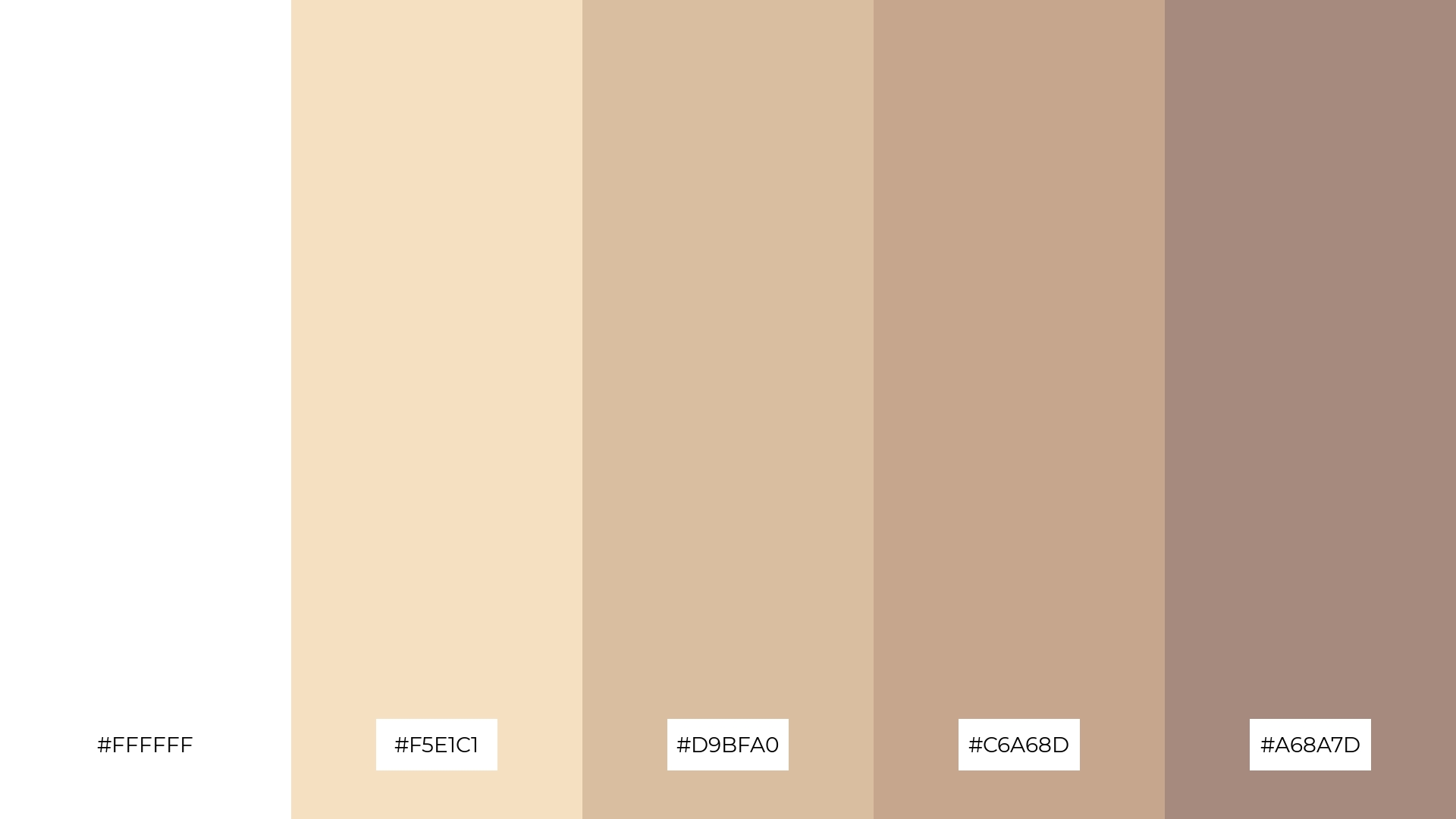
The ‘Rustic Cream’ palette, with its blend of pure white (#FFFFFF) and warm tones like #F5E1C1 and #D9BFA0, creates a harmonious balance that exudes a sense of comfort and understated elegance.
This palette is ideal for casual apparel lines, where the soft and inviting hues can enhance the brand’s appeal by evoking a relaxed and approachable vibe.
13) Dreamy Clouds
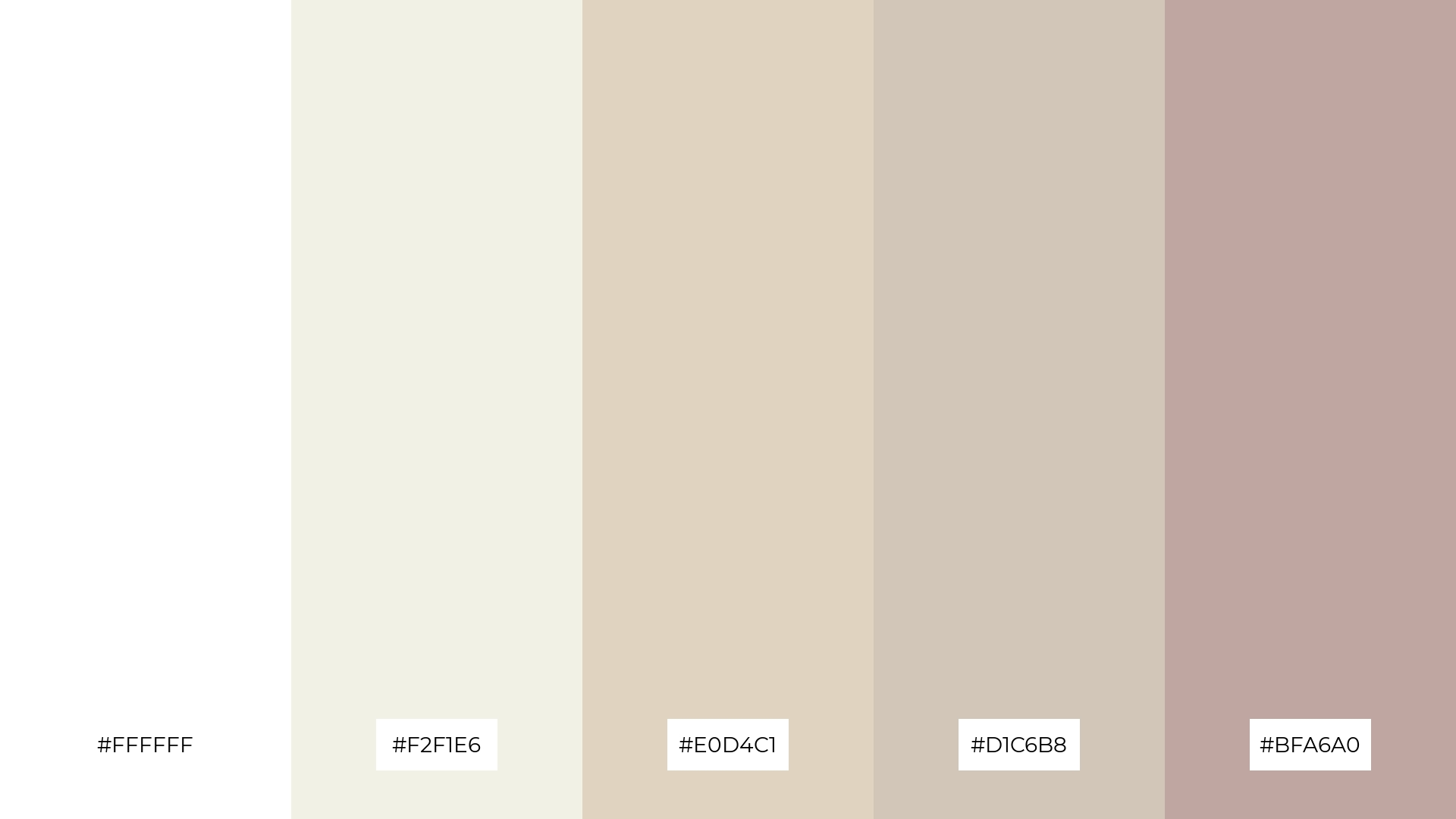
The ‘Dreamy Clouds’ palette, with its blend of pure white (#FFFFFF) and warm neutrals like #F2F1E6 and #E0D4C1, creates a balanced and serene mood that effortlessly combines warmth and coolness.
This harmonious mix is perfect for artisan product branding, where the subtle yet sophisticated colors can enhance the handcrafted and unique qualities of the products, making them stand out in a crowded market.
14) Soft Peach
The ‘Soft Peach’ palette, with its blend of pure white (#FFFFFF) and vibrant hues like #D35400, creates a dynamic interaction that can be both bold and subtle, making it versatile for various design needs.
This palette is ideal for festival marketing, where the energetic and inviting colors can capture attention and convey a sense of excitement and celebration.
15) Creamy Forest
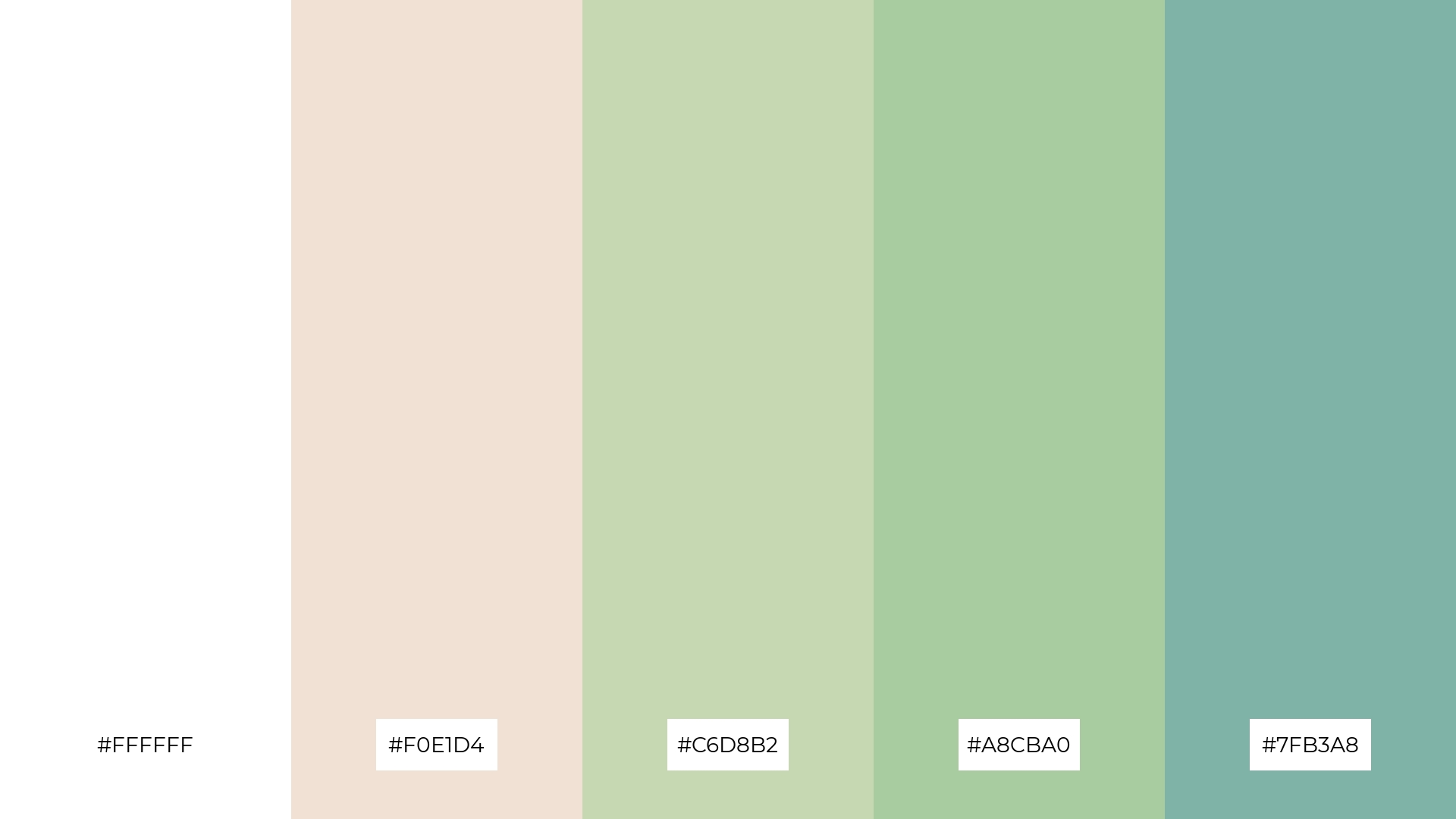
The ‘Creamy Forest’ palette, with its blend of pure white (#FFFFFF) and earthy greens like #C6D8B2 and #A8CBA0, conveys a sense of harmony by seamlessly integrating natural tones that evoke tranquility and balance.
This palette is ideal for cozy interior makeovers, where the warm and inviting hues can create a serene and welcoming atmosphere, or for tech startups aiming to convey a fresh and innovative brand identity through a harmonious yet dynamic color scheme.
How to Use White Cream Patterns in Design
White cream color palettes can be a game-changer in home decor, offering a neutral yet sophisticated backdrop that enhances any room. Pairing white cream with natural materials like wood or stone can create a warm and inviting atmosphere, perfect for living rooms or bedrooms.
In marketing materials, white cream tones can add a touch of elegance and professionalism. Use them as a base color for brochures or business cards, and accent with metallics or bold colors to make your brand stand out.
For clothing design, white cream palettes offer versatility and timeless appeal. These hues can be used to create chic, minimalist outfits or to balance more vibrant pieces, making them a staple in any wardrobe.
Ready to elevate your design projects with white cream color palettes? Try creating your own stunning palettes using Piktochart today!


