 Piktochart Team
·

Updated on
November 21, 2024
Published on
November 19, 2024

Embracing the charm of rural life, cottagecore color palettes bring a sense of nostalgia and tranquility to any design. These palettes are inspired by nature, vintage aesthetics, and the simplicity of countryside living.
From soft pastels to earthy tones, cottagecore colors evoke a warm and inviting atmosphere. Whether you're designing a graphic or redecorating a space, these hues can transform your project into a serene retreat.
Designing a color palette with a cottagecore theme requires a thoughtful approach to ensure harmony and versatility.

The 'Meadow Blossom' palette, with its blend of soft yellows, muted pinks, and fresh greens, creates a mood of gentle rejuvenation and natural elegance.
Perfect for a spring-themed interior decor project, these colors interact harmoniously to evoke the serene beauty of a blooming meadow, making any space feel both inviting and refreshingly vibrant.

The 'Rustic Autumn' palette, with its rich oranges and deep browns, evokes a feeling of warmth and coziness, reminiscent of a crisp fall day.
This color scheme would excel in product packaging for artisanal goods, where the earthy tones can convey a sense of handcrafted quality and seasonal charm.

The 'Lavender Fields' palette, featuring dominant shades of lavender and purple, creates a soothing and elegant atmosphere with colors like #E6D5E0 and #6B4C9A providing a balanced mix of light and deep tones.
Ideal for wellness branding, these hues evoke a sense of calm and tranquility, making them perfect for creating a harmonious and inviting environment in eco-friendly interior spaces.

The 'Enchanted Forest' palette, with its mix of deep greens and soft neutrals, offers a balance of soft and bold tones that create a distinct, immersive mood.
Ideal for modern web designs, these colors can transform a digital space into an inviting and visually captivating environment.

The 'Vintage Rose' palette, with its blend of soft pinks and muted mauves, creates an ambiance of timeless romance and delicate elegance.
Perfect for wedding themes, these colors can transform any venue into a dreamy, fairy-tale setting, enhancing the overall atmosphere with a touch of vintage charm.

The 'Sunlit Orchard' palette, with its blend of warm yellows and rich browns, creates a harmonious balance that evokes a sense of rustic sophistication and natural warmth.
Ideal for minimalistic branding, these colors can infuse a brand with a touch of elegance and approachability, making it perfect for artisanal food products or eco-friendly packaging.

The 'Whimsical Sky' palette, with its blend of airy blues and soft whites, creates a striking contrast that adds visual interest and depth to any design.
Ideal for creative projects like magazine layouts or artistic websites, these colors can infuse a sense of lightness and creativity, making the content both engaging and aesthetically pleasing.

The 'Cozy Hearth' palette, with its warm and inviting shades like #C4A69F and #D9BFA6, brings a sense of calm and relaxation, making it perfect for spa branding where tranquility is key.
Conversely, the deeper tones like #A67B6D and #7A4B3A can be combined to create a sense of excitement and energy, ideal for vibrant marketing campaigns that aim to capture attention and evoke a sense of passion.

The 'Serene Waters' palette, with its softer tones like #A4D8E1 and #E0F7FA, creates a calming and refreshing atmosphere that evokes the tranquility of a peaceful lakeside retreat.
Ideal for home decor or seasonal promotions, this blend of bright and soothing hues can transform any space into a serene and inviting environment, perfect for evoking a sense of relaxation and rejuvenation.

The 'Wildflower Meadow' palette, with its vibrant hues of #F2A900 and #F2D600, creates a visual flow that evokes feelings of joy and energy, while the softer tones of #A8D600 and #E8C6A0 add a touch of tranquility and balance.
Ideal for lifestyle branding, these colors can infuse a sense of natural beauty and vitality into tech product packaging, making the products feel both innovative and grounded in nature.
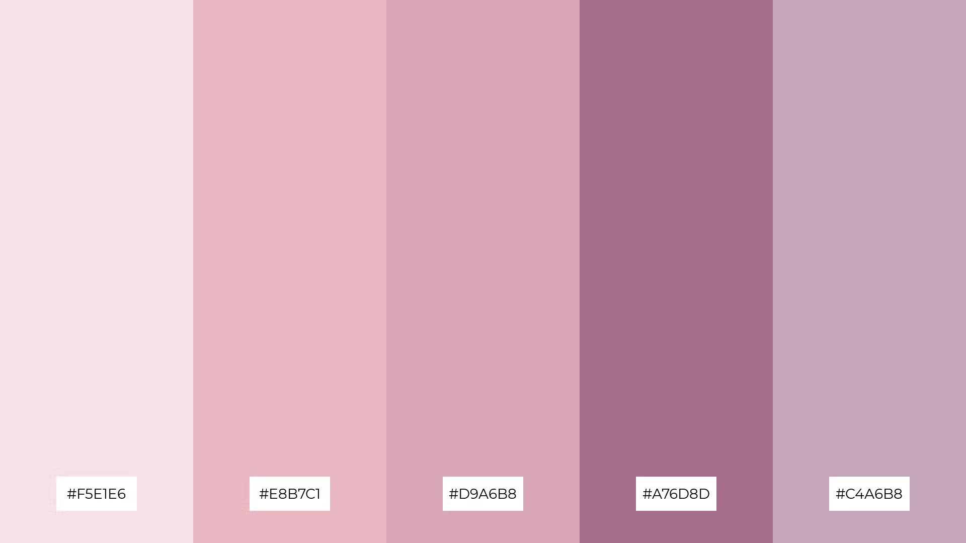
The 'Soft Petals' palette, with its blend of gentle pinks and rich mauves, creates a welcoming and sophisticated atmosphere that can make any design feel both inviting and elegant.
Ideal for luxury e-commerce sites, these tones can enhance the user experience by adding a touch of drama and refinement, making the products appear more exclusive and desirable.

The 'Harvest Moon' palette, with its blend of #D9C6A0, #E8B76D, #A65E2E, #7A4B2A, and #C76D3D, creates a harmonious balance by combining warm, earthy tones that evoke a sense of rustic elegance and natural beauty.
Ideal for casual apparel lines, these colors can infuse clothing collections with a cozy, autumnal vibe, making them perfect for seasonal fashion that feels both stylish and grounded.
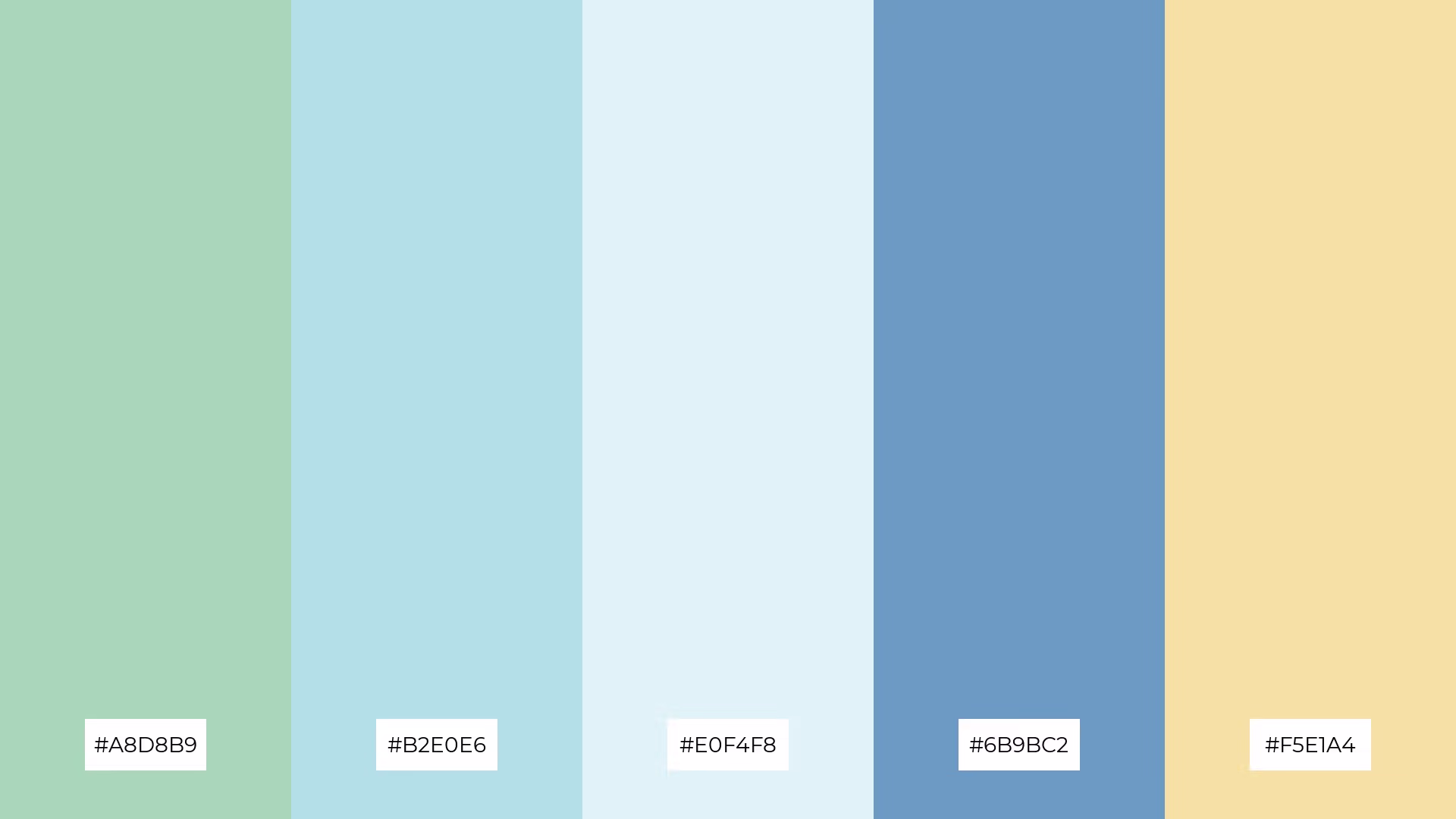
The 'Morning Dew' palette, with its blend of warm and cool tones like #A8D8B9 and #6B9BC2, evokes a mood of fresh tranquility and gentle rejuvenation.
Ideal for artisan product branding, these colors can infuse packaging with a sense of natural elegance and serene sophistication, making the products feel both high-quality and inviting.

The 'Secret Garden' palette, with its dynamic interplay of #C4D6A6, #A8D8B9, #B2E0E6, #E8C6D4, and #F2B2C6, offers a versatile mix of bold and subtle hues that can create a visually captivating experience.
Ideal for festival marketing, these colors can infuse promotional materials with a sense of whimsical elegance and vibrant energy, making the event feel both enchanting and inviting.
The 'Autumn Leaves' palette, with its rich blend of #C76D3D, #E8B76D, #A65E2E, #7A4B2A, and #D9C6A0, conveys a sense of harmony when used in cozy interior makeovers, creating a warm and inviting atmosphere that feels both balanced and comforting.
Conversely, this palette can create a striking contrast in tech startup branding, where the deep, earthy tones can stand out against sleek, modern designs, making the brand feel innovative yet grounded.
In home decor, Cottagecore color palettes can transform any space into a serene retreat. Use soft pastels and earthy tones to create a warm and inviting atmosphere, perfect for living rooms or bedrooms. Incorporate natural textures like wood and linen to enhance the rustic charm.
For marketing materials, these palettes can evoke a sense of nostalgia and tranquility, making your brand feel approachable and authentic. Pair muted greens with blush pinks for a cohesive and pleasing aesthetic. Add subtle patterns and textures to create depth without overwhelming the design.
In clothing design, Cottagecore colors can infuse collections with a timeless, romantic vibe. Opt for a mix of soft pinks, muted mauves, and earthy browns to create pieces that feel both stylish and grounded. These hues are perfect for seasonal fashion lines that aim to evoke a cozy, autumnal feel.
Ready to bring the charm of Cottagecore to your designs? Try creating your own color palettes using Piktochart. Get started today and transform your projects with these enchanting hues.
The latest industry news, interviews, technologies, and resources.

Published on
November 25, 2024


