
Mint green is a versatile and refreshing color that has gained popularity in various design fields. Its soothing and vibrant qualities make it a favorite choice for creating visually appealing graphics.
From web design to interior decor, mint green palettes offer a unique blend of tranquility and energy. This article explores the different ways you can incorporate mint green into your projects for a modern and stylish look.
Tips For Creating Mint Green Color Palettes
Designing with mint green can be both exciting and challenging. Here are some practical tips to help you create stunning color palettes:
- Balance with Neutrals: Pair mint green with neutral colors like white, beige, or gray to create a balanced and sophisticated look.
- Complementary Shades: Use complementary colors such as coral, peach, or soft pink to add warmth and contrast to your design.
- Accent with Bold Colors: Introduce bold colors like navy blue or deep purple as accents to make your mint green palette pop.
- Consider the Mood: Think about the mood you want to convey. Mint green combined with pastel shades can create a calming effect, while pairing it with brighter colors can energize the design.
- Versatility in Design: Mint green works well in various design styles, from minimalist to vintage. Experiment with different textures and patterns to see what fits best.
- Test and Iterate: Always test your color combinations on different devices and in various lighting conditions to ensure they look great everywhere.
15 Mint Green Color Palettes
1) Fresh Mint Breeze
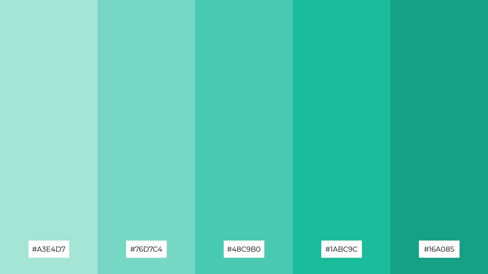
The ‘Fresh Mint Breeze’ palette, with its gradient of minty hues ranging from soft #A3E4D7 to deep #16A085, creates a refreshing and invigorating mood that evokes a sense of calm and rejuvenation.
These colors interact harmoniously to form a cohesive look, making them ideal for a spa-themed interior decor where tranquility and relaxation are paramount.
2) Minty Morning
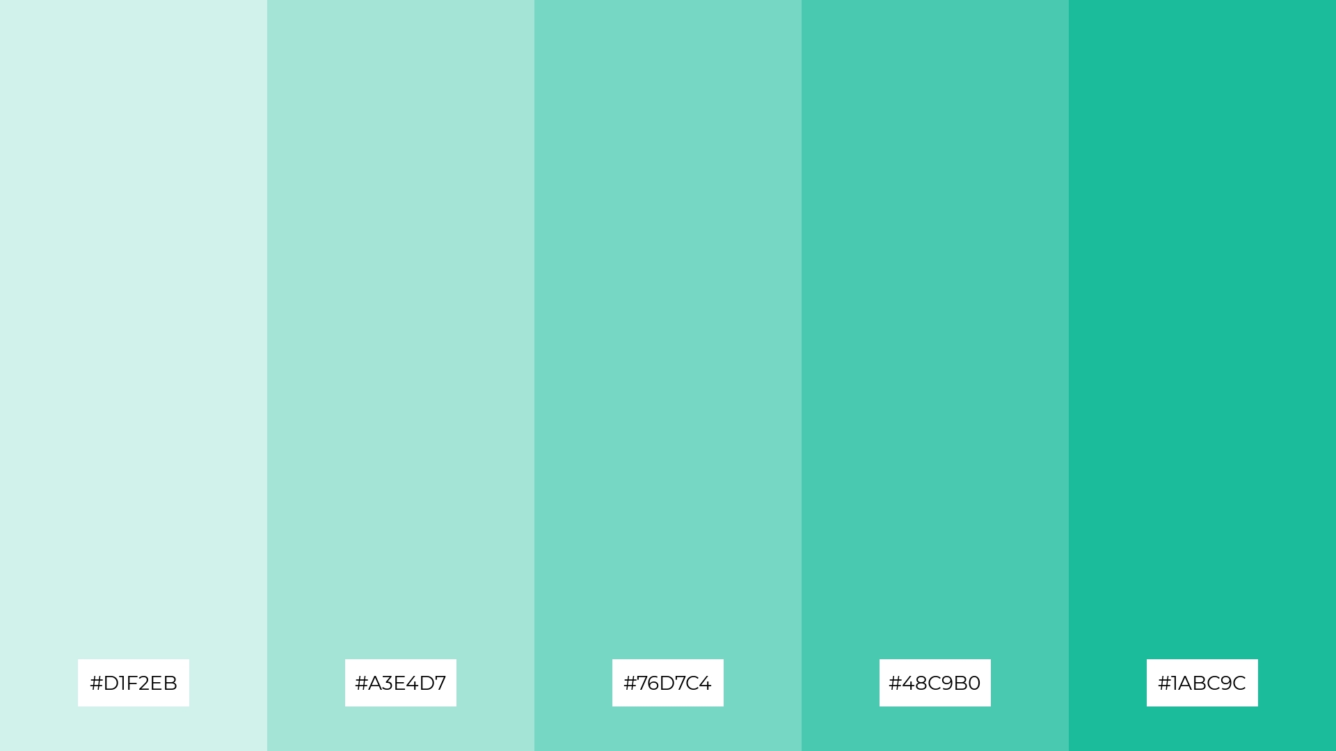
The ‘Minty Morning’ palette, with its gradient of minty hues from #D1F2EB to #1ABC9C, evokes a sense of calmness and serenity, making it perfect for wellness and self-care product packaging.
In digital branding, this palette can create an inviting and refreshing user experience, ideal for health and lifestyle websites aiming to convey a message of vitality and well-being.
3) Mint Chocolate Chip
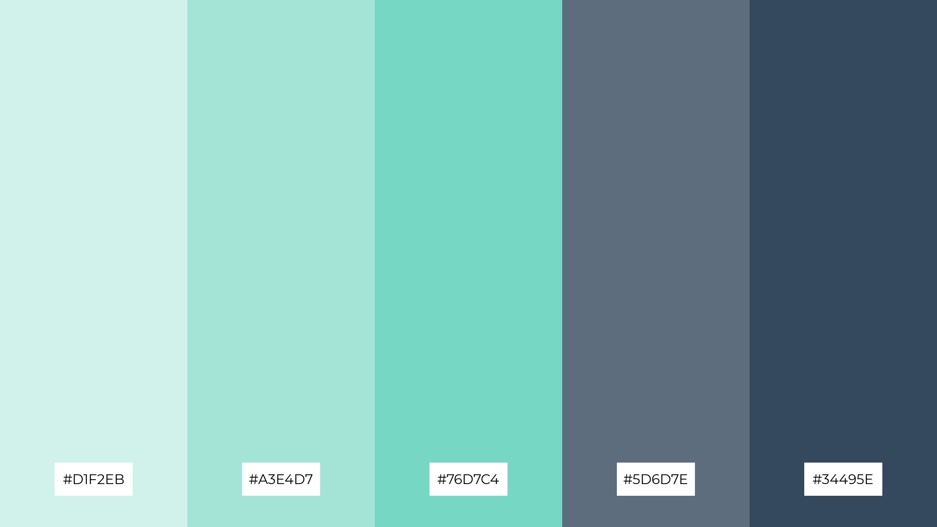
The ‘Mint Chocolate Chip’ palette features dominant colors like the refreshing #D1F2EB and #A3E4D7, balanced by the grounding tones of #5D6D7E and #34495E, creating a harmonious blend that is both invigorating and stable.
This palette is particularly effective for eco-friendly interior spaces, where the minty hues evoke a sense of freshness and the deeper shades add a touch of sophistication and balance.
4) Minty Sunset
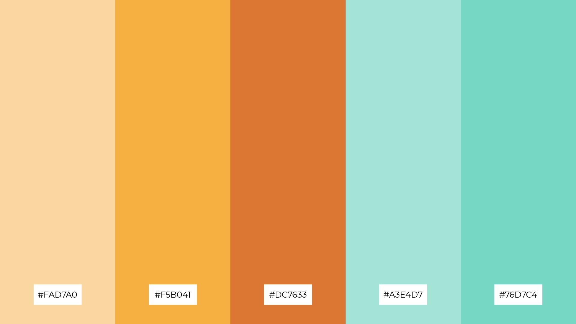
The ‘Minty Sunset’ palette, with its blend of soft pastels like #FAD7A0 and bold tones such as #DC7633, offers a balanced and distinct mood that is both inviting and dynamic.
This palette is ideal for creating inviting retail spaces or modern web designs, where the combination of warm and cool hues can attract and engage customers effectively.
5) Minty Fresh
The ‘Minty Fresh’ palette, with its gradient of minty hues from #A3E4D7 to #16A085, creates a serene and refreshing ambiance that is perfect for wedding themes, evoking a sense of tranquility and elegance.
These colors work harmoniously to bring a touch of vibrancy and sophistication, making them ideal for luxury fashion campaigns where a fresh and modern aesthetic is desired.
6) Minty Lavender
The ‘Minty Lavender’ palette, with its blend of minty greens and soft purples, creates a sophisticated yet playful mood, making it ideal for minimalistic branding that aims to convey elegance and creativity.
This harmonious combination of colors can also be effectively used in bold event designs, where the contrast between the minty hues and the deeper purples adds a touch of vibrancy and excitement to the overall aesthetic.
7) Minty Coral
The ‘Minty Coral’ palette, with its contrasting elements of warm corals (#FAD7A0, #F5B041, #DC7633) and cool minty greens (#A3E4D7, #76D7C4), creates a dynamic visual interest that captivates the viewer’s attention.
This vibrant combination is perfect for creative projects like magazine layouts or artistic websites, where the interplay of warm and cool tones can add depth and excitement to the overall design.
8) Minty Sky
The ‘Minty Sky’ palette, with its soothing blend of #D1F2EB, #A3E4D7, and #76D7C4, brings a sense of calm and tranquility, making it ideal for spa branding where relaxation and serenity are key.
Conversely, the vibrant combination of #5DADE2 and #3498DB injects excitement and energy, perfect for dynamic marketing campaigns that aim to captivate and engage a lively audience.
9) Minty Forest
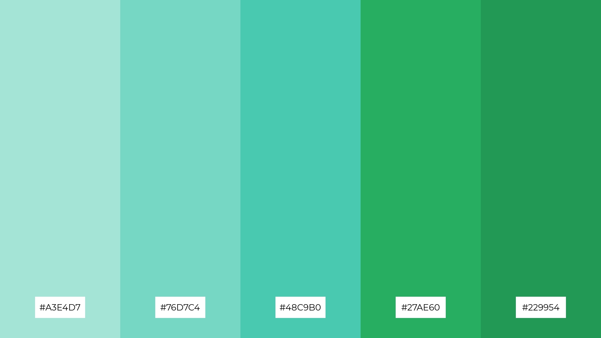
The ‘Minty Forest’ palette, with its softer tones like #A3E4D7 and #76D7C4, combined with brighter hues such as #48C9B0, #27AE60, and #229954, creates a refreshing and invigorating atmosphere that evokes a sense of natural tranquility and vitality.
This harmonious blend is perfect for home decor, where the calming minty shades can create a serene living space, or for seasonal promotions, where the vibrant greens can add a touch of freshness and energy to the design.
10) Minty Rose
The ‘Minty Rose’ palette, with its warm corals (#FAD7A0, #F5B041, #DC7633) and cool minty greens (#A3E4D7, #76D7C4), creates a visual flow that evokes both joy and tranquility, making it a versatile choice for various design applications.
This harmonious blend of colors is ideal for lifestyle branding, where the warm tones can convey a sense of happiness and energy, while the cool minty hues add a touch of calm and sophistication, making it perfect for tech product packaging that aims to balance excitement with a serene user experience.
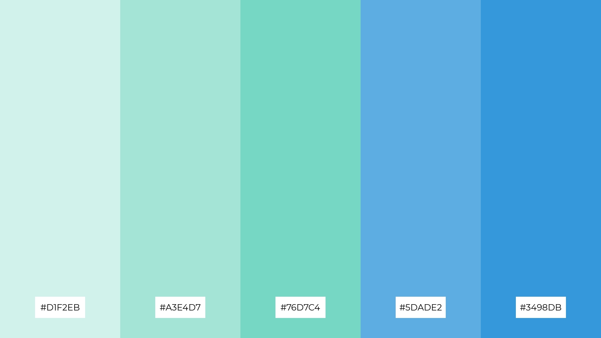
11) Minty Ocean
The ‘Minty Ocean’ palette, with its gradient of soothing blues and greens from #D1F2EB to #3498DB, creates a welcoming and serene effect that evokes the tranquility of the sea, making it perfect for boutique interiors aiming to offer a calming shopping experience.
Conversely, the deeper tones like #5DADE2 and #3498DB add a dramatic flair, making this palette ideal for luxury e-commerce sites that want to captivate and engage customers with a sophisticated and vibrant visual appeal.
12) Minty Lemonade
The ‘Minty Lemonade’ palette, with its warm corals (#FAD7A0, #F5B041, #DC7633) and cool minty greens (#A3E4D7, #76D7C4), creates a dynamic balance that evokes both energy and tranquility.
This versatile combination is perfect for casual apparel lines, where the vibrant corals can add a playful touch while the minty greens bring a refreshing and modern aesthetic.
13) Minty Peach
The ‘Minty Peach’ palette, with its warm corals (#FAD7A0, #F5B041, #DC7633) and cool minty greens (#A3E4D7, #76D7C4), creates a balanced and inviting mood that evokes both warmth and freshness.
This harmonious blend is perfect for artisan product branding, where the combination of vibrant and soothing tones can convey a sense of handcrafted quality and modern elegance.
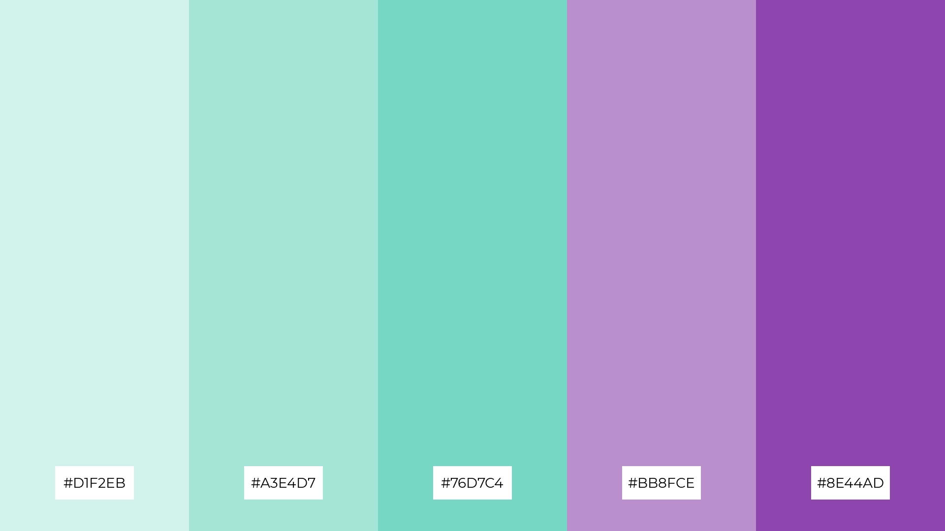
14) Minty Berry
The ‘Minty Berry’ palette, with its blend of minty greens (#D1F2EB, #A3E4D7, #76D7C4) and rich purples (#BB8FCE, #8E44AD), creates a dynamic interaction that balances freshness with bold sophistication.
This vibrant combination is perfect for festival marketing, where the energetic purples can captivate attention while the soothing minty hues add a touch of modern elegance.
15) Minty Ice
The ‘Minty Ice’ palette, with its gradient of cool blues and greens from #D1F2EB to #3498DB, conveys a sense of harmony when used in tech startups, creating a sleek and modern aesthetic that promotes focus and innovation.
Conversely, this palette can create a striking contrast in cozy interior makeovers, where the vibrant blues add a refreshing touch to warm, inviting spaces, making it perfect for accent walls or statement furniture pieces.
How to Use Mint Green Patterns in Design
Mint green color palettes can transform home decor by creating a serene and refreshing atmosphere. Use mint green as a base color for walls or furniture, and complement it with neutral tones like white or beige to maintain a balanced and sophisticated look. Adding accents of bold colors such as navy blue or deep purple can also enhance the overall aesthetic, making your space both inviting and stylish.
In marketing materials, mint green can convey a sense of vitality and freshness, perfect for health and wellness brands. Pair it with warm corals or soft pinks to add warmth and contrast, making your designs more engaging and visually appealing. For a modern and dynamic look, incorporate mint green with vibrant hues like orange or yellow to capture attention and energize your audience.
For clothing design, mint green offers a versatile and trendy option that can be both calming and invigorating. Use it as a primary color for casual apparel to evoke a sense of freshness and modernity, or as an accent in patterns and accessories to add a touch of sophistication. Experiment with different shades and combinations to create unique and stylish outfits that stand out.
Ready to bring your mint green design ideas to life? Try creating stunning color palettes using Piktochart. Get started now and elevate your design projects with ease!


