Charcoal color palettes offer a sophisticated and versatile option for various design projects. This deep, neutral hue can add depth and elegance to any visual composition.
Whether you’re creating infographics, presentations, or social media graphics, incorporating charcoal tones can elevate your design. Explore the potential of charcoal to bring a modern and polished look to your work.
Tips For Creating Charcoal Color Palettes
Designing with charcoal color palettes can be both exciting and challenging. Here are some practical tips to help you create stunning visuals:
- Balance with Lighter Shades: Pair charcoal with lighter colors like white, beige, or soft pastels to create a balanced and visually appealing design.
- Use Complementary Colors: Match charcoal with complementary shades such as deep blues, rich greens, or warm browns to add depth and interest to your palette.
- Incorporate Accent Colors: Introduce vibrant accent colors like mustard yellow or coral to make certain elements pop and draw attention.
- Maintain Versatility: Ensure your palette is versatile by including a range of tones from light to dark, allowing for flexibility in different design contexts.
- Test in Different Contexts: Always test your color combinations in various settings to see how they interact and ensure they work well together.
- Consider Accessibility: Make sure your color choices are accessible to all users by checking contrast ratios and ensuring readability.
15 Charcoal Color Palettes
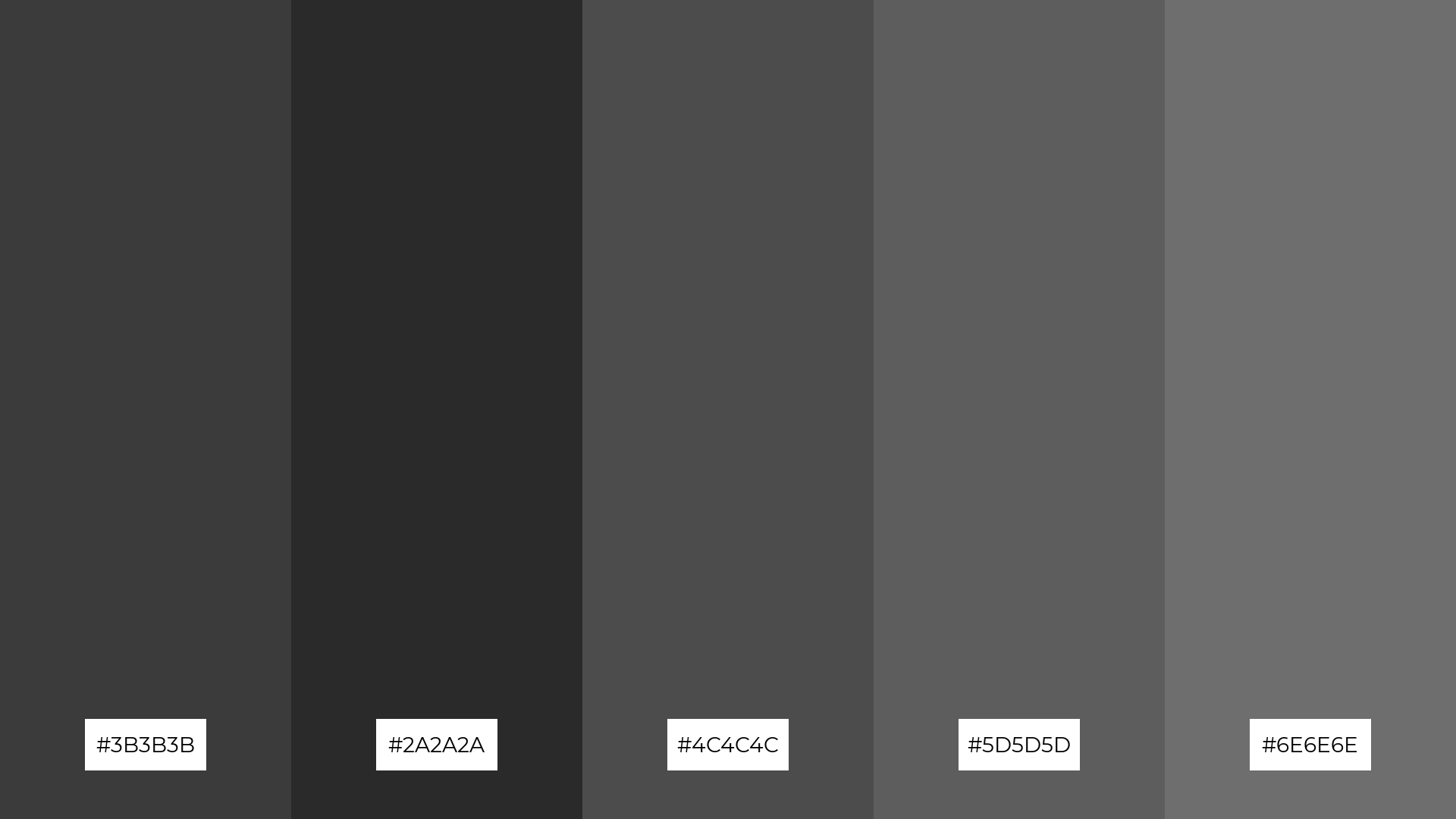
1) Urban Nightfall
The ‘Urban Nightfall’ palette, with its shades of deep grays and blacks, evokes a mood of modern sophistication and understated elegance.
These colors interact seamlessly to create a cohesive and sleek look, making them ideal for contemporary interior decor where a minimalist and chic atmosphere is desired.
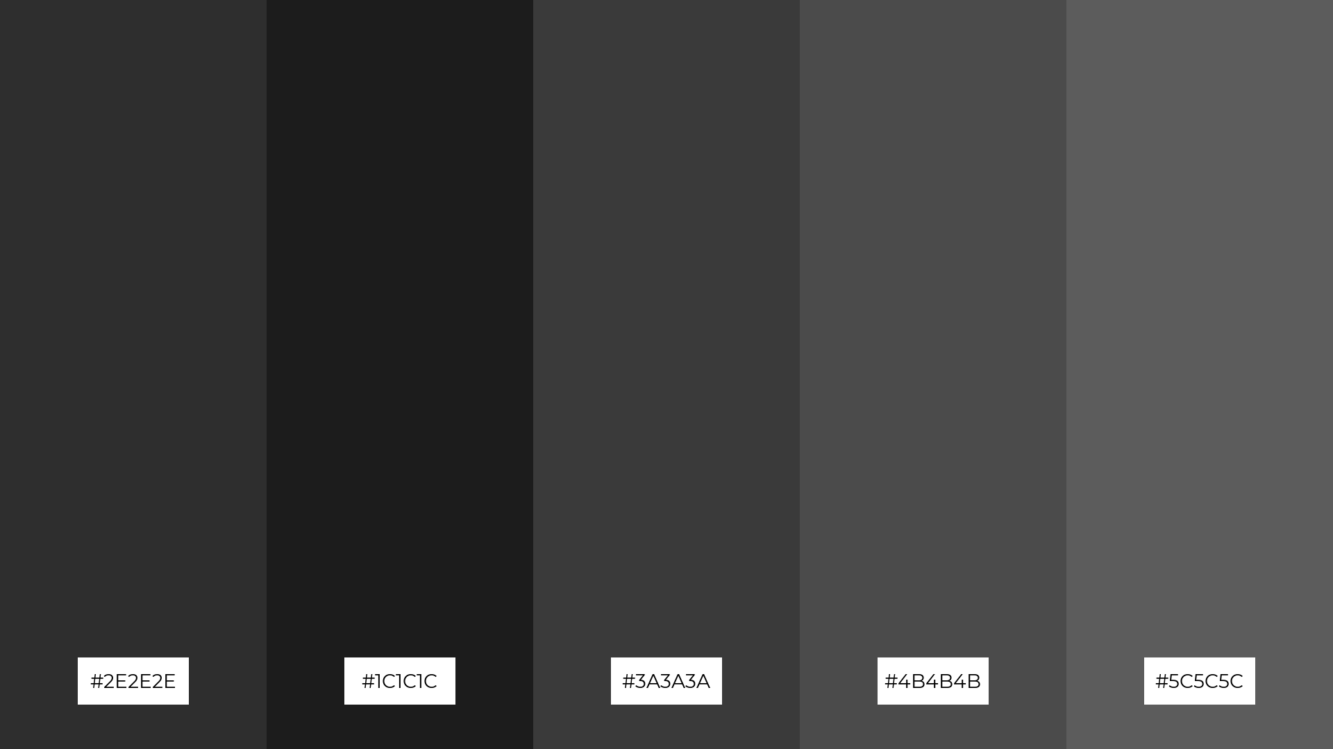
2) Industrial Elegance
The ‘Industrial Elegance’ palette, with its range of grays from #3B3B3B to #6E6E6E, evokes a sense of calmness and understated sophistication, making it perfect for creating a serene yet modern atmosphere.
This palette would excel in digital branding for tech companies, where a sleek and professional look is essential to convey innovation and reliability.
3) Monochrome Mist
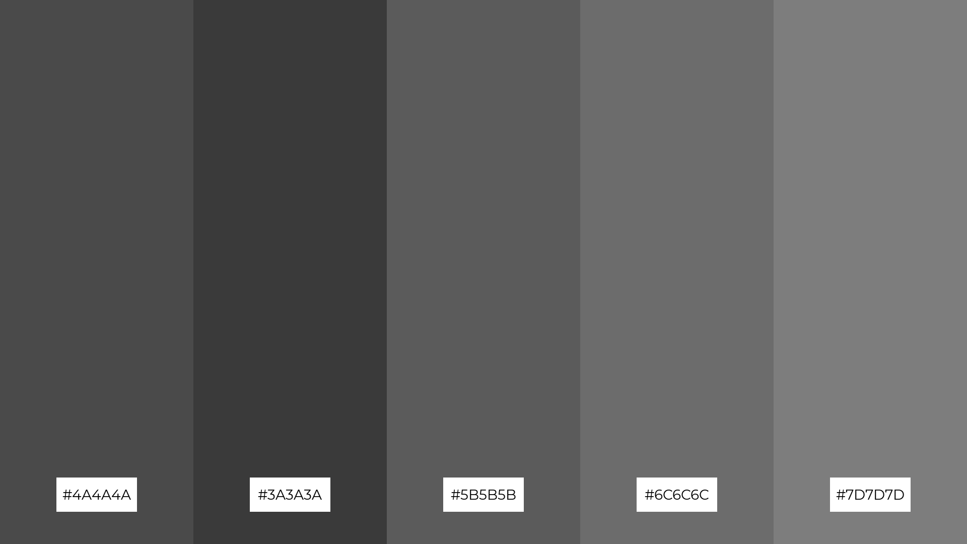
The ‘Monochrome Mist’ palette, featuring dominant shades like #4A4A4A, #3A3A3A, #5B5B5B, #6C6C6C, and #7D7D7D, creates a cohesive and tranquil visual experience through its subtle gradations of gray.
This harmonious blend of colors is particularly well-suited for wellness branding, where a calm and serene atmosphere is essential to convey relaxation and balance.
4) Charcoal Sunset
The ‘Charcoal Sunset’ palette, with its blend of deep charcoal and vibrant sunset hues, offers a perfect balance of soft and bold tones, creating a distinct and captivating mood.
This palette is ideal for designing inviting retail spaces or modern web designs, where the combination of warmth and sophistication can enhance the overall aesthetic and user experience.
5) Smoky Forest
The ‘Smoky Forest’ palette, with its blend of deep charcoal and rich greens, evokes a sense of tranquility and natural elegance, making it perfect for creating serene wedding themes that feel both timeless and intimate.
These colors work harmoniously to bring a touch of sophistication and organic beauty to luxury fashion campaigns, where the combination of earthy tones and deep grays can enhance the allure and exclusivity of the brand.
6) Midnight Ocean
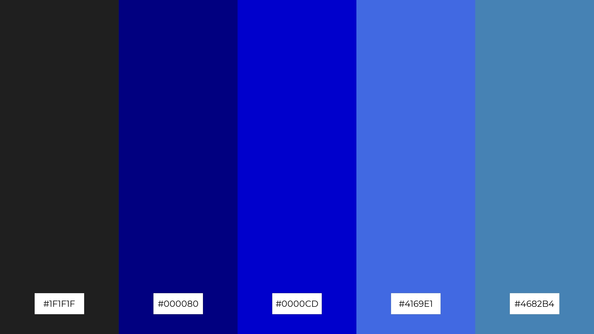
The ‘Midnight Ocean’ palette, with its deep charcoal and varying shades of blue, creates a sophisticated and calming atmosphere, perfect for minimalistic branding that aims to convey professionalism and trust.
These harmonious colors can also be used in bold event designs, where the rich blues add a touch of elegance and depth, making the overall aesthetic both striking and inviting.
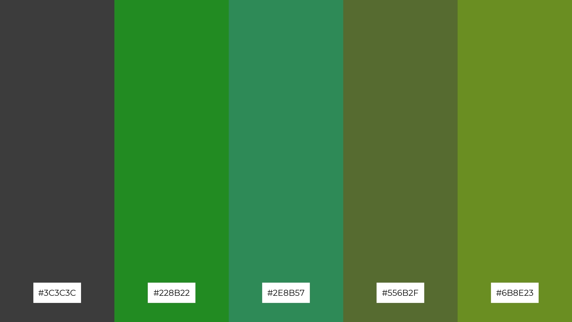
7) Urban Jungle
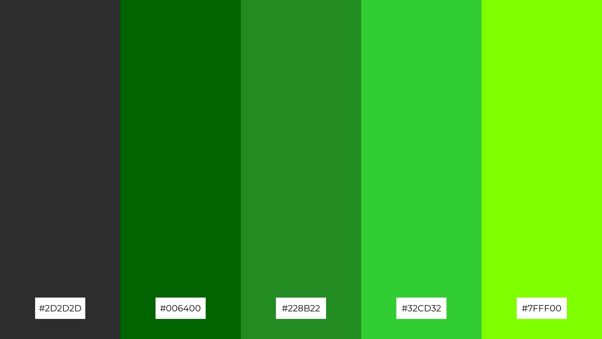
The ‘Urban Jungle’ palette, with its deep charcoal (#2D2D2D) and vibrant greens (#006400, #228B22, #32CD32, #7FFF00), creates a striking contrast that adds visual interest and dynamic energy to any design.
This palette is perfect for creative projects like magazine layouts or artistic websites, where the bold interplay of dark and bright tones can captivate the audience and enhance the overall aesthetic appeal.
8) Charcoal Rose
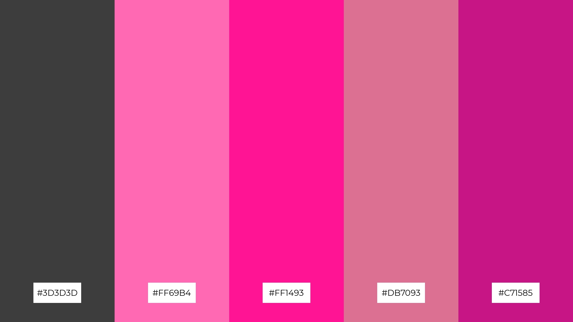
The ‘Charcoal Rose’ palette, with its blend of deep charcoal and vibrant pinks, can evoke a sense of calm when the darker shades are paired with the softer pinks, creating a soothing and balanced visual experience.
Alternatively, the brighter pinks in this palette can be combined with the charcoal tones to bring a burst of excitement and energy, making it ideal for vibrant marketing campaigns that aim to capture attention and convey a lively, dynamic brand personality.
9) Industrial Chic
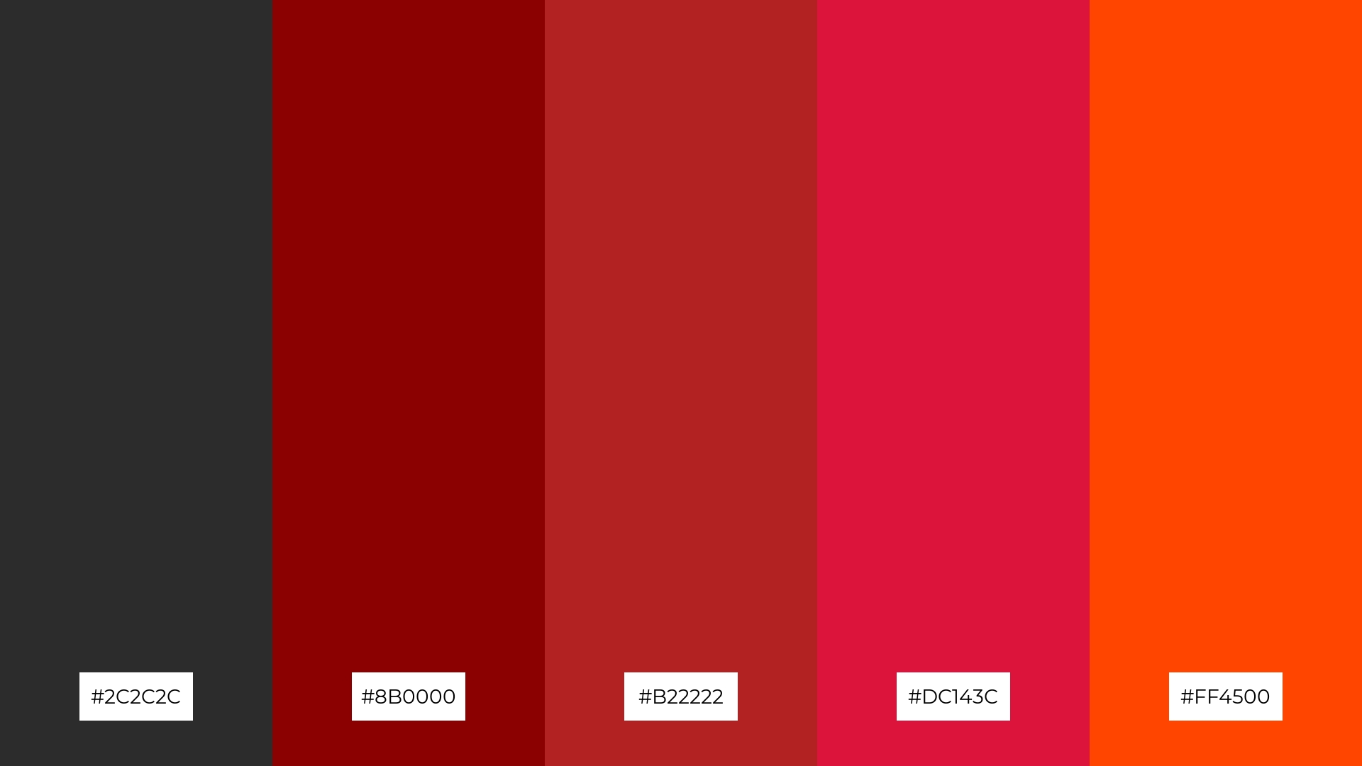
The ‘Industrial Chic’ palette, with its blend of deep charcoal (#2C2C2C) and vibrant reds (#8B0000, #B22222, #DC143C, #FF4500), creates a striking contrast that adds both warmth and intensity to any design.
This dynamic combination is perfect for seasonal promotions, where the bold and energetic tones can capture attention and evoke a sense of excitement and urgency.
10) Charcoal Ice
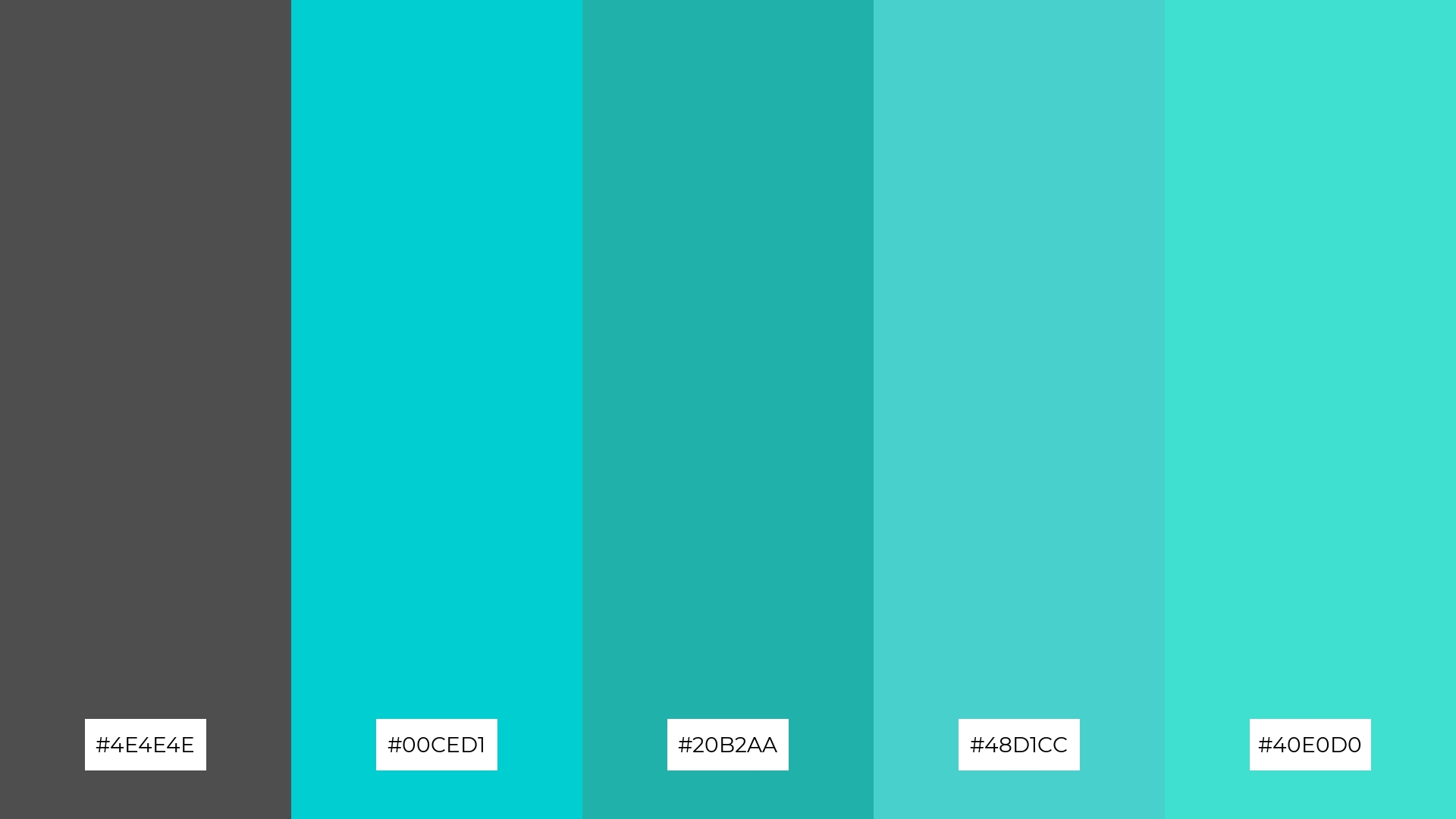
The ‘Charcoal Ice’ palette, with its blend of deep charcoal and cool turquoise tones, creates a visual flow that evokes a sense of tranquility and refreshing calmness, making it ideal for designs that aim to soothe and relax the viewer.
This harmonious combination of colors is perfect for lifestyle branding, such as wellness products or spa services, where the serene and rejuvenating hues can enhance the overall sense of peace and well-being.
11) Urban Sky
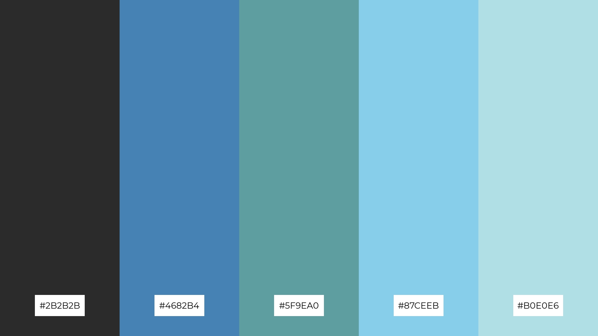
The ‘Urban Sky’ palette, with its blend of deep charcoal and varying shades of blue, creates a welcoming effect by combining the grounding nature of dark tones with the refreshing and calming qualities of lighter blues.
This palette shines in luxury e-commerce sites, where the sophisticated and serene color scheme can enhance the user experience, making the shopping environment feel both exclusive and inviting.
12) Charcoal Ember
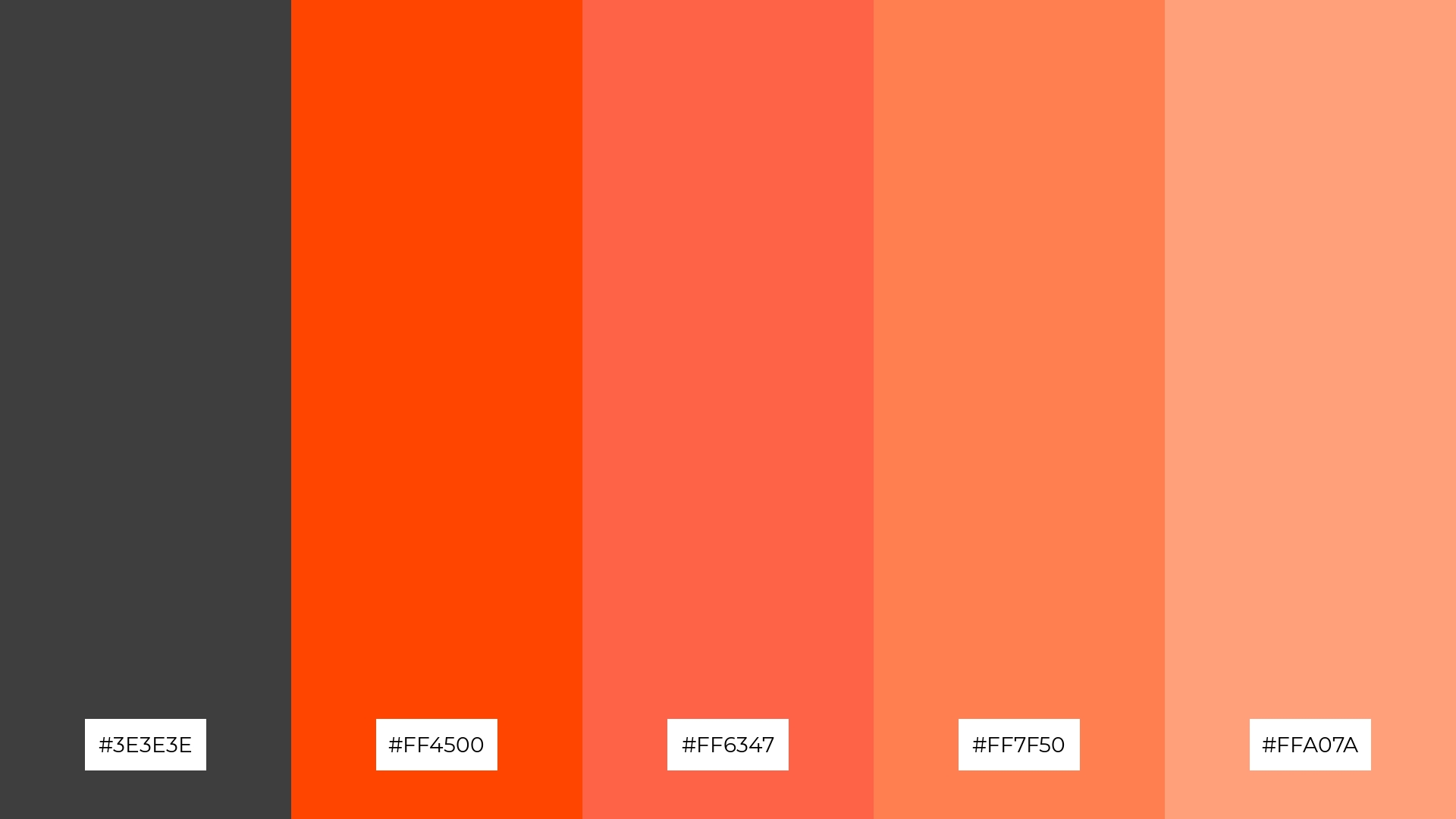
The ‘Charcoal Ember’ palette, with its deep charcoal (#3E3E3E) and vibrant orange hues (#FF4500, #FF6347, #FF7F50, #FFA07A), creates a striking balance between the grounding nature of dark tones and the energetic warmth of bright colors.
This dynamic combination is perfect for casual apparel lines, where the contrast between the sophisticated charcoal and lively oranges can convey a sense of modern style and youthful energy.
13) Smoky Lavender
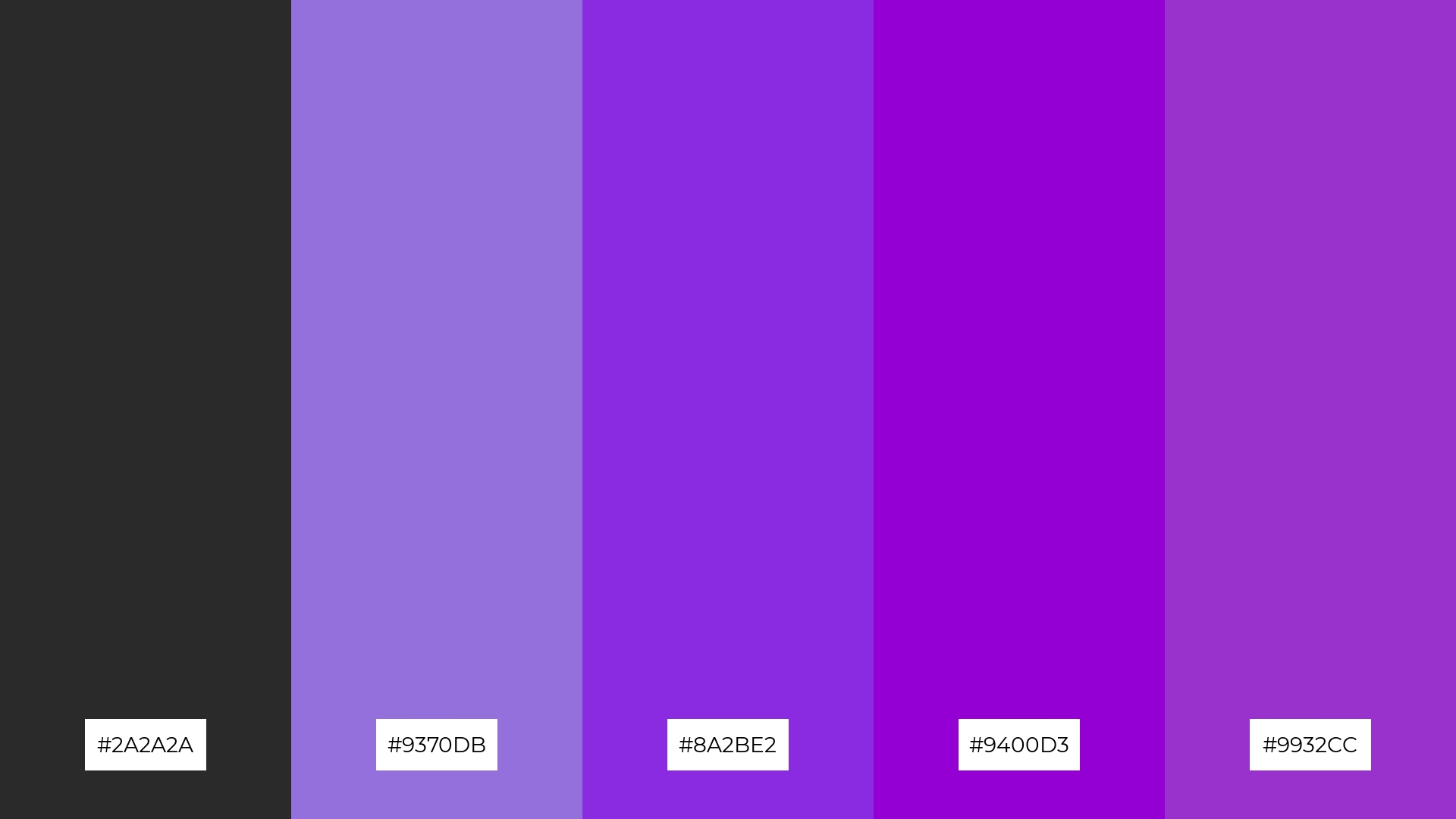
The ‘Smoky Lavender’ palette, with its blend of deep charcoal and varying shades of purple, masterfully combines warm and cool tones to evoke a mood of sophisticated tranquility and creative elegance.
This unique combination is perfect for artisan product branding, where the harmonious interplay of dark and vibrant hues can enhance the handcrafted quality and artistic appeal of the products.
14) Charcoal Mint
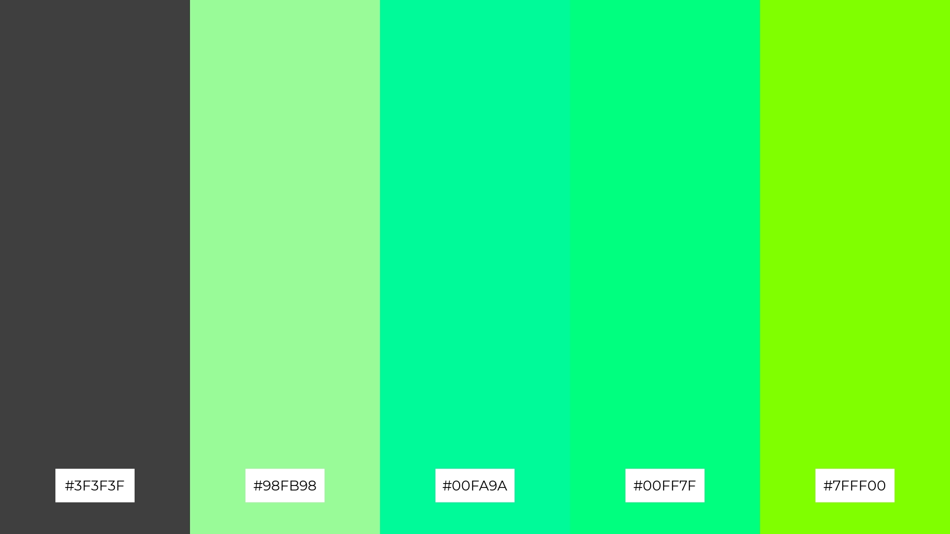
The ‘Charcoal Mint’ palette, with its deep charcoal (#3F3F3F) and vibrant mint greens (#98FB98, #00FA9A, #00FF7F, #7FFF00), creates a dynamic interplay of bold and subtle tones that can add both freshness and sophistication to any design.
This striking combination is perfect for festival marketing, where the energetic greens can capture attention and convey a lively, festive atmosphere, while the grounding charcoal provides a sleek and modern backdrop.
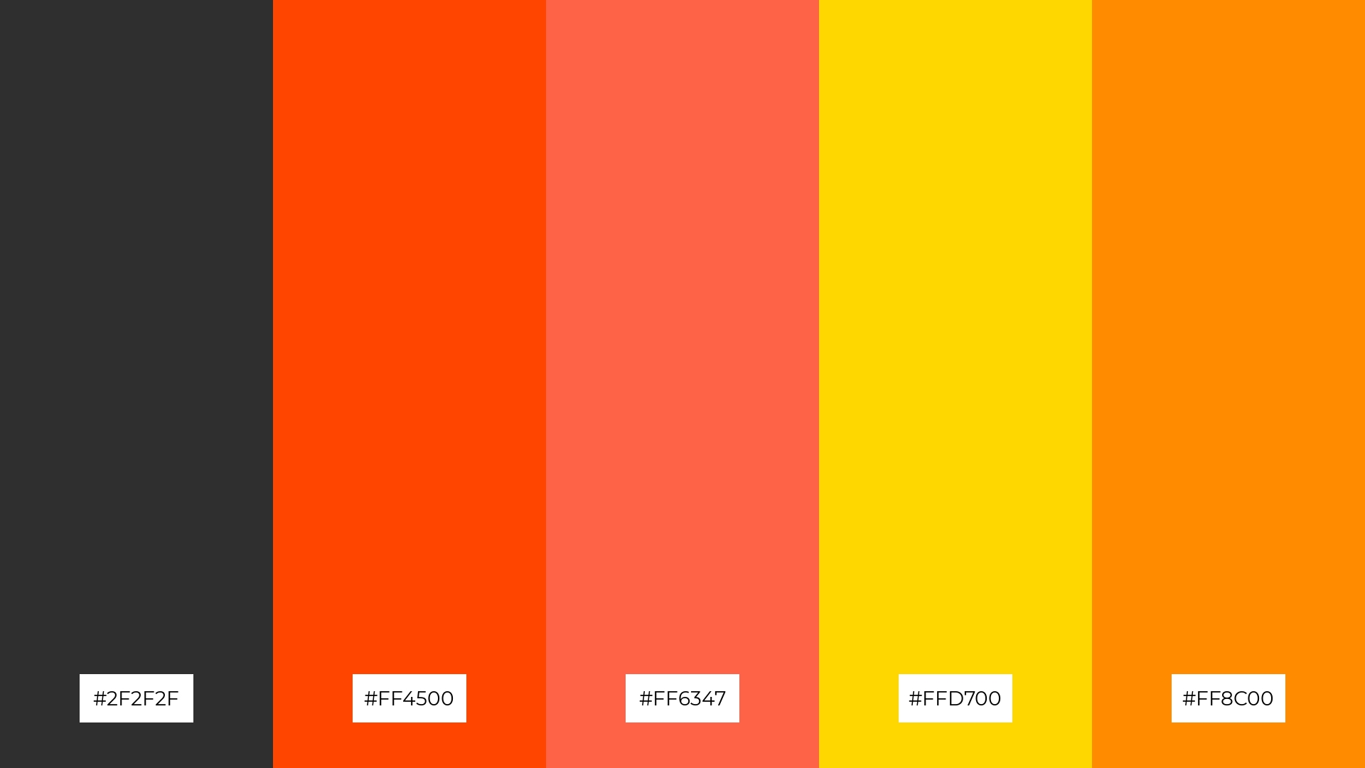
15) Urban Gold
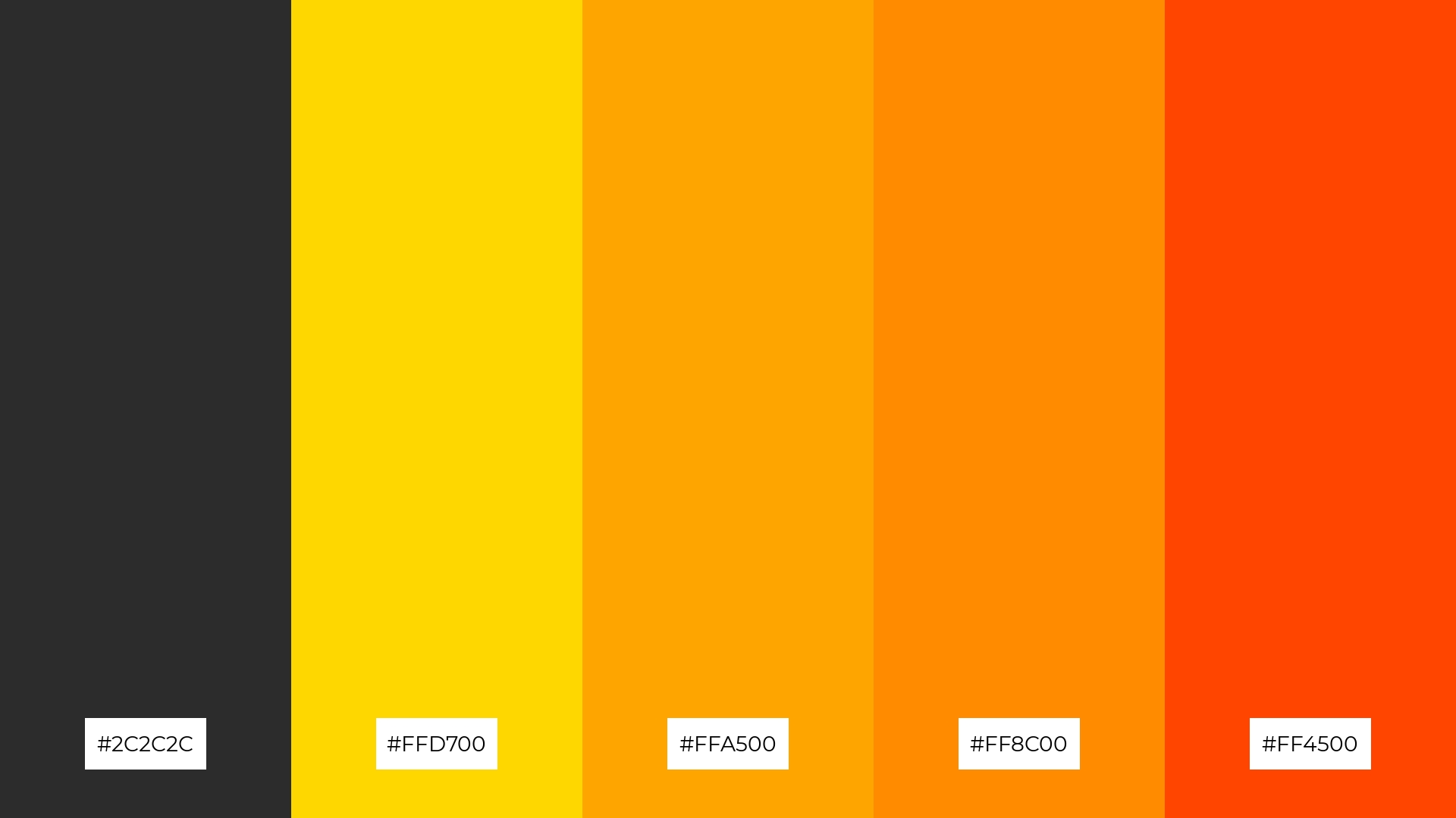
The ‘Urban Gold’ palette, with its deep charcoal and vibrant gold and orange hues, can convey a sense of harmony when the warm tones are balanced with the grounding dark shades, creating a cohesive and inviting visual experience.
This dynamic combination is ideal for tech startups aiming to project innovation and energy, or for cozy interior makeovers where the rich, warm colors can add a touch of modern elegance and comfort.
How to Use Charcoal Patterns in Design
Charcoal color palettes can be a game-changer in home decor, offering a sleek and modern aesthetic. Use charcoal tones on accent walls or furniture to create a sophisticated backdrop that highlights other design elements. Pairing charcoal with metallic accents like gold or silver can add a touch of luxury and elegance to any room.
In marketing materials, charcoal palettes can convey professionalism and reliability. Use deep charcoal backgrounds with contrasting white or vibrant text to make your message stand out. This combination is particularly effective in creating eye-catching brochures, business cards, and social media graphics that exude confidence and modernity.
For clothing design, charcoal hues offer a versatile and timeless option. Incorporate charcoal tones in casual wear for a chic, understated look, or mix them with bold colors for a more dynamic and trendy style. The neutral nature of charcoal makes it easy to pair with various other colors, ensuring your designs remain fresh and appealing.
Ready to elevate your designs with charcoal color palettes? Try creating your own stunning visuals using Piktochart. Get started today and bring your creative ideas to life!


