Champagne color palettes exude elegance and sophistication, making them a popular choice for various design projects. This versatile hue blends seamlessly with a range of colors, offering endless creative possibilities.
From wedding invitations to corporate branding, champagne tones add a touch of class and refinement. Discover how to incorporate these timeless shades into your next design endeavor.
Tips For Creating Champagne Color Palettes
Designing with champagne tones can elevate your project, but it requires a thoughtful approach to achieve the perfect balance.
- Balance with Neutrals: Pair champagne with neutral colors like white, beige, or gray to create a harmonious and sophisticated look.
- Complementary Shades: Use complementary colors such as soft pinks, muted greens, or gentle blues to enhance the champagne hue without overpowering it.
- Accent with Metallics: Incorporate metallic accents like gold or silver to add a touch of luxury and depth to your design.
- Versatile Combinations: Experiment with different shades of champagne, from light to dark, to create versatile and dynamic color palettes.
- Consider the Context: Think about the context in which your design will be used. For formal events, stick to classic combinations, while for casual settings, you can be more adventurous.
- Test and Adjust: Always test your color palette in different lighting conditions and on various devices to ensure it looks great everywhere.
15 Champagne Color Palettes
1) Elegant Bubbly
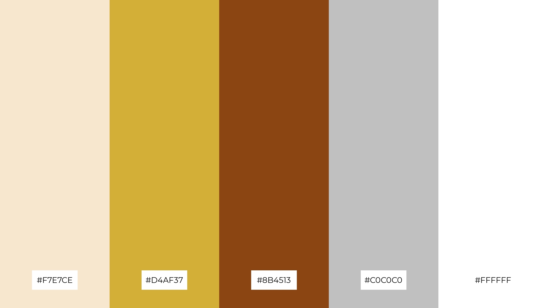
The ‘Elegant Bubbly’ color palette, featuring hues like champagne (#F7E7CE), gold (#D4AF37), and rich brown (#8B4513), creates a mood of opulence and warmth, while silver (#C0C0C0) and white (#FFFFFF) add a touch of modernity and freshness.
In interior decor, this palette can transform a living room into a luxurious yet inviting space, with the gold and brown tones providing depth and richness, and the silver and white elements ensuring a balanced and cohesive look.
2) Rosé All Day
The ‘Rosé All Day’ color palette, with its blend of soft pinks and champagne tones, evokes a sense of warmth and calmness, making it perfect for creating inviting and soothing designs.
This palette would excel in product packaging for beauty and skincare products, where the gentle hues can convey a message of elegance and care.
3) Golden Hour
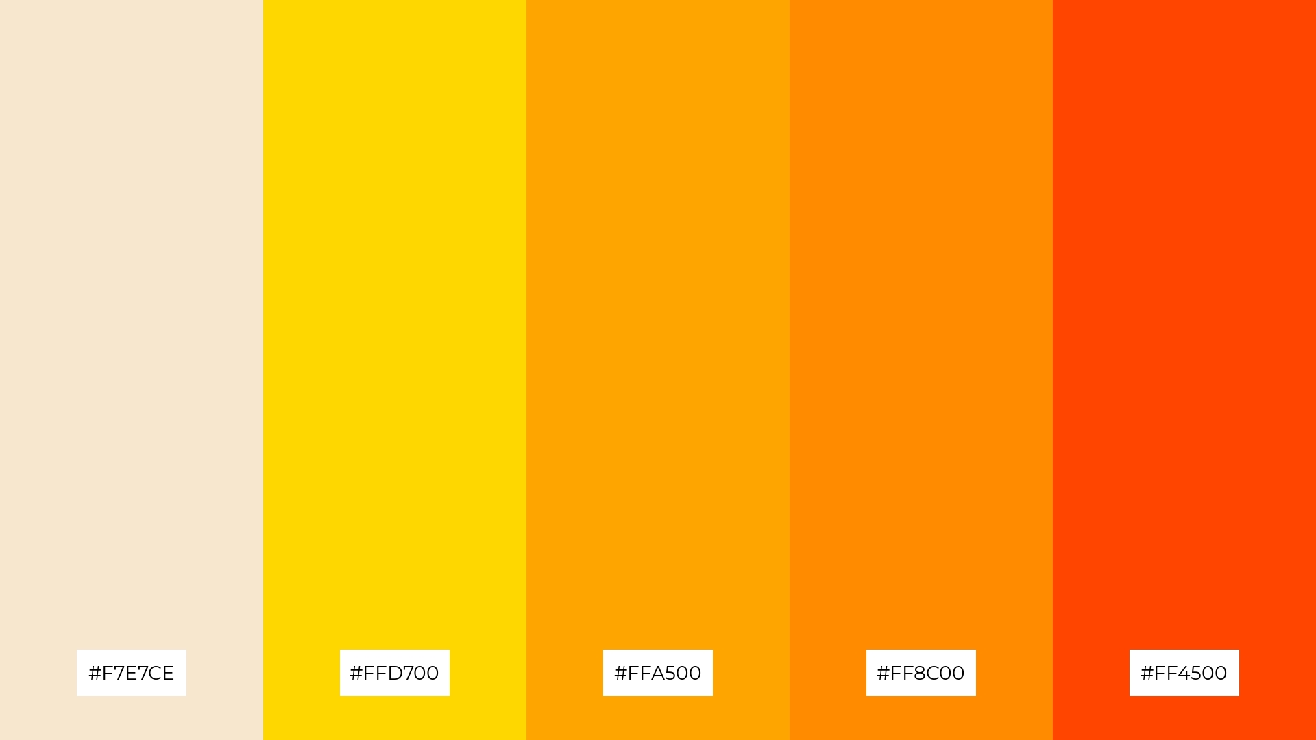
The ‘Golden Hour’ color palette, featuring dominant hues like champagne (#F7E7CE), gold (#FFD700), and orange (#FFA500, #FF8C00, #FF4500), creates a warm and inviting atmosphere that exudes positivity and energy.
This harmonious blend is ideal for wellness branding, where the vibrant and soothing colors can evoke feelings of health, vitality, and relaxation.
4) Winter Sparkle
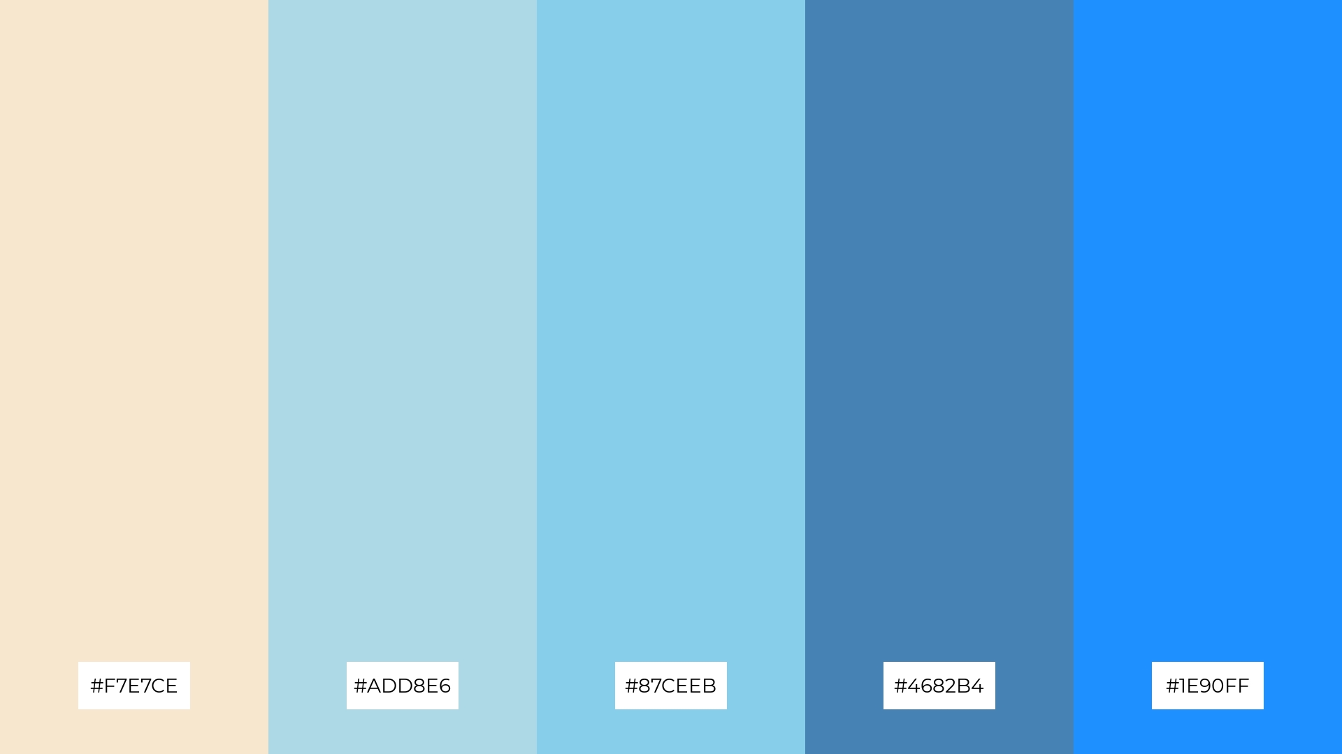
The ‘Winter Sparkle’ color palette, with its blend of champagne (#F7E7CE) and various shades of blue (#ADD8E6, #87CEEB, #4682B4, #1E90FF), offers a balance of soft and bold tones, creating a distinct and refreshing mood.
This palette is ideal for modern web designs, where the combination of gentle and vibrant hues can create an inviting and visually appealing user experience.
5) Autumn Bliss
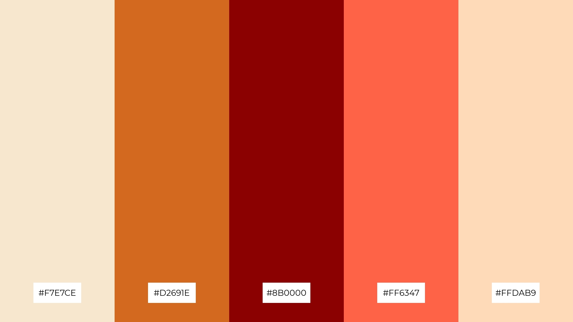
The ‘Autumn Bliss’ color palette, with its blend of champagne (#F7E7CE), chocolate brown (#D2691E), deep red (#8B0000), tomato (#FF6347), and peach (#FFDAB9), creates a warm and inviting ambiance that evokes feelings of comfort and coziness.
This palette is perfect for luxury fashion campaigns, where the rich and vibrant hues can convey a sense of opulence and sophistication, making the designs stand out with a touch of seasonal elegance.
6) Midnight Toast

The ‘Midnight Toast’ color palette, with its blend of champagne (#F7E7CE), dark slate gray (#2F4F4F), slate gray (#708090), light slate gray (#778899), and light steel blue (#B0C4DE), creates a sophisticated and serene mood, perfect for minimalistic branding that aims to convey elegance and modernity.
This palette’s harmonious mix of soft and muted tones can also be effectively used in bold event designs, where the contrast between the dark and light shades adds depth and visual interest, making the overall design both striking and refined.
7) Spring Fizz
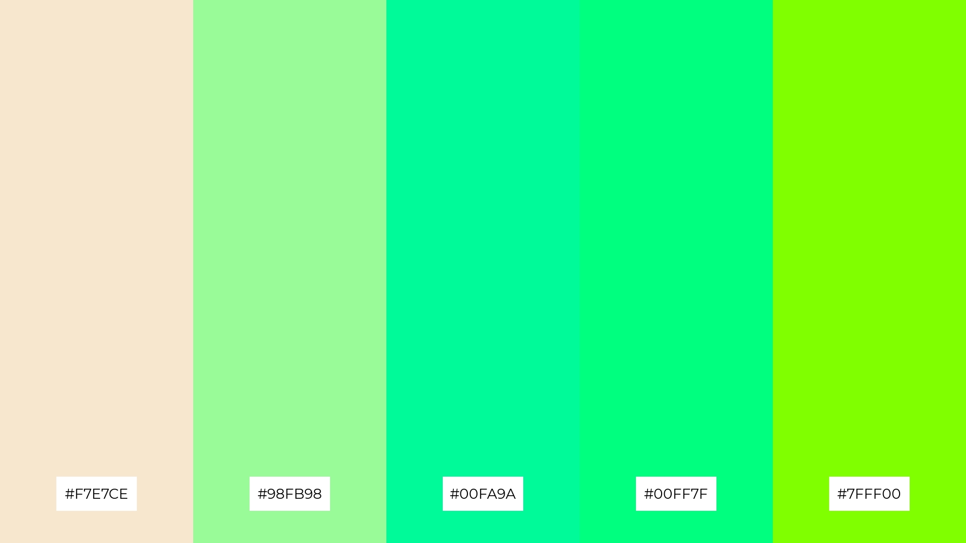
The ‘Spring Fizz’ color palette, with its blend of champagne (#F7E7CE) and vibrant greens (#98FB98, #00FA9A, #00FF7F, #7FFF00), creates a striking contrast that adds visual interest and energy to any design.
This dynamic combination is perfect for creative projects like magazine layouts or artistic websites, where the lively hues can capture attention and convey a sense of freshness and innovation.
8) Vintage Chic
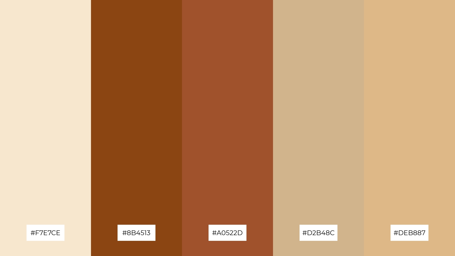
The ‘Vintage Chic’ color palette, with its blend of champagne (#F7E7CE), rich brown (#8B4513), sienna (#A0522D), tan (#D2B48C), and burly wood (#DEB887), can evoke a sense of calm when the softer tones are paired together, creating a soothing and timeless aesthetic.
Conversely, combining the deeper hues with the lighter ones can bring a sense of excitement and vibrancy, making this palette ideal for distinctive uses such as spa branding, where the calming tones can promote relaxation, or vibrant marketing campaigns that aim to capture attention and convey a sense of warmth and sophistication.
9) Ocean Breeze
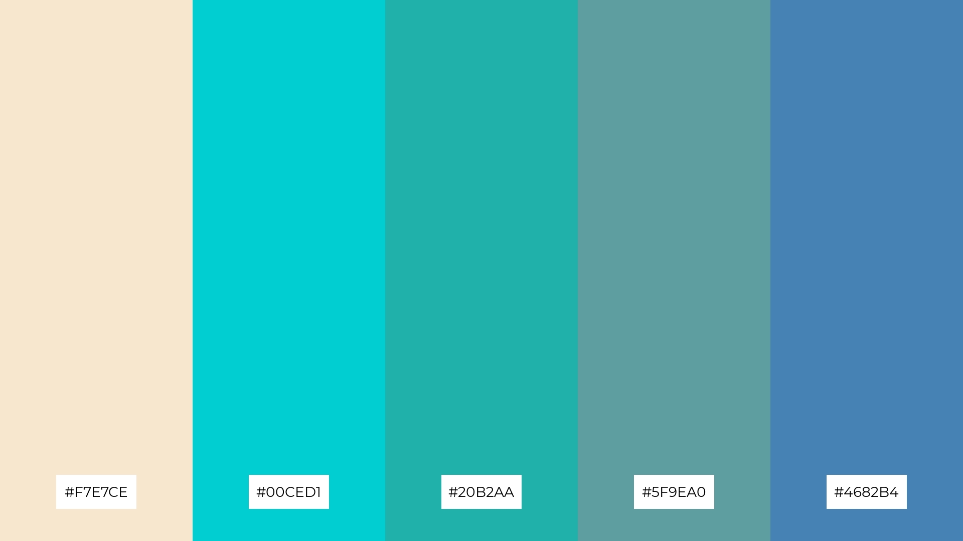
The ‘Ocean Breeze’ color palette, featuring softer tones like champagne (#F7E7CE) and brighter hues such as turquoise (#00CED1) and light sea green (#20B2AA), creates a refreshing and tranquil atmosphere.
This blend of gentle and vibrant colors is perfect for home decor, where the calming shades can evoke a sense of serenity and the brighter tones can add a touch of lively energy, making any space feel both peaceful and invigorating.
10) Sunset Glow
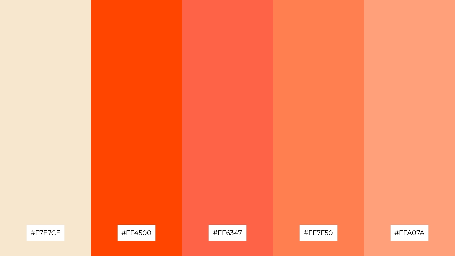
The ‘Sunset Glow’ color palette, with its blend of champagne (#F7E7CE) and vibrant oranges (#FF4500, #FF6347, #FF7F50, #FFA07A), creates a visual flow that evokes feelings of warmth, joy, and energy, reminiscent of a serene sunset.
This dynamic and emotionally uplifting palette is ideal for lifestyle branding or tech product packaging, where the vibrant hues can capture attention and convey a sense of innovation and positivity.
11) Forest Whisper
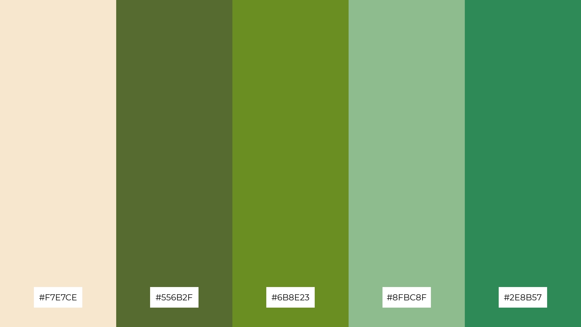
The ‘Forest Whisper’ color palette, with its blend of champagne (#F7E7CE) and various shades of green (#556B2F, #6B8E23, #8FBC8F, #2E8B57), creates a welcoming effect by combining the warmth of champagne with the calming and refreshing tones of green, making it perfect for designs that aim to evoke a sense of tranquility and natural beauty.
This palette shines in boutique interiors, where the harmonious mix of soft and rich hues can create an inviting and sophisticated atmosphere, or in luxury e-commerce sites, where the elegant and serene colors can enhance the user experience and convey a sense of exclusivity and refinement.
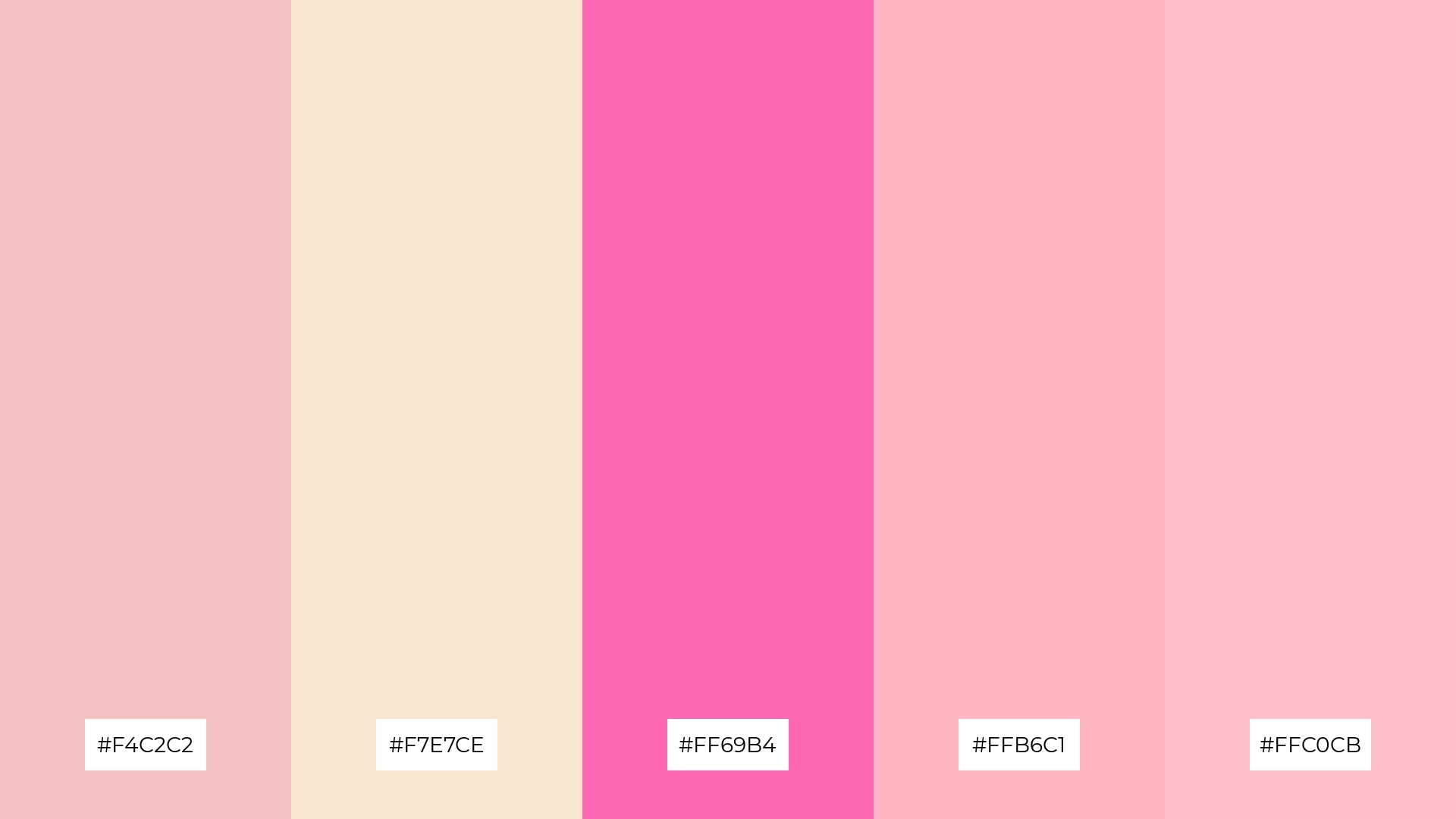
12) Blush & Bashful
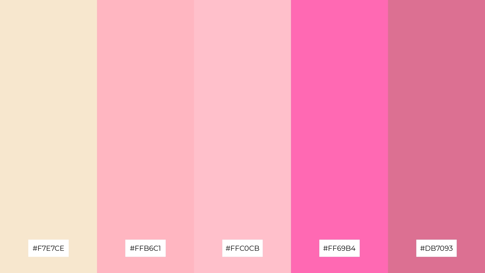
The ‘Blush & Bashful’ color palette, with its blend of champagne (#F7E7CE) and various shades of pink (#FFB6C1, #FFC0CB, #FF69B4, #DB7093), creates a harmonious balance by combining soft, gentle tones with more vibrant, energetic hues.
This palette is perfect for casual apparel lines, where the mix of subtle and bold colors can convey a sense of playful elegance and modern style.
13) Urban Chic
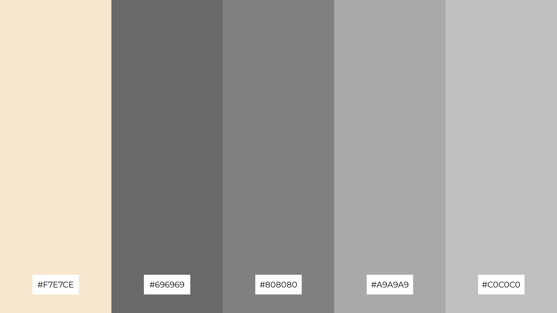
The ‘Urban Chic’ color palette, with its blend of champagne (#F7E7CE) and various shades of gray (#696969, #808080, #A9A9A9, #C0C0C0), masterfully combines warm and cool tones to evoke a mood of modern sophistication and understated elegance.
This versatile palette is perfect for artisan product branding, where the harmonious mix of soft and muted hues can convey a sense of craftsmanship and contemporary style, making the products stand out with a refined and urban appeal.
14) Lavender Fields
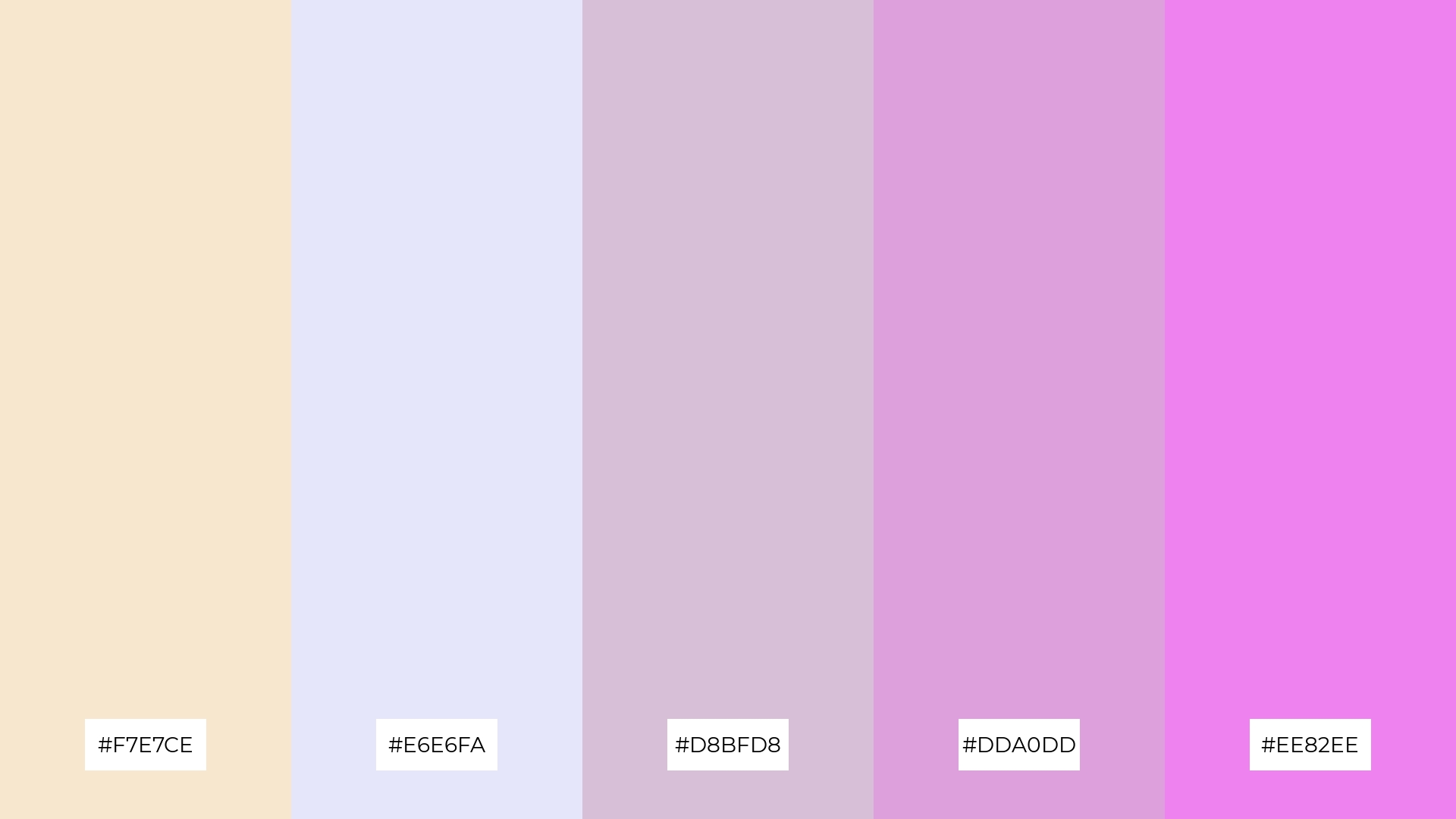
The ‘Lavender Fields’ color palette, with its blend of champagne (#F7E7CE) and various shades of lavender (#E6E6FA, #D8BFD8, #DDA0DD, #EE82EE), creates a dynamic interaction between soft and bold hues, offering a versatile range of design possibilities.
This palette is perfect for festival marketing, where the vibrant and soothing colors can capture attention and convey a sense of joy and celebration, making the event feel both inviting and memorable.
15) Tropical Delight
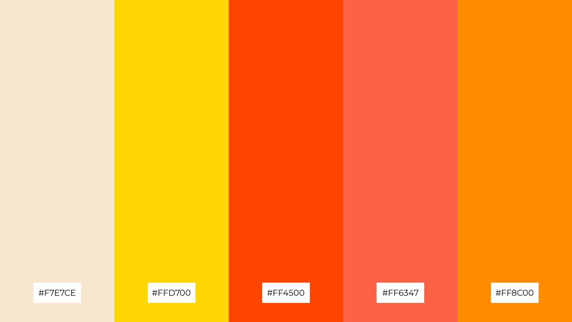
The ‘Tropical Delight’ color palette, with its blend of champagne (#F7E7CE), gold (#FFD700), and vibrant oranges (#FF4500, #FF6347, #FF8C00), can convey a sense of harmony when used in tech startups, where the warm and energetic hues can foster creativity and innovation.
Conversely, this palette can create a striking contrast in cozy interior makeovers, where the bold oranges can add a lively touch to the serene champagne and gold tones, making the space feel both inviting and dynamic.
How to Use Champagne Patterns in Design
Champagne color palettes can be a game-changer in home decor, offering a blend of elegance and warmth. Use champagne tones on walls or furniture to create a sophisticated backdrop, and accentuate with metallics like gold or silver for a touch of luxury. For a cozy yet refined look, pair champagne with soft textiles in complementary shades like beige or light gray.
In marketing materials, champagne hues can convey a sense of class and professionalism. Use these tones in backgrounds or typography to create a polished and cohesive look. Pairing champagne with bold colors like deep blue or rich burgundy can make your design stand out while maintaining an air of sophistication.
For clothing design, champagne palettes offer versatility and timeless appeal. Incorporate champagne tones in fabrics for a chic and elegant look, perfect for both casual and formal wear. Combining champagne with pastel colors can create a fresh and modern aesthetic, ideal for spring and summer collections.
Ready to elevate your designs with champagne color palettes? Try creating your own stunning palettes using Piktochart and bring your creative vision to life.


