Celadon, a soft and serene shade of green, has been cherished for centuries in art and design. Its versatility makes it a popular choice for creating calming and sophisticated color palettes.
From traditional ceramics to modern interiors, celadon’s subtle elegance can enhance various design projects. Discover how this timeless hue can transform your visual creations.
Tips For Creating Celadon Color Palettes
Designing with celadon can elevate your projects with a touch of tranquility and sophistication.
- Balance with Neutrals: Pair celadon with neutral tones like white, beige, or gray to create a harmonious and balanced palette.
- Complementary Shades: Use complementary colors such as soft pinks or muted purples to add depth and interest to your design.
- Accent with Bold Colors: Introduce bold accents like navy blue or deep brown to make celadon stand out and add a modern twist.
- Layering Textures: Combine celadon with different textures, such as matte and glossy finishes, to create a dynamic and engaging visual effect.
- Versatile Applications: Utilize celadon in various design elements, from backgrounds to typography, to ensure a cohesive and versatile look.
- Seasonal Adaptability: Adapt celadon to different seasons by pairing it with warm tones in the fall and cool shades in the spring.
15 Celadon Color Palettes
1) Serene Garden
The colors in ‘Serene Garden’ evoke a tranquil and refreshing mood, with shades like #A8D5BA and #F4F9E9 blending seamlessly to create a soothing atmosphere.
In interior decor, these hues interact harmoniously to form a cohesive look, perfect for creating a calming bedroom retreat that highlights the palette’s serene and natural essence.
2) Misty Morning
The ‘Misty Morning’ palette, with its blend of soft greens and cool blues, evokes a sense of calmness and rejuvenation, reminiscent of a serene morning by the sea.
This soothing color scheme would excel in digital branding for wellness apps or product packaging for eco-friendly skincare lines, where a tranquil and refreshing aesthetic is paramount.
3) Coastal Breeze
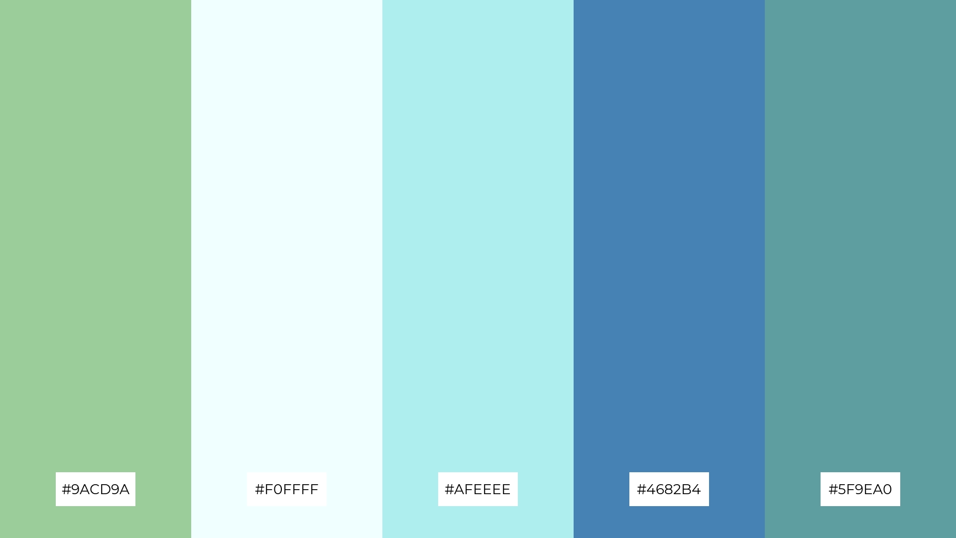
The ‘Coastal Breeze’ palette, featuring dominant colors like #9ACD9A and #4682B4, creates a refreshing and invigorating atmosphere that evokes the essence of a seaside escape.
This harmonious blend is ideal for wellness branding, where the calming greens and blues can promote a sense of tranquility and rejuvenation, making it perfect for eco-friendly interior spaces or holistic health products.
4) Spring Meadow
The ‘Spring Meadow’ palette, with its mix of soft pastels and bold greens, strikes a perfect balance that creates a fresh and inviting atmosphere.
This versatile color scheme is ideal for designing modern web interfaces or creating welcoming retail spaces that aim to captivate and soothe visitors.
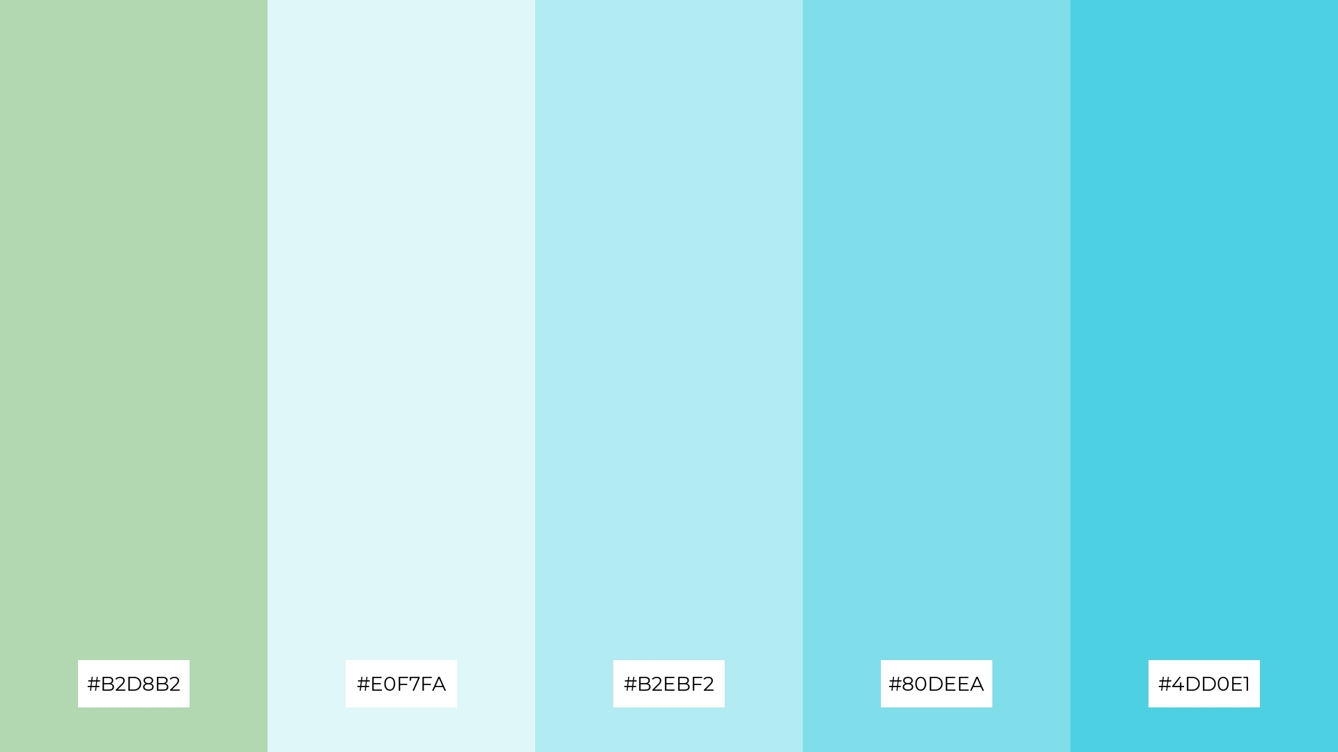
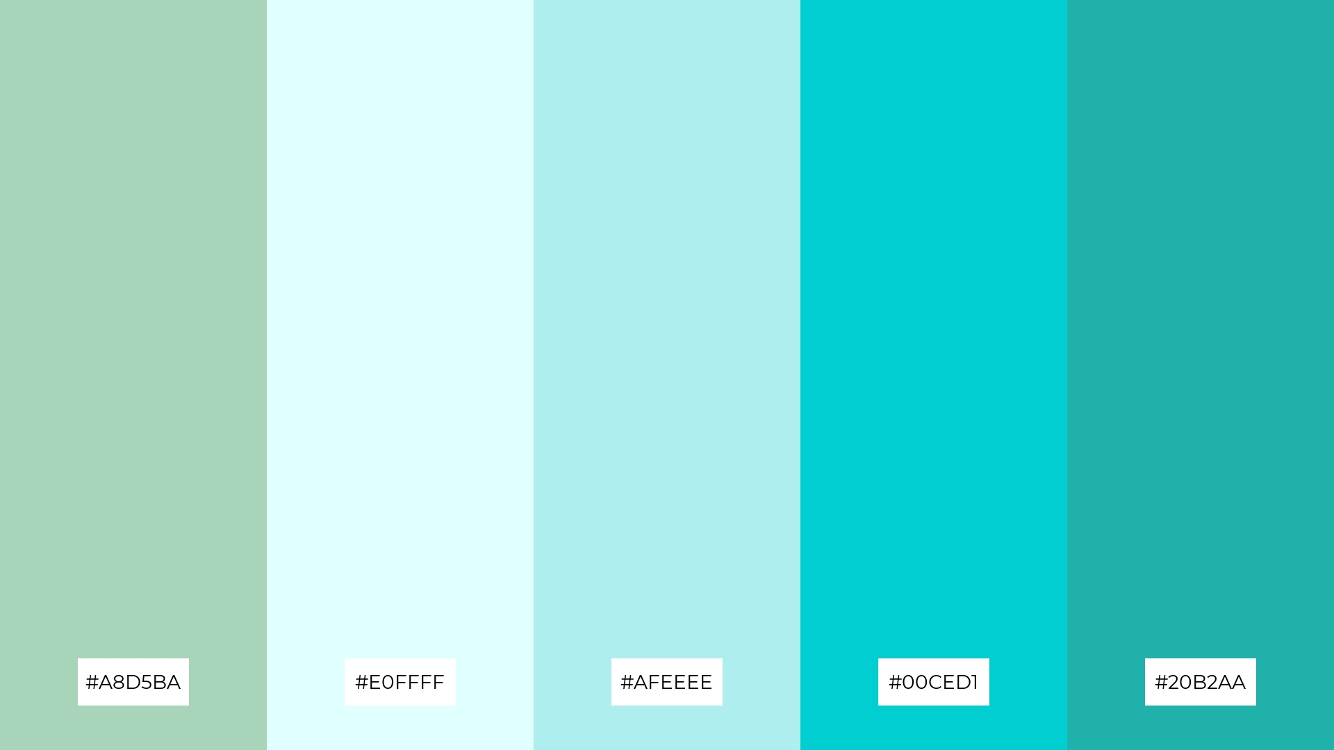
5) Tranquil Waters
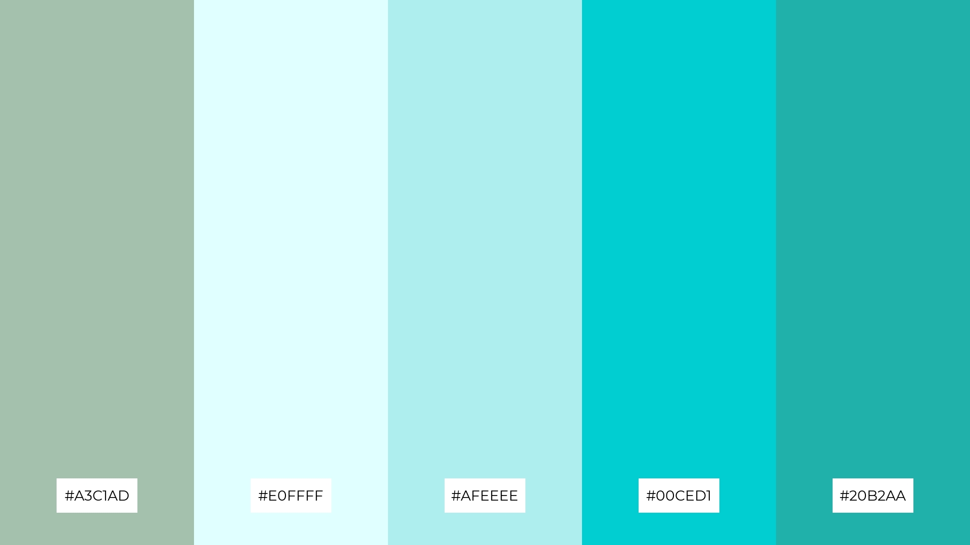
The ‘Tranquil Waters’ palette, with its blend of #A3C1AD, #E0FFFF, #AFEEEE, #00CED1, and #20B2AA, evokes a serene and refreshing ambiance reminiscent of a peaceful lakeside retreat.
This calming color scheme is perfect for luxury fashion campaigns, where the soothing hues can create an elegant and sophisticated backdrop that highlights the tranquility and refinement of high-end designs.
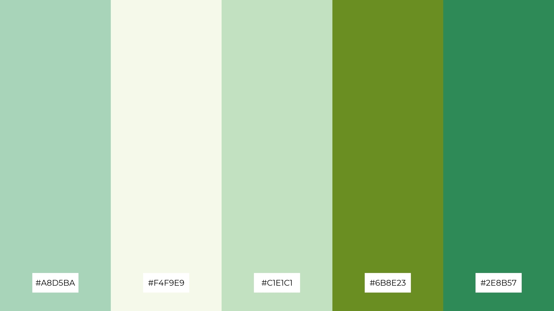
6) Forest Whisper
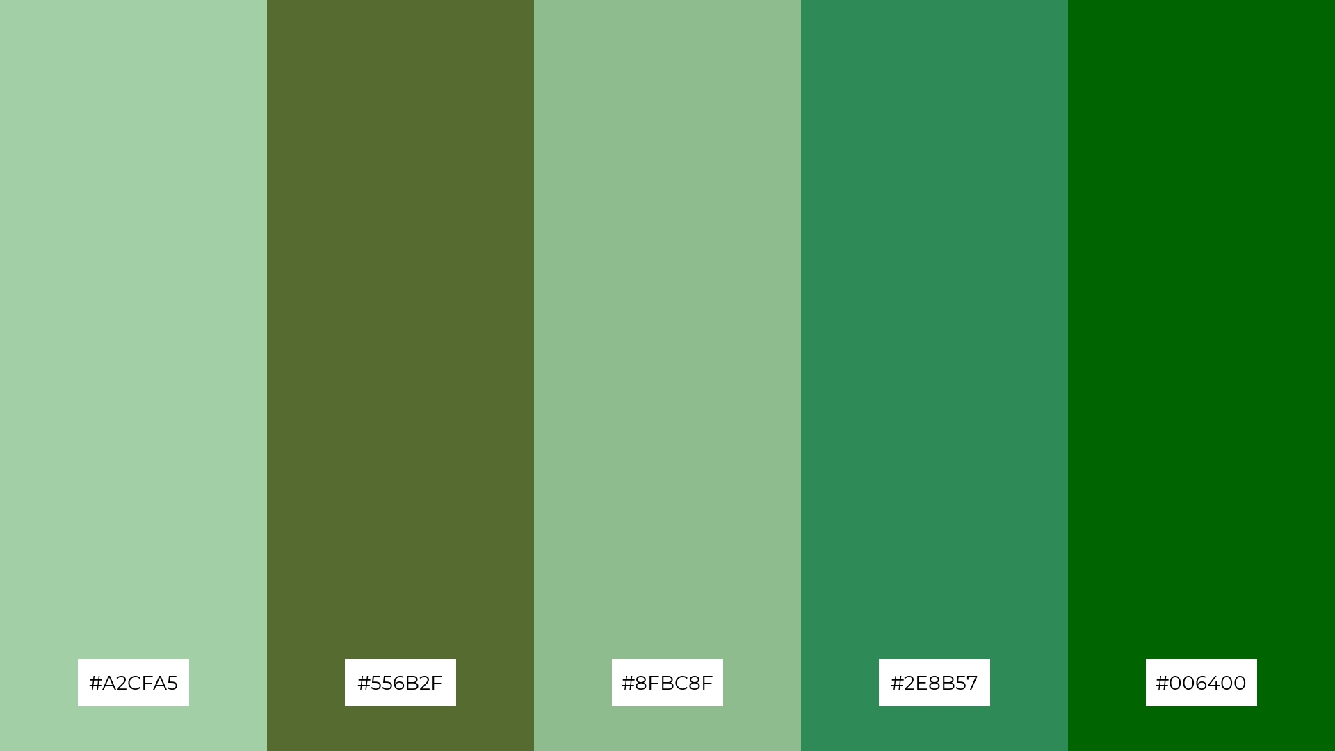
The ‘Forest Whisper’ palette, with its harmonious blend of #A2CFA5, #556B2F, #8FBC8F, #2E8B57, and #006400, exudes a sense of sophistication and natural elegance, making it ideal for creating a serene and refined atmosphere.
This color scheme is perfect for minimalistic branding, where the subtle yet rich greens can convey a message of sustainability and tranquility, enhancing the brand’s connection to nature.
7) Celestial Harmony
The ‘Celestial Harmony’ palette, with its blend of soft pastels and deep blues, creates a striking contrast that adds visual interest and depth to any design.
This dynamic color scheme is perfect for creative projects like magazine layouts or artistic websites, where the interplay of light and dark hues can captivate and engage the audience.
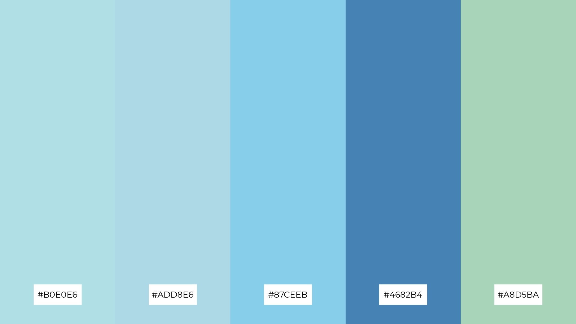
8) Pastel Dreams
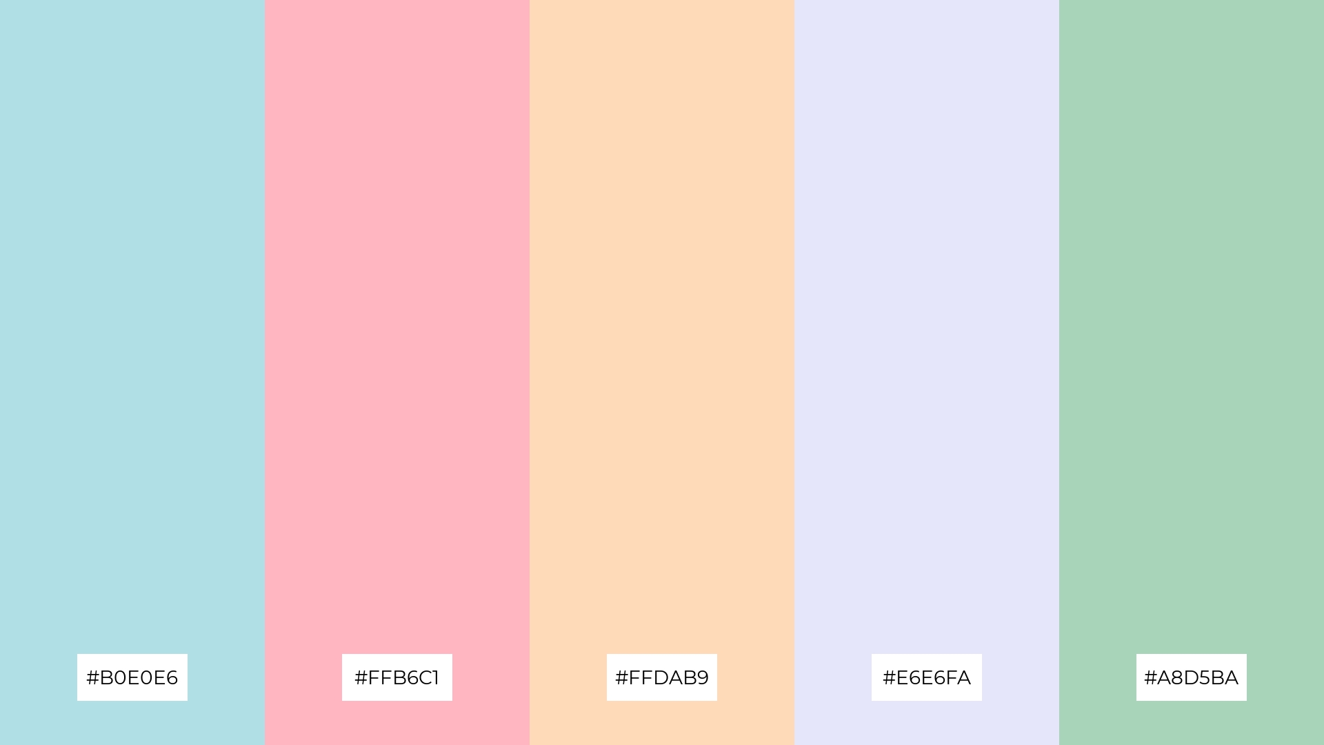
The ‘Pastel Dreams’ palette, with its blend of #B0E0E6, #FFB6C1, #FFDAB9, #E6E6FA, and #A8D5BA, can evoke a sense of calm when used in soft, harmonious combinations, making it perfect for spa branding that aims to create a serene and relaxing atmosphere.
Alternatively, this palette can bring excitement and vibrancy when the colors are paired in bold, contrasting ways, ideal for dynamic marketing campaigns that seek to capture attention and convey a playful, energetic vibe.
9) Ocean Mist
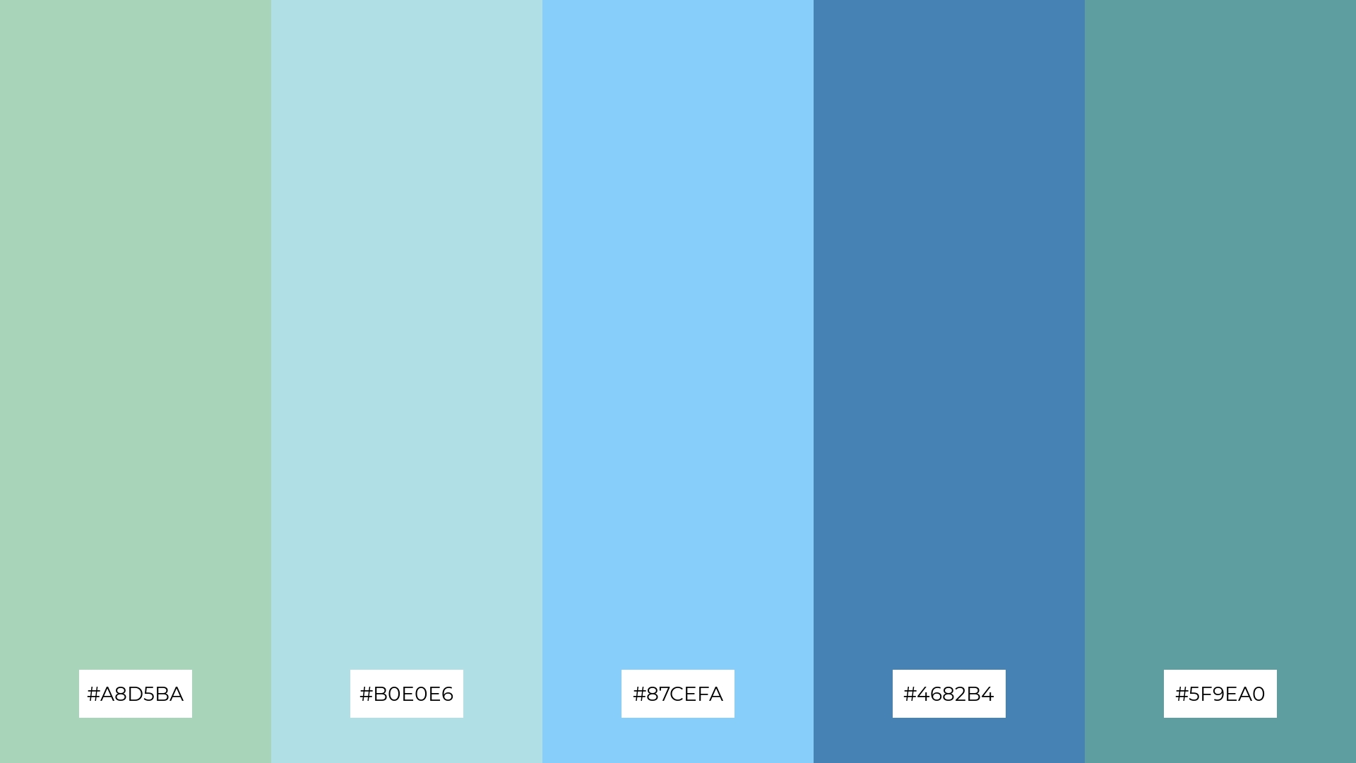
The ‘Ocean Mist’ palette, with its softer tones like #A8D5BA and #B0E0E6, creates a gentle and calming atmosphere, while the brighter shades such as #87CEFA and #4682B4 add a refreshing and invigorating touch.
This harmonious blend is perfect for home decor, where the soothing colors can transform any space into a serene retreat, or for seasonal promotions that aim to evoke a sense of renewal and tranquility.
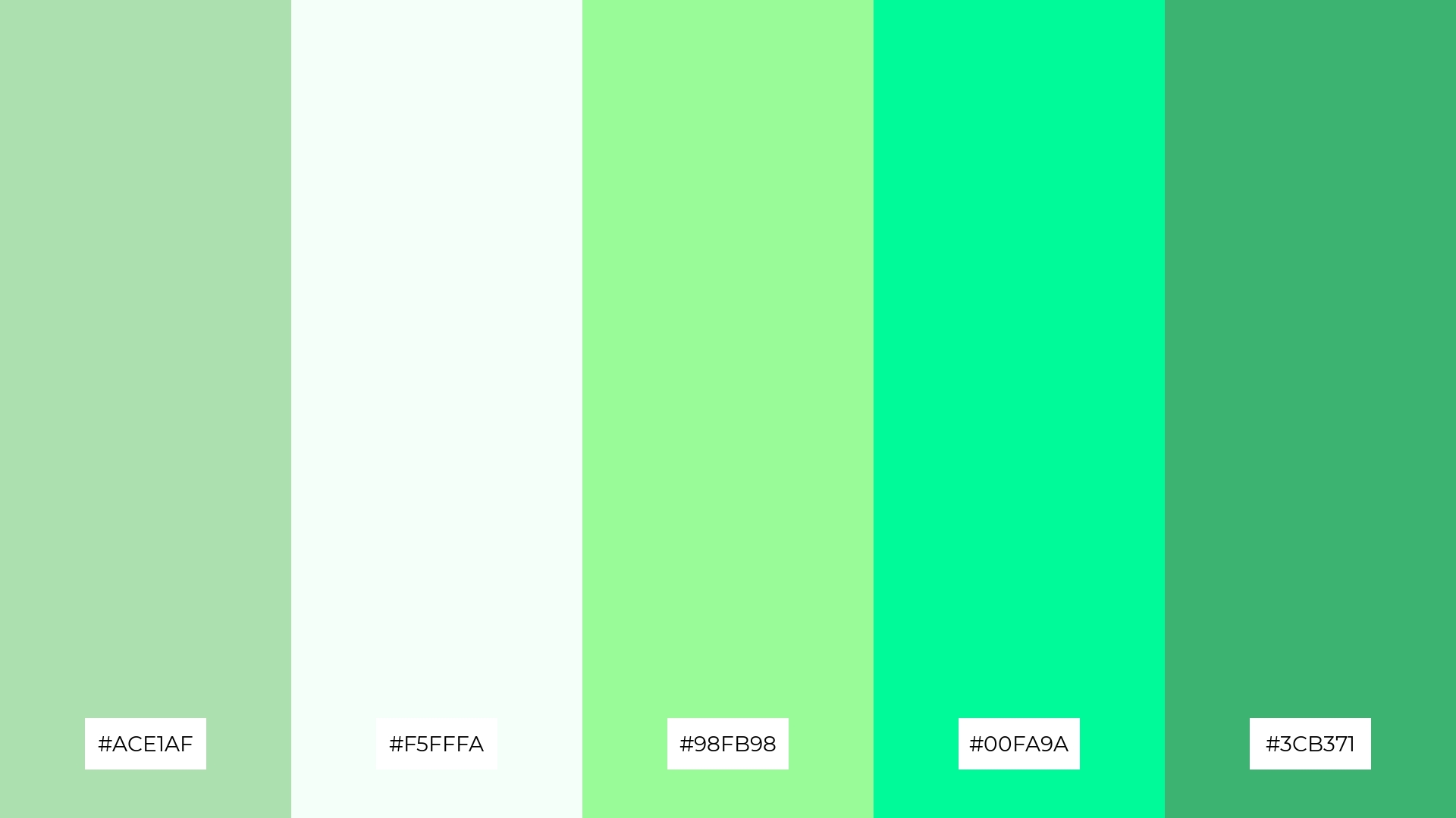
10) Fresh Mint
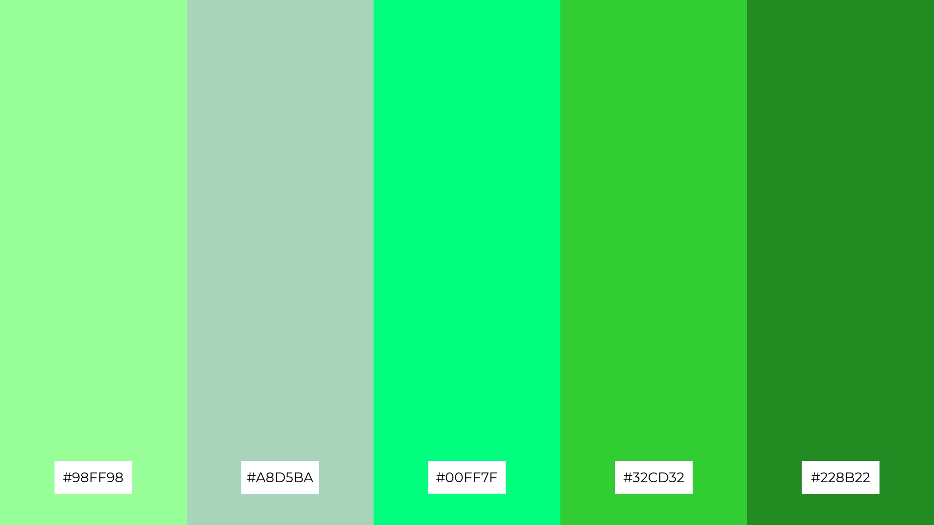
The ‘Fresh Mint’ palette, with its vibrant greens like #98FF98 and #00FF7F, creates a lively and invigorating visual flow that evokes feelings of joy and freshness.
This energetic color scheme is ideal for lifestyle branding, where the bright and refreshing hues can enhance the appeal of wellness products, or for tech product packaging, where the dynamic greens can convey innovation and vitality.
11) Soft Petals
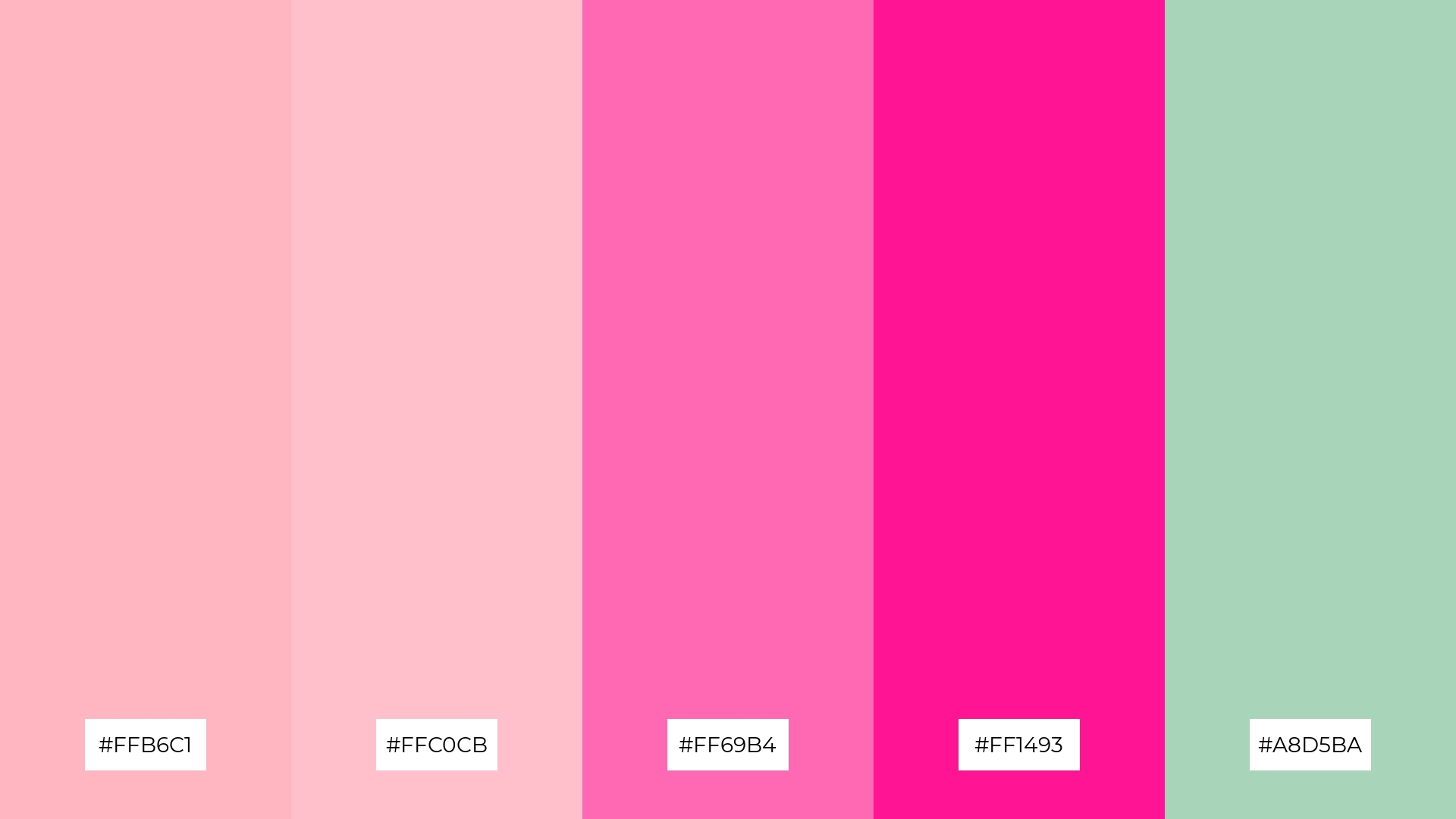
The ‘Soft Petals’ palette, with its blend of #FFB6C1, #FFC0CB, #FF69B4, #FF1493, and #A8D5BA, creates a welcoming effect through its harmonious mix of soft pinks and gentle greens, evoking a sense of warmth and comfort.
This palette shines in boutique interiors, where the inviting tones can create a cozy and elegant atmosphere, or in luxury e-commerce sites, where the dramatic contrast of vibrant pinks and soothing greens can captivate and engage shoppers.
12) Morning Dew
The hues in ‘Morning Dew’ interact harmoniously, with the soft greens and blues blending seamlessly to create a balanced and refreshing visual experience.
This serene color scheme is perfect for casual apparel lines, where the calming tones can evoke a sense of relaxation and effortless style.
13) Earthy Tones
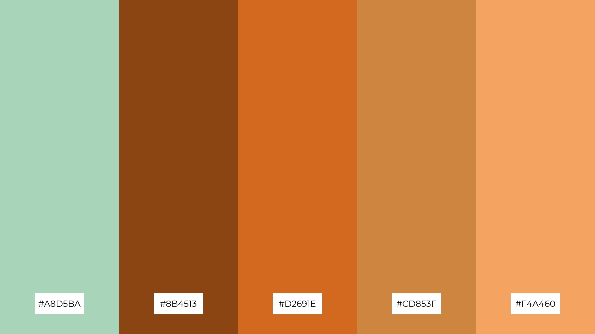
The ‘Earthy Tones’ palette, with its blend of warm hues like #8B4513 and #D2691E and cool shades like #A8D5BA, creates a balanced and grounded mood that evokes a sense of natural harmony.
This versatile color scheme is perfect for artisan product branding, where the rich and inviting tones can highlight the craftsmanship and authenticity of handmade goods, or for editorial layouts that aim to convey a rustic yet sophisticated aesthetic.
14) Sunset Glow
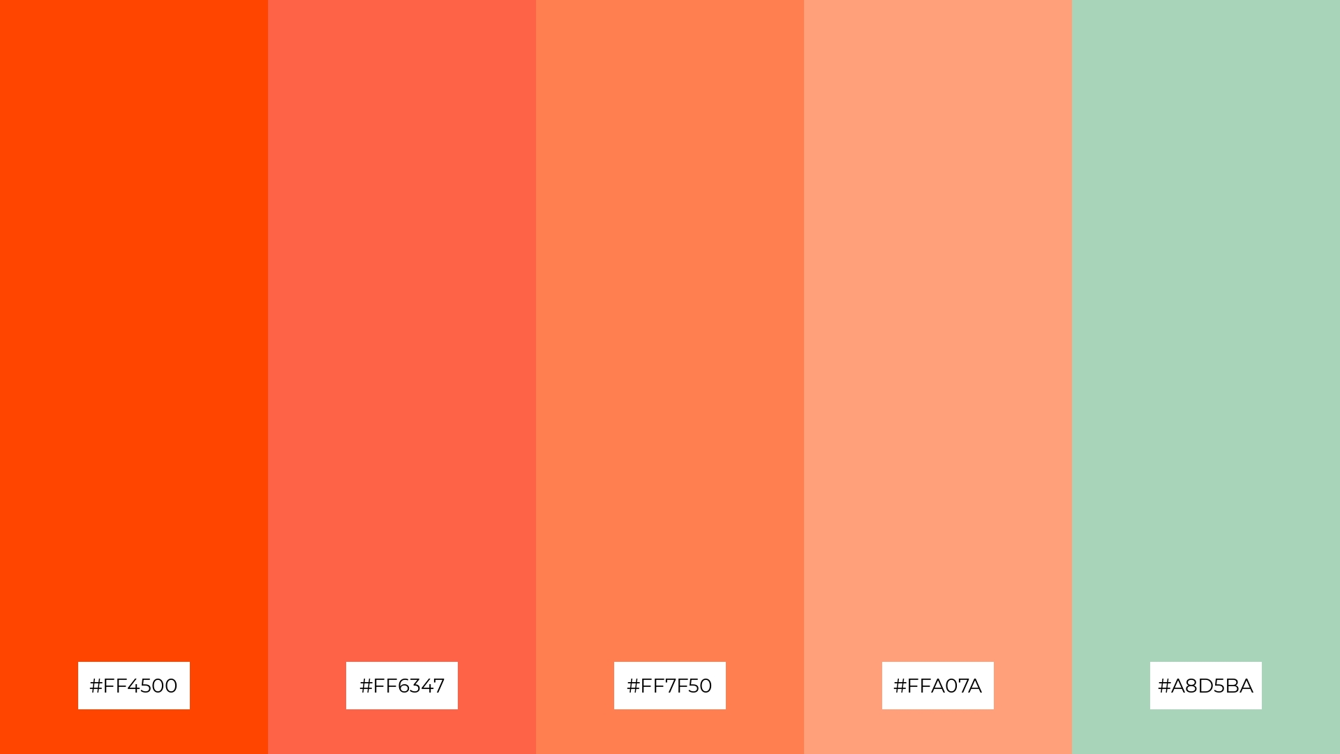
The ‘Sunset Glow’ palette, with its vibrant mix of #FF4500, #FF6347, #FF7F50, #FFA07A, and #A8D5BA, creates a dynamic interplay of bold and subtle hues that can evoke warmth and energy.
This striking color scheme is perfect for festival marketing, where the lively and inviting tones can capture attention and convey a sense of excitement and celebration.
15) Winter Chill
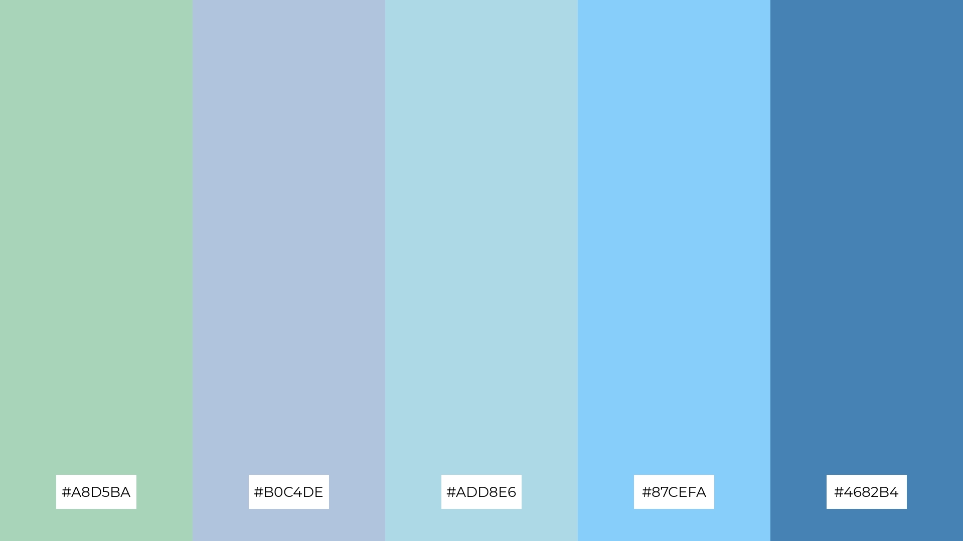
The ‘Winter Chill’ palette, with its blend of #A8D5BA, #B0C4DE, #ADD8E6, #87CEFA, and #4682B4, conveys a sense of harmony through its cohesive mix of cool tones, creating a serene and unified visual experience.
This versatile color scheme is ideal for tech startups aiming to evoke a sense of calm and innovation in their branding, or for cozy interior makeovers where the soothing blues and greens can transform a space into a tranquil retreat.
How to Use Celadon Patterns in Design
Celadon color palettes can bring a touch of tranquility to home decor by pairing soft greens with neutral tones like beige or white. This combination creates a serene and inviting atmosphere, perfect for living rooms or bedrooms where relaxation is key.
In marketing materials, celadon can be used to evoke a sense of calm and sophistication. Pair it with bold accents like navy blue or deep brown to make your designs stand out while maintaining a professional and polished look.
For clothing, celadon hues can create a refreshing and stylish aesthetic. Combine these soft greens with complementary shades like muted purples or soft pinks to add depth and interest to your fashion designs.
Ready to transform your designs with celadon color palettes? Try creating your own using Piktochart and see how this versatile hue can elevate your projects.


