Exploring the rich and sophisticated hues of burgundy can elevate any design project, adding depth and elegance. This article delves into the versatility of burgundy color palettes and how they can be effectively used in various contexts.
From branding to interior design, burgundy offers a timeless appeal that resonates with both modern and classic aesthetics. Discover the nuances of this captivating color and learn how to incorporate it seamlessly into your creative endeavors.
Tips For Creating Burgundy Color Palettes
Designing with burgundy can be both exciting and challenging, but with the right approach, it can transform your projects into stunning visual experiences.
- Balance with Neutrals: Pair burgundy with neutral colors like white, beige, or gray to create a balanced and sophisticated look.
- Complementary Shades: Use complementary colors such as gold, navy blue, or forest green to enhance the richness of burgundy and add depth to your design.
- Accent with Metallics: Incorporate metallic elements like gold or copper to give your burgundy palette a luxurious and modern touch.
- Varying Tones: Experiment with different tones of burgundy, from deep wine to lighter maroon, to add variety and interest to your palette.
- Texture and Patterns: Use textures and patterns to break the monotony and add a dynamic element to your burgundy-based designs.
- Versatile Combinations: Combine burgundy with pastel colors for a softer look or with bold colors for a more dramatic effect, ensuring versatility in your design.
Create a free Piktochart account to get started on creating your visual.
15 Burgundy Color Palettes
1) Autumn Leaves
The ‘Autumn Leaves’ palette, with its deep reds, vibrant oranges, and golden yellows, evokes a warm and inviting mood reminiscent of a crisp fall day.
In interior decor, this palette can be used to create a cozy and welcoming living space, with each color interacting harmoniously to reflect the natural beauty of the autumn season.
2) Vintage Romance
The ‘Vintage Romance’ palette, with its blend of deep burgundy, rich magenta, and soft pinks, evokes a sense of warmth and nostalgia, perfect for creating an intimate and inviting atmosphere.
This palette would excel in product packaging for luxury goods or digital branding for boutique businesses, where the combination of these colors can convey elegance and a touch of timeless charm.
3) Royal Elegance
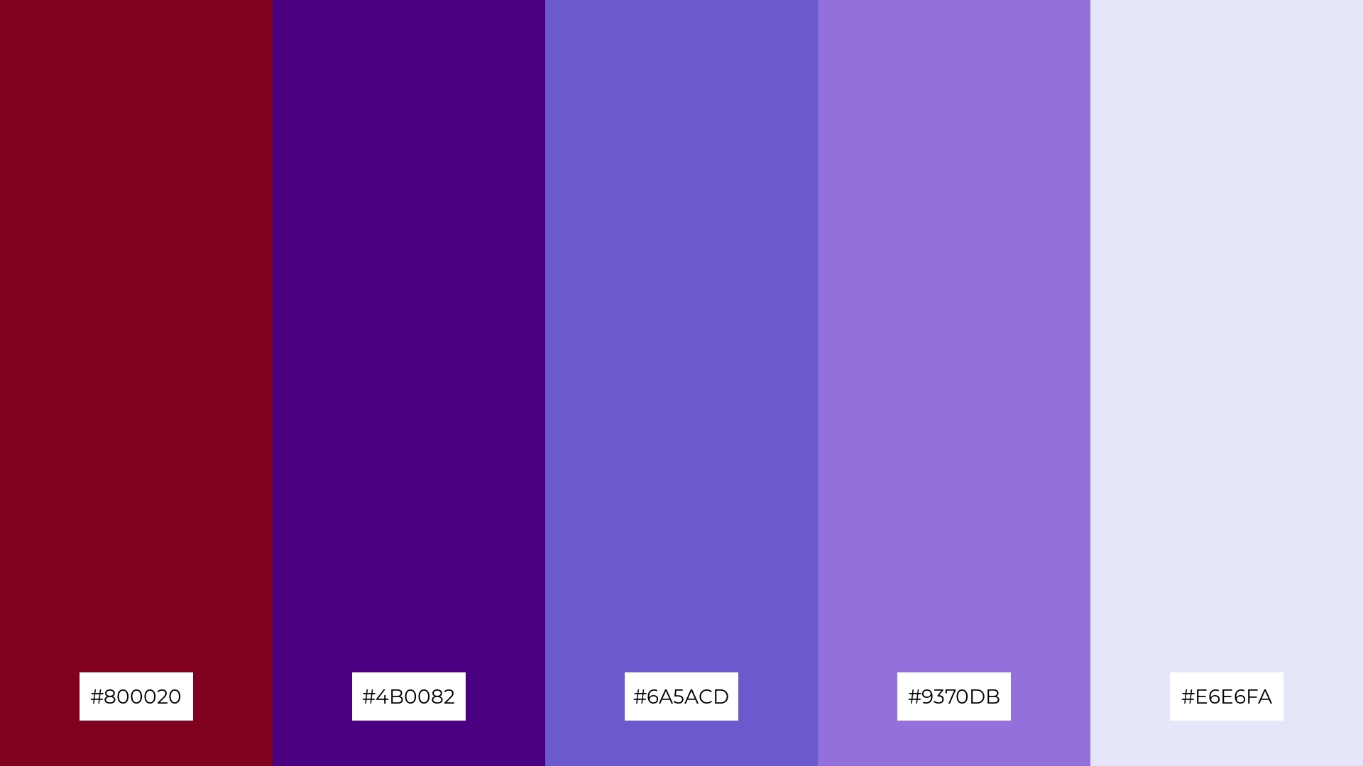
The ‘Royal Elegance’ palette, featuring dominant colors like deep burgundy (#800020), indigo (#4B0082), and lavender (#E6E6FA), creates a sophisticated and harmonious blend that exudes luxury and refinement.
This palette is particularly well-suited for wellness branding, where the calming and elegant hues can evoke a sense of tranquility and high-end care, making it ideal for spas or holistic health centers.
4) Rustic Charm
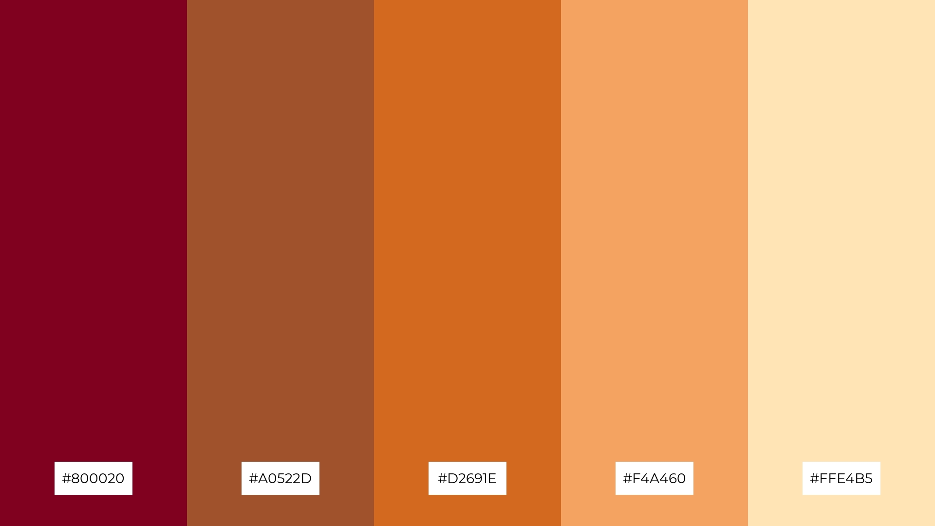
The ‘Rustic Charm’ palette, with its blend of deep burgundy (#800020), sienna (#A0522D), chocolate (#D2691E), sandy brown (#F4A460), and moccasin (#FFE4B5), offers a perfect balance of soft and bold tones, creating a distinct and inviting mood.
This palette is ideal for creating inviting retail spaces or modern web designs, where the combination of these colors can evoke warmth and a welcoming atmosphere.
5) Winter Wonderland
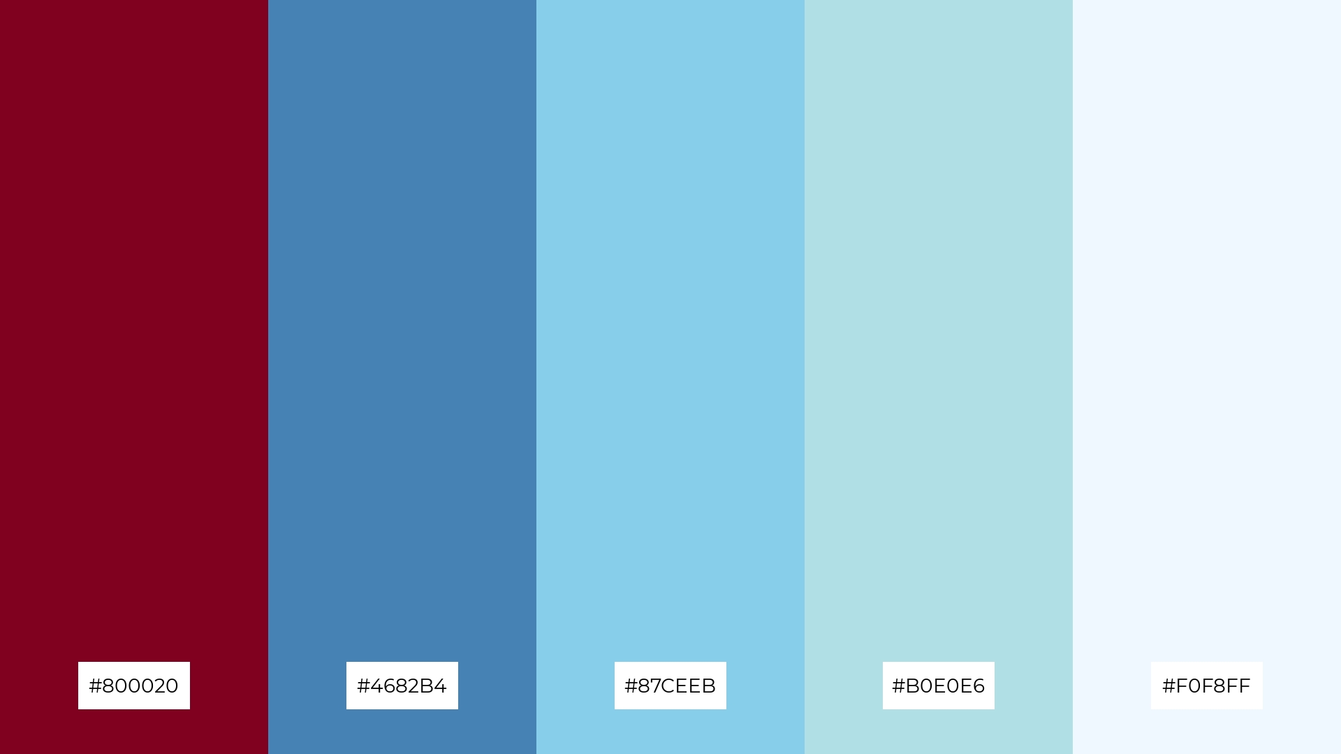
The ‘Winter Wonderland’ palette, with its deep burgundy (#800020), steel blue (#4682B4), sky blue (#87CEEB), powder blue (#B0E0E6), and Alice blue (#F0F8FF), creates a serene and tranquil ambiance reminiscent of a peaceful winter landscape.
This palette is perfect for winter wedding themes, where the cool blues can evoke a sense of calm and elegance, while the touch of burgundy adds warmth and sophistication to the overall design.
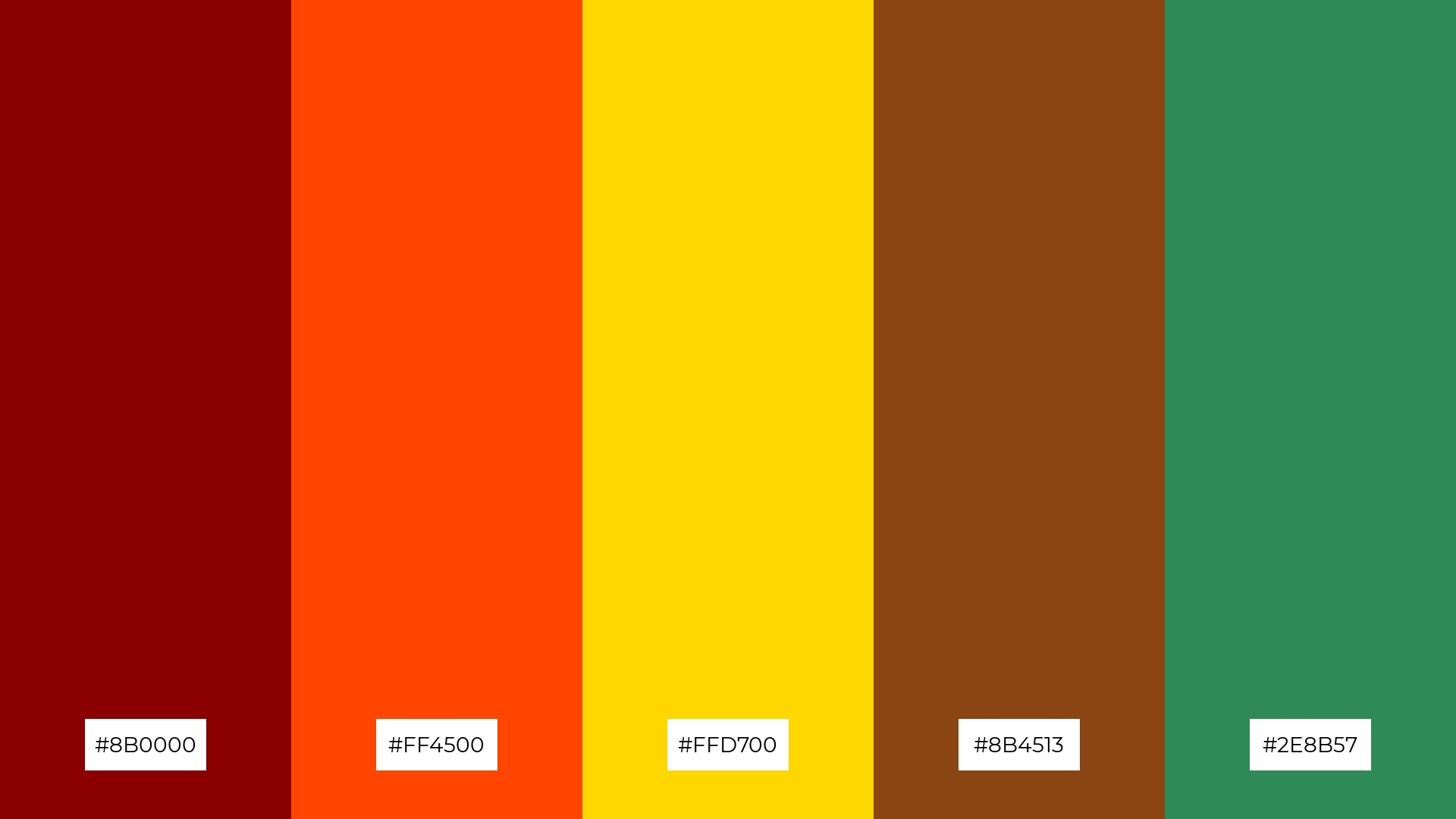
6) Sunset Glow
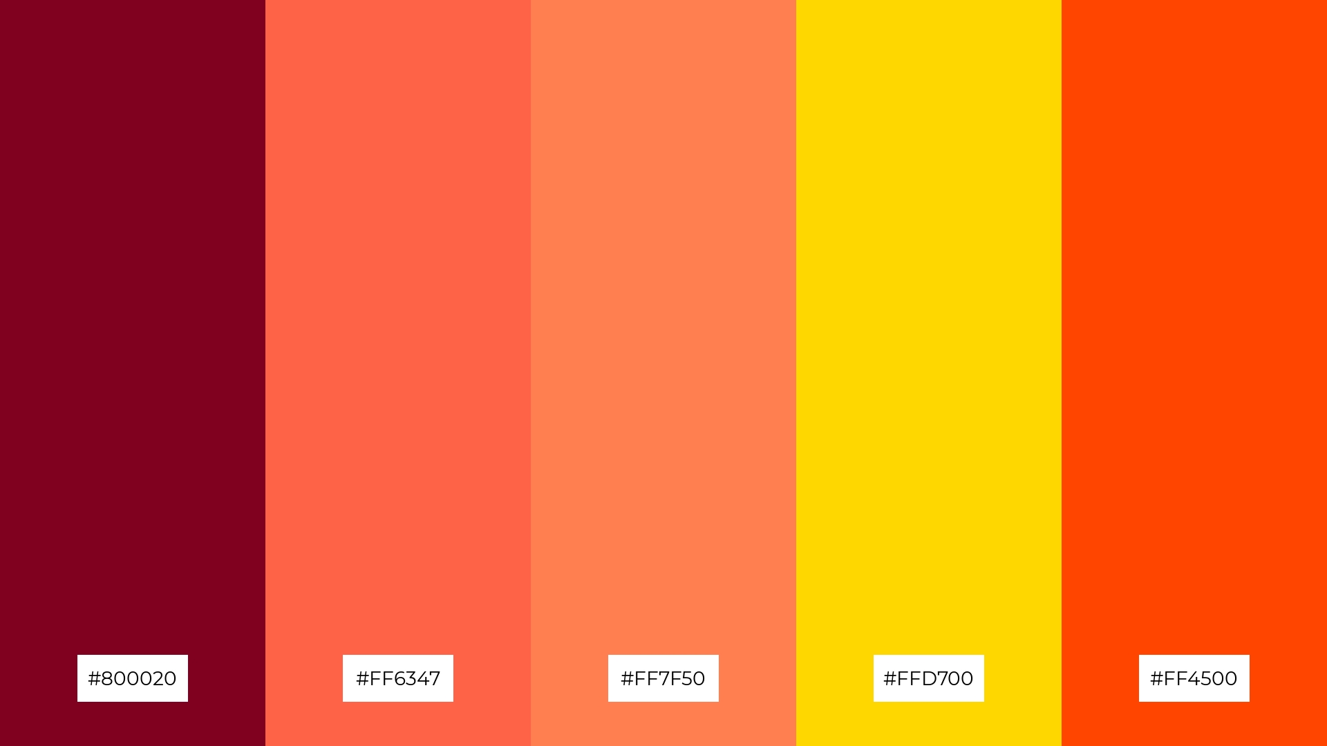
The ‘Sunset Glow’ palette, with its blend of deep burgundy (#800020), tomato (#FF6347), coral (#FF7F50), gold (#FFD700), and orange red (#FF4500), creates a vibrant and harmonious color scheme that can evoke a sense of warmth and energy, perfect for setting a sophisticated yet playful mood.
This palette is ideal for bold event designs, where the dynamic interplay of these colors can create an inviting and lively atmosphere, making it perfect for festive occasions or dynamic brand activations.
7) Forest Whisper
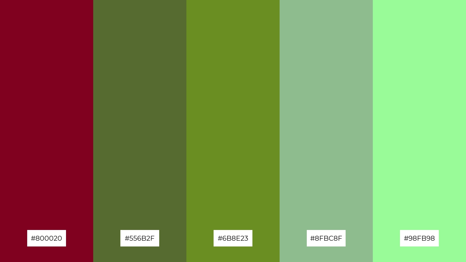
The ‘Forest Whisper’ palette, with its deep burgundy (#800020) and varying shades of green (#556B2F, #6B8E23, #8FBC8F, #98FB98), creates a striking contrast that adds visual interest and depth to any design.
This palette is perfect for creative projects like magazine layouts or artistic websites, where the interplay of rich and muted tones can evoke a sense of natural elegance and sophistication.
8) Ocean Depths
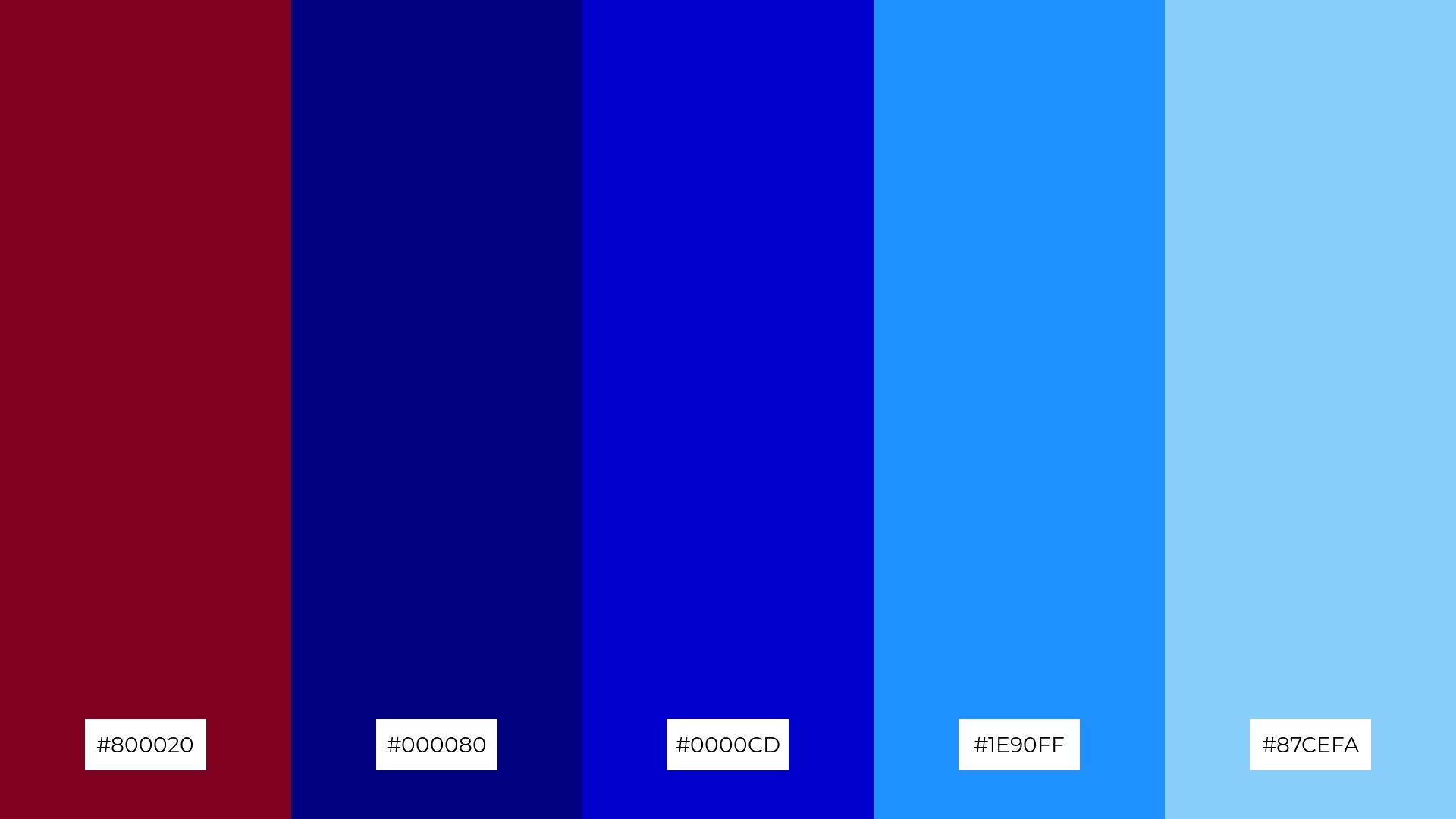
The ‘Ocean Depths’ palette, with its deep burgundy (#800020), navy (#000080), medium blue (#0000CD), dodger blue (#1E90FF), and light sky blue (#87CEFA), can evoke a sense of calm when the cooler blues are dominant, creating a serene and tranquil atmosphere.
Conversely, incorporating more of the vibrant blues alongside burgundy can infuse energy and excitement, making this palette ideal for dynamic marketing campaigns or eye-catching event designs.
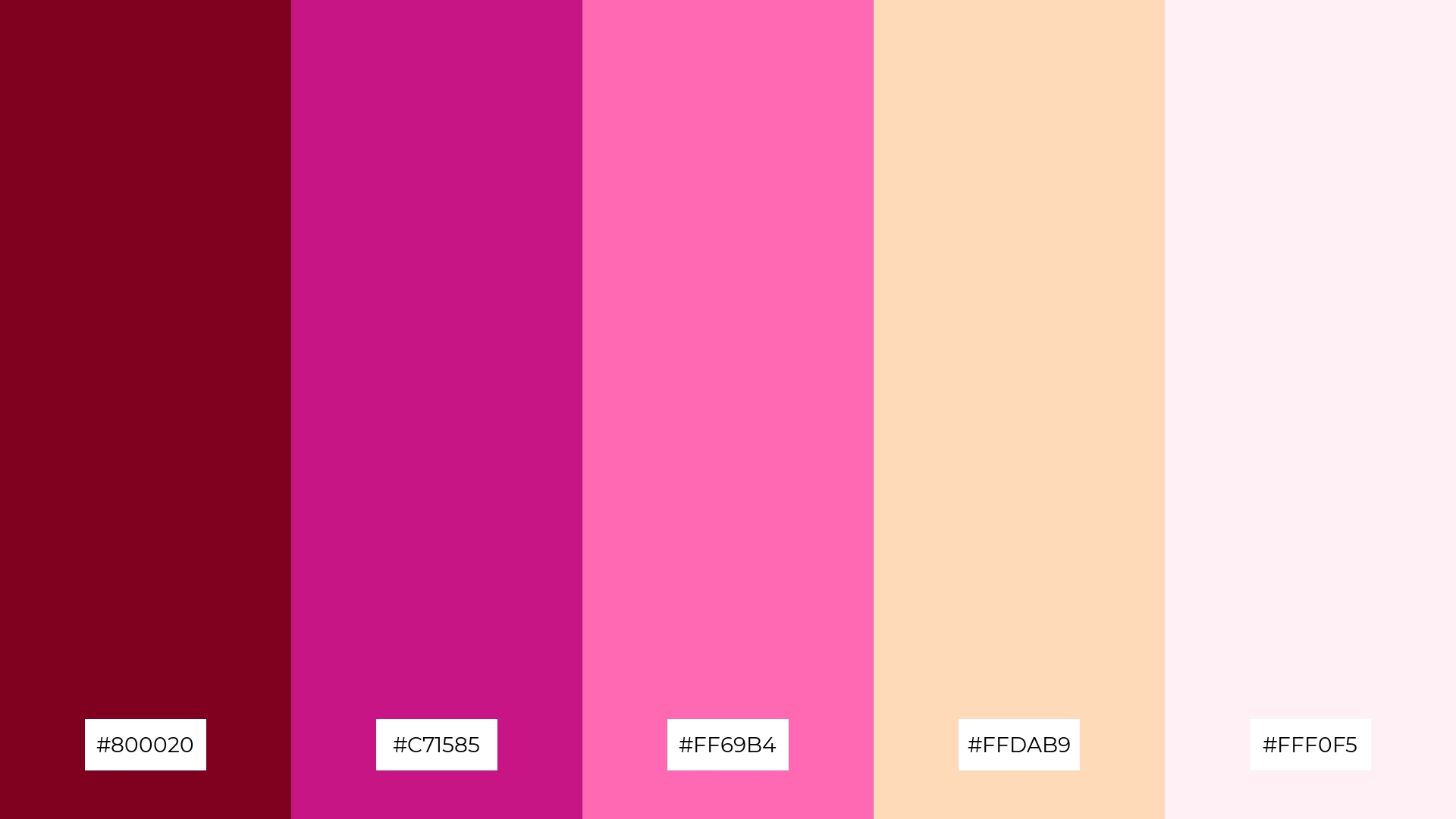
9) Spring Blossom
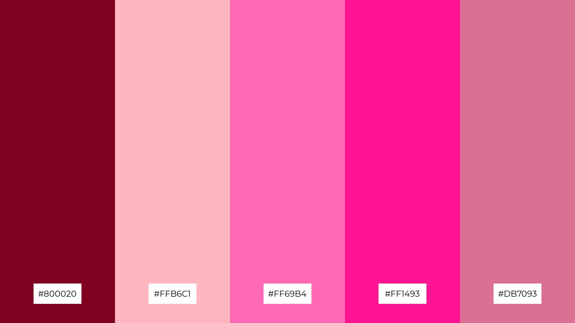
The ‘Spring Blossom’ palette, with its mix of deep burgundy (#800020) and brighter tones like light pink (#FFB6C1), hot pink (#FF69B4), deep pink (#FF1493), and pale violet red (#DB7093), creates a vibrant and cheerful mood that evokes the freshness and beauty of springtime.
This blend is ideal for seasonal promotions or home decor, where the lively and uplifting colors can infuse a space or campaign with a sense of renewal and joy.
10) Desert Mirage
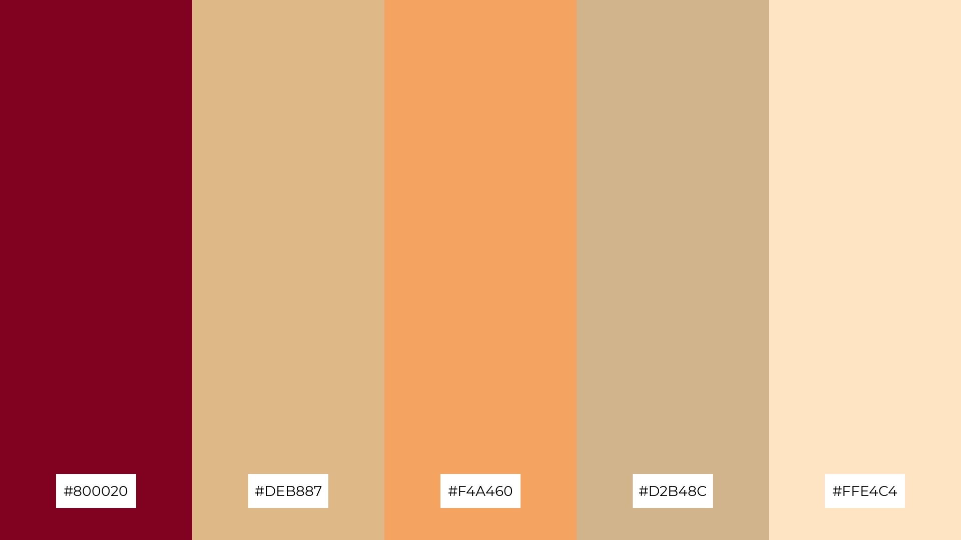
The ‘Desert Mirage’ palette, with its deep burgundy (#800020), burly wood (#DEB887), sandy brown (#F4A460), tan (#D2B48C), and bisque (#FFE4C4), creates a warm and inviting visual flow that evokes feelings of tranquility and comfort.
This harmonious blend is perfect for lifestyle branding or tech product packaging, where the soothing and earthy tones can convey a sense of reliability and understated elegance, appealing to consumers seeking both aesthetic appeal and emotional connection.
11) Midnight Garden
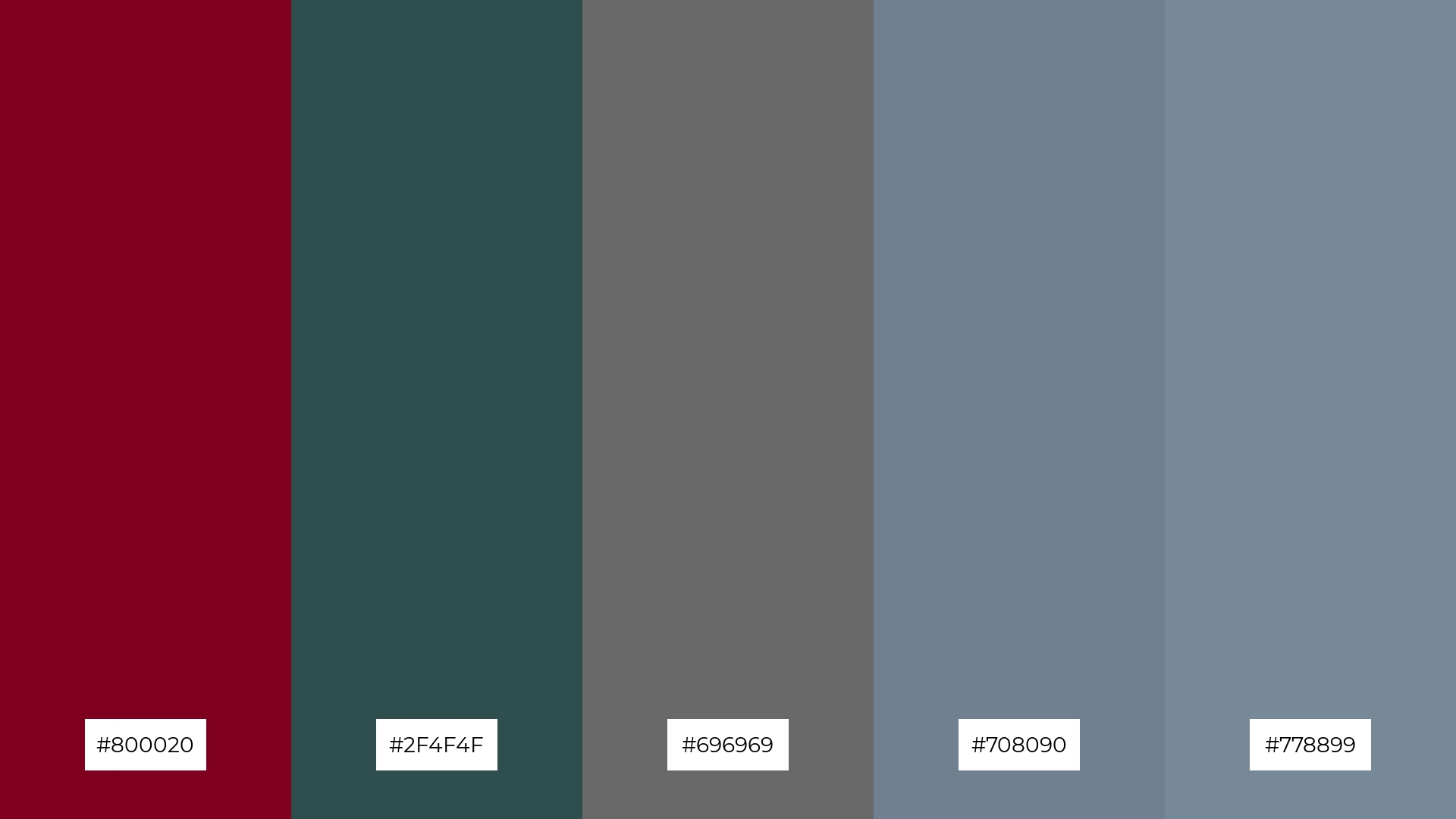
The ‘Midnight Garden’ palette, with its deep burgundy (#800020) and varying shades of gray (#2F4F4F, #696969, #708090, #778899), creates a dramatic and sophisticated effect that can add depth and intrigue to any design.
This palette shines in luxury e-commerce sites, where the rich and moody tones can evoke a sense of exclusivity and high-end appeal, making it perfect for brands aiming to create a memorable and upscale shopping experience.
12) Harvest Moon
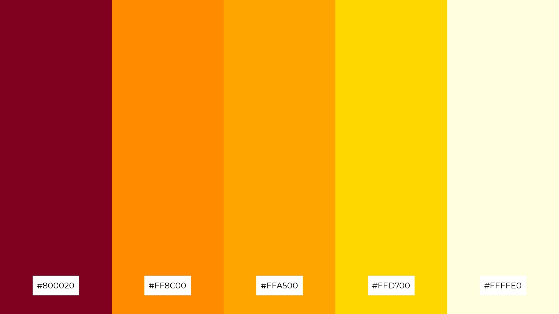
The ‘Harvest Moon’ palette, with its deep burgundy (#800020), dark orange (#FF8C00), orange (#FFA500), gold (#FFD700), and light yellow (#FFFFE0), creates a harmonious balance where the warm tones interact seamlessly, evoking a sense of comfort and vibrancy.
This palette is ideal for casual apparel lines, where the blend of rich and bright hues can convey a relaxed yet stylish vibe, appealing to consumers looking for both comfort and fashion-forward designs.
13) Enchanted Forest
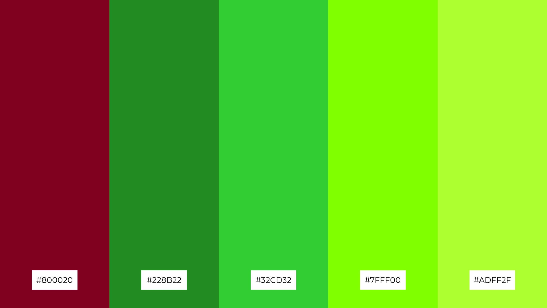
The ‘Enchanted Forest’ palette, with its deep burgundy (#800020) and varying shades of green (#228B22, #32CD32, #7FFF00, #ADFF2F), masterfully blends warm and cool tones to evoke a mood of mystical tranquility and natural elegance.
This palette is perfect for artisan product branding, where the harmonious interplay of rich and vibrant hues can convey a sense of handcrafted quality and organic sophistication, making it ideal for eco-friendly or bespoke goods.
14) Mystic Twilight
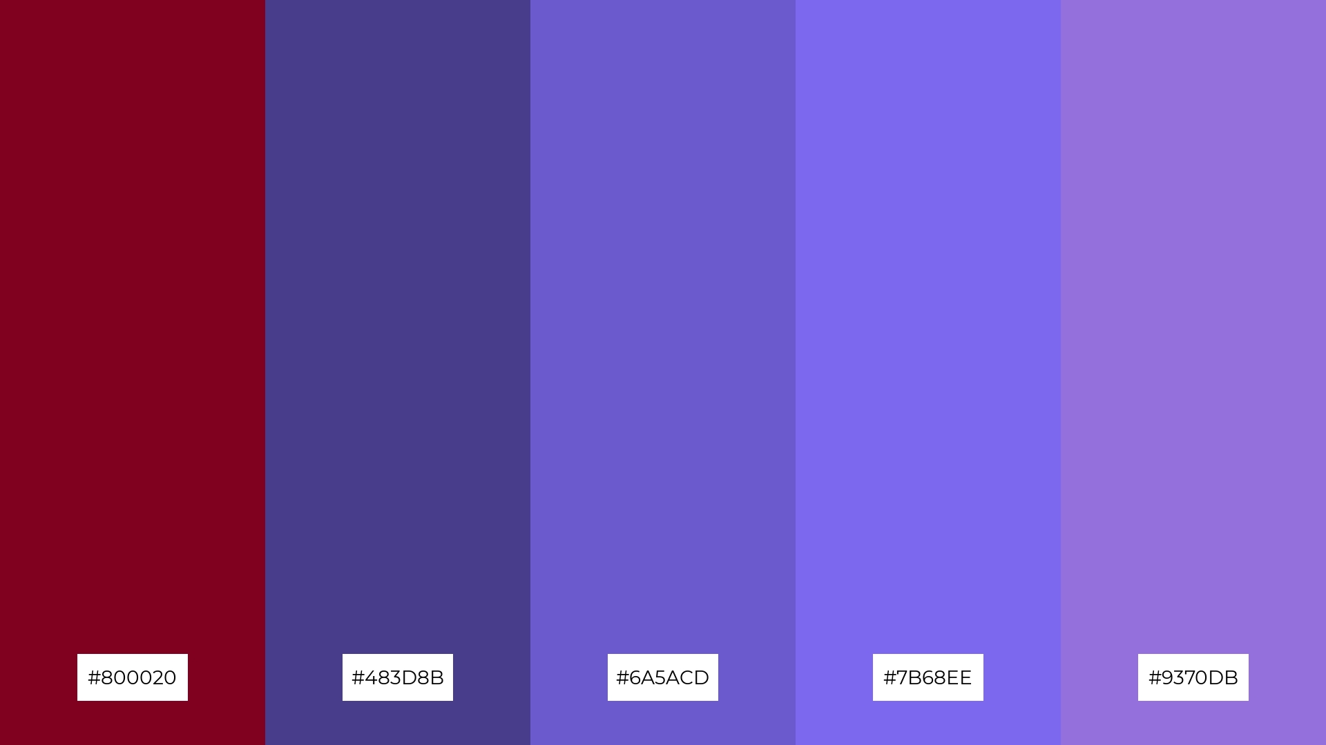
The ‘Mystic Twilight’ palette, with its deep burgundy (#800020) and varying shades of purple (#483D8B, #6A5ACD, #7B68EE, #9370DB), creates a dynamic interplay of bold and subtle hues that can evoke a sense of mystery and sophistication.
This palette is perfect for festival marketing, where the rich and vibrant colors can capture attention and convey an atmosphere of excitement and allure, making it ideal for events that aim to leave a lasting impression.
15) Coral Reef
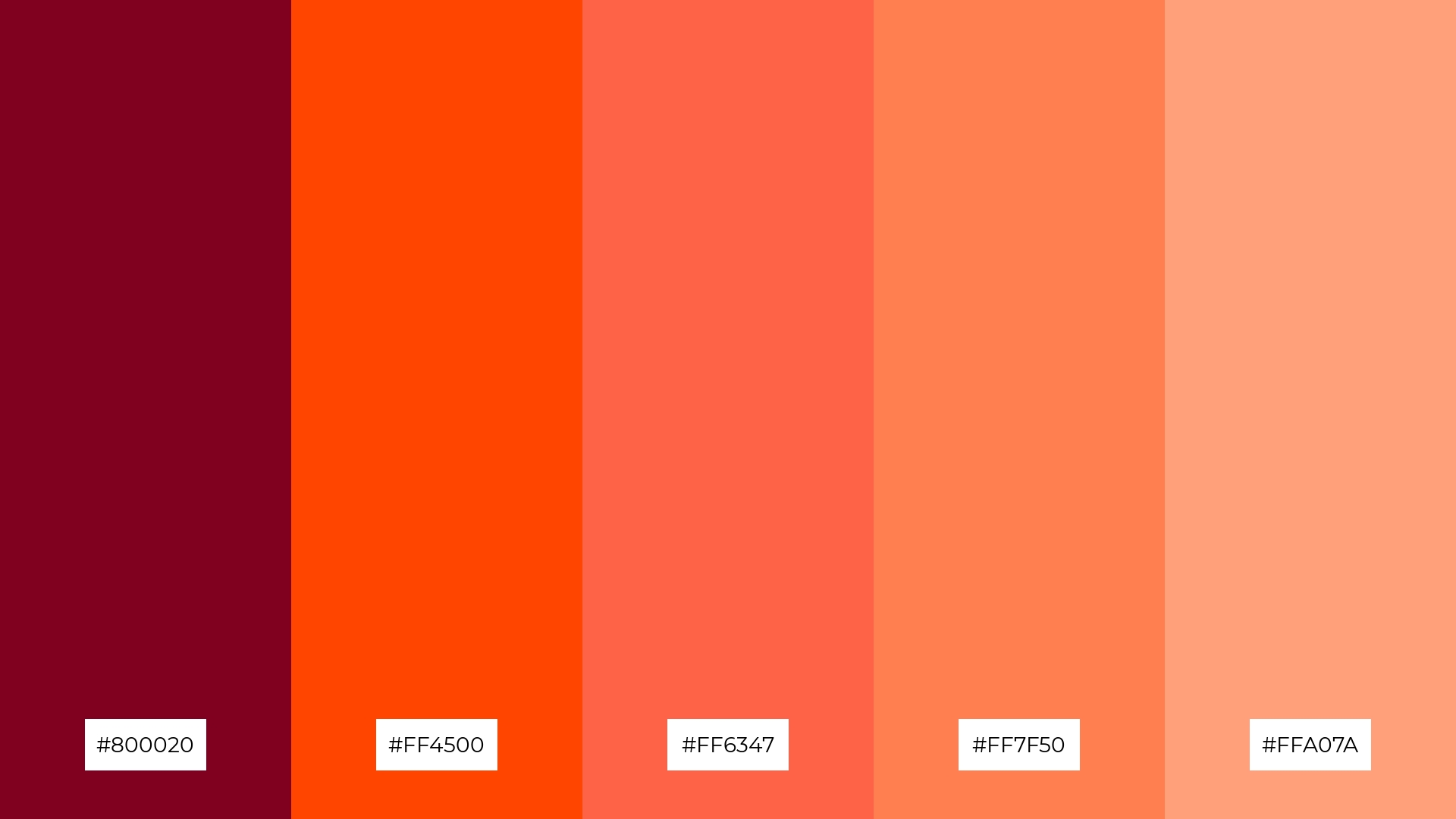
The ‘Coral Reef’ palette, with its blend of deep burgundy (#800020), orange red (#FF4500), tomato (#FF6347), coral (#FF7F50), and light salmon (#FFA07A), can convey a sense of harmony when used in a gradient, creating a smooth and visually appealing transition between warm tones.
This palette is ideal for tech startups aiming to create a vibrant and energetic brand identity, or for cozy interior makeovers where the warm and inviting colors can transform a space into a welcoming retreat.
How to Use Burgundy Patterns in Design
In home decor, burgundy color palettes can be used to create a warm and inviting atmosphere. Pairing burgundy with neutral tones like beige or gray can add sophistication to living spaces, while incorporating metallic accents can elevate the overall aesthetic.
For marketing materials, burgundy can convey a sense of luxury and reliability. Use it as a primary color in branding to evoke elegance, and complement it with gold or navy blue to enhance its richness and depth.
In clothing design, burgundy offers a versatile option that can be both bold and understated. Combine it with lighter shades for a soft, romantic look or with darker tones for a more dramatic and stylish effect.
Ready to experiment with burgundy color palettes in your next design project? Try creating stunning visuals using Piktochart and bring your creative ideas to life!


