 Piktochart Team
A well-designed Bubble Chart can make a significant impact on your presentations and data visualization, setting you apart from others and increasing the effectiveness of your message. Utilizing Bubble Chart templates, like those found on Piktochart, can streamline the process and help you create professional and impactful Bubble Charts.
Before diving into creating your own Bubble Charts, it's a great idea to explore 15 of the best examples of Bubble Charts for inspiration on the most effective ways to present your data visually. This will ensure that your Bubble Charts are both engaging and informative.
A Bubble Chart is a data visualization tool that uses circles, or bubbles, to represent collected information, allowing for the comparison of three or more variables by adjusting each bubble's size, location, and color. This type of chart is particularly useful when comparing numerous variables and their relationships, as well as handling multiple types of information related to a single topic. Specific situations where a Bubble Chart would be beneficial include comparing the cost-effectiveness of various sales strategies or analyzing employee performance based on attendance records, sales revenue, and customer growth.
Here are the top 15 Bubble Chart examples:

The Pain Scale Bubble Chart example exhibits a clean and modern design that is both visually appealing and easy to comprehend. The layout is specifically tailored for presenting various levels of pain intensity, ensuring that your information is effectively communicated to healthcare professionals and patients alike.

The Event Timeline Bubble Chart example presents a clean and modern design that is both visually appealing and easy to comprehend. The layout is specifically tailored for showcasing a sequence of events or milestones in a chronological order, ensuring that your timeline is effectively communicated to your audience.

The Anxiety Level Bubble Chart example presents a clean and modern design that is both visually appealing and easy to comprehend. The layout is specifically tailored for displaying various levels of anxiety intensity, ensuring that your information is effectively communicated to healthcare professionals and patients alike.

The Individual's Wealth Bubble Chart example presents a clean and modern design that is both visually appealing and easy to comprehend. The layout is specifically tailored for displaying data related to personal wealth, ensuring that your information is effectively communicated to your audience.

The Intern's Salary Bubble Chart example presents a clean and modern design that is both visually appealing and easy to comprehend. The layout is specifically tailored for displaying data related to intern salaries, ensuring that your information is effectively communicated to your audience.

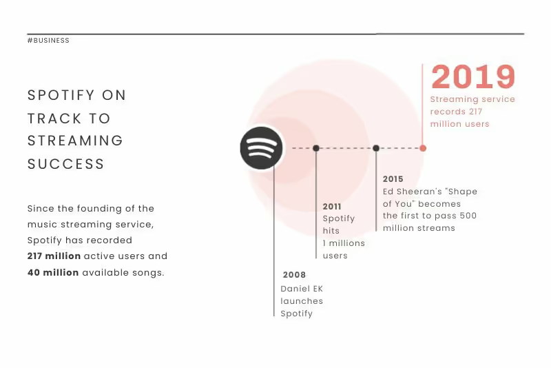
The Music Streaming Bubble Chart example presents a clean and modern design that is both visually appealing and easy to comprehend. The layout is specifically tailored for displaying data related to music streaming platforms, ensuring that your information is effectively communicated to your audience.

The Road System Bubble Chart example presents a clean and modern design that is both visually appealing and easy to comprehend. The layout is specifically tailored for displaying data related to various aspects of road systems, ensuring that your information is effectively communicated to your audience.

The Company Growth Bubble Chart example presents a clean and modern design that is both visually appealing and easy to comprehend. The layout is specifically tailored for displaying data related to various aspects of company growth, ensuring that your information is effectively communicated to your audience.

The Sleep Stages Bubble Chart example presents a clean and modern design that is both visually appealing and easy to comprehend. The layout is specifically tailored for displaying data related to various stages of sleep, ensuring that your information is effectively communicated to your audience.

The Computer Processors Bubble Chart example presents a clean and modern design that is both visually appealing and easy to comprehend. The layout is specifically tailored for displaying data related to various aspects of computer processors, ensuring that your information is effectively communicated to your audience.

The Cyberbullying Bubble Chart example presents a clean and modern design that is both visually appealing and easy to comprehend. The layout is specifically tailored for displaying data related to various aspects of cyberbullying, ensuring that your information is effectively communicated to your audience.

The Carbon Footprint Bubble Chart example presents a clean and modern design that is both visually appealing and easy to comprehend. The layout is specifically tailored for displaying data related to various aspects of carbon footprint, ensuring that your information is effectively communicated to your audience.

The Education Cost Bubble Chart example presents a clean and modern design that is both visually appealing and easy to comprehend. The layout is specifically tailored for displaying data related to various aspects of education expenses, ensuring that your information is effectively communicated to your audience.

The Stevia Cost Bubble Chart example presents a clean and modern design that is both visually appealing and easy to comprehend. The layout is specifically tailored for displaying data related to various aspects of stevia production and pricing, ensuring that your information is effectively communicated to your audience.

The Earthquake Count Bubble Chart example presents a clean and modern design that is both visually appealing and easy to comprehend. The layout is specifically tailored for displaying data related to the frequency and magnitude of earthquakes, ensuring that your information is effectively communicated to your audience.
If you need help generating a Bubble Chart, look no further than Piktochart, an infographic maker trusted by millions of users. Piktochart simplifies the design process, allowing you to create professional-looking visuals, including Bubble Charts, in less than an hour without any prior graphic design experience. With its user-friendly drag and drop editor, data visualization tools, and a wide range of templates, Piktochart has everything you need to turn complex data into engaging visuals. To start creating with Piktochart, simply sign up and begin exploring the platform's features.