 Piktochart Team
·

Updated on
November 26, 2024
Published on
November 25, 2024

Color palettes are the backbone of any compelling visual design, providing the necessary harmony and contrast to make graphics stand out. Understanding how to bridge different color palettes can elevate your design game, ensuring a cohesive and visually appealing result.
Whether you're working on infographics, presentations, or social media graphics, mastering the art of blending color palettes is essential. This article will guide you through the nuances of creating seamless transitions between colors, making your designs more engaging and professional.
Designing color palettes with Bridge can transform your visuals into cohesive masterpieces. Here are some practical tips to get you started:

The colors in 'Sunset Over the Bridge' evoke a warm, inviting mood with their blend of vibrant oranges, yellows, and deep purples, reminiscent of a serene evening sky.
These hues interact harmoniously to create a cohesive look, making them ideal for fashion collections that aim to capture the essence of a tranquil sunset, adding a touch of elegance and calm to any wardrobe.

The colors of 'Steel and Sky' evoke a sense of calm and sophistication, with their blend of soft grays, blues, and whites creating a serene and professional atmosphere.
This palette would excel in digital branding for tech companies, providing a modern and trustworthy aesthetic that appeals to a wide audience.

The dominant colors in 'River Reflection'—a mix of deep blues and aquas—create a tranquil and refreshing palette that evokes the serene beauty of a flowing river.
This harmonious blend is perfect for wellness branding, as it promotes a sense of calm and rejuvenation, making it ideal for businesses focused on health and relaxation.

The 'Autumn Walk' palette, with its mix of vibrant oranges, warm yellows, and rich browns, offers a balance of soft and bold tones that create a distinct, inviting mood.
This palette is ideal for creating inviting retail spaces, as the warm and earthy colors can make customers feel welcome and comfortable, enhancing their shopping experience.

The 'Urban Jungle' palette, with its blend of deep greens and soft aquas, creates a refreshing and invigorating ambiance that evokes the lush tranquility of a verdant forest.
This palette is perfect for eco-friendly wedding themes, providing a natural and serene backdrop that enhances the romantic and intimate atmosphere of the celebration.

The 'Twilight Glow' palette, with its rich purples and soft lavenders, creates a sophisticated and dreamy atmosphere, perfect for minimalistic branding that aims to evoke elegance and mystery.
This harmonious blend of hues can also be used in bold event designs, where the interplay of deep and light purples adds a touch of playfulness and enchantment, making any occasion feel magical and memorable.

The 'Coastal Breeze' palette, with its mix of vibrant turquoise and calming teal shades, creates a striking contrast that captures the dynamic essence of a breezy seaside.
This palette is ideal for creative projects like magazine layouts or artistic websites, where the interplay of bold and serene colors can draw attention and enhance the visual storytelling.

The 'Rustic Charm' palette, with its earthy browns and warm siennas, can evoke a sense of calm and relaxation, making it ideal for spa branding that aims to create a serene and inviting atmosphere.
Alternatively, the vibrant combination of these hues can inject excitement and energy into marketing campaigns, providing a distinctive and engaging visual appeal that captures attention and drives engagement.

The 'Industrial Vibes' palette, with its softer grays like #D3D3D3 and #C0C0C0, creates a calm and understated ambiance that can add a touch of modern elegance to any space.
This blend of tones is perfect for home decor, providing a versatile and neutral backdrop that can be easily accented with seasonal promotions to keep the look fresh and engaging throughout the year.

The 'Vibrant Cityscape' palette, with its dynamic mix of #FF1493, #FF69B4, #FFB6C1, #FF7F50, and #FF4500, creates a lively and energetic visual flow that evokes feelings of joy and excitement.
This palette is ideal for lifestyle branding or tech product packaging, as its bold and cheerful colors can capture attention and convey a sense of innovation and enthusiasm.

The tones in 'Serene Waters'—a blend of #4682B4, #5F9EA0, #B0E0E6, #AFEEEE, and #E0FFFF—create a welcoming effect by evoking a sense of calm and tranquility, making any space feel inviting and peaceful.
This palette shines in boutique interiors, where its soothing colors can enhance the shopping experience by creating a serene and luxurious atmosphere that encourages customers to linger and explore.

The hues in 'Golden Hour'—a blend of #FFD700, #FFA500, #FF8C00, #FF4500, and #FF6347—interact to create a vibrant yet balanced palette, where the warm yellows and oranges harmonize with the deeper reds to evoke a sense of energy and warmth.
This palette is perfect for casual apparel lines, as its dynamic and inviting colors can capture the essence of a sunset, making the clothing feel both stylish and approachable.
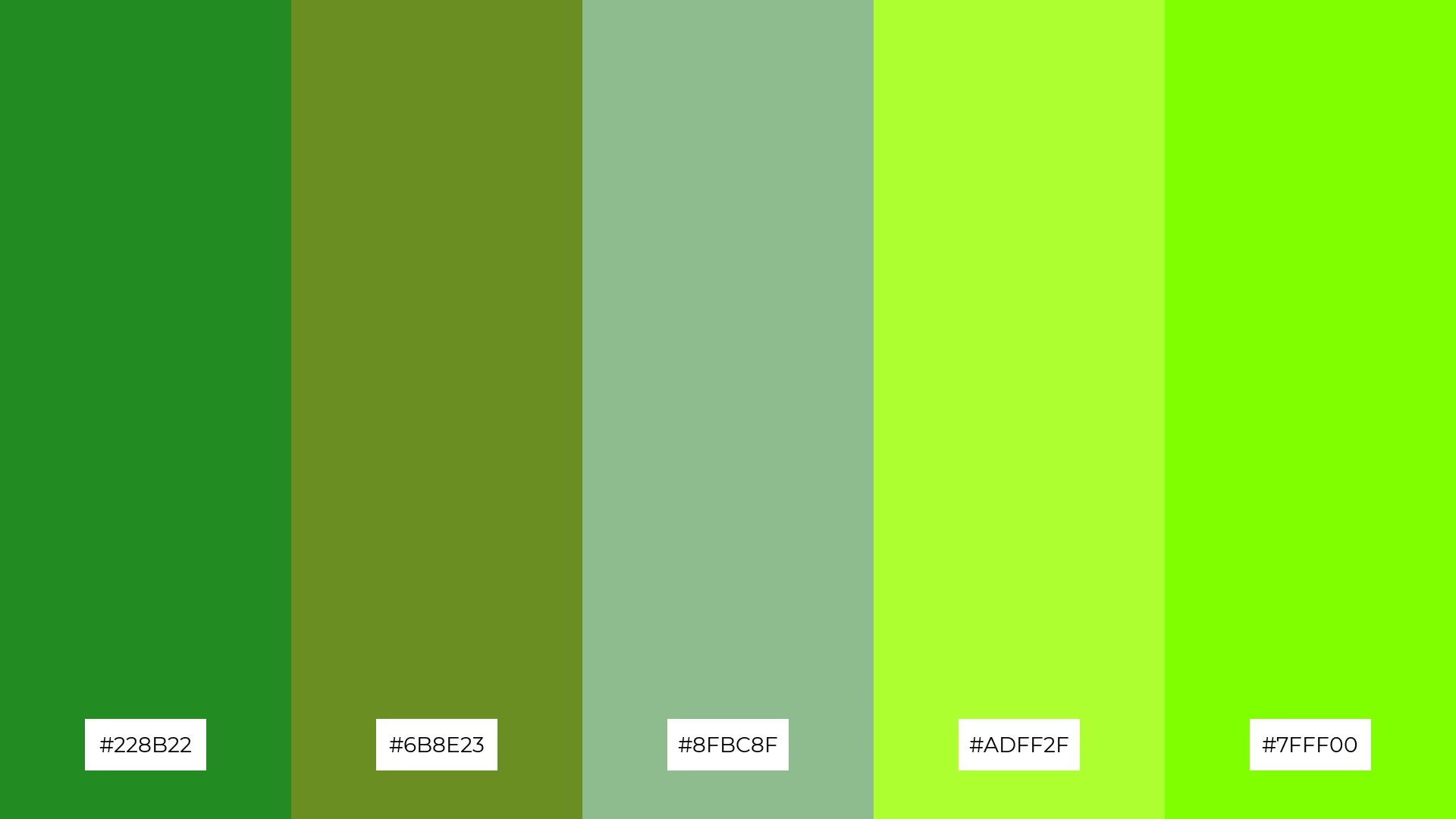
The 'Forest Path' palette, with its blend of warm greens like #228B22 and #6B8E23 and cool tones such as #8FBC8F, #ADFF2F, and #7FFF00, creates a balanced and refreshing ambiance that evokes the serene beauty of a lush forest.
This harmonious mix of hues is perfect for artisan product branding, where the natural and inviting colors can enhance the handcrafted appeal and authenticity of the products, making them stand out in a crowded market.

The 'Nightfall' palette, with its deep blues and rich indigos, creates a bold and dramatic visual effect that can captivate and intrigue viewers.
This dynamic blend of hues is perfect for festival marketing, where the striking colors can evoke a sense of excitement and mystery, drawing attention and enhancing the overall atmosphere of the event.

The 'Bridge of Dreams' palette, with its blend of #E6E6FA, #D8BFD8, #DDA0DD, #BA55D3, and #9932CC, conveys a sense of harmony through its soft lavenders and purples, creating a serene and cohesive visual flow.
This palette is ideal for cozy interior makeovers, where the calming and inviting hues can transform a space into a tranquil retreat, perfect for relaxation and unwinding.
Bridge color palettes can be a game-changer in various design applications. For home decor, consider using palettes like 'Bridge of Dreams' to create a serene and cohesive atmosphere. The soft lavenders and purples can transform any space into a tranquil retreat, perfect for relaxation.
In marketing materials, vibrant palettes such as 'Vibrant Cityscape' can capture attention and convey a sense of innovation and enthusiasm. The dynamic mix of bold colors can make your brand stand out, creating a lively and energetic visual flow that resonates with your audience.
For clothing design, palettes like 'Golden Hour' can evoke a sense of energy and warmth, making casual apparel lines feel both stylish and approachable. The harmonious blend of warm yellows and oranges can capture the essence of a sunset, adding a dynamic and inviting touch to your collection.
Ready to elevate your design game? Try creating these stunning color palettes using Piktochart and see the difference they can make in your projects.
The latest industry news, interviews, technologies, and resources.

Published on
November 25, 2024


