 Piktochart Team
·

Updated on
November 21, 2024
Published on
November 8, 2024

Black, red, and orange color palettes are a striking combination that can evoke a range of emotions and create a powerful visual impact. These colors, when used together, can convey warmth, energy, and sophistication.
Whether you're designing a website, creating an infographic, or working on a marketing campaign, understanding how to effectively use these colors can elevate your project. Let's explore the nuances and applications of black, red, and orange color palettes.
Designing with black, red, and orange can be both exciting and challenging. Here are some practical tips to help you create stunning color palettes:
The 'Fiery Sunset' palette, with its vibrant oranges and yellows contrasted against deep black, creates a mood of intense warmth and dynamic energy, reminiscent of a breathtaking sunset.
In interior decor, this palette can be used to create a bold and inviting living space, where the interplay of these colors brings a sense of both comfort and excitement, making it perfect for a modern, stylish home.

The 'Midnight Blaze' palette, with its deep black and fiery shades of red and orange, evokes a sense of intense energy and boldness, making it perfect for designs that aim to capture attention and convey a powerful message.
This palette would excel in digital branding for tech startups or innovative product packaging, where the striking contrast and vibrant hues can create a memorable and impactful visual identity.

The 'Ember Glow' palette, featuring dominant colors like #FF5722, #000000, #FF9800, #FFC107, and #FFEB3B, creates a harmonious blend of warmth and intensity, making it visually captivating and balanced.
This palette is ideal for wellness branding, where the vibrant oranges and yellows can evoke feelings of vitality and positivity, while the black adds a touch of sophistication and grounding to the overall design.

The 'Dark Inferno' palette, with its deep black and vibrant shades of orange, offers a balance of soft and bold tones, creating a distinct mood that is both intense and inviting.
This palette is ideal for creating modern web designs or inviting retail spaces, where the striking contrast and warm hues can draw attention and create a memorable atmosphere.

The 'Crimson Night' palette, with its deep black and vibrant shades of red and gold, creates an ambiance of opulence and drama, perfect for luxury fashion campaigns that aim to exude elegance and boldness.
This palette's rich and contrasting colors can also be used in wedding themes to evoke a sense of romance and sophistication, making the event both memorable and visually stunning.

The 'Radiant Fire' palette, with its blend of #FF4500, #000000, #FF6F20, #FFB300, and #FFF176, creates a dynamic harmony that can evoke a mood of both sophistication and playfulness, making it versatile for various design contexts.
This palette is particularly effective for bold event designs, where the vibrant oranges and yellows can energize the atmosphere, while the black adds a touch of elegance and depth, ensuring the overall aesthetic is both striking and refined.

The 'Charcoal Flame' palette, with its deep black and vibrant shades of red, orange, and yellow, creates a striking contrast that draws the eye and adds visual interest to any design.
This palette is perfect for creative projects like magazine layouts or artistic websites, where the bold colors can highlight key elements and create a dynamic, engaging visual experience.

The 'Solar Eclipse' palette, with its deep black and vibrant shades of orange and yellow, can evoke a sense of calm when the softer hues like #FFEB3B are paired with black, creating a balanced and serene visual experience.
Conversely, this palette can bring excitement and energy when the bolder shades like #FF5722 and #FF8F00 are used prominently, making it ideal for vibrant marketing campaigns that aim to capture attention and convey a dynamic message.

The 'Blazing Horizon' palette, with its softer tones like #FFEB3B and brighter hues such as #FF4500, creates a vibrant yet balanced mood that evokes both warmth and energy.
This blend is ideal for seasonal promotions, where the dynamic colors can capture attention and convey a sense of excitement and renewal, making it perfect for spring or summer campaigns.

The 'Vivid Ember' palette, with its striking combination of #FF3D00, #000000, #FF6A00, #FF8F00, and #FFD700, creates a dynamic visual flow that evokes feelings of joy and excitement, while the deep black adds a grounding element that balances the vibrant hues.
This palette is ideal for lifestyle branding, where the energetic colors can convey a sense of vitality and enthusiasm, or for tech product packaging, where the bold contrasts can create a memorable and impactful visual identity that stands out on the shelves.

The 'Dark Radiance' palette, with its deep black and vibrant shades of orange and yellow, creates a dramatic effect that can captivate and engage viewers, making it perfect for designs that aim to leave a lasting impression.
This palette shines in luxury e-commerce sites, where the bold contrasts and warm hues can evoke a sense of opulence and exclusivity, enhancing the overall shopping experience and drawing attention to premium products.

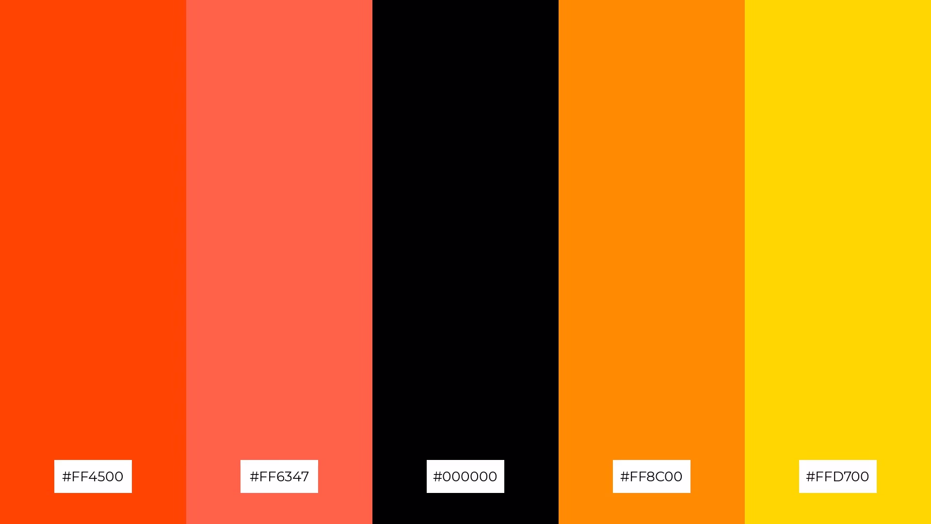
The 'Searing Twilight' palette, with its vibrant hues of #FF4500, #FF6F20, #FF8C00, and #FFD700 contrasted against deep black, creates a dynamic interplay of warmth and intensity that balances boldness with sophistication.
This palette is ideal for casual apparel lines, where the energetic oranges and yellows can evoke a sense of fun and vibrancy, while the black adds a sleek, modern touch that appeals to contemporary fashion trends.

The 'Shadowed Flame' palette, with its blend of deep black and vibrant shades of red, orange, and yellow, masterfully combines warm and cool tones to evoke a mood of both intensity and balance.
This palette is uniquely suited for artisan product branding, where the rich, contrasting colors can highlight the craftsmanship and quality of handmade goods, creating a visually compelling and memorable brand identity.

The 'Luminous Ash' palette, with its vibrant hues of #FF5722, #FF7043, #FFB300, and #FFF176 contrasted against deep black, creates a dynamic interplay of bold and subtle tones that can evoke both excitement and sophistication.
This palette is particularly effective for festival marketing, where the energetic oranges and yellows can capture attention and convey a sense of celebration, while the black adds a touch of elegance and depth, ensuring the overall aesthetic is both striking and inviting.

The 'Cinder Glow' palette, with its deep black and vibrant shades of orange and gold, can create a striking contrast that draws attention to key elements, making it perfect for tech startups aiming to establish a bold and memorable brand identity.
Conversely, when used in a cozy interior makeover, the harmonious blend of #FF6F61 and #FFD700 can evoke warmth and comfort, transforming a space into an inviting and stylish retreat.
In home decor, black, red, and orange color palettes can create a bold and inviting atmosphere. Use black as a grounding element for furniture or accent walls, while red and orange can be incorporated through accessories like cushions, rugs, and artwork to add warmth and energy to the space.
For marketing materials, this palette can make your designs stand out and capture attention. Use black for text and backgrounds to create a sleek, professional look, while red and orange can highlight key information and calls-to-action, ensuring your message is both impactful and visually appealing.
In clothing design, black, red, and orange can create striking and fashionable pieces. Black can serve as the base color for garments, with red and orange accents adding vibrancy and flair, making the outfit both stylish and eye-catching.
Ready to experiment with these dynamic color palettes? Try creating your own designs using Piktochart's intuitive tools. Get started with Piktochart today!
The latest industry news, interviews, technologies, and resources.

Published on
November 25, 2024


