 Piktochart Team
·

Updated on
November 7, 2024
Published on
November 8, 2024

Orange beige color palettes are a versatile choice for designers looking to create warm, inviting visuals. These hues blend the vibrancy of orange with the subtlety of beige, offering a balanced and sophisticated look.
Whether you're designing for digital or print, orange beige palettes can add a touch of elegance and warmth to your projects. This combination is perfect for creating a cozy, yet professional atmosphere.
Designing with orange beige color palettes can be both exciting and challenging.

The 'Sunset Glow' palette evokes a sense of warmth and tranquility, with its blend of vibrant oranges and soft beiges creating a serene and inviting atmosphere.
Perfect for interior decor, this palette can transform a living space into a cozy retreat, with each color complementing the others to form a cohesive and harmonious look.

The 'Warm Embrace' palette, with its rich oranges and soft beiges, evokes a feeling of warmth and comfort, making it ideal for creating inviting and cozy visuals.
This palette would excel in product packaging for artisanal goods, where the colors can enhance the perception of quality and craftsmanship, or in digital branding for wellness and lifestyle brands aiming to convey a sense of calm and relaxation.
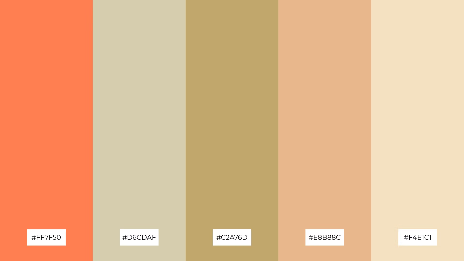
The 'Autumn Whisper' palette features dominant colors like coral (#FF7F50) and light beige (#D6CDAF), which together create a warm and inviting atmosphere.
This harmonious blend is perfect for wellness branding, where the soothing and earthy tones can evoke a sense of calm and natural balance.

The 'Sandy Shores' palette, with its mix of bold oranges and soft beiges, offers a balanced blend of vibrant and subtle tones, creating a distinct and inviting mood.
This palette is ideal for designing modern retail spaces, where the warm and welcoming colors can enhance the shopping experience and create a cozy, yet sophisticated atmosphere.

The 'Golden Harvest' palette, with its blend of warm golds and soft beiges, evokes a sense of rustic elegance and timeless charm, perfect for creating serene and inviting wedding themes.
This harmonious combination of colors can also be utilized in luxury fashion campaigns, where the rich and sophisticated tones enhance the perception of opulence and refined taste.

The 'Coral Dream' palette, with its blend of vibrant coral (#FF6F61) and soft beiges (#E1B07A, #D9CBA0, #F5E3C1), creates a harmonious balance that can evoke a sense of sophistication and warmth.
This palette is ideal for minimalistic branding, where the subtle yet striking colors can enhance the perception of elegance and modernity, making it perfect for high-end product packaging or sleek corporate identities.

The 'Rustic Charm' palette, with its blend of vibrant orange (#FF8C42) and soft beige (#D9BBA0), creates a striking contrast that adds visual interest and depth to any design.
This palette is perfect for creative projects like magazine layouts or artistic websites, where the dynamic interplay of colors can enhance the overall aesthetic and captivate the audience.

The 'Honeyed Sunset' palette, with its blend of vibrant orange (#FF9F00) and soft beiges (#E4CDAF, #D6B88C, #C2A76D, #F5E3C1), can evoke a sense of calm or excitement depending on the combination, offering a versatile range of emotions for various design needs.
This palette is perfect for spa branding, where the soothing beiges can create a tranquil atmosphere, or for vibrant marketing campaigns, where the energetic orange can capture attention and convey enthusiasm.

The 'Earthy Tones' palette, with its mix of bright orange (#FF6F20) and softer beiges (#D9CBA0, #C6A76B, #E1B07A, #F2E1C1), creates a warm and inviting atmosphere that feels both vibrant and grounded.
This blend of colors is perfect for seasonal promotions, where the bright tones can capture attention and the softer hues can evoke a sense of comfort and coziness.

The 'Creamy Citrus' palette, with its vibrant orange (#FFA500) and soft beiges (#F5E1A4, #D9BBA0, #E4B169, #C2A76D), creates a visual flow that evokes feelings of joy and warmth, making it perfect for uplifting and energizing designs.
This harmonious blend of colors is ideal for lifestyle branding, where the cheerful and inviting tones can enhance the perception of positivity and well-being, or for tech product packaging, where the dynamic palette can convey innovation and approachability.

The 'Peachy Bliss' palette, with its blend of warm peaches and soft beiges, creates a welcoming and inviting atmosphere that can make any space feel cozy and comfortable.
This palette shines in boutique interiors, where the harmonious tones can enhance the shopping experience by creating a serene and luxurious environment.

The 'Caramel Delight' palette, with its blend of vibrant coral (#FF7F50) and soft beiges (#D9BFA0, #C2A76D, #E4CDAF, #F5E1A4), creates a harmonious balance where the boldness of coral is tempered by the soothing beiges, resulting in a visually appealing and cohesive design.
This palette is perfect for casual apparel lines, where the warm and inviting tones can enhance the perception of comfort and style, making the clothing line feel both trendy and approachable.

The 'Sunlit Meadow' palette, with its blend of warm oranges (#FFB74D) and cool beiges (#E4B169, #D9CBA0, #C6A76B, #F2E1C1), creates a balanced and serene atmosphere that evokes a sense of calm and natural beauty.
This harmonious combination is perfect for artisan product branding, where the warm and cool tones can enhance the perception of handcrafted quality and authenticity, making the products feel both inviting and sophisticated.

The 'Citrus Breeze' palette, with its vibrant orange (#FF8C00) and soft beiges (#F5E3C1, #D6B88C, #E1B07A, #C2A76D), creates a dynamic interplay of bold and subtle tones that can energize and soothe simultaneously.
This palette is perfect for festival marketing, where the lively orange can capture attention and the calming beiges can provide a balanced backdrop, making the promotional materials both eye-catching and inviting.

The 'Warm Sand' palette, with its blend of vibrant orange (#FFA500) and soft beiges (#D9CBA0, #E4CDAF, #C6A76B, #F5E1A4), can convey a sense of harmony when used in balanced proportions, creating a cohesive and inviting visual experience.
This palette is ideal for tech startups aiming to create a welcoming and innovative office space, or for cozy interior makeovers where the warm and soothing tones can enhance the feeling of comfort and relaxation.
Orange beige color palettes can transform home decor by creating a warm and inviting atmosphere. Use these hues in living rooms or bedrooms to evoke a sense of coziness and comfort. Pairing orange accents with beige walls or furniture can add a touch of sophistication and balance to the space.
In marketing materials, orange beige palettes can capture attention while maintaining a professional look. Use vibrant orange for call-to-action buttons and headlines, while incorporating beige for backgrounds and text to ensure readability and visual harmony. This combination can make your promotional content both eye-catching and approachable.
For clothing design, orange beige palettes can create trendy and stylish apparel. Use bold orange for statement pieces and soft beige for complementary items to achieve a balanced and fashionable look. This palette is perfect for casual wear, where the warm tones can enhance the perception of comfort and style.
Ready to create your own stunning orange beige color palettes? Try using Piktochart to bring your design ideas to life. Get started now!
The latest industry news, interviews, technologies, and resources.

Published on
November 25, 2024


