Baby blue is a timeless and versatile color that evokes feelings of calmness and serenity. Its soft, soothing hue makes it a popular choice for a variety of design projects.
From nurseries to corporate branding, baby blue can be adapted to fit numerous styles and themes. This article explores the best baby blue color palettes to inspire your next creative endeavor.
Tips For Creating Baby Blue Color Palettes
Designing with baby blue can be both exciting and challenging. Here are some practical tips to help you create stunning color palettes:
- Balance with Neutrals: Pair baby blue with neutral colors like white, gray, or beige to create a balanced and harmonious look.
- Complementary Shades: Use complementary colors such as soft pinks or pastel yellows to add a touch of warmth and contrast to your design.
- Accent with Bold Colors: Introduce bold colors like navy blue or deep green as accents to make your design more dynamic and visually interesting.
- Consider the Mood: Think about the mood you want to convey. Baby blue can evoke calmness, so use it in designs where a serene and peaceful atmosphere is desired.
- Versatility in Design: Baby blue is versatile and can be used in various design contexts, from modern to vintage. Experiment with different styles to see what works best for your project.
15 Baby Blue Color Palettes
1) Ocean Breeze

The ‘Ocean Breeze’ palette, with its range of tranquil blues from #A2D5F2 to #2980B9, creates a refreshing and invigorating mood reminiscent of a serene seaside escape.
Perfect for coastal-themed interior decor, these shades interact harmoniously to evoke a sense of calm and relaxation, making any space feel like a peaceful retreat.
2) Morning Mist

The ‘Morning Mist’ palette, with its gradient of soft blues from #D6EAF8 to #3498DB, evokes a sense of calmness and tranquility, reminiscent of a peaceful morning sky.
This soothing color scheme would excel in digital branding for wellness apps, creating a serene and inviting user experience that promotes relaxation and mindfulness.
3) Sky Dream
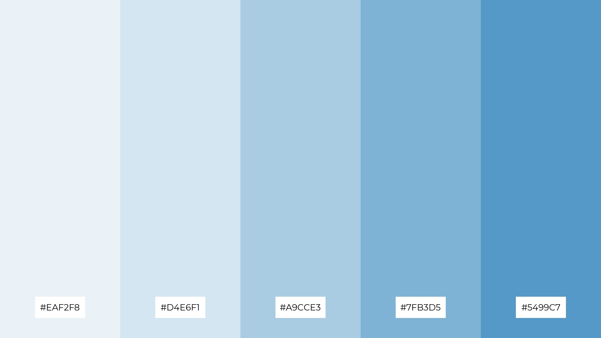
The ‘Sky Dream’ palette, featuring dominant colors like #EAF2F8 and #5499C7, creates a cohesive and serene visual experience that is both calming and uplifting.
Ideal for eco-friendly interior spaces, this palette’s harmonious blend of soft and vibrant blues fosters a tranquil environment that promotes relaxation and well-being.
4) Winter Chill
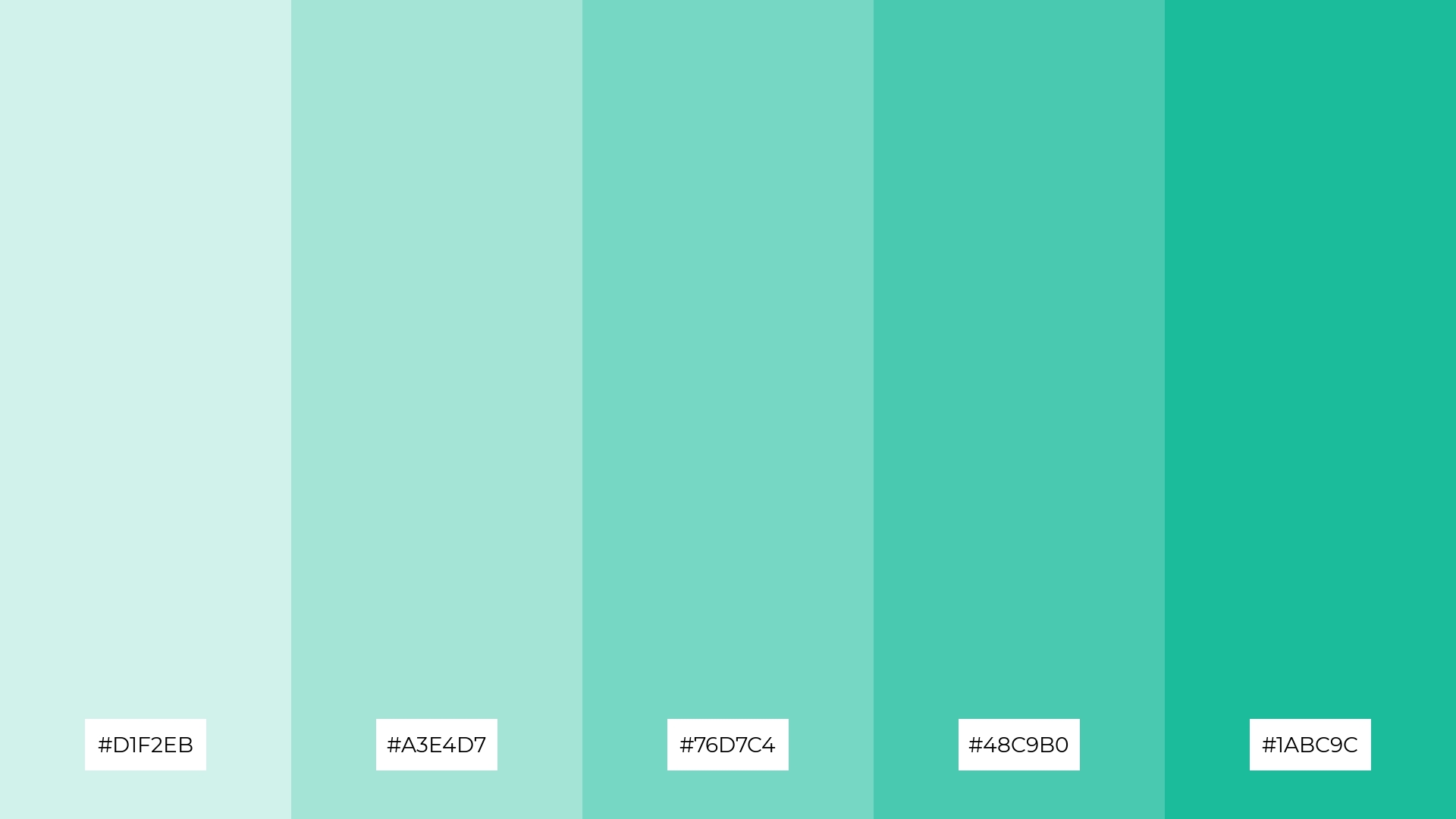
The ‘Winter Chill’ palette, with its blend of soft hues like #D1F2EB and bold tones such as #1ABC9C, offers a balanced and distinct mood that is both refreshing and invigorating.
This versatile color scheme is ideal for creating inviting retail spaces or modern web designs, where a harmonious yet dynamic atmosphere is desired.
5) Soft Whisper
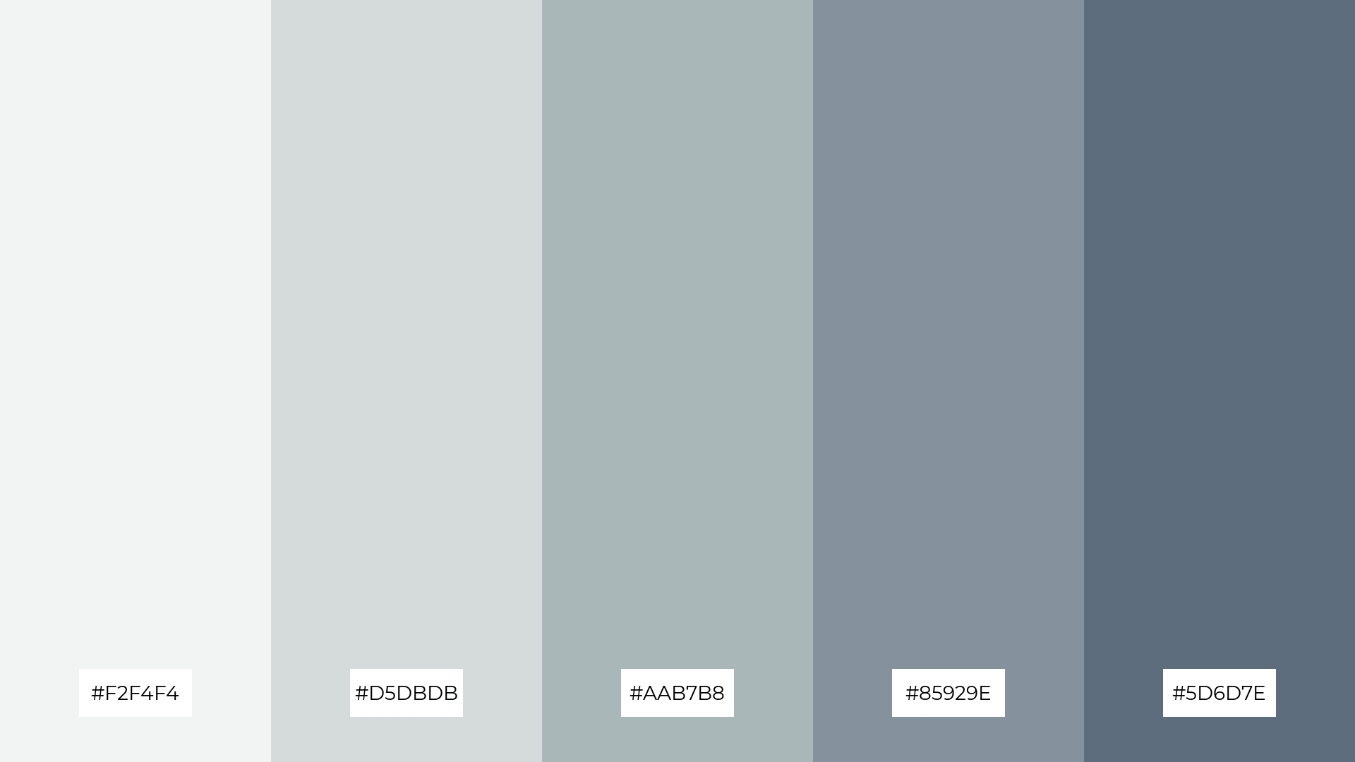
The ‘Soft Whisper’ palette, with its gentle blend of hues from #F2F4F4 to #5D6D7E, creates a serene and sophisticated ambiance that is perfect for elegant wedding themes.
These subtle and harmonious colors work together to evoke a sense of timeless beauty and understated luxury, making them ideal for high-end fashion campaigns that aim to convey refinement and grace.
6) Spring Dew
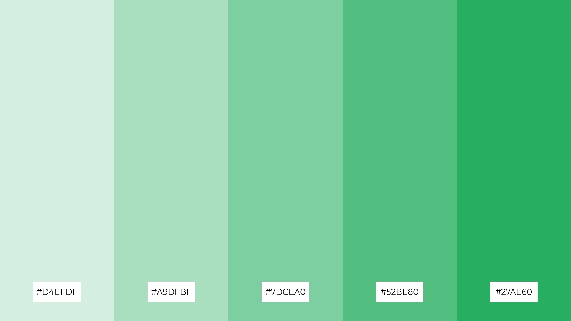
The ‘Spring Dew’ palette, with its harmonious blend of greens from #D4EFDF to #27AE60, exudes a fresh and sophisticated mood, making it ideal for minimalistic branding that seeks to convey elegance and modernity.
These vibrant yet soothing shades are perfect for bold event designs, where the interplay of soft and vivid greens can create an inviting and playful atmosphere that captivates and energizes attendees.
7) Twilight Glow
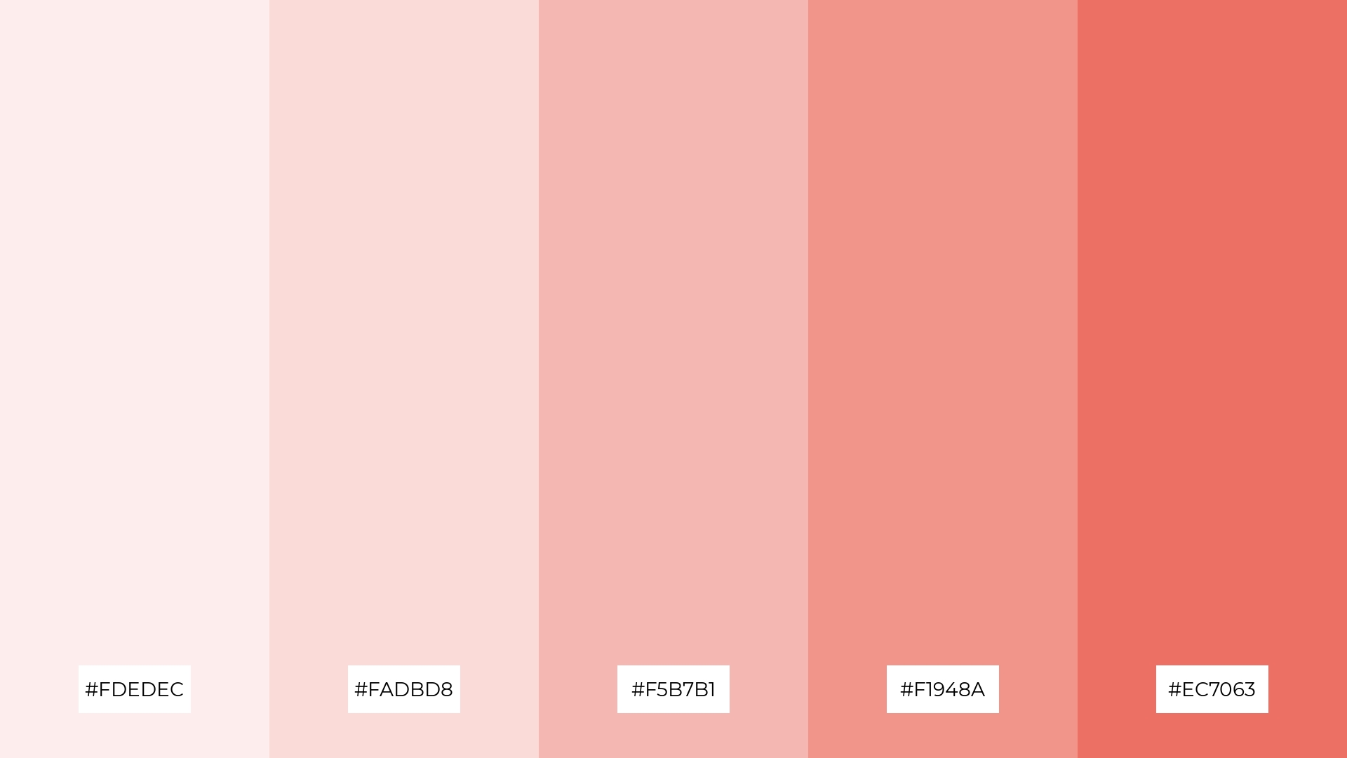
The ‘Twilight Glow’ palette, with its contrasting elements of soft pastels like #FDEDEC and bold tones such as #EC7063, creates a visually captivating experience that balances delicacy with vibrancy.
Ideal for creative projects like magazine layouts or artistic websites, this palette’s dynamic interplay of hues can add depth and interest, making your designs stand out with a unique and engaging aesthetic.
8) Coral Reef
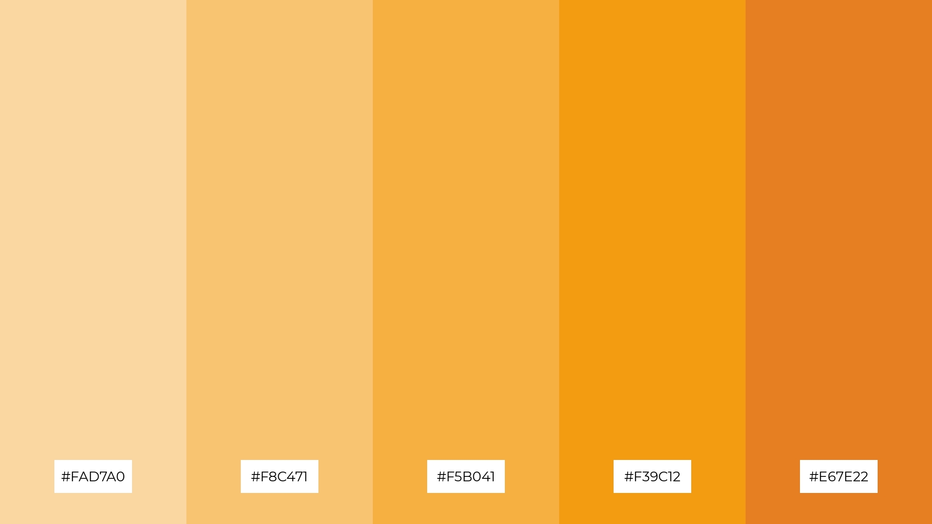
The ‘Coral Reef’ palette, with its warm and inviting hues ranging from #FAD7A0 to #E67E22, can evoke a sense of calm when paired with softer shades, making it perfect for spa branding that aims to create a serene and relaxing atmosphere.
Conversely, the vibrant and energetic tones in this palette can be combined to generate excitement and dynamism, making it an excellent choice for vibrant marketing campaigns that seek to capture attention and convey a lively, upbeat message.
9) Sunset Hues
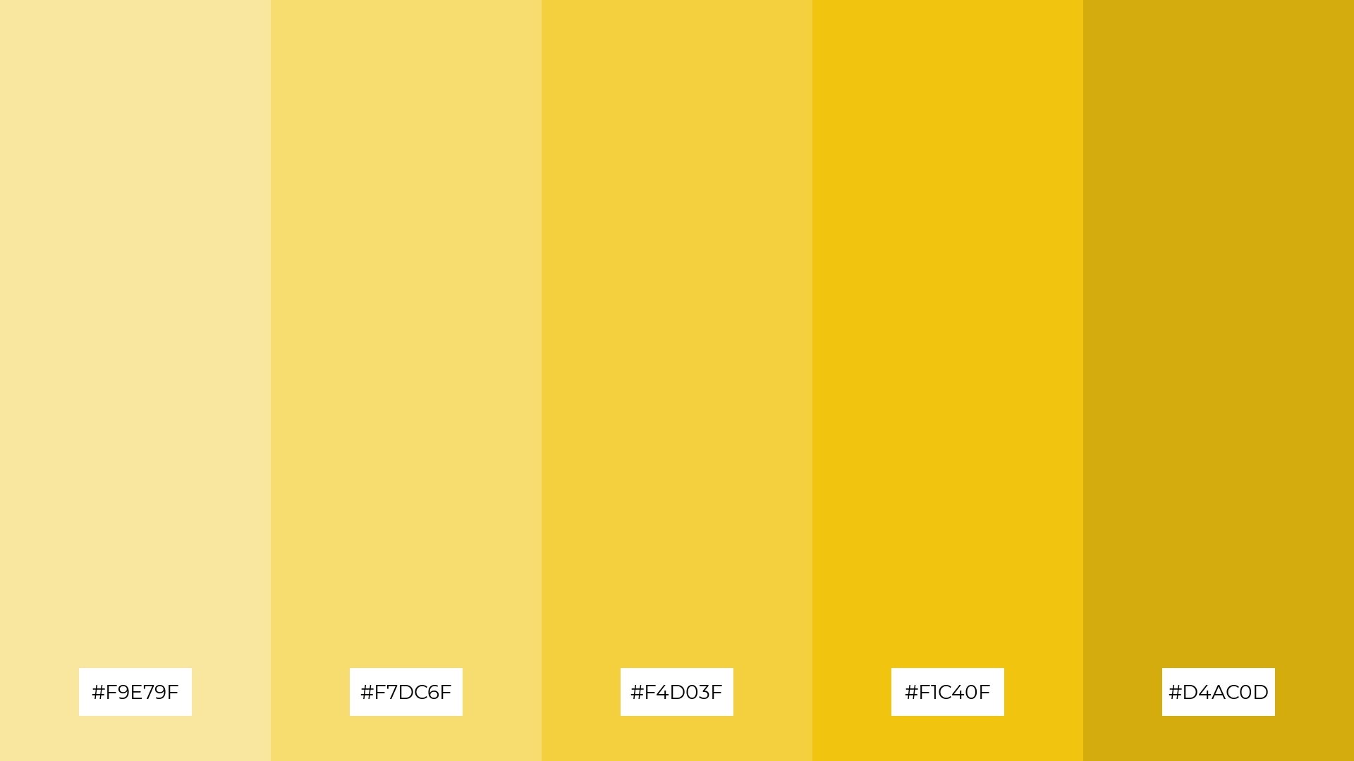
The ‘Sunset Hues’ palette, with its range of softer tones like #F9E79F and brighter shades such as #F1C40F, creates a warm and inviting atmosphere that evokes the serene beauty of a sunset.
This blend of colors is perfect for home decor, where the harmonious interplay of soft and vibrant yellows can create a cozy and uplifting environment, or for seasonal promotions that aim to capture the essence of a golden, sunlit evening.
10) Lavender Fields
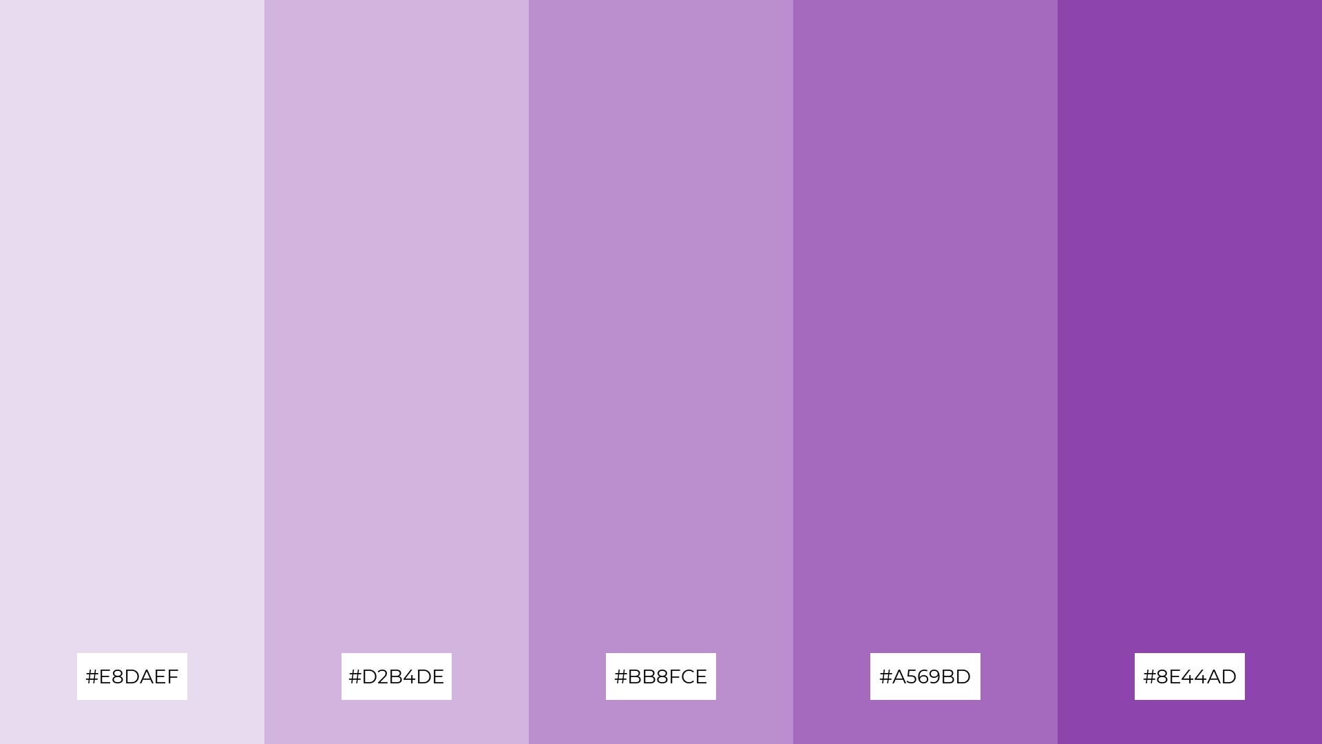
The ‘Lavender Fields’ palette, with its gradient from soft #E8DAEF to deep #8E44AD, creates a visual flow that evokes a sense of tranquility and subtle elegance, making it perfect for designs that aim to soothe and calm the viewer.
This harmonious blend of purples is ideal for lifestyle branding, such as wellness products or tech product packaging, where the serene and sophisticated hues can convey a message of luxury and relaxation.
11) Autumn Leaves
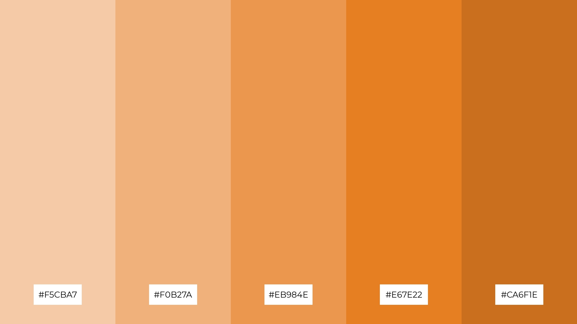
The ‘Autumn Leaves’ palette, with its warm and earthy tones ranging from #F5CBA7 to #CA6F1E, creates a welcoming and cozy atmosphere that can make any space feel inviting and comfortable.
This dramatic and rich color scheme is perfect for boutique interiors, where the interplay of these hues can evoke a sense of luxury and sophistication, making it an ideal choice for high-end retail environments.
12) Forest Canopy
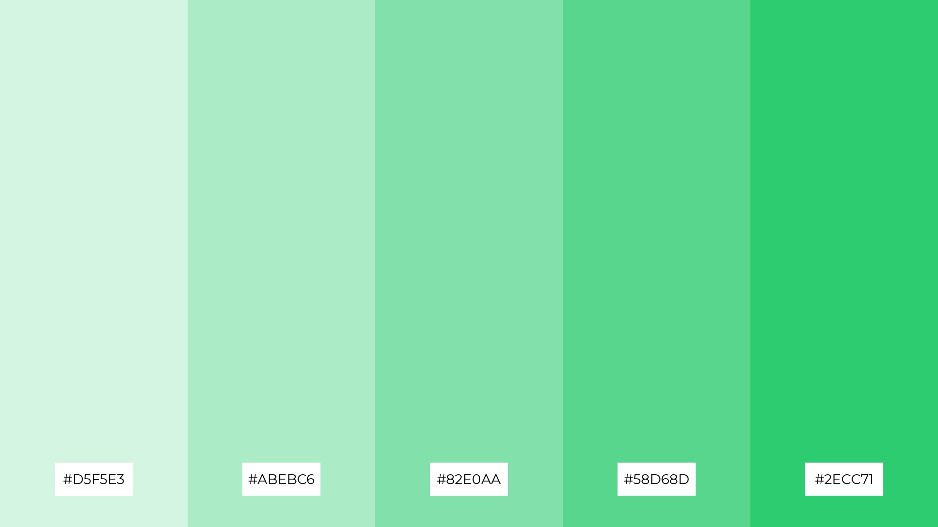
The ‘Forest Canopy’ palette, with its gradient of greens from #D5F5E3 to #2ECC71, creates a harmonious balance that evokes the natural tranquility of a lush forest, making it ideal for designs that seek to convey a sense of calm and rejuvenation.
This versatile color scheme is perfect for casual apparel lines, where the soothing and refreshing hues can create a relaxed and inviting aesthetic that appeals to a wide audience.
13) Berry Bliss
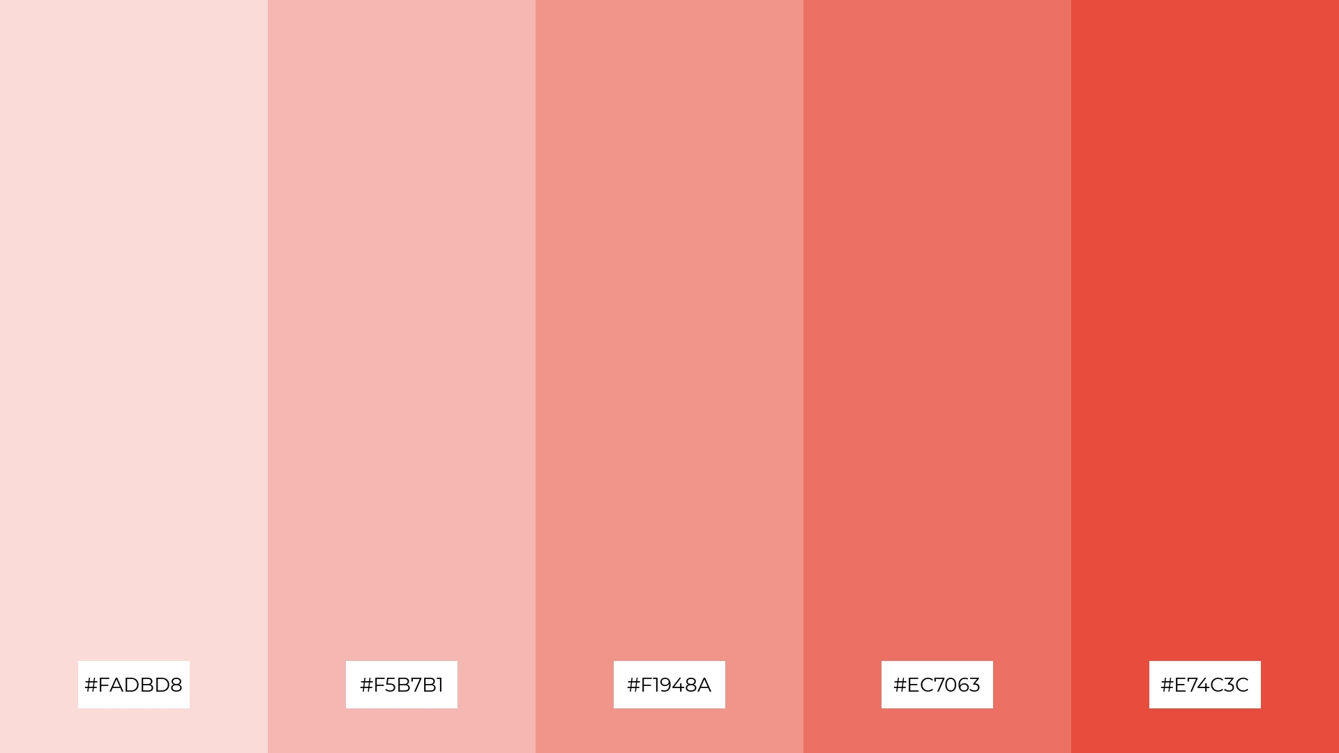
The ‘Berry Bliss’ palette, with its blend of warm and cool tones from #FADBD8 to #E74C3C, creates a balanced and inviting mood that evokes both comfort and sophistication.
This versatile color scheme is perfect for artisan product branding, where the harmonious interplay of these hues can convey a sense of handcrafted quality and artistic elegance.
14) Golden Hour
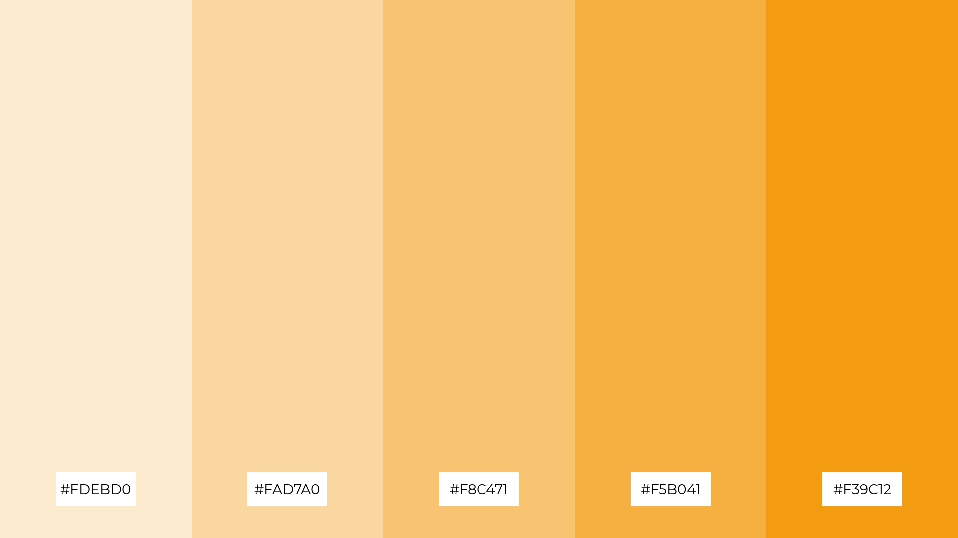
The ‘Golden Hour’ palette, with its dynamic range from soft #FDEBD0 to bold #F39C12, creates a visually striking interplay of warm hues that can evoke both subtle elegance and vibrant energy.
This versatile color scheme is perfect for festival marketing, where the harmonious blend of these golden tones can capture the festive spirit and create an inviting, celebratory atmosphere.
15) Midnight Sky
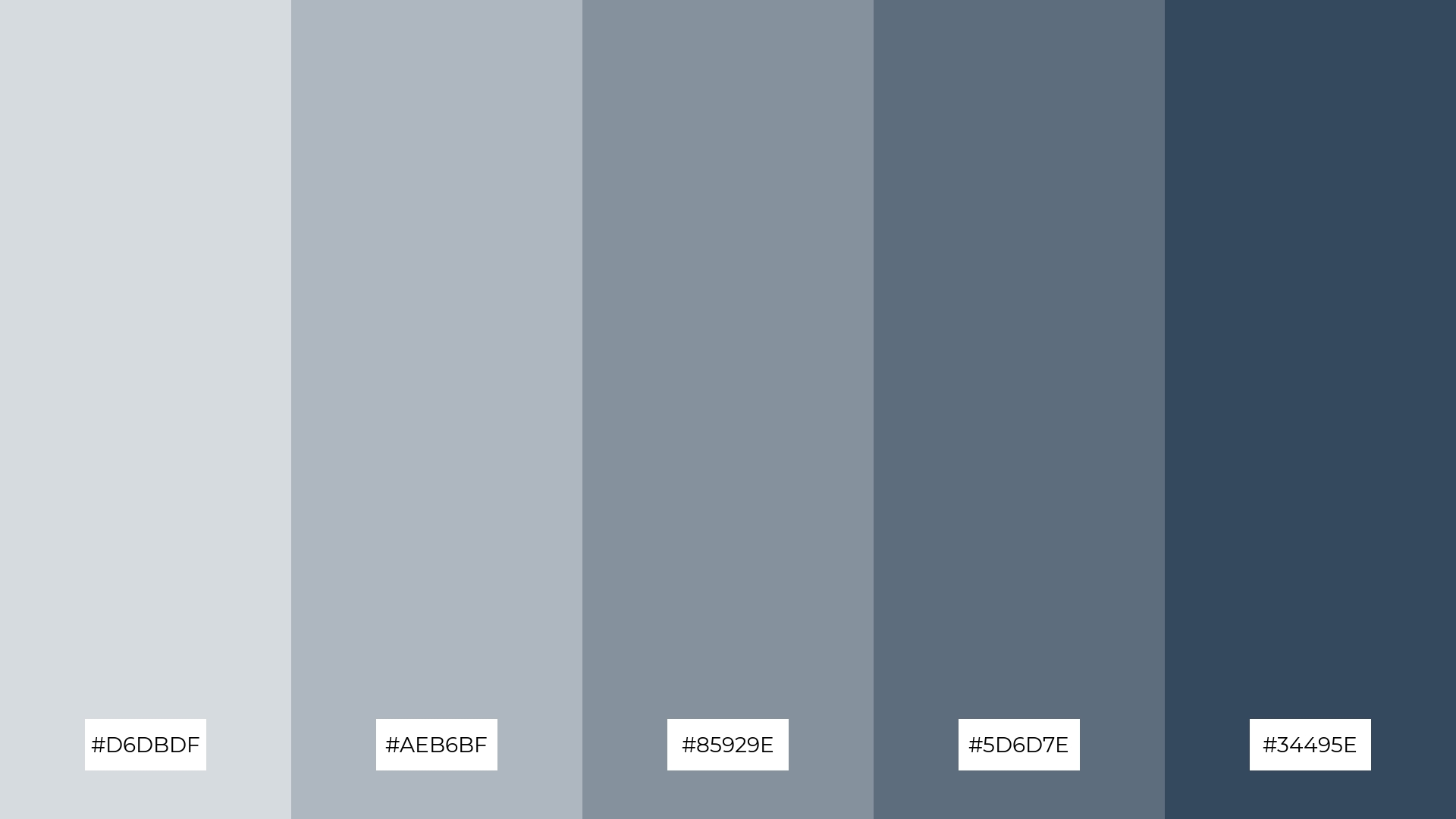
The ‘Midnight Sky’ palette, with its gradient from #D6DBDF to #34495E, conveys a sense of harmony through its cohesive blend of soft and deep blues, creating a balanced and serene visual experience.
This versatile color scheme is ideal for tech startups aiming to project a modern and professional image, or for cozy interior makeovers where the interplay of these hues can evoke a sense of calm and sophistication.
How to Use Baby Blue Patterns in Design
In home decor, baby blue color palettes can create a serene and inviting atmosphere. Pairing baby blue with neutral tones like white or beige can make a space feel airy and spacious, perfect for bedrooms or living areas. Adding accents of deeper blues or greens can provide a refreshing contrast that enhances the overall aesthetic.
For marketing materials, baby blue can evoke trust and calmness, making it ideal for wellness brands or tech companies. Use baby blue as a background color to create a clean and professional look, and incorporate complementary colors like soft pinks or pastel yellows to add warmth and approachability. Bold accents in navy or deep green can make key elements stand out, ensuring your message captures attention.
In clothing design, baby blue offers a versatile and timeless option that suits various styles. It can be used in casual wear to create a relaxed and comfortable vibe or in formal attire to add a touch of sophistication. Combining baby blue with other pastel shades can result in a chic and modern look that appeals to a wide audience.
Ready to bring your baby blue color palettes to life? Try creating stunning designs with Piktochart today! Get started here.


