 Piktochart Team
·

Updated on
November 26, 2024
Published on
November 25, 2024
Discover the vibrant world of Atlantis color palettes, where hues inspired by the mythical underwater city bring your designs to life. These palettes offer a unique blend of deep blues, shimmering golds, and lush greens.
Perfect for creating visually stunning graphics, Atlantis color palettes evoke a sense of mystery and wonder. Dive into this oceanic spectrum to elevate your next project with a touch of enchantment.
Unlock the full potential of Atlantis color palettes with these practical design tips:

The 'Ocean Depths' palette, with its rich blend of deep blues and vibrant aquas, creates a serene and calming mood reminiscent of tranquil underwater scenes.
Perfect for interior decor, these colors interact harmoniously to evoke a sense of peace and relaxation, making them ideal for creating a soothing bedroom retreat.

The 'Coral Reef' palette, with its vibrant mix of coral and soft pinks, evokes a feeling of warmth and energy, reminiscent of a sunlit beach.
This palette would excel in product packaging for beauty and skincare brands, where the inviting and lively colors can attract attention and convey a sense of rejuvenation and vitality.

The 'Sunken Treasure' palette, featuring dominant colors like #CDAA6B, #D4B65D, #E1C16D, #F2E1A0, and #F9F5E3, creates a warm and inviting atmosphere with its golden and earthy tones.
This harmonious blend is perfect for wellness branding, where the soothing and natural hues can evoke a sense of calm and well-being, making it ideal for eco-friendly interior spaces that aim to promote tranquility and sustainability.

The 'Mystic Waters' palette, with its blend of deep blues and vibrant reds, offers a balance of soft and bold tones that create a distinct and captivating mood.
Ideal for modern web designs, this palette can make your digital presence both inviting and visually striking, ensuring a memorable user experience.
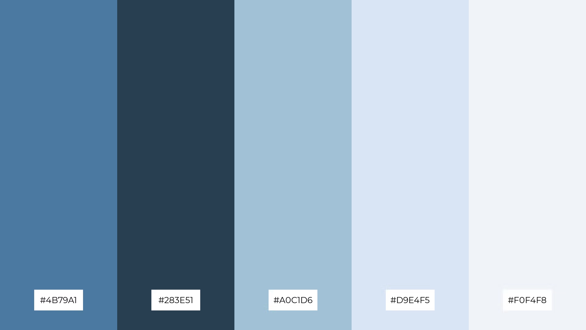
The 'Celestial Tides' palette, with its harmonious blend of #4B79A1, #283E51, #A0C1D6, #D9E4F5, and #F0F4F8, evokes a serene and ethereal ambiance, reminiscent of a tranquil twilight sky.
Perfect for wedding themes, these colors can create a dreamy and romantic atmosphere, making every moment feel magical and unforgettable.

The 'Enchanted Lagoon' palette, with its harmonious blend of #2E8B57, #3CB371, #5F9EA0, #B2E0D4, and #E0F2F1, creates a sophisticated and tranquil mood, perfect for minimalistic branding that seeks to convey elegance and calm.
Ideal for bold event designs, this palette's mix of deep greens and soft aquas can evoke a sense of playfulness and freshness, making it suitable for lively and vibrant occasions.

The 'Ancient Ruins' palette, with its rich browns and soft beiges, combines earthy and neutral tones to create a striking contrast that adds depth and visual interest to any design.
Ideal for creative projects like magazine layouts or artistic websites, this palette's blend of warm and muted colors can evoke a sense of history and sophistication, making your content both engaging and aesthetically pleasing.

The 'Siren's Call' palette, with its mix of soft pinks and deep purples, can create a calming atmosphere when the lighter shades are used predominantly, evoking a sense of serenity and relaxation.
Conversely, the vibrant pinks and dark blues can be combined to generate excitement and energy, making this palette ideal for dynamic marketing campaigns that aim to capture attention and inspire action.
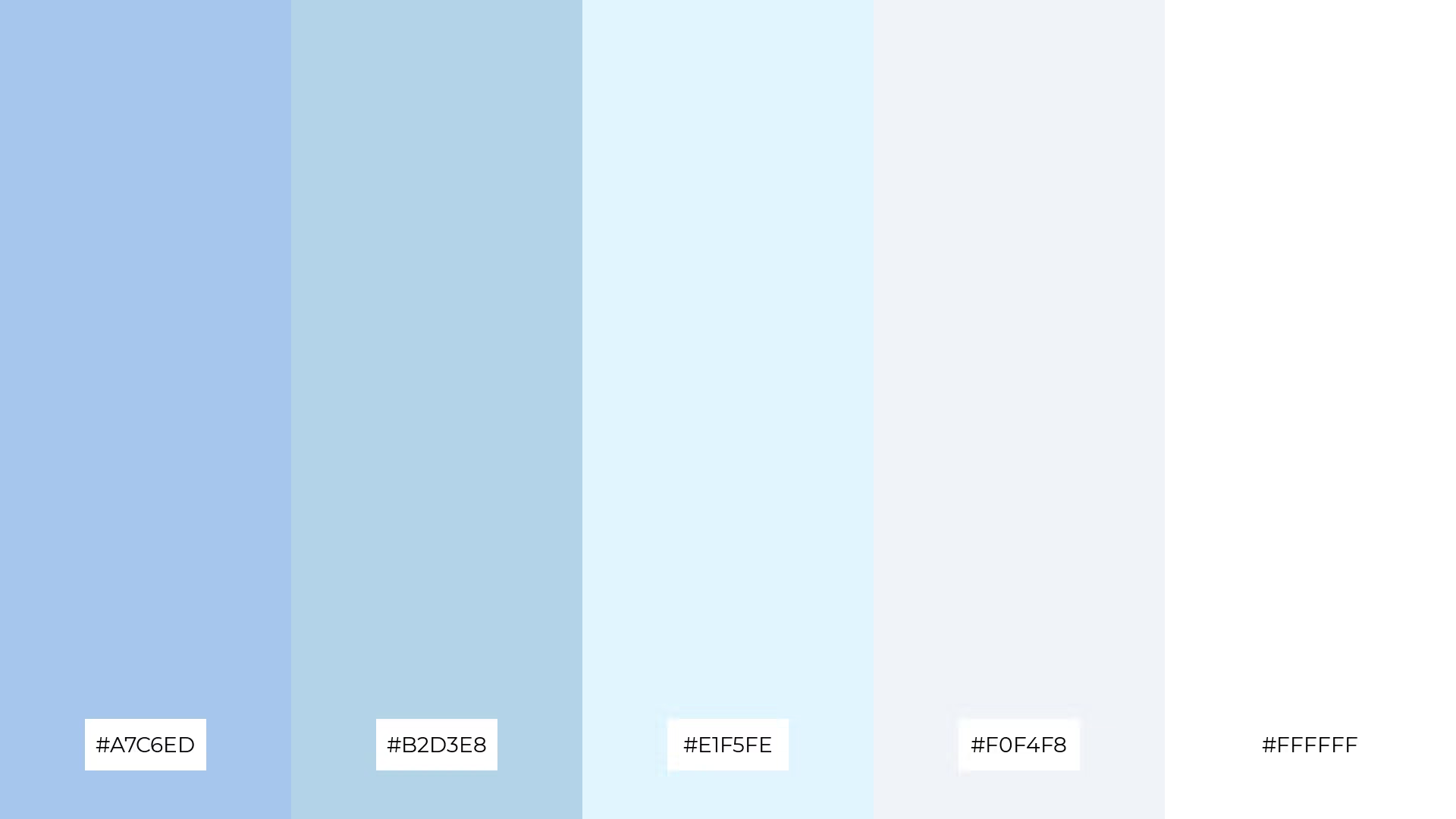
The 'Atlantis Glow' palette, with its softer and brighter tones like #A7C6ED and #E1F5FE, creates a light and airy mood that evokes a sense of calm and freshness.
Ideal for seasonal promotions, these colors can bring a touch of elegance and serenity to your designs, making them perfect for spring or summer campaigns that aim to uplift and inspire.

The 'Tranquil Shores' palette, with its soothing blend of #A8DADC, #457B9D, #1D3557, #F1FAEE, and #F9C74F, creates a visual flow that evokes a sense of calm and serenity, making it perfect for designs that aim to instill peace and relaxation.
Ideal for lifestyle branding or tech product packaging, this palette's harmonious colors can convey a sense of trust and reliability, making it an excellent choice for brands looking to create a welcoming and reassuring visual identity.

The 'Underwater Garden' palette, with its vibrant mix of #F9C74F, #90BE6D, #43AA8B, #577590, and #F3722C, creates a welcoming effect by combining warm and cool tones that evoke a sense of natural harmony and freshness.
Ideal for boutique interiors, this palette's dynamic colors can create a dramatic yet inviting atmosphere, making it perfect for spaces that aim to captivate and comfort visitors simultaneously.

The 'Lost City' palette, with its blend of #4A4E69, #9A8C98, #C9ADA7, #F0E8D0, and #F7B7A3, creates a harmonious balance by combining deep, muted tones with soft, pastel hues, resulting in a sophisticated and cohesive look.
Ideal for sleek corporate branding, these colors can convey professionalism and elegance, making them perfect for companies aiming to project a refined and modern image.
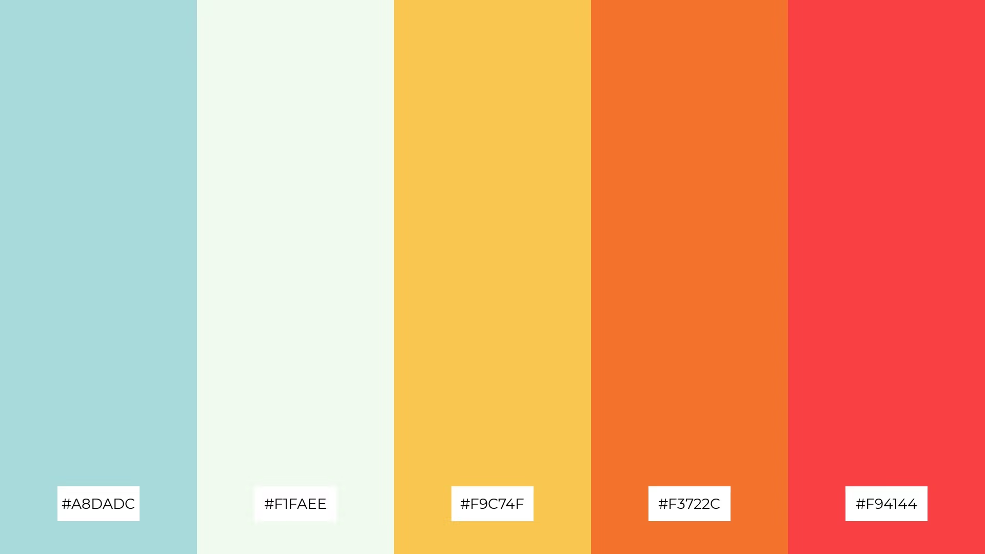
The 'Crystal Waters' palette, with its blend of warm tones like #F9C74F and #F94144 and cool hues like #A8DADC and #F1FAEE, creates a balanced and invigorating mood that feels both refreshing and vibrant.
Ideal for artisan product branding, this palette's dynamic mix of colors can convey a sense of handcrafted quality and modern elegance, making it perfect for brands that aim to stand out with a unique and sophisticated visual identity.

The 'Ethereal Waves' palette, with its dynamic interplay of #2A9D8F, #264653, #E9C46A, #F4A261, and #2A9D8F, offers a striking balance between bold and subtle tones, creating a visually captivating experience.
Ideal for festival marketing, these colors can evoke excitement and energy, making your promotional materials stand out and resonate with a vibrant audience.

The 'Dreamy Abyss' palette, with its blend of #1D3557, #457B9D, #A8DADC, #F1FAEE, and #F9C74F, conveys a sense of harmony through its balanced mix of deep blues and soft pastels, creating a serene and cohesive visual experience.
Ideal for tech startups, this palette can also create striking contrasts when the vibrant yellow is paired with the darker blues, making it perfect for cozy interior makeovers that aim to combine modern elegance with a touch of warmth.
Atlantis color palettes can transform your home decor by infusing spaces with a sense of tranquility and elegance. For a serene bedroom, use deep blues and soft aquas to create a calming atmosphere. In living areas, incorporate shimmering golds and lush greens to add a touch of luxury and natural beauty.
When designing marketing materials, Atlantis palettes can make your brand stand out. Use vibrant corals and soft pinks to evoke warmth and energy in your promotional campaigns. For a more sophisticated look, blend earthy tones with neutral shades to create a professional and inviting visual identity.
In fashion design, Atlantis color palettes offer endless possibilities. Combine deep blues with shimmering golds for a chic and modern look, or use lush greens and soft aquas for a fresh and vibrant style. Ready to bring these enchanting palettes to life? Try creating your own designs using Piktochart today!
The latest industry news, interviews, technologies, and resources.

Published on
November 25, 2024


