 Piktochart Team
·

Updated on
October 29, 2024
Published on
October 28, 2024

Army green is more than just a color; it's a versatile hue that evokes a sense of strength and resilience. This shade, often associated with military uniforms, has found its way into various design elements, from fashion to interior decor.
Incorporating army green into your color palette can add a touch of rugged sophistication. Whether you're designing a website, creating an infographic, or redecorating a room, this earthy tone offers a unique blend of neutrality and boldness.
Designing with army green can elevate your project with a touch of rugged elegance.

The colors in 'Forest Camouflage' create a mood of tranquility and natural harmony, evoking the serene ambiance of a dense forest.
These hues interact seamlessly to form a cohesive look, perfect for a rustic interior decor theme that emphasizes a connection to nature.

The colors of 'Desert Patrol' evoke a sense of warmth and calmness, reminiscent of sunlit sands and serene desert landscapes.
This palette would excel in product packaging for organic skincare products, where the natural and soothing tones can convey a message of purity and relaxation.

The dominant colors in 'Urban Jungle'—dark slate gray, dark olive green, gray, dark gray, and silver—create a sophisticated and modern palette that exudes urban elegance and natural tranquility.
This harmonious blend is ideal for wellness branding, where the calming grays and greens can evoke a sense of balance and serenity, making it perfect for eco-friendly interior spaces that aim to promote relaxation and well-being.

'Night Ops' offers a balance of soft and bold tones, creating a distinct mood that is both sophisticated and inviting.
This palette is ideal for modern web designs, where the combination of dark and muted shades can create a sleek and professional look.
The colors of 'Woodland Retreat'—dark olive green, olive drab, artichoke, dark gray, and silver—work together to evoke a serene and tranquil ambiance, reminiscent of a peaceful forest setting.
This palette is perfect for luxury fashion campaigns, where the blend of earthy and metallic tones can create a sophisticated and natural aesthetic that appeals to eco-conscious consumers.

The color harmony in 'Arctic Camo'—featuring shades like light gray, dark gray, and olive green—creates a sophisticated and understated mood, perfect for minimalistic branding that aims to convey elegance and simplicity.
This palette can also be effectively used in bold event designs, where the muted grays and greens can provide a balanced backdrop that allows vibrant accents to stand out, creating a dynamic and engaging atmosphere.

The contrasting elements in 'Autumn Leaves'—ranging from the deep brown of #8B4513 to the vibrant coral of #FF7F50—create a dynamic visual interest that captures the essence of fall's rich and varied palette.
This versatile combination is ideal for creative projects like magazine layouts or artistic websites, where the interplay of warm and earthy tones can evoke a sense of seasonal warmth and natural beauty.

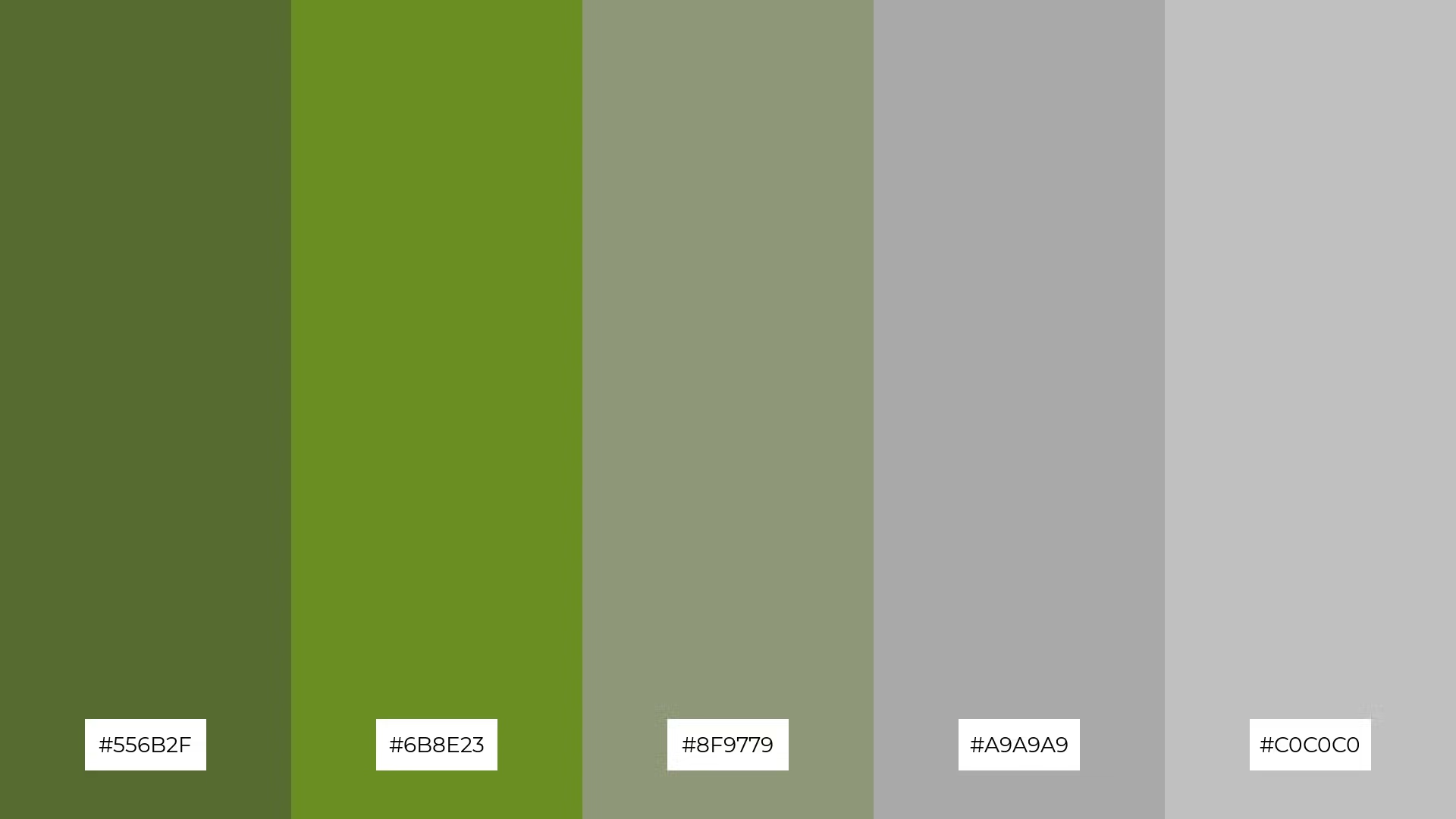
The colors in 'Mountain Trek'—#8B4513, #A0522D, #556B2F, #6B8E23, and #8F9779—can evoke a sense of calm when combined in a harmonious blend, making them ideal for spa branding that aims to promote relaxation and tranquility.
Alternatively, these hues can be arranged to create a vibrant and dynamic palette, perfect for marketing campaigns that seek to capture attention and convey a sense of adventure and excitement.
The softer and brighter tones in 'Swamp Mist'—#6B8E23 and #C0C0C0—create a refreshing and airy ambiance that can uplift any design.
This blend of hues is perfect for home decor, where the combination of muted greens and silvers can evoke a serene and inviting atmosphere, ideal for creating a tranquil living space.
The visual flow of colors in 'Jungle Expedition'—#4B5320, #556B2F, #6B8E23, #8F9779, and #A9A9A9—creates a sense of tranquility and connection to nature, evoking feelings of calm and balance.
This harmonious palette is ideal for lifestyle branding, where the soothing greens and grays can convey a message of sustainability and well-being, or for tech product packaging, where the natural tones can suggest reliability and innovation.

The vibrant tones in 'Savanna Sunset'—ranging from the golden #FFD700 to the deep green #4B5320—create a welcoming and dramatic effect that can captivate and engage viewers.
This palette is perfect for luxury e-commerce sites, where the rich and warm hues can evoke a sense of opulence and exclusivity, making products appear more desirable and high-end.

The hues in 'Rainforest Canopy'—#006400, #228B22, #32CD32, #556B2F, and #4B5320—interact to create a feeling of balance by blending deep and vibrant greens, evoking the lush and layered textures of a dense rainforest.
This palette is ideal for casual apparel lines, where the natural and harmonious greens can convey a sense of freshness and vitality, making the clothing feel both stylish and connected to nature.

The 'Coastal Patrol' palette—featuring shades like #4682B4, #5F9EA0, #6495ED, #87CEEB, and #4B5320—blends warm and cool tones to evoke a mood of serene coastal tranquility, reminiscent of a peaceful seaside retreat.
This harmonious combination is perfect for artisan product branding, where the blend of soothing blues and earthy greens can convey a sense of handcrafted quality and natural elegance.

The dynamic color interactions in 'Desert Mirage'—#F4A460, #D2B48C, #DEB887, #F5DEB3, and #4B5320—create a warm and inviting palette that balances bold and subtle tones, evoking the serene beauty of a desert landscape.
This versatile combination is perfect for restaurant menus, where the earthy and soothing hues can enhance the dining experience by creating a cozy and welcoming atmosphere.

The 'Tundra Expedition' palette—#B0C4DE, #778899, #708090, #556B2F, and #4B5320—conveys a sense of harmony through its balanced blend of cool and earthy tones, creating a serene and cohesive visual experience.
This versatile combination is ideal for tech startups aiming to project a modern and reliable image, or for cozy interior makeovers where the mix of muted blues and greens can evoke a tranquil and inviting atmosphere.
Army green color palettes can be a game-changer in various design applications. In home decor, this versatile hue can be used to create a calming and grounded atmosphere. Pairing army green with neutral tones like beige or gray can enhance the sense of tranquility, making it perfect for living rooms or bedrooms.
For marketing materials, army green can add a touch of rugged sophistication. Use it as a background color to make text and images pop, or incorporate it into your branding to convey a message of strength and reliability. In clothing design, army green works well with both casual and formal wear, offering a timeless and stylish look that appeals to a wide audience.
Ready to experiment with army green in your next project? Try creating your own color palettes using Piktochart's intuitive design tools. Get started today and bring your creative vision to life!
The latest industry news, interviews, technologies, and resources.

Published on
November 25, 2024


