 Piktochart Team
·

Updated on
November 26, 2024
Published on
November 25, 2024

Arabian Nights color palettes evoke the rich, vibrant hues of Middle Eastern landscapes and architecture. These palettes are perfect for adding a touch of exotic elegance to your designs.
From deep blues and purples to shimmering golds and reds, the colors capture the essence of Arabian culture. Whether you're designing infographics, presentations, or social media graphics, these palettes can bring a unique and captivating flair to your work.
Designing with Arabian Nights color palettes can transform your visuals into captivating masterpieces.

The 'Desert Dusk' palette, with its earthy browns and warm oranges, creates a serene and grounded mood reminiscent of a tranquil desert evening.
These colors interact harmoniously, with the deeper tones providing a solid foundation while the lighter shades add warmth and softness, making it ideal for creating cozy, inviting interior decor that exudes natural elegance.

The 'Midnight Oasis' palette, with its deep blues and striking red, evokes a sense of mystery and sophistication, perfect for creating an atmosphere of calm elegance.
This palette would excel in digital branding for luxury products, where the rich hues can convey a sense of exclusivity and high-end appeal.

The 'Golden Sands' palette, featuring dominant colors like #CDAA6B and #A65E2E, creates a warm and inviting atmosphere that is both earthy and luxurious.
These hues harmonize beautifully, making the palette ideal for wellness branding, where the soothing and natural tones can evoke a sense of calm and well-being.

The 'Jewel Tones' palette, with colors like #6A0572 and #FFB400, offers a perfect balance of soft and bold tones, creating a distinct and captivating mood.
This palette is ideal for modern web designs, where the vibrant hues can make your site stand out while maintaining a sophisticated and inviting atmosphere.

The 'Mystic Twilight' palette, with its blend of deep blues and soft grays, creates a serene and tranquil ambiance, perfect for evoking a sense of calm and introspection.
This palette is ideal for luxury fashion campaigns, where the sophisticated hues can enhance the elegance and exclusivity of high-end clothing lines.
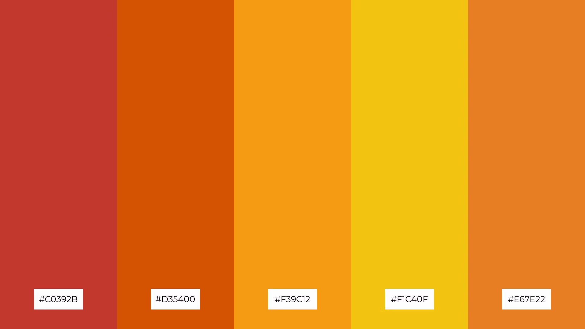
The 'Spice Market' palette, with its vibrant reds, oranges, and yellows, creates a dynamic and energetic mood that can infuse any design with a sense of warmth and excitement.
This palette is perfect for bold event designs, where the lively colors can capture attention and convey a festive, celebratory atmosphere.

The 'Enchanted Night' palette, with its deep and moody blues contrasted by lighter, more vibrant shades, creates a visually compelling interplay that draws the eye and adds depth to any design.
This palette is perfect for creative projects like magazine layouts or artistic websites, where the dynamic range of colors can enhance visual storytelling and captivate the audience.

The 'Arabian Jewel' palette, with its rich purples and soft pinks, can evoke a sense of calm when the lighter shades are used predominantly, creating a serene and soothing atmosphere perfect for spa branding.
Conversely, the vibrant purples and pinks can be combined to create an exciting and energetic mood, making this palette ideal for vibrant marketing campaigns that aim to capture attention and convey a sense of dynamism.

The 'Serene Mirage' palette, with its softer tones like #F9E79F and #FAD7A1, creates a gentle and inviting atmosphere that exudes warmth and comfort.
This blend of colors is perfect for seasonal promotions, where the bright yet soothing hues can evoke a sense of renewal and positivity, making it ideal for spring or summer campaigns.

The 'Celestial Skies' palette, with its gradient of deep blues to soft aquas, creates a visual flow that evokes a sense of tranquility and expansive freedom, reminiscent of a clear, open sky.
This calming and uplifting color scheme is ideal for lifestyle branding, where the serene hues can convey a sense of peace and well-being, or for tech product packaging, where the modern and refreshing tones can suggest innovation and reliability.

The 'Rich Tapestry' palette, with its blend of deep purples and soft pinks, creates a welcoming effect by combining bold and gentle tones that evoke a sense of warmth and sophistication.
This palette shines in luxury e-commerce sites, where the dramatic interplay of colors can enhance the visual appeal and convey a sense of exclusivity and high-end quality.
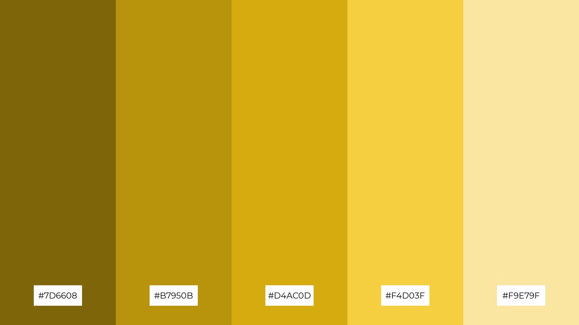
The 'Ancient Ruins' palette, with its blend of earthy tones like #7D6608 and #B7950B, interacts harmoniously with the brighter hues of #D4AC0D, #F4D03F, and #F9E79F to create a balanced yet dynamic visual experience.
This palette is ideal for casual apparel lines, where the natural and vibrant colors can evoke a sense of timeless style and effortless sophistication.

The 'Vibrant Bazaar' palette, with its blend of warm oranges and cool yellows, creates an energetic yet balanced mood that can captivate and engage viewers.
This palette is perfect for artisan product branding, where the dynamic interplay of colors can highlight the craftsmanship and unique qualities of handmade goods.

The 'Moonlit Sands' palette, with its blend of deep blues and soft grays, creates a dynamic interplay of bold and subtle tones that evoke a sense of calm and sophistication.
This versatile palette is perfect for restaurant menus, where the elegant hues can enhance the dining experience by creating a serene and inviting atmosphere.
The 'Royal Caravan' palette, with its rich purples and soft pinks, conveys a sense of harmony when the lighter shades are used predominantly, creating a serene and cohesive visual experience.
This palette is ideal for tech startups aiming to convey innovation and creativity, or for cozy interior makeovers where the blend of bold and gentle tones can create a warm and inviting atmosphere.
Arabian Nights color palettes can transform home decor by incorporating deep blues and purples as base colors, accented with shimmering golds and reds. This combination creates a luxurious and inviting atmosphere, perfect for living rooms or bedrooms. Use neutral tones like beige or cream to balance the vibrant hues and add a touch of elegance.
For marketing materials, these palettes can make your designs stand out. Pair warm hues like reds and golds with cooler tones such as blues and purples to create eye-catching and harmonious visuals. This approach is ideal for event posters, social media graphics, and promotional flyers, where the rich colors can capture attention and convey a sense of sophistication.
In clothing design, the 'Spice Market' palette with its vibrant reds, oranges, and yellows can infuse energy and warmth into your apparel lines. Alternatively, the 'Mystic Twilight' palette's deep blues and soft grays can evoke a sense of calm and exclusivity, perfect for high-end fashion. Ready to bring these captivating palettes to life? Try creating your own designs using Piktochart here.
The latest industry news, interviews, technologies, and resources.

Published on
November 25, 2024


