 Piktochart Team
·

Updated on
October 29, 2024
Published on
October 28, 2024

Amethyst color palettes are a stunning blend of purples and lavenders that can add a touch of elegance to any design. These palettes are inspired by the rich hues of the amethyst gemstone, known for its calming and luxurious appearance.
Whether you're designing a website, creating an infographic, or working on a presentation, incorporating amethyst tones can elevate your project. The versatility of these shades makes them suitable for both professional and creative endeavors.
Designing with amethyst color palettes can be both exciting and rewarding. Here are some practical tips to help you make the most of these beautiful hues:

The 'Royal Amethyst' color palette creates a vibrant and energetic mood, with each hue interacting harmoniously to produce a cohesive and visually striking look.
This palette is particularly effective in fashion, where the bold and contrasting colors can make a statement, highlighting the wearer's confidence and creativity.

The 'Twilight Amethyst' palette, with its deep and rich purples, evokes a sense of mystery and sophistication, making it perfect for creating an atmosphere of intrigue and elegance.
This palette would excel in digital branding for luxury products, where the combination of these hues can convey a sense of exclusivity and high-end appeal.

The 'Amethyst Garden' palette features dominant colors such as soft pink (#D4A5A5), muted mauve (#B56576), and deep indigo (#355070), which together create a serene and balanced visual experience.
This harmonious blend is ideal for wellness branding, where the calming and nurturing tones can evoke a sense of tranquility and holistic well-being.

The 'Mystic Amethyst' palette, with its blend of soft and bold tones like #7B68EE and #8A2BE2, offers a unique balance that creates a distinct and captivating mood.
This versatile palette is ideal for modern web designs, where the combination of these hues can create an inviting and visually appealing user experience.

The 'Amethyst Sunset' palette, with its vibrant blend of #FF4500, #FF6347, #FFD700, #DA70D6, and #9B30FF, creates a warm and energetic ambiance that can infuse any design with a sense of excitement and dynamism.
This striking combination is perfect for luxury fashion campaigns, where the bold and contrasting colors can highlight the sophistication and allure of high-end garments.

The 'Amethyst Dream' palette, with its harmonious blend of #E6E6FA, #D8BFD8, #DDA0DD, #EE82EE, and #8B008B, creates a sophisticated and dreamy mood, perfect for minimalistic branding that seeks to convey elegance and subtlety.
This palette's balance of soft and bold purples can also be used in bold event designs, where the vibrant hues can infuse the atmosphere with a sense of playfulness and creativity.

The 'Amethyst Night' palette, with its deep and contrasting shades of #191970, #000080, #4B0082, #8A2BE2, and #9370DB, creates a visually captivating experience by blending dark, mysterious tones with vibrant, energetic hues.
This dynamic combination is perfect for creative projects like magazine layouts or artistic websites, where the interplay of these colors can draw attention and evoke a sense of intrigue and sophistication.

The 'Amethyst Bloom' palette, with its blend of #FF69B4, #FF1493, #C71585, #DB7093, and #8A2BE2, can evoke a sense of calm when the softer pinks and purples are combined, creating a soothing and tranquil atmosphere.
Conversely, the vibrant and bold hues in this palette can be used to generate excitement and energy, making it ideal for vibrant marketing campaigns that aim to capture attention and convey a lively, dynamic message.
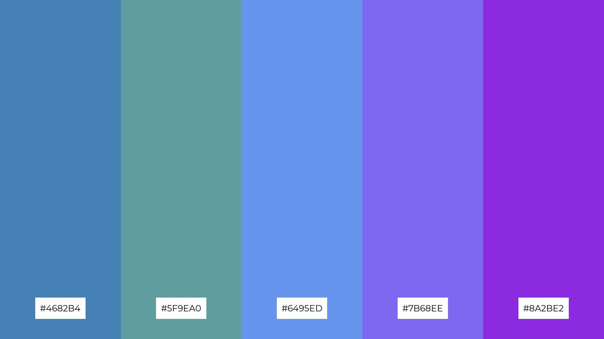
The 'Amethyst Ocean' palette, with its softer tones like #4682B4 and #5F9EA0, creates a serene and calming mood, perfect for evoking a sense of tranquility and relaxation.
This blend of hues is ideal for home decor, where the combination of these soothing colors can transform a space into a peaceful retreat, or for seasonal promotions that aim to convey a refreshing and rejuvenating vibe.

The 'Amethyst Forest' palette, with its blend of #228B22, #32CD32, #7FFF00, #ADFF2F, and #8A2BE2, creates a visual flow that evokes a sense of vitality and rejuvenation, seamlessly transitioning from deep greens to vibrant purples, which can instill feelings of joy and tranquility.
This harmonious combination is ideal for lifestyle branding, where the refreshing greens and captivating purples can convey a message of wellness and innovation, or for tech product packaging, where the dynamic hues can highlight the product's cutting-edge features and eco-friendly appeal.

The 'Amethyst Sky' palette, with its blend of #87CEEB, #00BFFF, #1E90FF, #4169E1, and #8A2BE2, creates a welcoming effect by combining soft sky blues with deep, dramatic purples, offering a balanced yet striking visual experience.
This palette shines in luxury e-commerce sites, where the harmonious mix of calming and bold tones can enhance the user experience, making the platform both inviting and visually captivating.

The 'Amethyst Flame' palette, with its fiery oranges and golds contrasted by a deep purple, creates a dynamic interplay of warmth and intensity that can evoke both energy and sophistication.
This vibrant combination is perfect for casual apparel lines, where the bold and contrasting hues can make a statement, highlighting the wearer's boldness and creativity.

The 'Amethyst Ice' palette, with its blend of cool aquas and a striking purple, creates a refreshing yet sophisticated mood that can evoke a sense of modern elegance and tranquility.
This unique combination is perfect for artisan product branding, where the harmonious mix of warm and cool tones can highlight the craftsmanship and exclusivity of handmade goods, or for editorial layouts that aim to captivate readers with a visually engaging and serene aesthetic.

The 'Amethyst Earth' palette, with its rich browns and vibrant purple, creates a dynamic interplay of earthy warmth and bold sophistication, making it perfect for designs that seek to balance natural elements with a touch of luxury.
This striking combination is ideal for restaurant menus, where the deep, inviting hues can enhance the dining experience by evoking a sense of comfort and elegance, or for festival marketing, where the vibrant colors can capture attention and convey a lively, energetic atmosphere.

The 'Amethyst Aurora' palette, with its blend of #FF00FF, #FF1493, #FF69B4, #FFB6C1, and #8A2BE2, can convey a sense of harmony when the softer pinks and purples are combined, creating a soothing and balanced visual experience.
Conversely, the vibrant and bold hues in this palette can be used to generate contrast and excitement, making it ideal for tech startups looking to create a dynamic and innovative brand identity, or for cozy interior makeovers that aim to infuse spaces with a lively and inviting atmosphere.
Amethyst color palettes can transform home decor by adding a touch of elegance and tranquility. Use soft purples and lavenders for walls and furnishings to create a serene atmosphere, while deeper shades can be used for accent pieces to add depth and sophistication.
In marketing materials, amethyst tones can make your brand stand out. Pairing these hues with complementary colors like gold or green can create eye-catching visuals that convey luxury and creativity. Use gradients to add dimension and make your designs more dynamic.
For clothing, amethyst palettes can highlight confidence and creativity. Bold purples can be used for statement pieces, while softer shades can be incorporated into everyday wear for a subtle yet stylish look. Experiment with different combinations to find the perfect balance for your fashion line.
Ready to elevate your designs with amethyst color palettes? Try creating your own stunning palettes using Piktochart today!
The latest industry news, interviews, technologies, and resources.

Published on
November 25, 2024


