Fewer meetings.
Less email.
More of what matters.
Piktochart’s collaborative design tool brings your entire team and all your brand assets into a single workspace so that you can create great visual work. Together.
Over 11M Users Worldwide Design with Piktochart

Collaboration
Welcome to a streamlined collaboration with Piktochart Teams
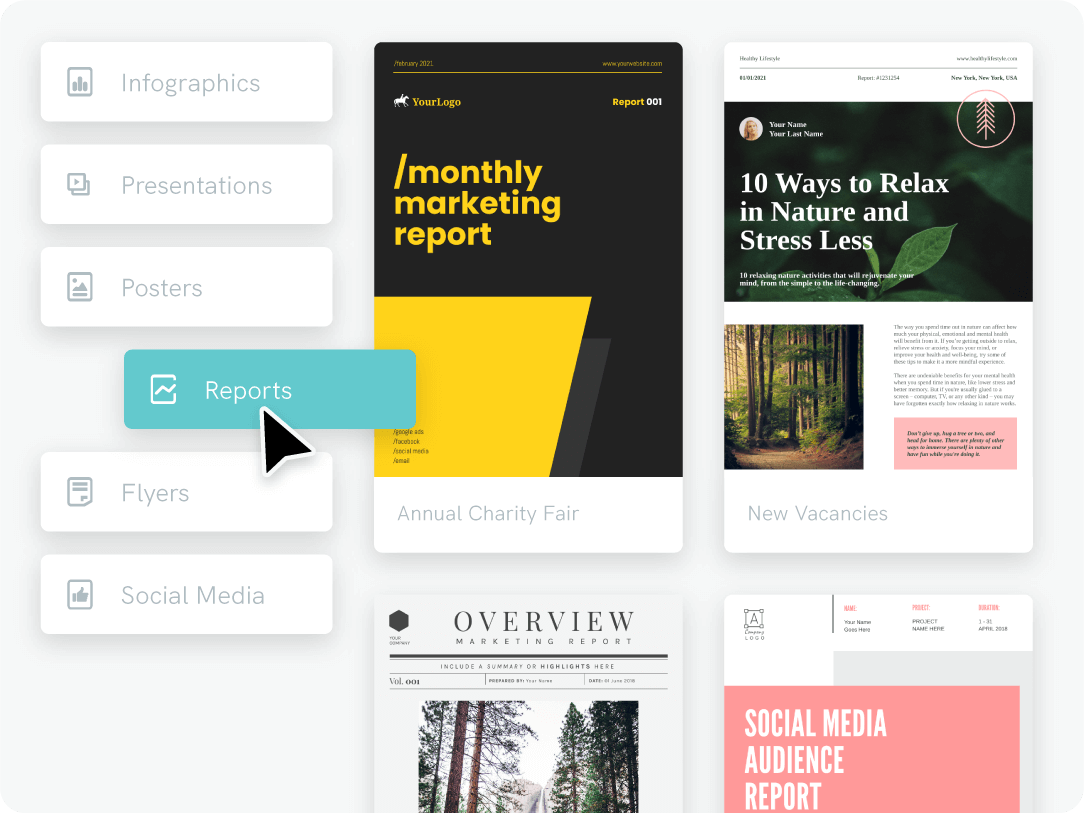
Create infographic reports collaboratively, include live data, and brand elements on a single platform. Share, review, and align effortlessly.
Get Started
On Brand
Streamline brand consistency across your team
Upload your brand kit – fonts, colors, logos – in a snap, and create shared team templates. Empower your team to craft on-brand content effortlessly.
Get Started
Visualize your data with charts and maps
It’s time to make your data understandable, compelling, and convincing. With Piktochart’s robust charts and maps you can quickly translate your data into a visual story that will grasp the attention of your audience.
Get Started
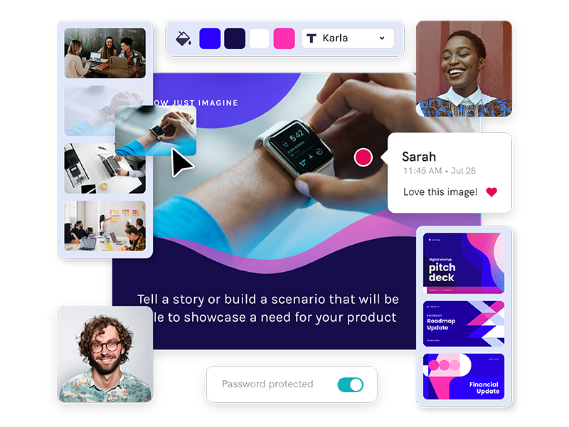
Work collaboratively
Share, Edit, Comment
To kick off collaboration, simply invite your team to your Workspace. Once they’re in, you can begin sharing visuals for feedback or editing, either with the whole team or select members.
Get Started
“Thanks to Piktochart we have been able to tackle the stigma of an old company, give a new approach to content marketing.”
Neil O’SullivanMarketing and Communication Manager at PRIA

“The reports created in Piktochart have helped us to get featured in important industry media outlets many times. This increased our brand awareness.”
Julia Gómez AcuñaCo-founder and Content Strategist at Dear Content

“Piktochart enables our teams to internally communicate results, news and updates in a visually-appealing way.”
Thomas TripMarketing Specialist at Booking.com
FAQs
Ready to design collaboratively?
Join more than 14 million professionals who already use Piktochart to craft amazing visual stories.