Design
25 Green Color Palette Combinations (With Hexes and Name Codes)
If you’re looking for design inspiration, nature’s green palette is an endless source of wonder. Think of the tender shoots of springtime, the deep hues of a rainforest canopy, or the subtle sage of desert succulents. Green is commonly used in branding, especially for companies who want to convey freshness, sustainability, health, growth, or financial themes. […]


Communications
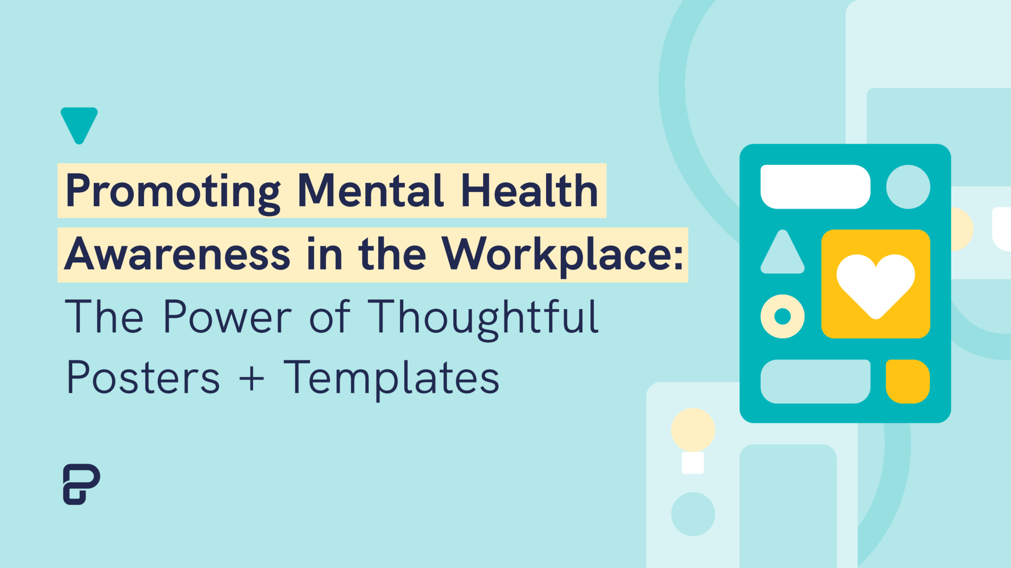
Promoting Mental Health Awareness in the Workplace: The Power of Thoughtful Posters + Templates


Human Resources (HR)