Whether you’re flipping through TV channels, hopping from one website to the other, or simply browsing through your social media feeds, our minds have a habit of picking up on colors first.
Color, along with shape, is a visual element the brain uses to detect and discriminate objects, even having an impact on our emotions.
The right color scheme can do wonders for catching a person’s attention, making whatever you wish to communicate more impactful.
This is especially true with infographics, where visual elements are used to highlight text. Dots, lines, and shapes are the obvious elements found in almost any infographic, but it’s color that can breathe life into the design and bring it together.
However, for many people, choosing an appropriate color palette is tricky—let’s face it, not all of us are artists who understand color by feel and instinct.
And even if you were, if you’re creating an infographic for your company, you can’t exactly tell your boss, “I picked different shades of red because it felt good.”
The good news is that there are a few logical rules you can refer to when choosing good color combinations.
Here’s what you need to know to use color effectively in your next infographic. And if you want to create one already, simply sign up for a free Piktochart account.
1. Understand Color Theory
First things first, let’s review the fundamentals. Below are some of the technical terms used to describe color:
- Hue – The basic color of an object as seen in the color wheel (e.g., blue, red, green)
- Tone – The mixture of a pure hue and gray
- Chroma – The purity or intensity of a hue. If more gray is added to a hue, the less “pure” it becomes
- Saturation – The intensity or vividness of a color
- Shade – A color created by mixing a hue with black, which increases darkness
- Tint – A color created by mixing a hue with white, which reduces darkness
- Value – The lightness or darkness of a color
You don’t necessarily need to know these key terms by heart, but knowing the difference between, say, hue and tone, can help you better explain your design choices to a client or your boss.
Understanding these terms also allows you to better grasp the rules of color.
With literally millions of colors to choose from, it can be easy to get lost in the choices you have to make in your design. How many colors should you use? Which colors go together? Which colors don’t?
Enter the color wheel
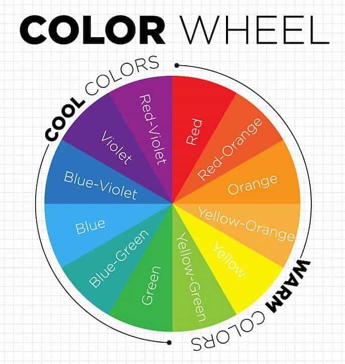
This is where the color wheel comes in. Arguably the most useful tool for choosing different types of color palettes, the color wheel helps you make logical choices by providing a visual representation of the theory.
Devised by Isaac Newton in the 17th century, the color wheel breaks up color hues into three basic categories:
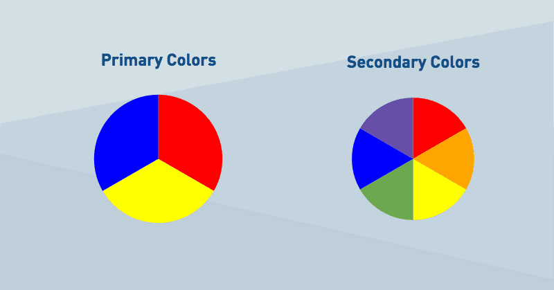
- Primary colors – The colors red, yellow, and blue, which are “pure” colors (i.e., they cannot be formed by combining other colors)
- Secondary colors – These colors, like orange, green, and violet, are formed by combining two primary colors.
- Tertiary colors – Colors like red-orange, blue-purple, and blue-green, which are created by mixing a primary color and a secondary color.
Through the color wheel, you can leverage the rules of color harmony to come up with good color combinations. The simplest theory of color harmony is the rule of 3 colors.
For example, if you want blue to be the main color of your infographic, you can use different types of palettes to end up with different colors that go well together. Below are a few examples of these palettes.
Analogous Color Palette

Analogous colors, or related colors, are defined by choosing one main color and two or more colors in close proximity to it on the color wheel.
Triadic Color Palette

A triadic color scheme is composed of three colors spaced evenly on the color wheel.
Complementary Color Palette

Complementary colors are colors on opposing sides of the color wheel.
Monochromatic Color Palette

Monochromatic colors are composed of different shades and tones of a single hue.
2. Understand Color Psychology
This is where things get truly fun and exciting.
As mentioned earlier, colors are deeply rooted in emotions, with certain color schemes capable of communicating ideas and emotions on a subconscious level. This element plays a huge role in visual storytelling.
Color psychology looks at the effect colors can have on human behavior and how we perceive different things, whether it’s food, our environment, and objects we use in our daily lives.
In marketing and graphic design, color psychology is often used to reinforce messages, ensuring that certain emotions are associated with the information being communicated in a visual medium.
For example, red can convey a sense of urgency. Green can be connected with nature. Blue can be used for its calming effect. In fact, according to research, blue is the world’s most liked color, perhaps because of how it’s found in things people find soothing: the ocean and sky.
Here’s a closer look at different colors and their associated meanings.
Orange
Orange is a color that, in the proper context, promotes cheerfulness, fun, and energy. It can also be a color associated with youth, as seen in logos for brands like Nickelodeon, Firefox, and SoundCloud.
In the infographic below, the color orange matches its subject matter of youths dropping out of college.

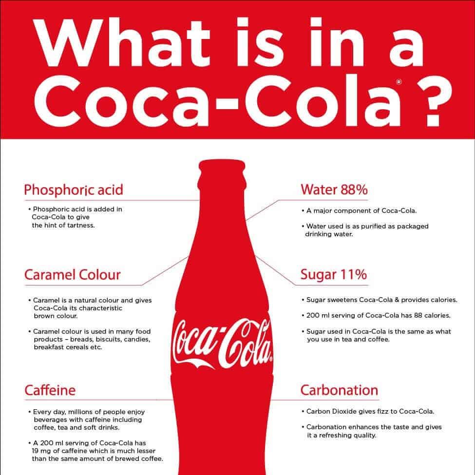
Red
Red is a commanding color, inviting attention wherever you go. As a marketing and design color, red is often associated with excitement, love, and action. It can also be used as a warning color.
This Coca-Cola infographic uses red effectively, using its intensity to draw attention to the header and Coca-Cola bottle.
Green
In color psychology, green tends to be a color with positive meaning, communicating growth, health, and fertility. Apart from nature, the color green is also associated with money. In the infographic below, shades of green are used to reinforce the positive message of financial security.

Remember, while leveraging color psychology can be a great way to make your infographics stand out, any color combination you use needs to make sense with your brand and whatever information is in the graphic.
For example, an infographic with content about something serious, like disease, may not go well with a color scheme with shades of green.
3. Pick Your Method of Choosing a Color Palette
Now that you know the basics of color theory and color psychology, you can then go about choosing your infographic’s color palette. There are a variety of ways to do this.
Take colors from a sample image
If you see an image on Instagram or Pinterest with nice colors, you can download it or take a screenshot and use a tool to sample its color palette.
Protip: You can use Piktochart to upload any image in JPG, PNG, or SVG format. The tool detects the colors on the image, allowing you to choose up to six colors and keep them as your brand colors in all your designs.
This feature can also be found on other tools like Adobe Color, which extracts colors from an image and shows you its matching codes in RGB, CMYK, or HSV mode.
Use a generator
If you would rather start from scratch instead of using a reference image, tools like Coolors generate a random color scheme for you.
If you would rather browse through color swatches, tools like PANTONE’s Color Finder tool is for you.
Follow your company’s brand colors
Of course, if you’re creating branded material, it makes sense to choose a color scheme that actually matches your logo or is aligned with your brand guidelines.
Depending on your branding policies, this may be a requirement. Here’s an example of an infographic from FedEx, which is clearly consistent with the brand’s purple logo.

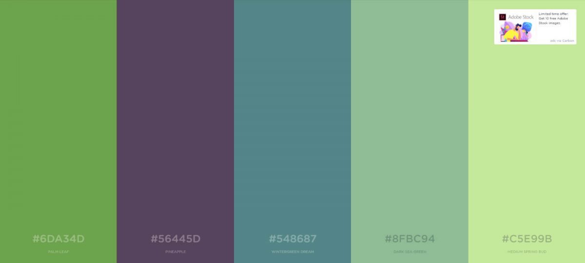
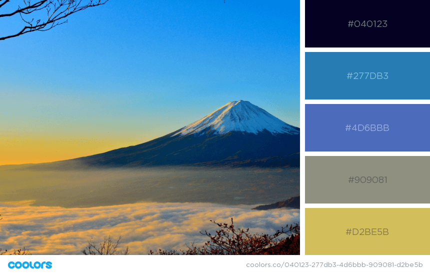
Get inspiration from nature
When in doubt, trust mother nature to provide you with inspiration. Nothing beats the color harmony naturally found in our environment, whether it’s the blue, green, and white combination found in the skies and trees or the many shades of blue found in the ocean.
If you’re not sure where to start, look for a landscape photo on the Internet or upload your own images to a tool like Piktochart or Coolors to grab whatever colors are on it. Here’s an example:
Let others do it for you
When all else fails, there’s nothing wrong with borrowing other people’s color schemes. Look to top brands for inspiration or use apps like Coolors and Color Hunt, which provide an extensive collection of color palettes used by designers—great if you need a bit of help to get started.
4. Implement Your Colors Into Your Design
Now it’s time for the real work to begin: integrating your colors into your infographic. Again, there are a few ways to do this.
Follow the 60-30-10 Rule
One of the fundamental principles of using color in design is the 60-30-10 Rule. This design system can be broken down into the following steps:
- In your color scheme, choosing a primary or “root” color. This will dominate 60 percent of the area in your infographic.
- Next, choose a secondary color. This will cover 30 percent of the infographic.
- Finally, choose your accent color, which will cover the remaining 10 percent of the design. It’s the pop of color that helps tie the whole graphic together.
The 60-30-10 Rule is great if your color scheme follows a Triadic color palette. However, if you have a fourth or fifth color, you can either divide your primary or secondary colors and add a lighter shade of one color or the other to your design.
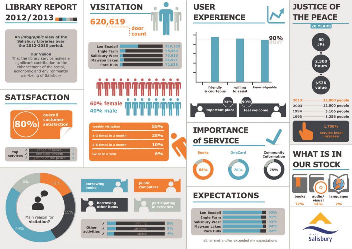
In the infographic below, there are four colors—shades of grey, orange, teal, and red, with their dominance listed in this order.
Stick to two main colors
Another basic design principle is to have two colors in your color scheme dominate your infographic. Reducing the number of colors in your infographics makes it feel more cohesive.
If your color scheme has more than two colors, pick two as your main colors and use the rest as accents.
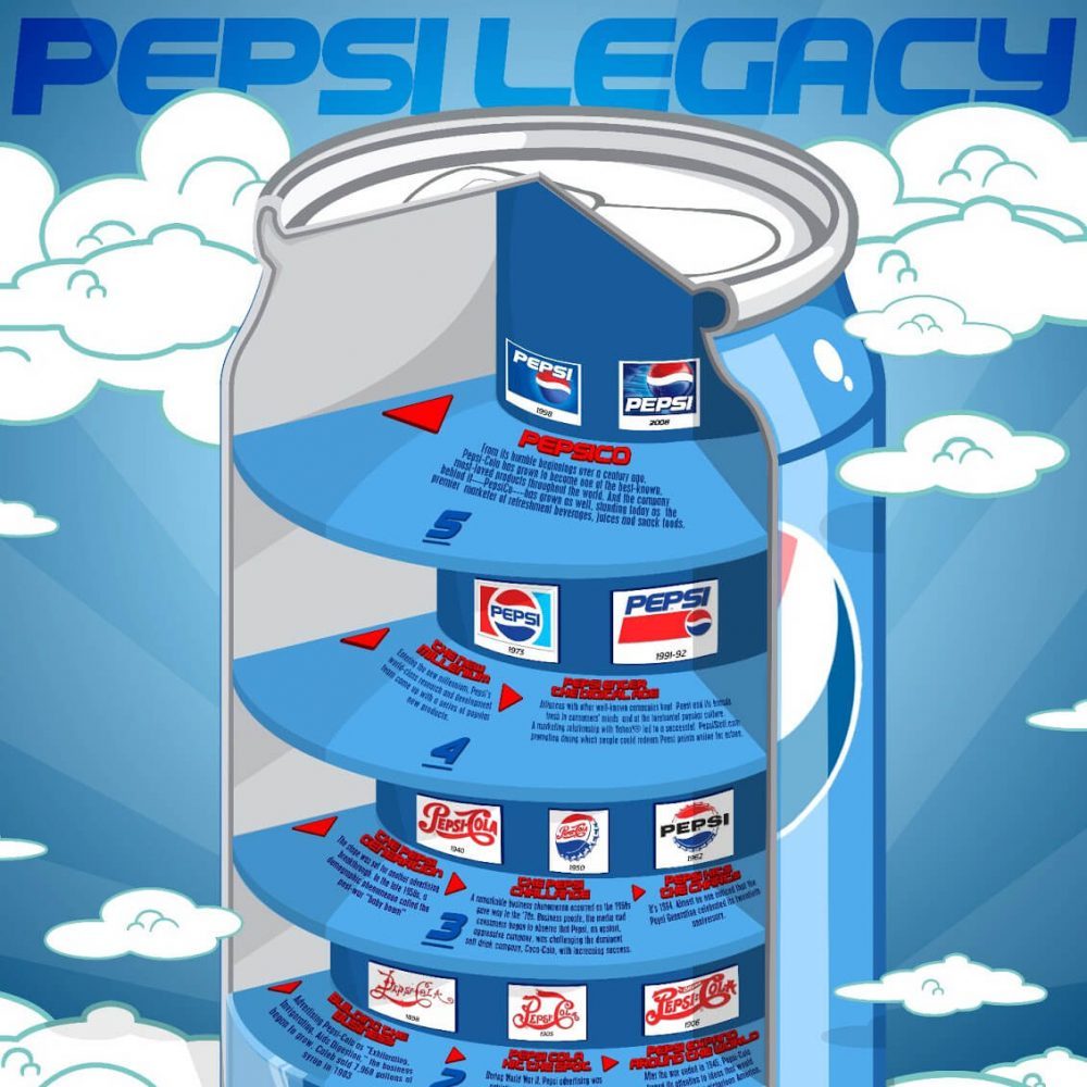
This Pepsi infographic offers an example of this design principle in action.
Meanwhile, this infographic of Ferrari’s history also features two main colors: Ferrari’s signature red and yellow.

Use dull and muted colors in the background
If your color scheme has dull and muted colors such as light shades of grey, blue, beige, or brown, try to use these colors in the background.
Dull colors can serve as your infographic’s white space, helping text and other visual elements in brighter colors stand out.
Check out this Emirates infographic, whose text visual elements are set against a light blue background.

Colors from the same family work well together
A monochromatic color palette can look great on an infographic, especially if it reflects your branding.
This infographic from BP clearly has the company’s signature green and yellow branding. However, three shades of green dominate the design, creating a consistent design.

Bring It All Together
When choosing a color scheme for your next infographic project, remember the following steps:
- Brush up on color theory. This allows you to understand the differences between hue, saturation, value, and chroma, which, in turn, helps you grasp color concepts visualized by the color wheel.
- Look up color psychology. Color can make your infographic create an emotional response. The trick lies in using the right colors that evoke the response you want.
- Figure out how to pick your color scheme. There are all kinds of online tools to help you choose color schemes from sample images or from scratch.
- Follow a specific design principle. Set up your color scheme for success by applying them in a way that follows good design principles.
We cover more about color theory in our free online course, which you can enroll in to become a certified visual storyteller!
Once you’re ready to get started, use Piktochart’s infographic maker to create professional infographics. We offer a wide variety of infographic templates for all kinds of messages, brands, and industries. Browse through our collection—there’s bound to be one for you.
Piktochart allows you and your team members to work together on visuals.
Collaborate on presentations, reports, flyers, and infographics online. Watch this demo to learn about the Team plan.
Watch the demo