Infographics are an incredibly effective way to quickly convey your message. However, if you don’t keep the user in mind when creating your infographic, your message may not reach everyone that it could otherwise.
Making your infographic accessible means removing limitations that could prevent any user, with or without disabilities, from being able to view it. Better accessibility means more people can view and share your creation — and search engines will have an easier time finding it. All of this leads to a big “win” for you, but here’s the best part: it can be done easily and quickly.
For a related read, see our guide on asymmetrical balance.
Follow along by creating an account for free and selecting a template from the infographic gallery.
Make your visuals accessible for screen readers
Screen readers are programs that the blind and visually impaired use to browse and navigate websites. Screen readers work by translating text to either braille or voice. Except…images are obviously not text. That’s where alt text comes in!

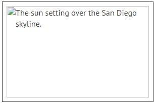
Image on the left: Screen readers won’t register an image unless it has alt text.
Image on the right: By using alt text, you provide content that screen readers can scan.
Alt text is an attribute you can add to any image on your site, including infographics. Screen readers (and even search engines like Google) can read alt text to understand what the image is displaying. If you’re using a framework like Wordpress on your site, adding alt text is easy (shown below). Just make sure you use periods in alt text. It’s how screen readers know when a sentence ends.
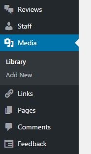
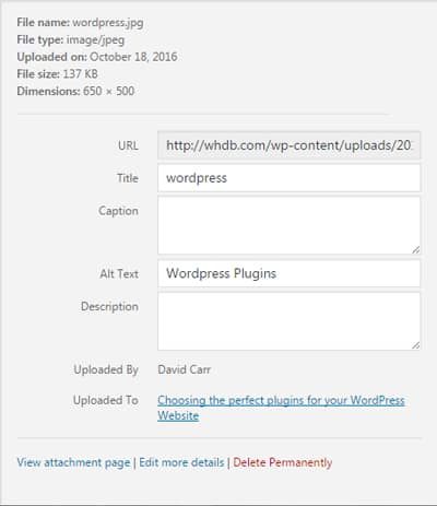
Step 1: In your Wordpress dashboard, go to the Media Library.
You might also find our article on emphasis principle design useful.
Step 2: Select any image to view its options.
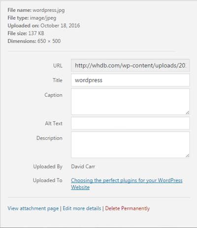
Step 3: Add your alt text and Wordpress will automatically save it.
When creating an infographic with Piktochart, you can choose to publish and share your project instead of downloading it as an image. By doing this, Piktochart will display the infographic in a way that is readable by screen readers and search engines — without the need for any alt text! Try it out by signing up for free.
It is worth knowing that text on Piktochart will be readable through a screen reader if the visual is shared electronically through HTML. According to the blog post on this topic, you’ll just need to add the “alt-text” by using WordPress, then embed it on your website. What happens is the “alt text” will be added to the infographic as a whole, not just for each individual image and icon.
At this stage unfortunately, you will not be able to add “alt text” tags for images and icons. Also, maps and data charts will not be accessible through a screen reader.
If your infographic has a lot of content, using alt text may not be the ideal solution. Additionally, not everyone with a visual impairment or low vision uses a screen reader. People with color blindness may not pick up red and green light — the most common types of color blindness — often changing the color that they actually see. This makes it impossible to design an infographic that everyone can see exactly the same.
In this case, you can simply type out what your infographic says below (or above) it. Screen readers will still be able to scan it, giving you more control over formatting the text. Using either alt text or a text version is a win-win for you: those with disabilities have access to your image, and you increase your odds of popping up in a search.
Looking for more? Check out information design.
[clickToTweet tweet=”Use alt text or summarize the content of your visual to make it easily accessible to everyone” quote=”Use alt text or summarize the content of your visual to make it easily accessible to everyone”]
Other things to consider for the visually impaired
Blindness is not the only visual impairment. You should consider color blindness and low vision as well. Don’t act skeptical either — according to the National Federation of the Blind, there are over 7.3 million people with visual impairments in the US alone, and WebAIM estimates that 93% of the visually impaired use screen readers.
[clickToTweet tweet=”There are 7.3M people with visual impairments in the US alone. Are your designs accessible to all?” quote=”There are 7.3M people with visual impairments in the US alone. Are your designs accessible to all?”]
Fortunately, being considerate of the visually impaired is easy to do. It’s just a matter of making things easy to read and stand out — and it actually ends up helping everyone.
Here are some tips:

#Tip 1: Use a legible font size
Use a font size that doesn’t require squinting to read. I recommend sticking to 14px or “medium” for your smallest font size at least. Smashing Magazine, an authoritative source dedicated to web design, goes ever further by suggesting you should use 16px as the font-size for your body text. If you find this makes your visual too long, consider using more concise language, removing less important points, or narrowing the focus of your visual.
We also cover this in our piece on principles of design.
#Tip 2: Don’t use stylized fonts for paragraphs
We all love fancy-looking fonts, but it’s generally hard to read as paragraphs. Stick to basic fonts for large chunks of text. Fonts like Georgia, Times, Arial, Helvetica, and Calibri are great choices, but they’re far from your only choices. Since headings generally use a larger font and are shorter than paragraphs, you have more flexibility with the style of font. Let’s still avoid using Webdings though. Here is all you need to know about pairing fonts for your visual.
#Tip 3: Use high-contrast colors for fonts and visuals
For fonts and visuals conveying information, use colors that have high contrast together. Don’t let this limit your creativity — just avoid situations like putting blue text on a purple background. In this situation, blue and yellow or orange would be more appropriate. If you’re curious about how well your colors contrast, try this:
position yourself about three feet away from your screen and squint your eyes. If you cannot make out the general features of your visual, chances are that the colors don’t contrast well enough.
Pro Tip: You can also desaturate the image, which will replace the color with shades of gray. If you cannot tell the grays apart, then the original colors don’t have high contrast.
#Tip 4: Avoid white text on dark backgrounds
Avoid using large blocks of white text on a black (or even dark) background. Over time, it strains users’ eyes and hurts the legibility. Ideally, your paragraph text should be a darker font on a lighter background. If you must use a light color for your body text, consider a mid value color for your background, like muted red or blue or 60% gray, but keep in mind the previous point about contrast. It’s less of an issue for headings though — so long as the headings are fairly short.
Prep your infographic for slow connection speeds
The visually impaired aren’t the only users to consider when it comes to accessibility.
For a related read, see our guide on principles unity design.
In a world where fast internet is widely available, it’s easy to forget that many Americans are still using dial-up service to connect to the internet, over 2 million in fact. However, there’s an even bigger group that experiences slow connection speeds occasionally: mobile users.
Images with large file sizes will take forever to load for people with slow connection speeds. File size doesn’t refer to how big an image looks; you can think of file size like density. If two items are the same size, the one with higher density will weigh more. You can reduce your image’s file size without lowering its quality by using compression. The end result is a fantastic looking infographic that loads quickly.
There are several programs you can use that feature compression tools, but many of them, like Photoshop, are paid services or software. If your site is running on a framework like Wordpress or Joomla, there are plugins, like Smush Image Compression and Optimization, that will compress images for you without using a paid service. It will take a bit of work on your part though.
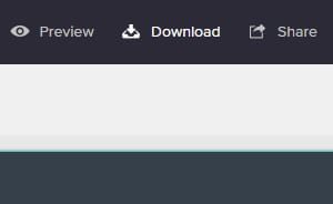
Piktochart provides a built-in compression feature that is easy to use — in fact, it only requires one mouse click. You can access the compression options when you are downloading your project as an image.
Step 1: Access the compression options by selecting “Download” in the top right of Piktochart’s editor.
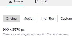
Step 2: Choose between “Original”, “Medium”, and “Hi Res” for the compression level that best fits your needs.
You might also find our article on psychology of shapes useful.
Piktochart offers professional templates to create presentations, infographics, posters, brochures, reports, and more. Just by creating a free account, you get unlimited access to templates, collaborative features, pay-per-download and a folder to organize your visuals! Get started now.
Looking for more? Check out visual hierarchy.
Make visuals that are appealling, comprehensive, and accessible to all.
Create infographics, posters, presentations, social media graphics, and more. Customize every element and add icons, images, and charts. Export in PDF or PNG.
Create a visual